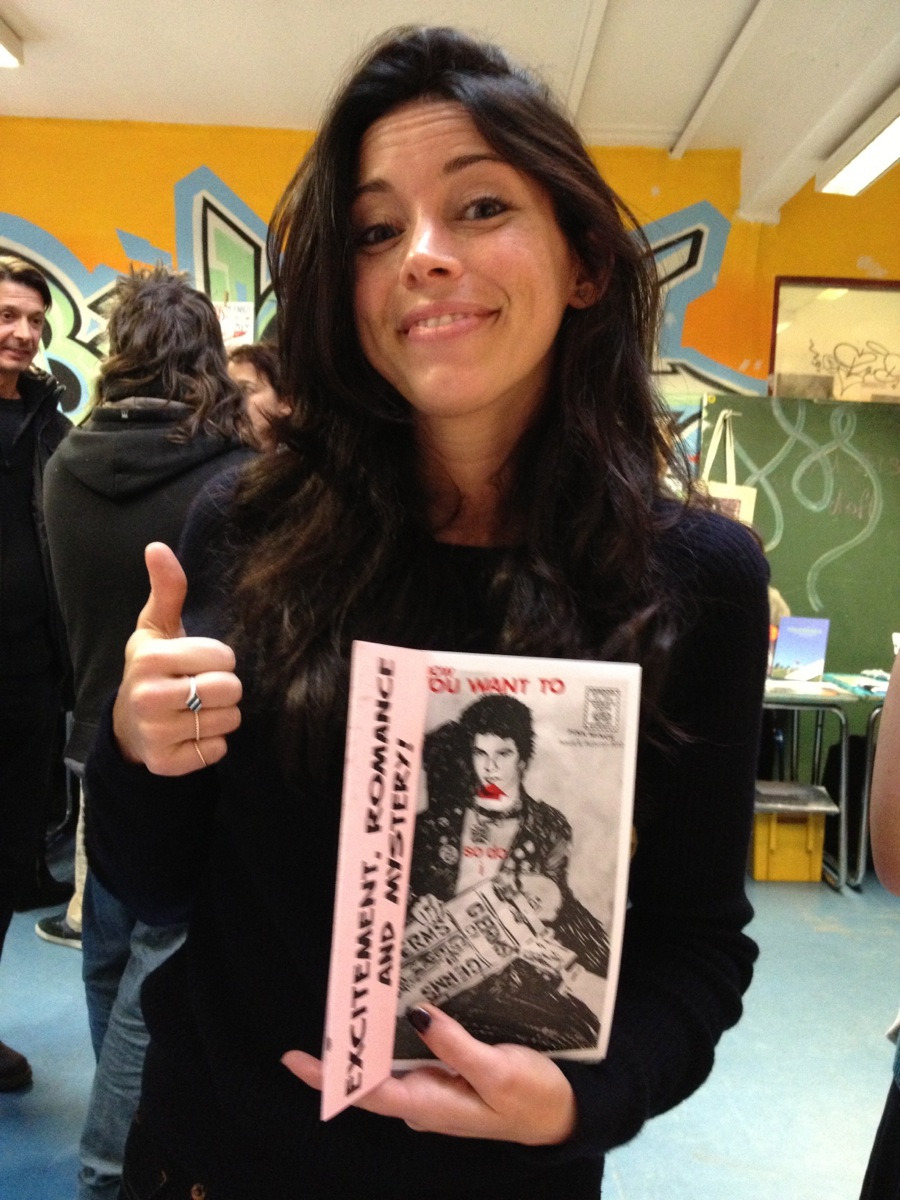
Me! Just a quick email Q&A for Design Week that I did recently:
Monotype type director Dan Rhatigan on a changing typographic industry, the perils of a second degree and the importance of experimentation.

[Photo by the magnificent GUAzine]
Ragtag grab-bag

Me! Just a quick email Q&A for Design Week that I did recently:
Monotype type director Dan Rhatigan on a changing typographic industry, the perils of a second degree and the importance of experimentation.
[Photo by the magnificent GUAzine]

I generally don’t talk about Pink Mince when I’m doing things related to my day job, but I threw in a handful of visual references to accompany an interview in the latest issue of 8 Faces magazine. (If you like or love typography, then you really should check out 8 Faces.)
You can order 8 Faces here. And, of course, you can order Pink Mince here. You can also buy that t-shirt (and others) at the Pink Mince Zazzle shop.


I wrote a short little thing for Wired UK about the history of the Johnston Underground typeface. I was worried that I could only barely scratch the surface in 500 or so words, but people seem to enjoy it anyway:
Last week we celebrated 150 years of the London Underground, but 2013 also marks the centennial of its iconic typeface, first commissioned in 1913. Edward Johnston, a British calligrapher and lettering artist, was asked to create a typeface with “bold simplicity” that was truly modern yet rooted in tradition. Johnston’s design, completed in 1916, combined classical Roman proportions with humanist warmth. This mix of qualities, driven by Johnston’s approach to the written letterform, also influenced his student Eric Gill, who assisted with the design of the Underground typeface and developed some of its ideas in his own Gill Sans in the following decade.
“Underground” — later known as “Johnston” — was circulated as a lettering guide for sign-painters and also made into wood and metal type for posters, signs, and other publicity materials used throughout London’s transport network.
Johnston himself only drew one weight of the typeface. He based its weight and proportions on seven diamond-shaped strokes of a pen stacked in a row. This gesture even shows up in the typeface itself, with the characteristic diamond used as the tittle of the “i” and “j”. He felt so strongly about the weight of the design that when another student of his agreed to create an accompanying set of bold capitals, Johnston wouldn’t speak to him for decades afterward.
Johnston’s type became a distinctive feature of the Underground brand over the years, but by the late ’70s it was less practical to use the old wood and metal fonts. Inevitably, the brand was getting watered down as other typefaces were chosen for different uses around the system. In 1979, London Transport asked design agency Banks & Miles to modernise “Johnston” and prepare it for the typesetting systems of the day, such as the Linotron 202.
Eiichi Kono, a new designer at the agency, was asked to revise and revive the family. Not only did he redraw the proportions for better display and even out some of the inconsistent details of the original, but he also took on the challenge of adding two new weights and accompanying italics for the full set, giving the family much greater versatility. Some years later, this design was further refined and expanded by Monotype, with even greater support for different languages. Known now as “New Johnston”, the fonts are used exclusively by Transport for London today as its brand typeface.
Other versions are commercially available to the rest of us, each taking a different approach to adapting Johnston’s design.
P22 Type Foundry released its faithful, officially licensed version of Johnston’s original in 1997, also offering a number of lively graphic
elements such as ornaments and borders that draw on TfL’s rich visual history. P22 London Underground was later updated as P22 Underground Pro with many more weights and typographic features.
While P22 revived “Johnston” as a display typeface, designer Dave Farey was interested in refining the concept to work better for text in his 1999 design of “ITC Johnston”. His first iteration included three Roman weights that were redrawn and respaced with a freer hand, using the original as a starting point and a model. When adding italics
later, Farey looked back to Edward Johnston’s legacy as an influential teacher of calligraphy and writing, and he devised a more cursive set of forms that drew on a very English tradition of lettering.
So happy birthday to the Underground and its namesake typeface, in all its flavours.
Just a quickie: a link to a nice little article about zines written by Kate Nancy, who I met when she stopped by the Pink Mince stall at Zinefest Berlin last November. The article includes a couple of quotes:
“For me, the latest explosion of zines is very much about a return to paper, a reaction to years of content and interaction only happening online,” says Rhatigan, who published a zine called Rumpus Room in the early ‘90s and maintained activity in the zine community for more than a decade. He describes a wave of zine-makers – wearied by the costs of mailing and photocopying – defecting to online publishing en mass. “But a decade later the Internet was clearly figured out by regular media, so it doesn’t surprise me that people react against that once again to find ways of making things they care about tangible and more permanent, more special.”
A preview section of the interview I gave to Eye magazine for their Monotype special edition, number 84:
Since I started working full-time at Monotype, and especially since I took over as UK Type Director last Spring, work has consumed a larger and larger part of my life. This would be bad if I didn’t love this job more than any other I’ve ever had, and if I didn’t feel like I was contributing to what happens at Monotype. My attempts to keep up with this site, always a tricky endeavor at the best of times, may have fallen slack, but I’ve hardly been slacking off elsewhere.
The last two weeks have been the culmination of a frantic couple of months of preparation for a giant exhibition of work from Monotype’s past and its present, and hopefully a look at its future. Pencil to Pixel, masterminded by my extraordinarily talented colleague James Fooks-Bale, designed by SEA, partially curated (and with guided tours) by me, and pulled off thanks to the efforts of many more, was huge success by all measures, and hopefully one of many more endeavors to come.
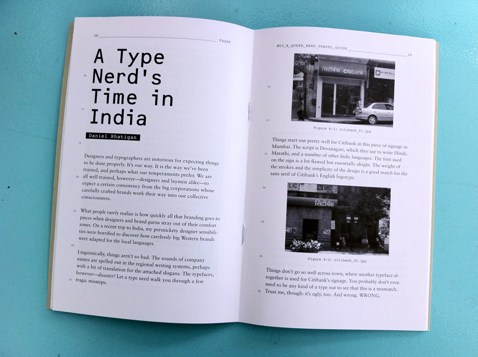
Last year I submitted an article to a very excellent zine called FAQNP (which stands for, mischievously, “FAQNP‘s a Queer Nerd Publication”) for their “Queer Nerd Travel Guide” issue, since I’m a queer nerd who travels a lot.
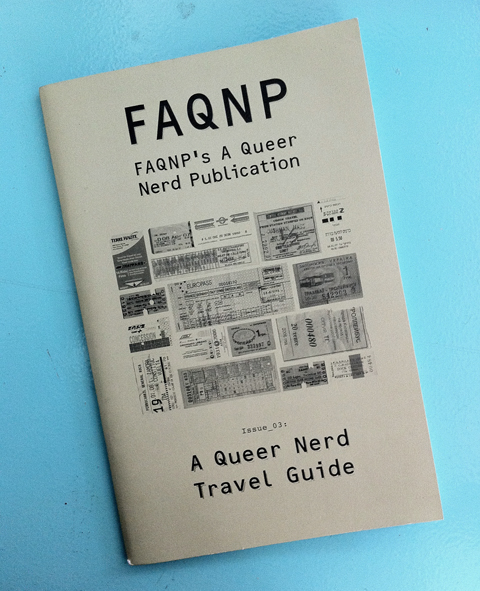
The gents at FAQNP have kindly agreed to let me reprint my story about how Western brands drop their typographic standards when they trade in India. You should repay that kindness and check out some of their back issues or cool merchandise.
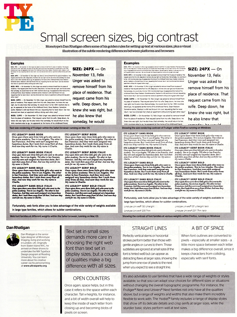
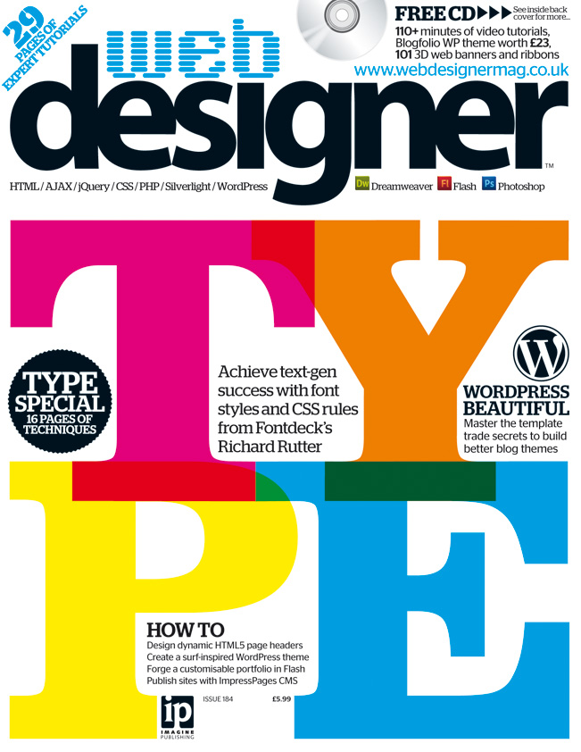 Just a quick one for the clippings file: I wrote up a few quick tips about choosing typefaces for the web (or any screen-based project, really). Nothing major, but some ideas to chew on. This is from the web typography special issue Web Designer magazine (no. 184).
In my official capacity, I wrote an opinion column for the latest issue (no. 192) of Computer Arts magazine about the state of digital type. I’m not sure if the article will be posted to their website, so just to be safe I’ll include it here:
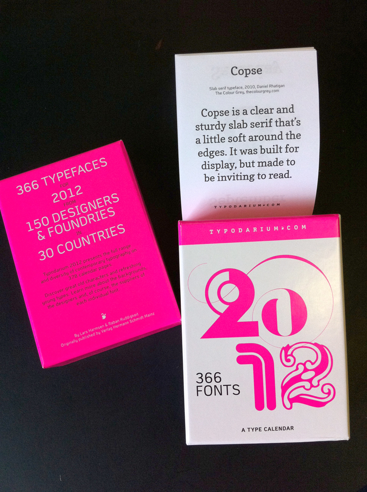
I contributed to the Typodarium 2012 calendar with Copse and Astloch.