Psycho Sixteen

In this flyer I made for my friend Lynn’s 16th birthday party, we can see that I was playing aorund with this punky, pre-digital, cut-n-paste aesthetic ages ago. This was 1988 when I was 17, just about to head off to college. Lynn and I both straddled the edge of Staten Island’s suburban-y punk scene, so this wasn’t entirely us being poseurs. You can definitely see the early seeds of the Punk Mince art direction.

Media: felt tip pen, Letraset, Letratone, Apple IIe printouts, cut-n-pasted catalogue photos, and the Xerox machine at my part-time receptionist job at a Catholic retreat house

Treasures from the attic

About five years ago, when I was getting ready to move to England and take another crack at grad school, I was starting to worry about what to do with all my stuff. I’d surrendered many treasures as I downsized and moved from one place to another, but emigrating — even if it would only be for a year — would require me to pare down to the essentials once and for all, and even then I’d probably need to give preference to relevant books for my course.

Luckily, my brother generously agreed to let me use the attic of his large house to store all the boxes of things that I couldn’t take, but wasn’t quite prepared to throw away or sell. In the years since, as I’ve adjusted to the idea that I may be living here for quite a while, I’ve emptied out a box or two when possible, throwing away things that don’t seem quite so precious anymore and bringing some of the treasure back to the UK.

Last week I sorted through the stack of boxes again, grabbing a few essential books I’d been missing and rescuing a small stack of ephemera I’ve been collecting for the past thirty years or so. Looking through the pile is like finding old friends again, and unleashing a flood of memories. I suspect many of the the tidbits will make their way into Pink Mince eventually, but here’s a selection of other things with less editorial potential.
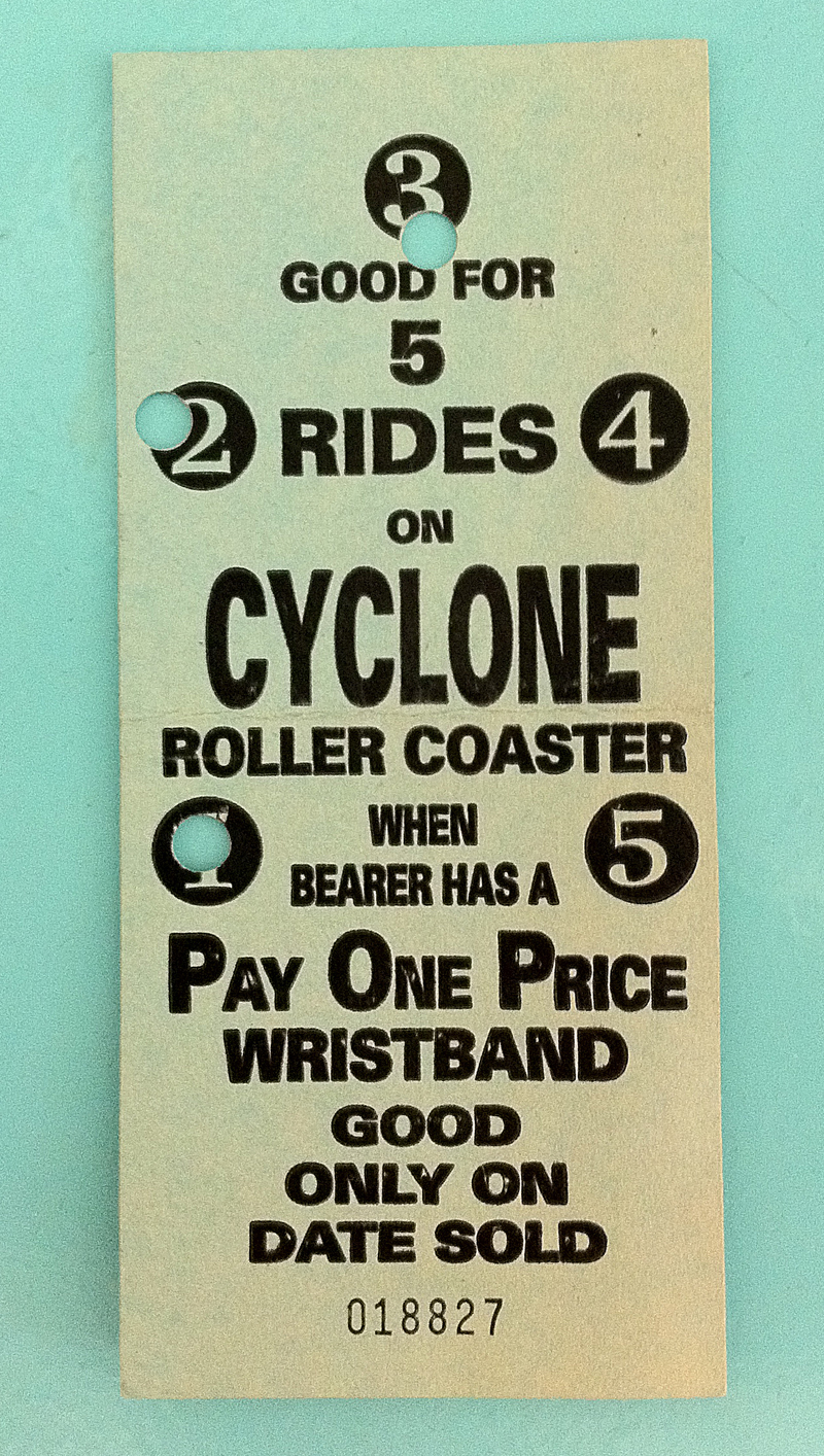
cyclone.jpg

Ticket stub from the Cyclone at Coney Island
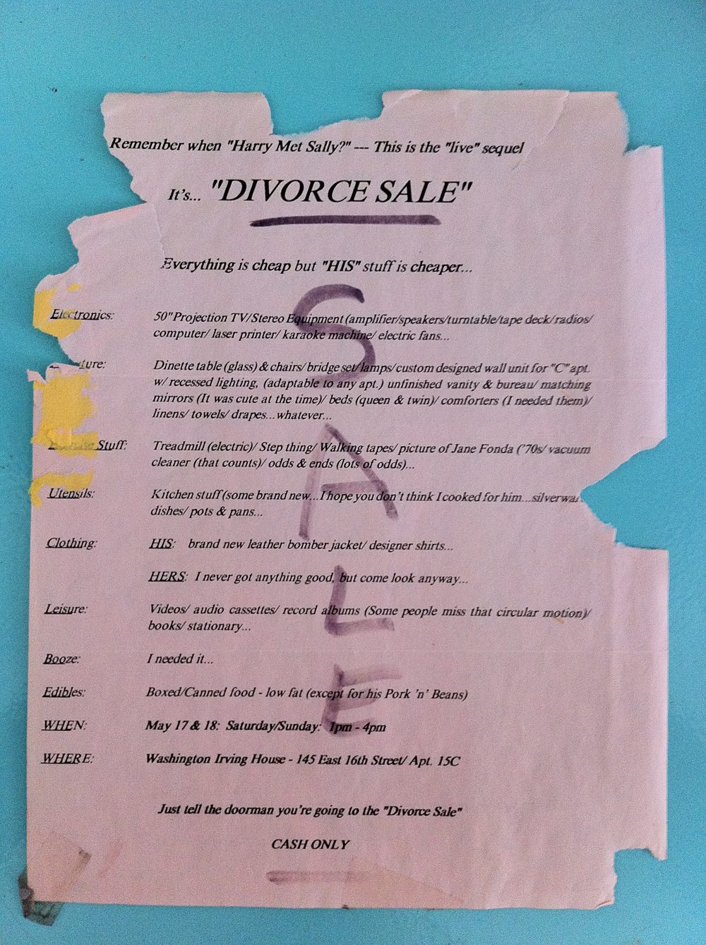
Divorce Sale

Flyer for a divorce sale — “Everything is cheap but HIS stuff is cheaper”

Loch Ness

Flyer for a “Scottish” gay bar in Rio de Janeiro
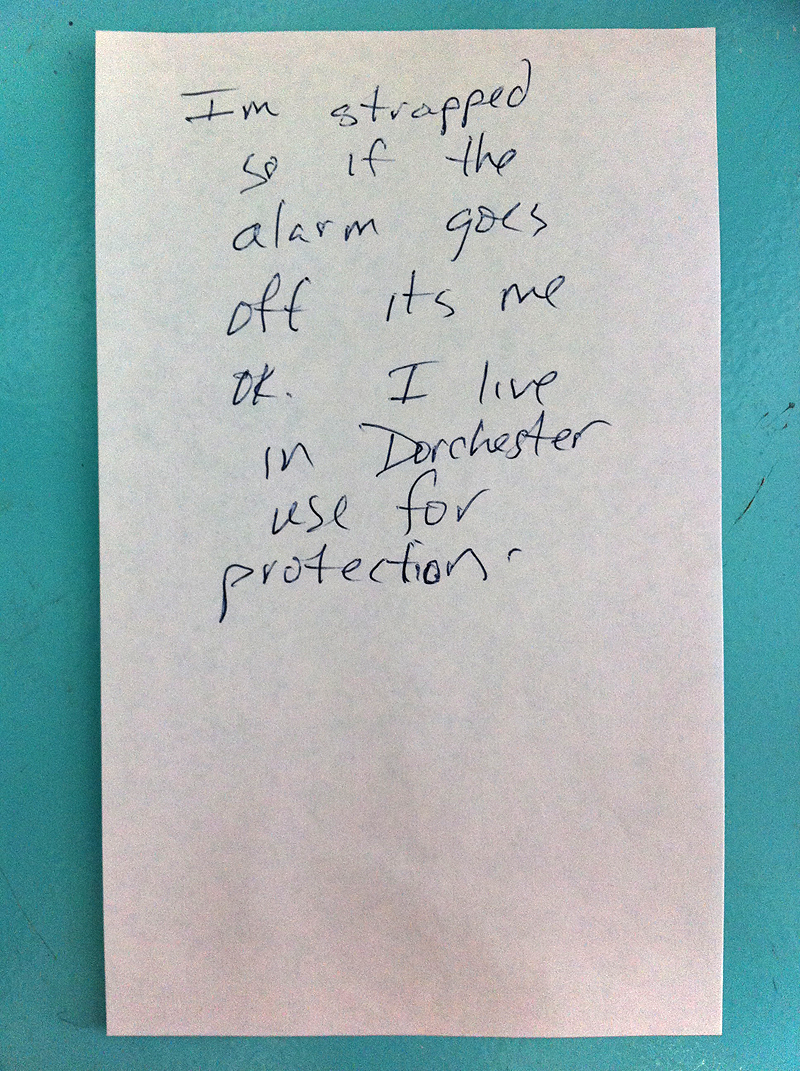
Strapped

Note given to me by a 15-year-old deaf boy when I was working the front desk at Waterstone’s in Boston
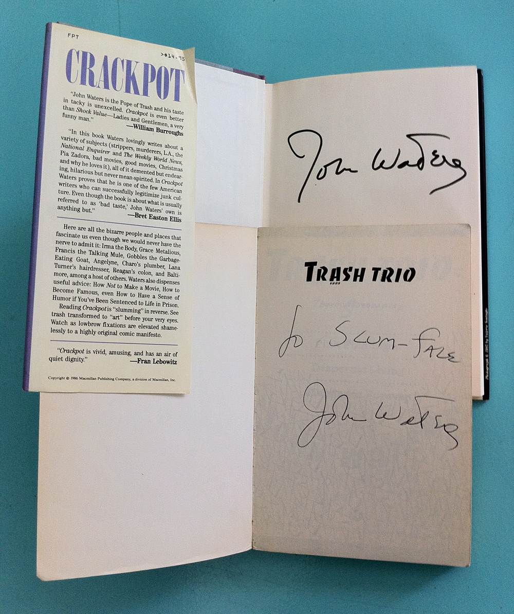
John Waters autographs

A couple of John Waters autographs from 1989 or so.
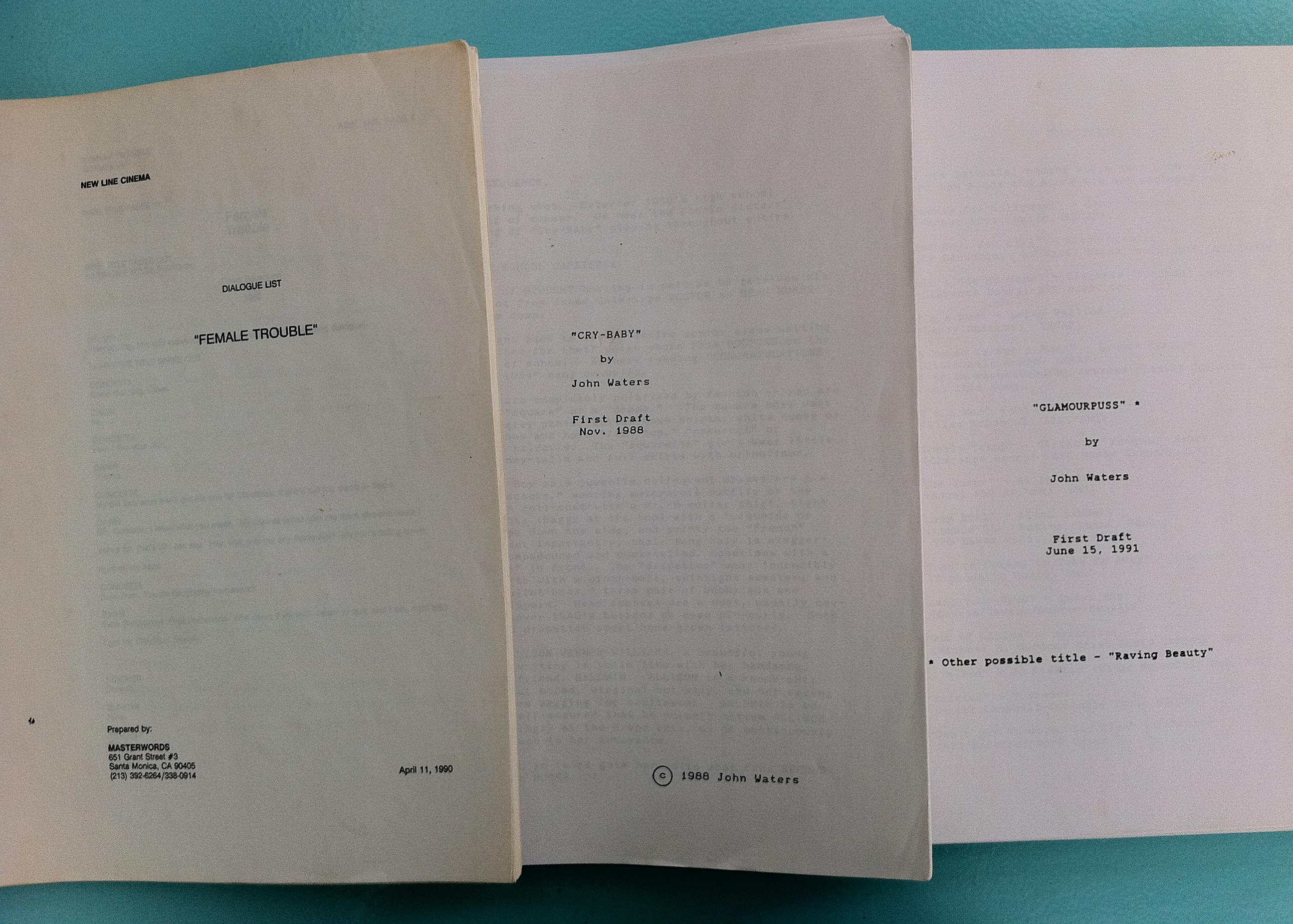
John Waters scripts

Much more beloved Waters memorabilia: copies of various scripts from films of his.

Avant Garde

Avant Garde

I spent the day working on a custom version of this typeface, thinking that it’s one of those designs that only seems to deserve its fame when it’s used just right, but the rest of the time feels a bit off. I don’t love it, but I have a deep affection for it. Avant Garde was, after all, the typeface that turned me into a typographer.

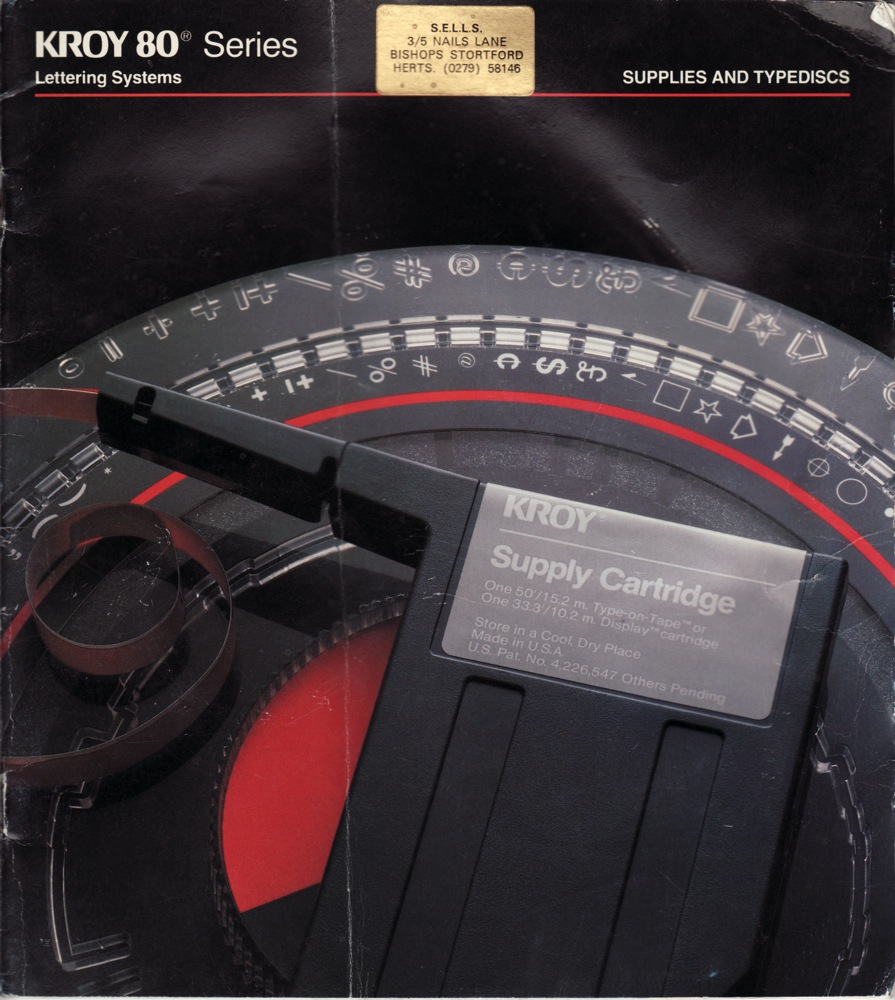
Kroy 80 Supplies and Specimens-coverKroy 80 Supplies and Specimens

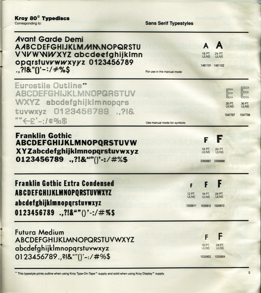
When I was a pimply 14-year-old freshman in high school who still just wanted to draw comics for a living, I joined the staff of the school newspaper hoping to contribute a bit of art now and then. One of the first things I was taught was the use of the Kroy machine, which set type on transparent strips of adhesive tape for the headlines in the paper. Among the font discs we had on hand was Avant Garde Demi, and it included a number of the alternate glyphs that actually make this design interesting. Playing with that font and that machine was the first time I thought about the visual possibilities of a certain style of letter, and how you could create something by manipulating how you arranged letters. It wasn’t an immediate conversation, but something clicked, connected to my fascination with comic book titles and sound effect balloons, and — obviously — eventually led to a lifelong fixation.

Avant Garde Sparky

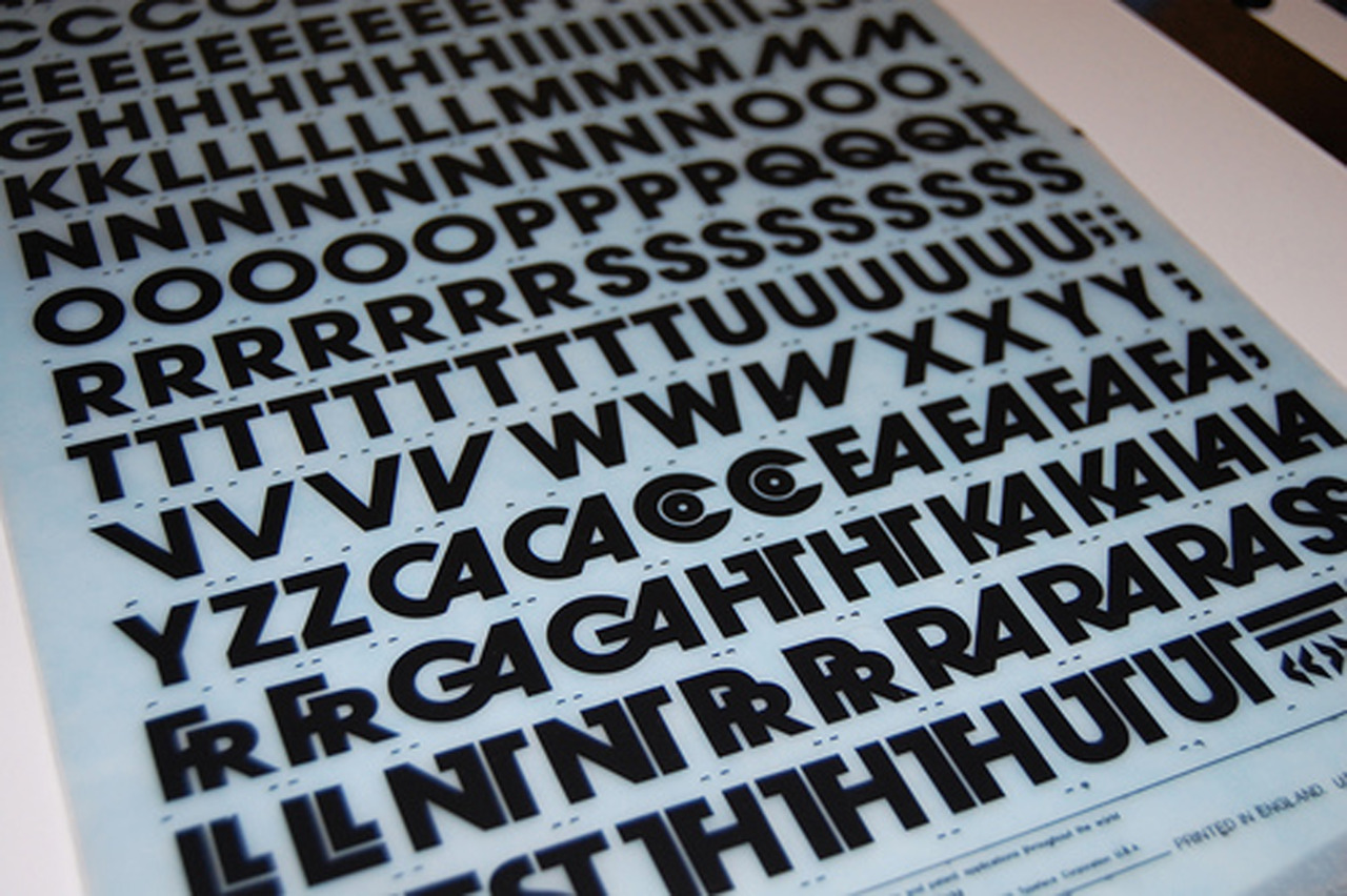
[Letraset photo via alexvmsf]

Official business

April Fool’s Day is probably a bad time to make a major announcement, but I swear this one is for real. As of today, I am employed full-time as a senior type designer at Monotype Imaging, based out of our office in Salfords, a bit south of London. (I live and spend most of the time working in London itself, however.) I will probably spend most of my time for the next few months continuing to work on Indic typefaces, and doing a bit more speaking about type design and typography. And actually getting paid for it. Is that awesome or what?

Hooray! Did you know that I’ve spent the last few months whining about my work visa issues, and living back in New York while I waited for all this to fall into place? After working for two years on a collaborative project between Monotype and the University of Reading, and then waiting for the visa stuff to get sorted, I feel like I have finally completed the longest job interview of my life. I am relieved, and excited.

Sparky typefaces

[Note: This is as good a time as any to point out that this is my personal web site, though, where I generally speak off the cuff, and occasionally talk some shit. Those opinions are mine, not the company’s. Obviously.]

Oh Coney, My Coney

The start of Summer always makes me long for Coney Island, especially now that it’s so far away and I’ll probably never see it again before it finally gives in to all the pressure and becomes something else.

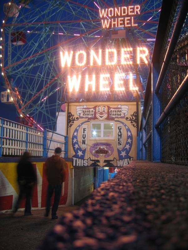
Wonder Wheel

But there’s so much to love. If you haven’t been there it may be hard to see past the decay and appreciate the real charm that comes from the liveliness of the place, and the visible signs of a long, colorful history. I’ve always had trouble putting my finger on my love for the place, although it’s such a goldmine of lettering and kitsch that it’s easy to understand what first sucked me in. But it’s always been more, somehow, too.

Coney Island Dream from Joshua Brown on Vimeo.

[Coney Island Dream from Joshua Brown on Vimeo.]

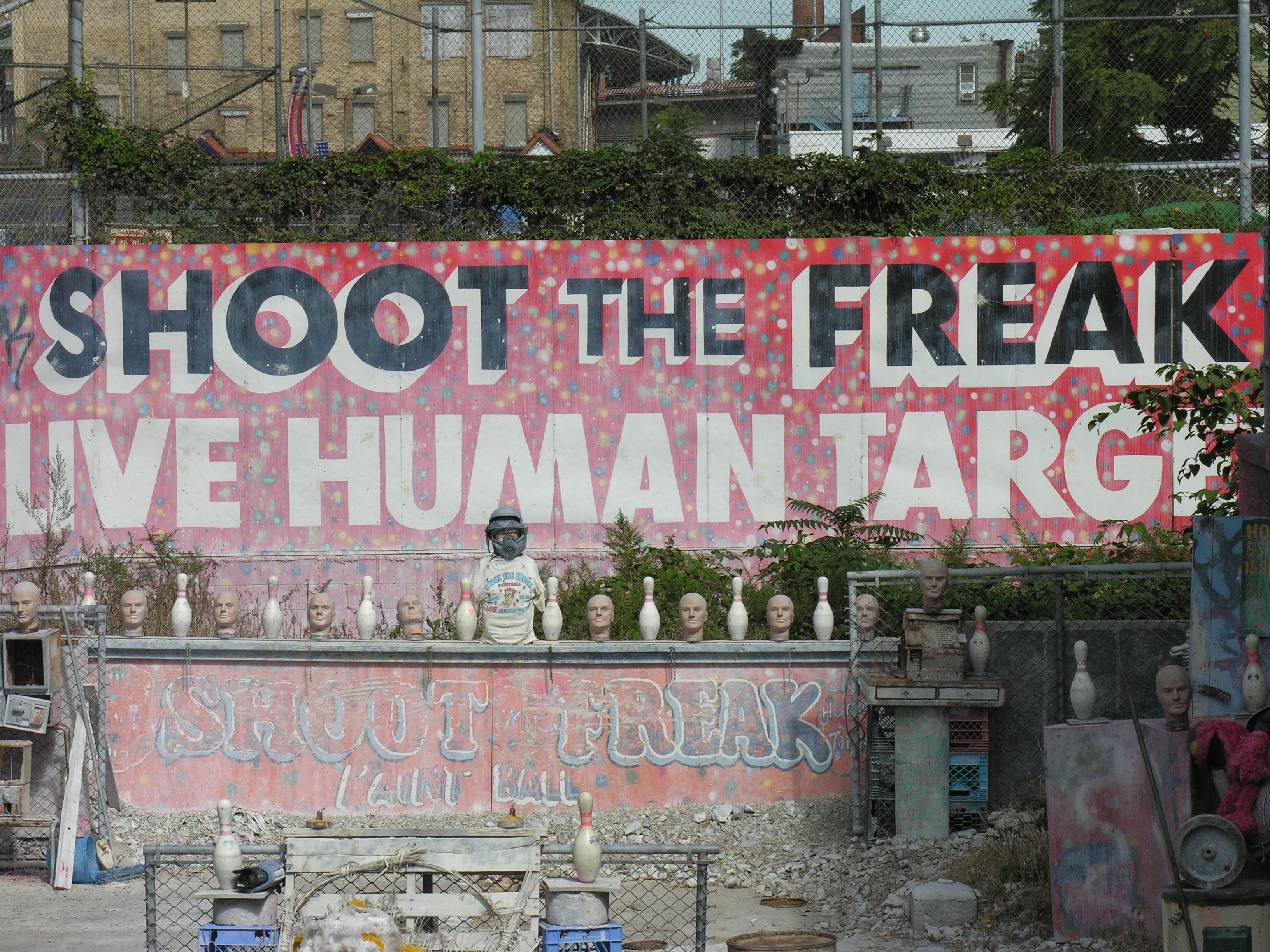
Shoot the Freak