Letraset: The DIY Typography Revolution

LETRASET: The DIY Typography Revolution

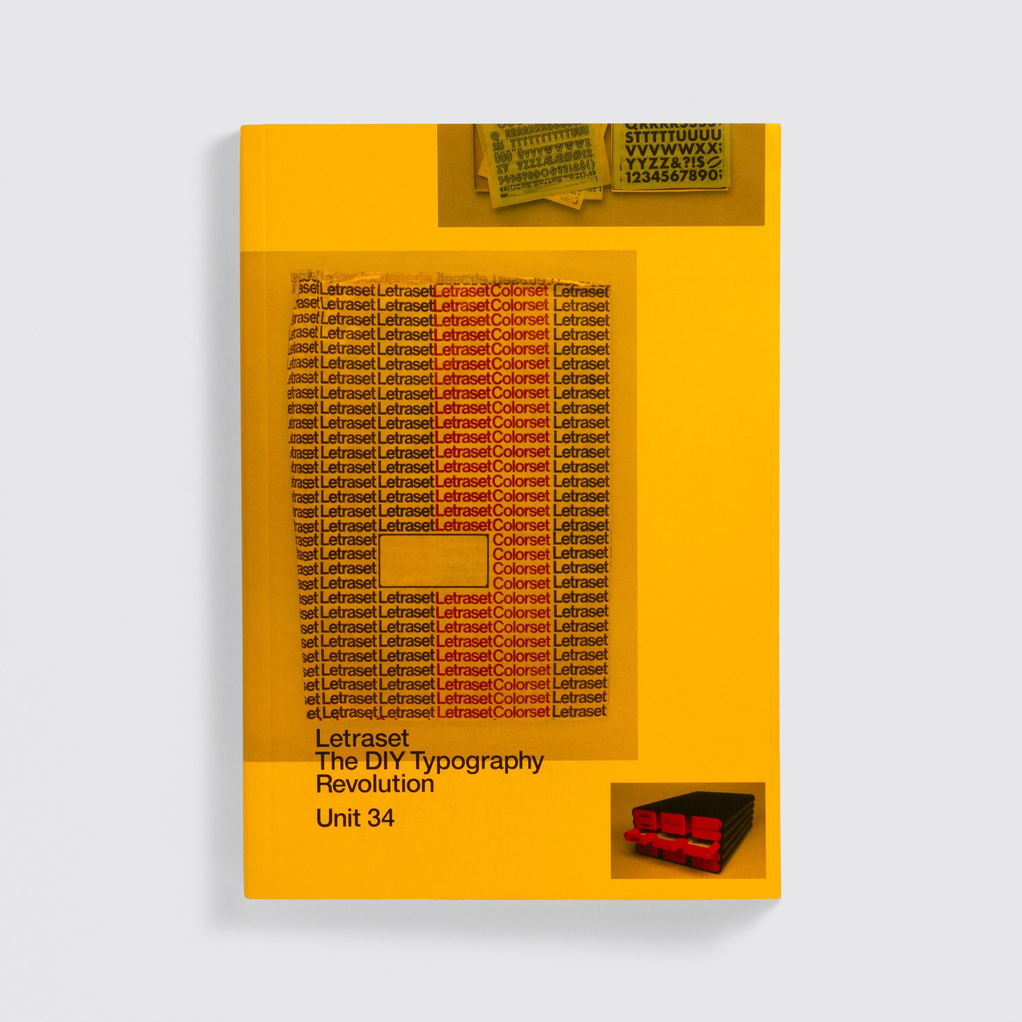
Aaaargh! Pink Mince and some of the source material for the “Punk Mince” and “The Stroke” issues is featured in this incredible exhibition about Letraset at the Sheffield Institute of Arts and I want to see it SO MUCH. The exhibition is connected to Letraset: The DIY Typography Revolution, the fantastic book about Letraset and its history that was published this year, which included an interview with me, some photos of Pink Mince, and lots of photos of items form my collection of Letraset sheets, ephemera, and paraphernalia.

Continue reading “Letraset: The DIY Typography Revolution”

I have a face for radio

Paper Cuts

Like this site, Pink Mince is another side project that’s been going for so long that its own history is part of why I can’t bring myself to call it quits. I may publish sporadically, but I’m really proud of the eleven issues (not to mention the Minis, the merch, and the far-more-active Tumblr moodboard) I’ve produced across the last 6 years or so.

Despite the body of work, it’s rare for a zine get much of a reach, so I don’t often get to talk much about what the overall project has been about over the years. Happily, book artist Christopher Kardambikis invited me for an interview on Paper Cuts, an online radio show he hosts, where he talks to zine makers and other DIY publishers about the things they do. It was great to ramble on for a bit, and finally explain what I mean when I say that Pink Mince isn’t just a gay zine, but is also a showcase for contemporary typeface design and vintage lettering that features pictures of dudes.

Sparky in Vienna

(That’s me sneaking a discussion of Pink Mince into a talk on Letraset I was giving in Vienna.)

Nerdgasm

There I was, happily doing some research at the Center here in New York, digging through the Donald Mashburn collection, when I had a nerdgasm. I was looking through an archive of flyers for gay nightclubs and sex clubs, with a fair amount of porn catalogues in the mix, but it’s safe to say that I’m pretty jaded about adult material at this point. I was trying to pick out things from the ’70s or ’80s that had a certain graphic sensibility about them, with a vague sense of collecting material for a future issue of Pink Mince.

But then I saw it.

GMSMA 10-year anniversary program

Continue reading “Nerdgasm”

FAQNP #3: A Queer Nerd Travel Guide

FAQNP #3

I contributed an article to the zine FAQNP for its third issue, “A Queer Nerd Travel Guide”. My photo feature, “A Type Nerd’s Time in India”, is a look at how well (or for the most part, how badly) a variety of western brands like Citibank and McDonald’s carry through their typographic branding when they use the local scripts in different Indian cities.

Spread from FAQNP #3

Continue reading “FAQNP #3: A Queer Nerd Travel Guide”