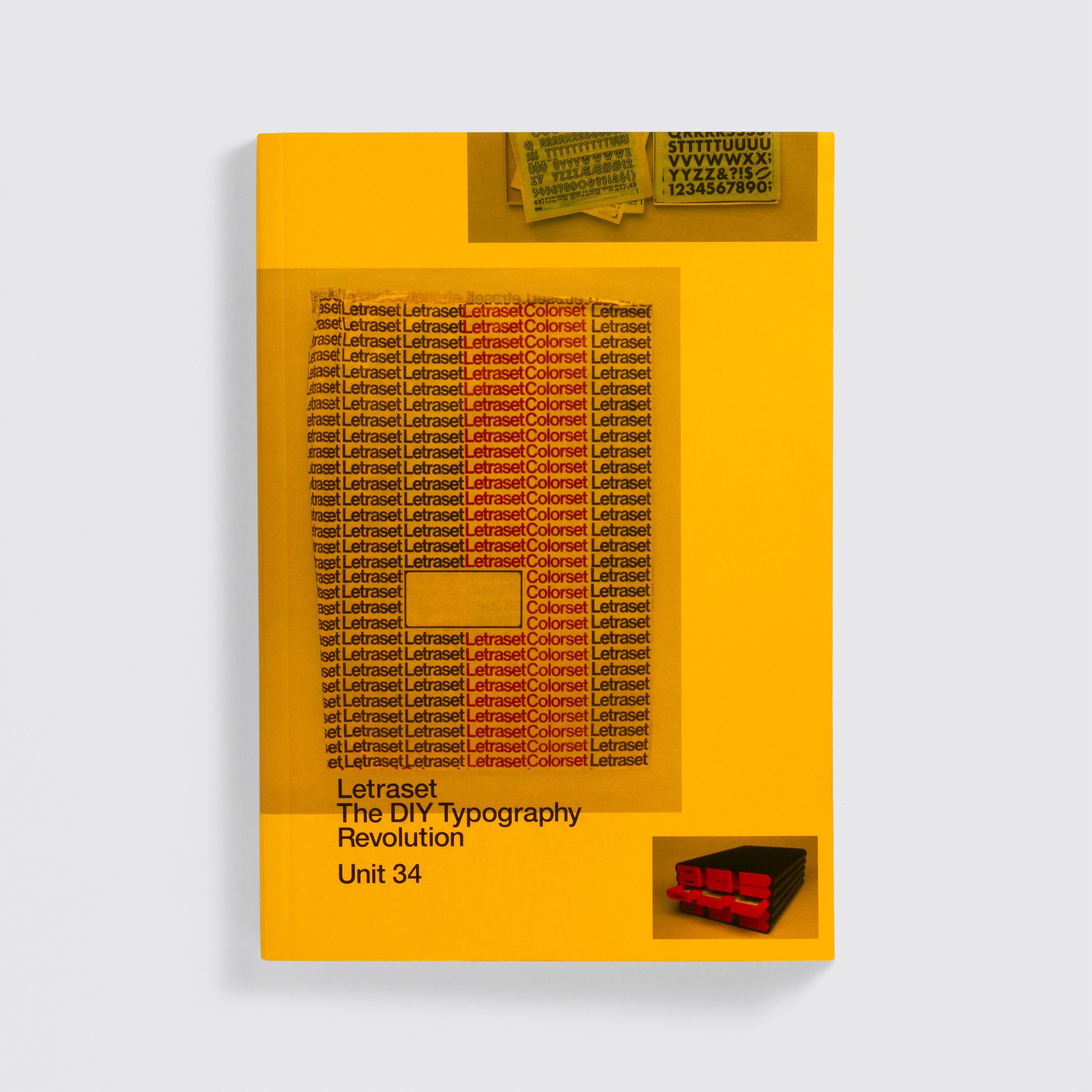
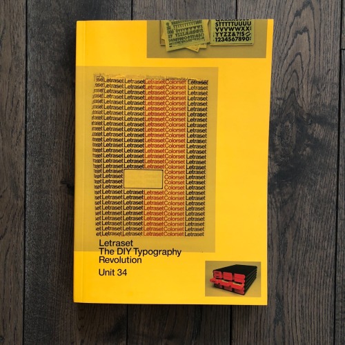
Letraset: The DIY Typography Revolution

LETRASET: The DIY Typography Revolution

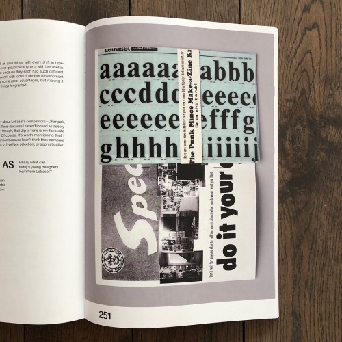
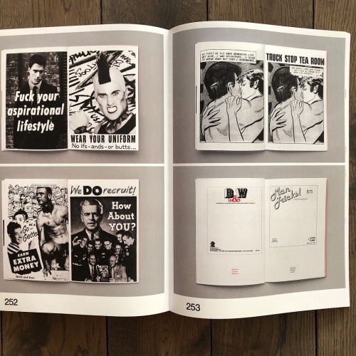
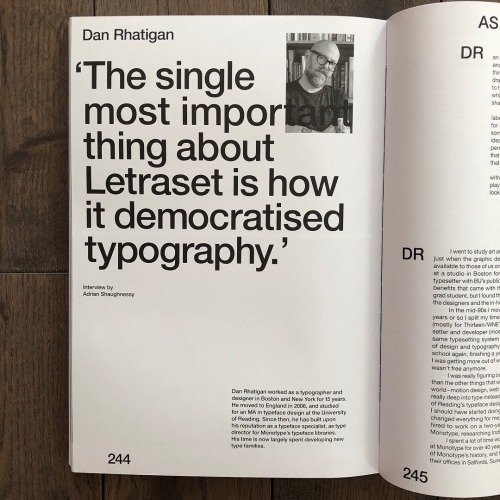
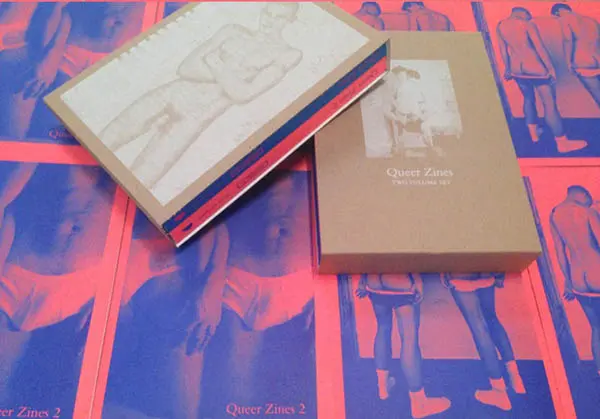
Aaaargh! Pink Mince and some of the source material for the “Punk Mince” and “The Stroke” issues is featured in this incredible exhibition about Letraset at the Sheffield Institute of Arts and I want to see it SO MUCH. The exhibition is connected to Letraset: The DIY Typography Revolution, the fantastic book about Letraset and its history that was published this year, which included an interview with me, some photos of Pink Mince, and lots of photos of items form my collection of Letraset sheets, ephemera, and paraphernalia.

Continue reading “Letraset: The DIY Typography Revolution”

Shortlist UAE

I recently got back from Dubai, where I’d been invited to speak at the -ing Creative Festival. Super fun, but that’s another story altogether. The PR team of the festival lined me up with Shortlist’s local edition for a feature where they ask someone each week to reimagine their masthead, and then ask a few questions. Here’s my take on it, plus the interview that ran in the magazine the week that I was in town.

Continue reading “Shortlist UAE”

Typography’s Alphabet Man!

dan-rhatigan.png

I’m giving a talk next week at the Revolve conference in Charleston, SC, and they just published this fun profile piece to promote it a bit:

Dan Rhatigan describes himself as a middle-aged nerd who really likes type; so much so, that he’s used his arms as a canvas to showcase the more than 30 letterforms that mean something to him.  If you happen to see him wearing short sleeves, you’ll react in one of two ways. One, you’ll immediately try to figure out what message the letters and numbers convey, then become confused because there appears to be no rhyme or reason to the tattoos. On the other hand, if you’re into typography, you’ll immediately get it and want to start a conversation.

Professionally, Dan brings to the table over 25 years of extensive experience in various industries as a typesetter, graphic designer, and typeface designer. He has spent time curating exhibits, speaking internationally, and teaching graphic design, typography, typeface design, and branding at Pratt Institute, The City College of New York, University of Reading, and ArtEZ Institute of the Arts.  He holds a BFA in graphic design from Boston University, and an MA in typeface design from the University of Reading in the UK.

While studying in the UK, Dan got involved in a joint project between Monotype and the University of Reading, researching and designing non-Latin typefaces. This project facilitated his entrance to the type-design world on a full-time basis; and later Dan worked at Monotype as their Type Director, with responsibility for their New York and London offices. Today, Dan lives in New York where he works with Adobe Typekit as the Senior Manager of Adobe Type, and serves on the board of the Society of Publication Designers, and is the Director-At-Large on the Board of Directors of The Type Directors Club.

As a child, Dan dreamed of drawing comic books, and kept busy drawing the covers with big splashy logos. In elementary school, Dan together with a friend drew comic books and sold them at their lemonade stand.  But, it was in his teen years while working with Letraset and a headline-setting machine for his high school newspaper that Dan realized he could manipulate the personality of the story he was headlining by changing the style of letters. This was when he first grasped that he could have a profession in type.

Dan began self-publishing Pink Mince  (a queer British zine) in 2006. This began as a side project to help him acclimatize to living in England, and relieve day-to-day stress.  Although published sporadically, Dan is really proud of the zine’s thirteen issues; the Minis and the related Tumblr moodboard. Today, Pink Mince has become a labor of love, and a ‘catch all bucket’ for the creative things Dan would like to do.  In fact, if money were no issue, he would parlay Pink Mince into a full magazine, because ‘it isn’t just a gay zine, it is a showcase for contemporary typeface design and vintage lettering that features pictures of dudes.’

Dan is the youngest of six children born to an Irish Catholic family in Staten Island, New York. He admits to being bookish and introverted (read awkward and shy), which seems contradictory to the nickname he picked up in his youth – Sparky, that has become an extension of who he is – Ultrasparky. When he’s not working or spending quality time with his partner, Dan enjoys hanging out with friends; indulges an indiscriminate sweet tooth; listens to an eclectic mix of music, and is an accomplished photographer.

In the final analysis, Dan Rhatigan has a healthy respect for the history of typography, is knowledgeable, articulate and displays immense curiosity in his craft.  Although he has collaborated on, and has his name attached to various innovative font families, it remains his dream to conceive, nurture and present to the world a typeface family all his own. … Stay tuned!

By Claudia L. Phillips

Variable Fonts in Print

Just a quick interview feature in Print about some upcoming things in the type world:

Variable Fonts with Dan Rhatigan

By: Callie Budrick | April 1, 2017

If you’re working in the typography world, you may have heard the whisperings of collaboration between some of the biggest names in technology. Adobe, Apple, Google and Microsoft have been working together (with the help of independent type foundries and designers) to create something that’s going to change the way we see type — literally. They’re called variable fonts, and Dan Rhatigan took the time to tell us everything we needed to know about them.

Variable fonts are a way of taking many, many, many styles within a typeface family — from very lightweight to very bold weight, from wide to skinny — and packaging them all up into one small file,” he explains. You’re not just saving space, you’re also getting access to all of the possible weights and sizes on the spectrum of a font. That includes more than the names you would choose from a font menu like bold or light. But how does it work?

Basically, “it’s a more complicated and sophisticated version of a font file. But it’s still just a font file and will behave on any operating system that can support it,” says Rhatigan. Variable fonts are based in formulas like any other font file. “In terms of how it knows what it can do, that’s where the applications will come in and be able to register, ‘oh, these are all possibilities within one file,’ rather than having to specify a different file to get a different style.”

Example of how Variable Fonts, a developing font technology, can work. Source: Erik van Blokland

He explained it to me like this: the same mechanism that allows a webpage to read flow when you zoom in and out in a browser window can manipulate a font’s style when it gets built into the CSS. So if you take a phone or tablet, and you turn it from vertical to horizontal, “the same device detection that allows it to register that the device orientation is changing could allow the font file to switch to, say, a more condensed style for the vertical orientation, or a more expanded style for the horizontal.”

Variable fonts are still in the early days of conception, but that isn’t stopping people from experimenting and pushing the boundaries here and now. David Jonathan Ross from DJR Foundry and the Dutch type foundry Underware have both been testing experiments. The Big Four have also been getting input on the technical side from designers and typographers around the world. Erik van Blokland from LettError has contributed a lot of the math that has made dynamic fonts more flexible. Friends from Monotype who helped develop TrueType GX in the 90s and Dalton Maag from Typekit have also been have helping make variable fonts the best they can be. “It’s encouraging to me that people aren’t holding their cards close to themselves, and that they’re trying to engage in a dialog as we all come to understand what will be possible and what we can make possible for people who use these fonts.”

The header of LettError’s website, demonstrating dynamic fonts.

A few days before chatting with Dan Rhatigan, I had a conversation with Paula Scher. She made the comment about how she prefers when design leads the software, rather than the software leading the design. Is it possible that variable fonts could be a shortcoming by giving designers too many options to work with? “Variable fonts will be a very flexible tool. My hope is that…it will encourage designers to think very deeply about what they can do with that. I would hate to see people saying things like, ‘Oh, I can have any weight,’ and then begin using weights that don’t make sense just because [they’re available],” he says.

As for other possible drawbacks, “[it’s] an added responsibility for type designers,” says Rhatigan. Variable fonts will require type designers to be more methodical, since every possible weight will be available to developers. “You can’t make a weight and then clean it up.”

“Variable fonts are not the solution for all kinds of fonts. Not everyone will have to make [or use them]. They’re a good solution for packaging up large font families that would otherwise come with a lot of different styles within them.”

Century: 100 Years of Type in Design

This little bit of excitement has taken up a lot of my time and concentration for the last few months, and the last few weeks in particular.

[Century: 100 Years of Type in Design from Monotype on Vimeo.]

From the AIGA, our hosts: “Gathering rare and unique works from premier archives in the United States and London, “Century” will serve as the hub of a series of presentations, workshops and events held at the AIGA gallery as well as the Type Directors Club and the Herb Lubalin Study Center of Design and Typography at Cooper Union in New York City. The “Century” exhibition features a range of artifacts representing the evolution from typeface conception to fonts in use. Typeface production drawings by the preeminent designers of the last 100 years, proofs, type posters and announcement broadsides are supplemented by publications, advertising, ephemera and packaging.”


And if you’re curious, here is some of the coverage:

[All photos by Bilyana Dimitrova. Video clip by Ben Louis Nicholas. Animations by Pentagram.]

What’s Ћ point?

[A short blog post I recently wrote for Design Week…]

The English language (and the Latin alphabet it uses) is well-known for adapting itself with the times and the needs of the many different people who use it. Because the language and the writing system have changed so much already, someone or another regularly comes along with a new pitch for yet another change. But is it a great idea or just a gimmick to propose something new when we’ve already got the building blocks?

Recently Paul Mathis, an Australian restaurateur, has decided to “improve efficiency” by shortening the word “the” to a letter “Ћ”* which is designed to look like a combination of the letters “T” and “h”. Mathis seems baffled that “and” can be abbreviated with an ampersand while being only the 5th most commonly used word in English, while the most commonly used word still requires THREE WHOLE LETTERS! His pitch is that his new character could save valuable strokes of the pen or valuable characters in a tweet. Maybe so, but is his the right solution?

Although he proposes this as a new shape, in fact just writing about it requires an existing solution (and probably not the best): the Cyrillic capital letter “Tshe”, used for Serbian.** If you look at Ћ in just about any typeface, though, you can see that it’s already got better proportions than just a T and an h crammed together. What troubles me the most, though, is that saying Ћ can replace “The” would be awkward for people who already know the Cyrillic alphabet and the sounds its letters can make.

Besides, the Latin alphabet already has a Unicode-ready single character that makes the right sound, and it comes in both upper- and lowercase: the thorn! Used mostly in Icelandic today, Þ and þ are used for the “th” sound of “the”. The eth (Ð and ð) might work a little better linguistically, but thorn also has history on its side. That quaint “Ye Olde” tavern you like? That comes from an older way of writing thorn that looked more like a “y”.

These gimmicks occasionally gain some ground, though. Martin Speckter invented the interrobang — ‽ — in 1962 and it finally made its way into the Unicode standard, although you’d be hard-pressed to find it in general use. You may also have seen talk of the SarcMark – which someone suggested could be used to denote sarcasm to avoid any awkward misinterpretations during text or email conversations – however that idea didn’t really take off either.

The ampersand grew out of writing convention, and eventually took on a slightly subtler meaning than just any instance of “and”. That kind of evolution is how these concepts take root. Mathis’s gimmick is more of a limp stab at a revolution, and probably one we should dismiss. Þ end.

Continue reading “What’s Ћ point?”

A Brief History of Typography 1928 – 1980

Note: for the sake of posterity, and because I’ve been blogging long enough to know that online stories tend to go missing after a while, I’ve started trying to repost articles in which I’m included. This lovely post by Ellen Shapiro, who came to see us at Pencil to Pixel, originally appeared on Print magazine’s site.

At Monotype’s “Pencil to Pixel” pop-up exhibition in New York City last month, 3,400 students and professions learned about the history of typography. Artifacts demonstrated how metal type was historically designed, made, specified by designers, and set by typesetting companies — and translated into today’s font menus for individual users.

“The lesson from an exhibition like this is that the design of a typeface can outlast the moment that produces it, and that a good design can evolve to meet the needs of technology without losing its essential spirit,” said Dan Rhatigan, Monotype’s UK type director. “Lots of younger designers who came through seemed really eager to see the background of the typefaces they already know, and the exhibit helped them appreciate why we’re still trying to improve the technology behind those designs,” he added.

Here are close-ups of some of the artifacts that were on display as well as some typography history:

1928 — Eric Gill’s pencil and ink drawings for Gill Sans, the fifth best-selling typeface of the twentieth century. Gill (1882-1940), a British sculptor, stonecarver, printmaker and typeface designer, designed Gill Sans in 1926-1928 for Monotype at the request of Stanley Morison, who was interested in a contemporary sans serif face with British character. Classified a “humanist” sans-serif face intended to be legible in both display and text, its proportions were based on Roman letterforms rather than being constructed geometrically. Famed uses of Gill Sans include programs for British Rail, the London Underground, Penguin Books, Saab Automobile, and the BBC. Note the use of white gouache paint to touch up the letterforms.

1937—Copper patterns for Eric Gill’s Joanna. Copper pattern plates were utilized in the manufacturing stage between the drawings and the metal type itself. A transitional serif typeface named for one of Gill’s daughters, Joanna was designed in 1930 and originally intended as a proprietary face for his printing business, Hague and Gill, opened in Buckhamshire, outside London, with son-in-law René Hague. It was adapted by Monotype in 1937 and made publicly available in 1958. Gill set the text of An Essay on Typography, his classic book on letterforms, typesetting and page design, in Joanna. In the book, he demonstrated and championed the first use of “rag right” rather than justified columns to create even letter- and word spacing.
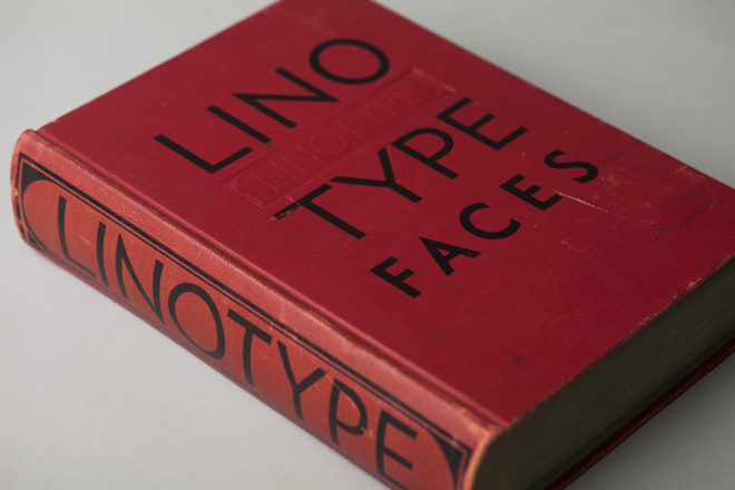

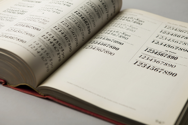
1939—“Big Red,” a comprehensive specimen book of Linotype faces. Published by Mergenthaler Linotype Company, this classic reference tool measures 7.75″ x 10.75″ and contains 1,215 pages of type specimens for hand-set headlines and text set on linotype machines, including model ads and announcements with lavish use of dingbats, ornaments and borders.


1932—Littleworth. These rare, original letter drawings are in the Monotype archive for Littleworth, a hot-metal typeface no longer available,

1971—Classic linotype faces were remastered for photo-typesetting. These brochures announced Monotype newly released versions of Helvetica and Univers for use on the first photo-typesetting machines.
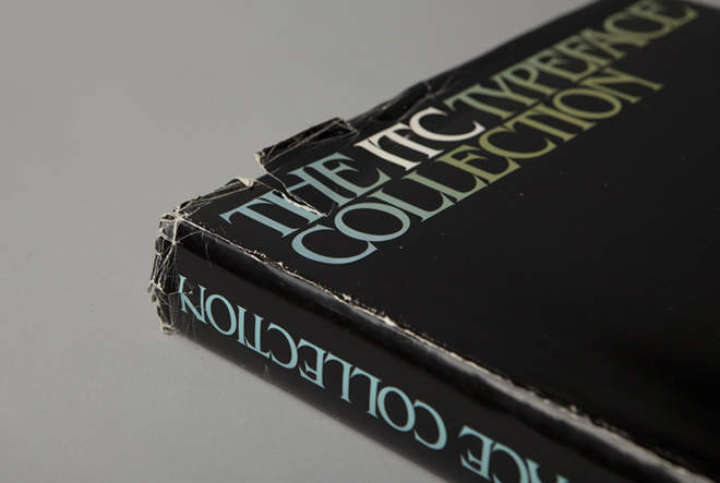

1980—The ITC Typeface Collection, a specimen book of the library of the International Typeface Corporation. This 574-page, 12 x 12” square book is a compendium of the individual “26 Good Reasons to Use” booklets originally designed by Herb Lubalin and released by ITC throughout the 1970s. It was published to interest manufacturers of typographic equipment and materials in licensing the ITC typeface library, which included American Typewriter, Avant Garde Gothic, ITC Benguiat, ITC Bookman, ITC Century, ITC Franklin Gothic, ITC Garamond, Korinna, Lubalin Graph, Serif Gothic, Souvenir, and Zapf Dingbats. In addition to Herb Lubalin, type designers included Ed Benguiat, Tom Carnase, Tony DiSpigna, Aldo Novarese and Herman Zapf.

The book concludes with a copyfitting chart, essential to all designers, part of whose job was to mathematically convert typewritten manuscripts into set type by calculating the size and leading to fit on the page.

In 1980, ITC subscribers included Cello-Tak, Chartpak, Letraset and Zipatone, manufacturers of rub-down lettering, in addition to Alphatype, Berthold, Compugraphic, Monotype, and other purveyors of photo-typesetting equipment. Agfa Monotype acquired ITC in 2000.

2013—the typographic body art of Dan Rhatigan, Monotype’s UK-based type director. This was the “display” in the exhibit I was most curious about (even though he was standing next to a display of covers and spreads of U&lc, a few of which I’d had a hand in).

“My tattoos are always a point of interest with type crowds,” said Rhatigan, who said he got his first tattoo, the swashy ‘R’ of an ersatz family crest he designed, in 1998. “After staring at that ‘R’ for months, I realized that my love of type is timeless. So I started adding shapes I loved from different typefaces, working with different tattoo artists who appreciate the idea enough to carefully reproduce the artwork I supply.”

Rhatigan’s friend Indra Kupferschmid put together a custom MyFonts list of most of the typefaces that are tattooed on him. There are a few others, too, he added (some of which apparently can’t be shown in polite company), including letters from Delittle Wood Type foundry; from H&FJ’s Champion Gothic; and from Sodachrome, designed by Rhatigan and Ian Moore for House Industry’s Photo-Lettering collection.

Two great independent magazines

I generally don’t talk about Pink Mince when I’m doing things related to my day job, but I threw in a handful of visual references to accompany an interview in the latest issue of 8 Faces magazine. (If you like or love typography, then you really should check out 8 Faces.)

You can order 8 Faces here. And, of course, you can order Pink Mince here. You can also buy that t-shirt (and others) at the Pink Mince Zazzle shop.


The iconic London Underground typeface turns 100

I wrote a short little thing for Wired UK about the history of the Johnston Underground typeface. I was worried that I could only barely scratch the surface in 500 or so words, but people seem to enjoy it anyway:


Last week
we celebrated 150 years of the London Underground,
but 2013 also marks the centennial of its iconic typeface, first
commissioned in 1913. Edward
Johnston
, a British calligrapher and lettering artist, was
asked to create a typeface with “bold simplicity” that was truly
modern yet rooted in tradition. Johnston’s design, completed in
1916, combined classical Roman proportions with humanist warmth.
This mix of qualities, driven by Johnston’s approach to the written
letterform, also influenced his student Eric Gill, who
assisted with the design of the Underground typeface and developed
some of its ideas in his own Gill Sans in the following decade.

“Underground” — later known as “Johnston” — was circulated as
a lettering guide for sign-painters and also made into wood and
metal type for posters, signs, and other publicity materials used
throughout London’s transport network.

Johnston himself only drew one weight of the typeface. He based
its weight and proportions on seven diamond-shaped strokes of a pen
stacked in a row. This gesture even shows up in the typeface
itself, with the characteristic diamond used as the tittle of the
“i” and “j”. He felt so strongly about the weight of the design
that when another student of his agreed to create an accompanying
set of bold capitals, Johnston wouldn’t speak to him for decades
afterward.

Johnston’s type became a distinctive feature of the Underground
brand over the years, but by the late ’70s it was less practical to
use the old wood and metal fonts. Inevitably, the brand was getting
watered down as other typefaces were chosen for different uses
around the system. In 1979, London Transport asked design agency
Banks & Miles
to modernise “Johnston” and prepare it for
the typesetting systems of the day, such as the Linotron 202.

Eiichi Kono, a new designer at the agency, was asked to revise
and revive the family. Not only did he redraw the proportions for
better display and even out some of the inconsistent details of the
original, but he also took on the challenge of adding two new
weights and accompanying italics for the full set, giving the
family much greater versatility. Some years later, this design was
further refined and expanded by Monotype, with even greater support
for different languages. Known now as “New Johnston”, the fonts are
used exclusively by Transport for London today as its brand
typeface.

Other versions are commercially available to the rest of us,
each taking a different approach to adapting Johnston’s design.

P22 Type Foundry released its
faithful, officially licensed version of Johnston’s original in
1997, also offering a number of lively graphic
elements
such as ornaments and borders that draw on TfL’s rich
visual history. P22 London Underground was later updated as P22
Underground Pro with many more weights and typographic
features.

While P22 revived “Johnston” as a display typeface, designer Dave Farey was
interested in refining the concept to work better for text in his
1999 design of “ITC
Johnston
”. His first iteration included three Roman weights
that were redrawn and respaced with a freer hand, using the
original as a starting point and a model. When adding italics
later, Farey looked back to Edward Johnston’s legacy as an
influential teacher of calligraphy and writing, and he devised a
more cursive set of forms that drew on a very English tradition of
lettering.

So happy birthday to the Underground and its namesake typeface,
in all its flavours.