I pulled out a few beloved treasures to share with the world on behalf of my employer.
Category: ultramedia
A bit from BITS
I went to Bangkok, Thailand, for the first time last month, attending the the BITS design conference with a few colleagues on behalf of our employer. While I was still in town after the conference I was invited to stop by the Cadson Demak podcast. (See just the bit in English on Monotype’s Foundry Platform.)
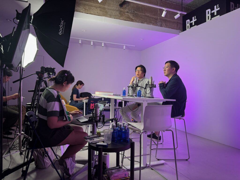
We talked about my role as Director of Inventory Strategy & Curation at Monotype, and discussed font licensing and the rise of subscription models. Among other things, I explained how a shift away from perpetual licenses can give foundries increased discoverability and secure a steady income stream.
Getting the W
A first! I’m on a flight back home to Portland, and I just glanced up to see a commercial on another passenger’s screen — using Gloridot! It appears Walden University has done a series of spots.
Titans of Transfer Type
Recorded at ATypI in Paris on May 13, 2023, this overview of the production of transfer type between the 1960s and the early 1990s looks at the most prominent brands (Chartpak, Letraset, Mecanorma, Zipatone, et al.) and the various licensed and original typefaces that they distributed. Details include the challenges and advantages of working with transfer type, the prominence of certain typefaces across multiple brands, the development of original designs by certain brands, and the spread of designs and genres across international markets.
Type: More of it than ever
My old pals at the TDC were kind enough to invite me to represent Adobe Fonts on a panel about the state of the type industry at their Type Drives Culture event this past March. I got to say a bit about why we make fonts available the way we do. Watching the video above, I’m also rethinking this past winter’s whole experiment with wearing turtlenecks.
Three typefaces for mathematics
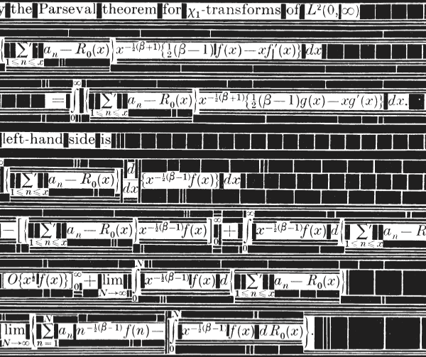 I just realized that “Three typefaces for mathematics”, my MA dissertation from the Typography department at Reading is one of a handful of examples posted at typefacedesign.net (and includes a link to the full document hosted on Issu). For future reference, that may be a more reliable place to find it than on this site, although for now it’s still available here. I lost all the source files (InDesign doc, illustrations, scans) in the Great Hard Drive Crash of Twenty-Twelve, so I’m glad that there are still copies of the PDF in circulation.
As I’ve often told people over the years about my experience on the Typeface Design MA, one of the most valuable things I learned there was how to properly research and write about a subject. There is some irony to my saying “valuable” here, in that I have a very good career in typeface design, but I actually think that what I learned about critical thinking, looking for and using primary source material, and shaping and defending an idea have proven to be fundamental to much of the work I’ve done as a designer, curator, and (begrudging) writer over the years since I finished my degree.
I’ve always been flattered that my dissertation has been used in class as an example of solid academic writing, considering what a slow and painful process it was to write it. I’m not a great writer, nor very disciplined at being productive when I need to write, but I discovered that working on something like that is an excellent way to clarify my thinking about something, by forcing me to consider every day. It exposes the gaps in my thinking in a way I can skim over in a talk, a tweet, or conversation.
It’s good to remind myself of the usefulness of the writing process as I consider whether I’m ready to buckle down and return to Reading (the university, not the town) to work (remotely, and part-time) on a PhD. It’s one thing to be interested enough in a subject to go deep, but another to get proper guidance and to be challenged on my assumptions. I often joke that I did a PhD’s worth of work on Monotype history when I worked there, but without ever getting any credentials. The reality is, though, that I did all that work without getting credentials OR doing the research work with any real rigor. Time to get serious, at last.
Beyond Type
I was in Hamburg last month at the kind invitation of the Peter Schmidt Group, who asked me to speak at their Beyond Type event. Despite the jet lag, I managed to speak in full sentences about the future of typography as I see it.
The Future of Typography
I was asked to speak at Adobe MAX once again this year, which gave me another opportunity to try and get people excited about some of the latest developments in font technology, and why I think they’ll prove to be significant. Sadly, of the two versions of this talk I gave at MAX, the less successful session was the one recorded. This one was held in a large hall subdivided into a number of rooms with curtains, and there’s a whole lot of audio interference from the other rooms, which made it hard for me to concentrate when speaking, and also screwed up the recording quite a bit. Nevertheless, there are some good nuggets you might enjoy.
Letraset: The DIY Typography Revolution
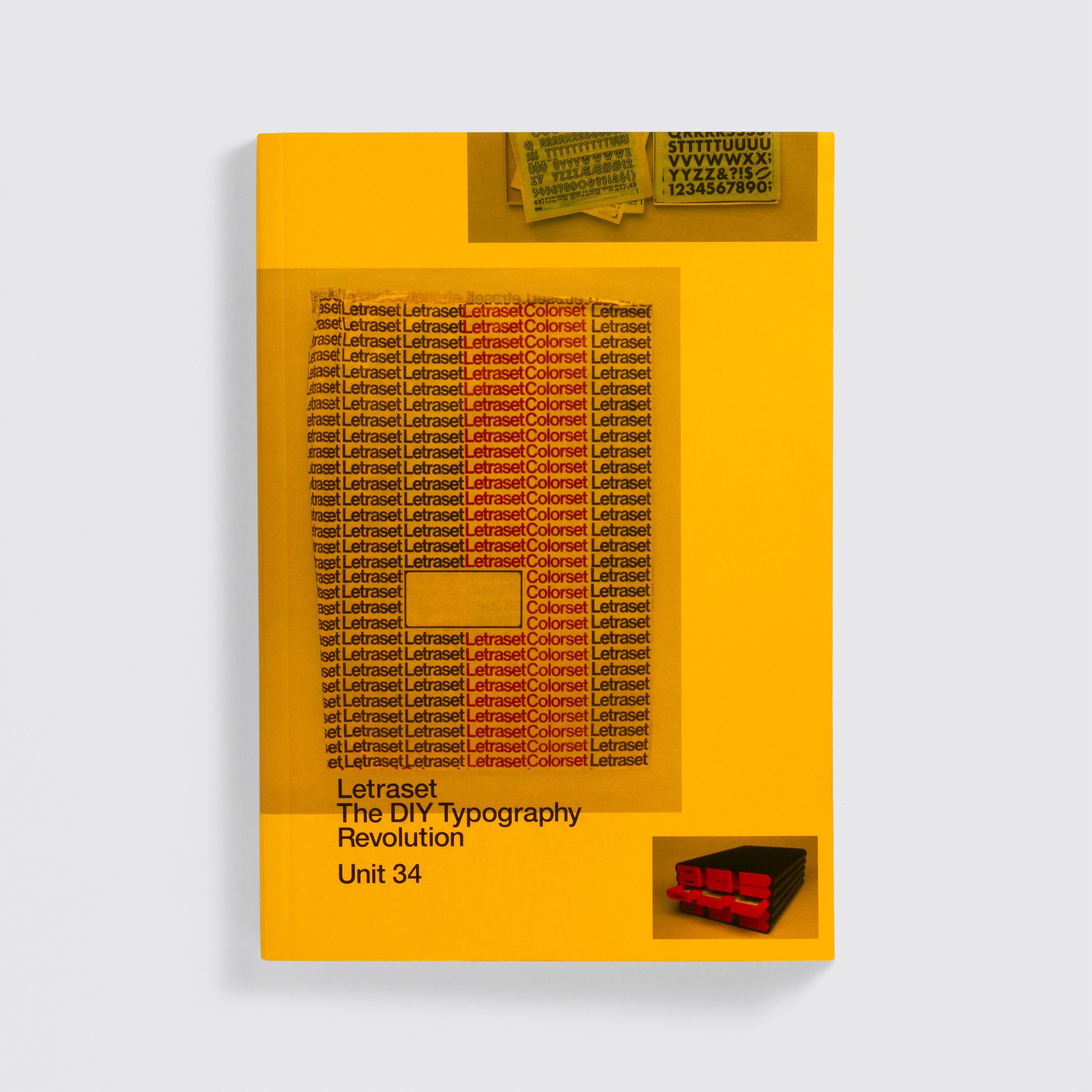
Aaaargh! Pink Mince and some of the source material for the “Punk Mince” and “The Stroke” issues is featured in this incredible exhibition about Letraset at the Sheffield Institute of Arts and I want to see it SO MUCH. The exhibition is connected to Letraset: The DIY Typography Revolution, the fantastic book about Letraset and its history that was published this year, which included an interview with me, some photos of Pink Mince, and lots of photos of items form my collection of Letraset sheets, ephemera, and paraphernalia.