
Since I started working full-time at Monotype, and especially since I took over as UK Type Director last Spring, work has consumed a larger and larger part of my life. This would be bad if I didn’t love this job more than any other I’ve ever had, and if I didn’t feel like I was contributing to what happens at Monotype. My attempts to keep up with this site, always a tricky endeavor at the best of times, may have fallen slack, but I’ve hardly been slacking off elsewhere.
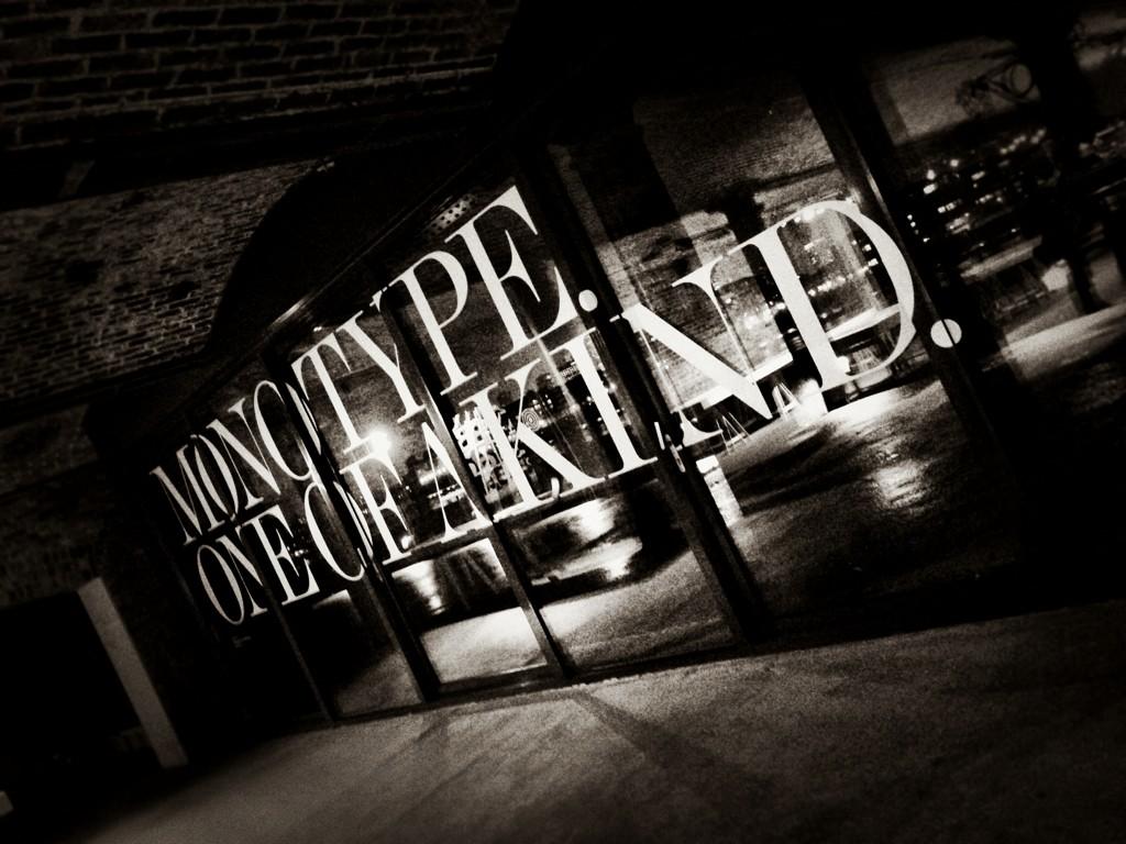
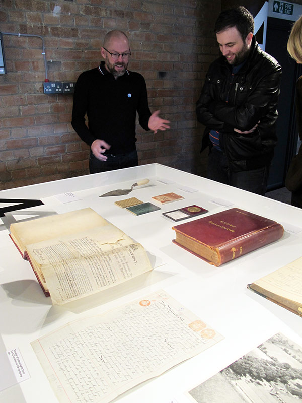
The last two weeks have been the culmination of a frantic couple of months of preparation for a giant exhibition of work from Monotype’s past and its present, and hopefully a look at its future. Pencil to Pixel, masterminded by my extraordinarily talented colleague James Fooks-Bale, designed by SEA, partially curated (and with guided tours) by me, and pulled off thanks to the efforts of many more, was huge success by all measures, and hopefully one of many more endeavors to come.
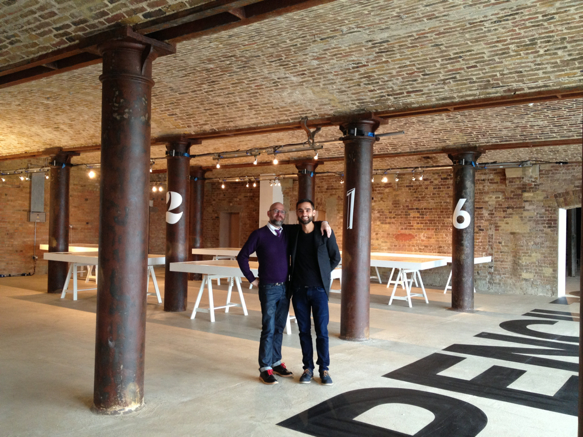
It’s difficult to summarise what an achievement this was. It’s not just one event, but the apex of well over a year’s work trying to shift perceptions about Monotype here in the UK: a combination of James’s astute vision and planning, SEA’s ongoing work to transform our brand materials, and my own efforts to tell a more comprehensive, compelling story about Monotype and its history and typographic richness. This builds on a lot of smaller efforts we’ve all been making, and it came together extremely well.
As I’ve taken on a much more public, more outspoken role for our part of the company, I’ve invested a lot of my own personal capital in this, in everything that will follow, and in Monotype in general. I’ve really tied my professional standing to Monotype, and I’m really proud of where we’re at these days.
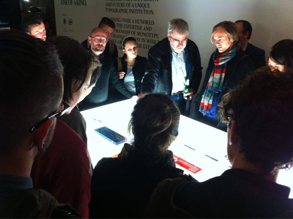
There was a lot of attention on blogs and Twitter and Instagram as word of the exhibition got around through our promotional channels, and then just through word of mouth of people who took an interest or came to the show itself. It’s definitely a sign that what you’ve done has struck a chord if people start getting excited without too much prompting. For the sake of posterity, here are highlights of the buzz:
- The Typography department of Reading, another partner and my alma mater and former employer, had good things to say.
- Gerry Leonidas — friend, mentor, colleague, former tutor, former landlord — is someone whose opinion I respect above most others. His kind words about the event really mean a lot to me.
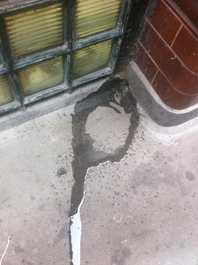
- D&AD, who we’ll be doing more with in the future, promoted the show and also ran a contest for people to submit images of a “p”. Once we saw the submissions, it was no contest at all.
- Eye magazine, another one of our partners, wrote about the exhibition and our series of type collections, designed by SEA.
- It’s Nice That also gave the collections a great review.
- The Drum, a marketing and media organization that helped us out, summarized the show and some of the background behind it.
- PrintWeek had great things to say about our private view on the 15th.
- Hoodywink was looking forward to the exhibition.
- Luccharli seems to have photographed everything on display for your viewing pleasure.
- Creative Clerkenwell wrote a really great review, including a ton of gorgeous photos of the exhibition. In one it looks like I’m shooting craps onto the drawings.

- Typoretum shared the news.
- Pootling Around, a local blog about Wapping, came by for a visit, too.
- Design Week called Monotype a “behemoth”, which stings a little, but I guess has a grain of truth to it.
- Visuelle gathered together some lovely photography.
- StyleSight blogged a nice little plug, including a picture of me looking like a robot.
- Bisqit was there.
- Type Token gave us a shout-out.
- Art Rabbit spread the word and some beautiful pictures.
- Plus Agency was there and got a grat photo of the issue of Centrefold magazine they designed, which was included in the exhibition. The publication of Centrefold, featuring a special new display cut of Monotype Modern that I designed for them, is something that makes me giddy with pride, but let’s save that for another post.
- Liron Lavi, one of this year’s MATD class at Reading, came with her classmates and got some great photos.
It was a particular treat to work with Simon Esterson and John Walters of Eye magazine throughout all of this, since I’ve been such an admirer of the magazine for so long. It felt great that they took an interest in what we’re up to at Monotype, and in the history documented in our archive. Along with their help on the exhibition — and perhaps even more of a personally exciting development — Eye devoted the entire editorial run of its 84th issue to Monotype and its history. This is major, and from the looks of the issue they put together their excitement about the material is evident. It s no small point of pride, either, that I’m interviewed in the issue about Monotype and my thoughts about its history and what we’re up to now.
[Eye before you buy 84 from Eye magazine on Vimeo. Eye 84 out now.]
The other major achievement that coincided with the exhibition was the publication of the first issue of the Monotype Recorder in 15 years, honoring the 47-year career of the gracious, talented Robin Nicholas. Like Centrefold and a few other things that have fallen into place lately, though, that’s too big a story to get into right now.