
Last year I submitted an article to a very excellent zine called FAQNP (which stands for, mischievously, “FAQNP‘s a Queer Nerd Publication”) for their “Queer Nerd Travel Guide” issue, since I’m a queer nerd who travels a lot.
The gents at FAQNP have kindly agreed to let me reprint my story about how Western brands drop their typographic standards when they trade in India. You should repay that kindness and check out some of their back issues or cool merchandise.
From FAQNP #3
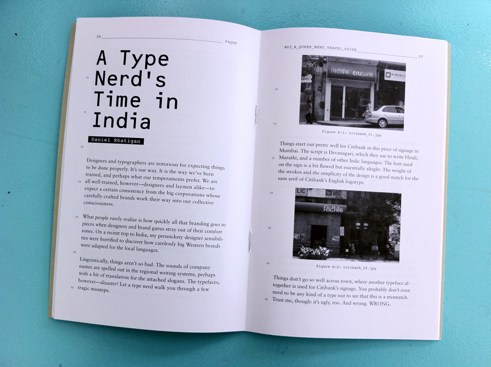
Designers and typographers are notorious for expecting things to be done properly. It’s our way. It is the way we’ve been trained, and perhaps what our temperaments prefer. We are all well-trained, however — designers and laymen alike — to expect a certain consistency from the big corporations whose carefully crafted brands work their way into our collective consciousness.
What people rarely realize is how quickly all that branding goes to pieces when designers and brand gurus stray out of their comfort zones. On a recent trip to India, my persnickety designer sensibilities were horrified to discover how carelessly big Western brands were adapted for the local languages.
Linguistically, things aren’t so bad. The sounds of company names are spelled out in the regional writing systems, perhaps with a bit of translation for the attached slogans. The typefaces, however — disaster! Let a type nerd walk you through a few tragic misteps.
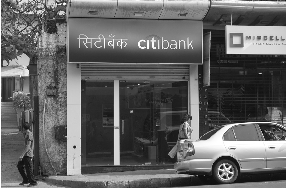
Things start out pretty well for Citibank in this piece of signage in Mumbai. The script is Devanagari, which they use to write Hindi, Marathi, and a number of other Indic languages. The font used on the sign is a bit flawed but essentially alright. The weight of the strokes and the simplicity of the design is a good match for the sans serif of Citibank’s English logotype.
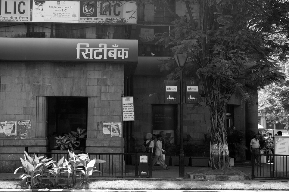
Things don’t go so well across town, where another typeface altogether is used for Citibank’s signage. You probably don’t even need to be any kind of a type nut to see that this is a mismatch. Trust me, though: it’s ugly, too. And wrong. WRONG.
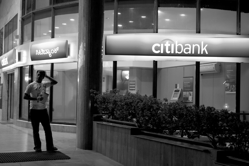
In Bangalore, things are once again pretty good in the Kannada version of Citibank’s logo. A pretty clean, low-contrast typeface is used, much like in the English version. I apologize for the quality of the photo that makes it hard to see that this isn’t a great Kannada typeface, but it will do in a pinch.
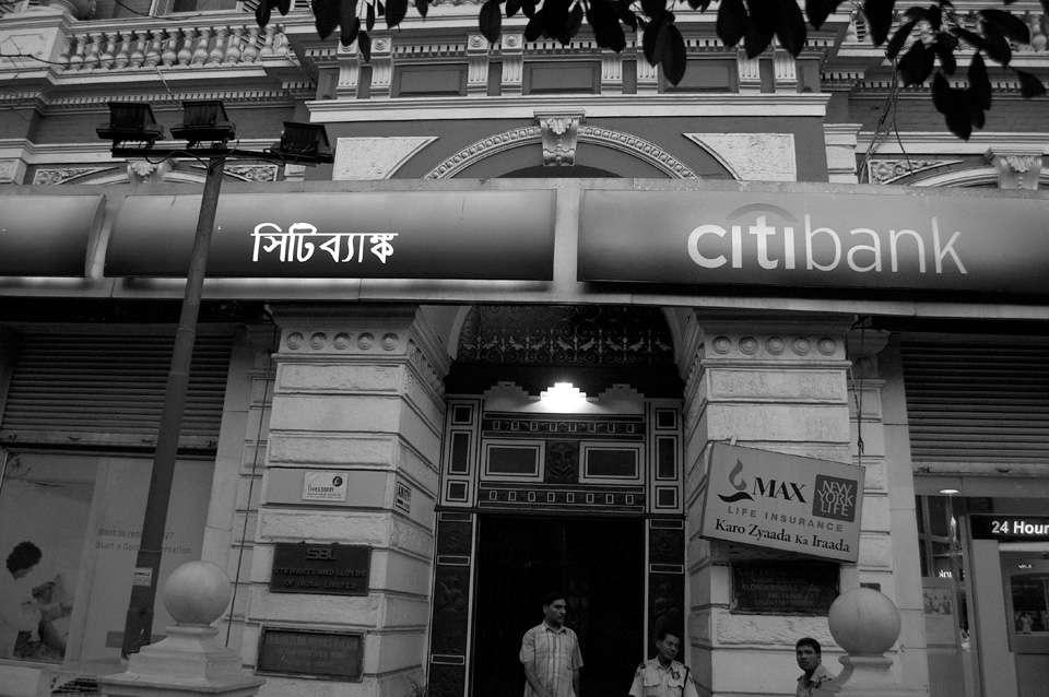
In Calcutta, though, disaster strikes again. If you’re a bit familiar with Indic typography, you’ll notice right away that whoever did the Bengali branding for Citibank set their name in low-quality equivalent to Times New Roman. This is essentially doing corporate branding with an old copy of WordPerfect and a pirate font some kid made as a school project.
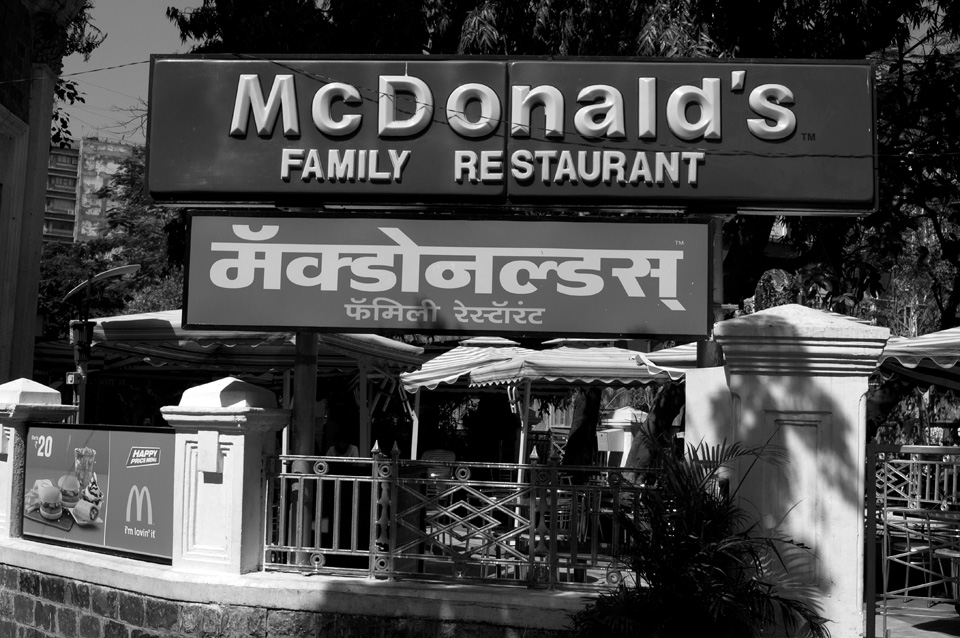
McDonald’s may be a franchise business, but they’re also a large corporation with pretty tight control over their “trade dress,” as we refer to all the elements of a graphic branding program. They regularly adapt things for local preferences, but I suspect they prefer that things don’t look completely unlike their all-too-familiar logotype. This Devanagari font in Mumbai is too bold, too wide, and too clunky. And it has been artifically stretched, a typographic crime in any land.
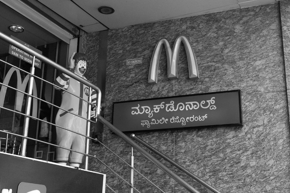
Once again, another random design has been used for the signage in Bangalore. This fares a little better. The monolinear strokes and simplified shapes are an acceptable equivalent for translating their name to Kannada. It was a wise decision, though, not to place this right underneath the English name, or it might be easier to spot the compromises made.
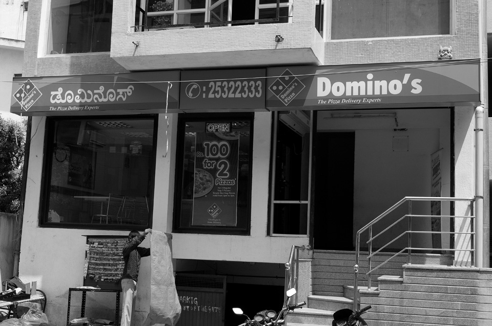
For Domino’s in Bangalore, another random font is used. While the English logotype is a heavy, condensed, low-contrast sans serif (not great, but that’s another dicussion altogether), the Kannada design is a somewhat fussy design with awkward curves and a mixture of light and heavy strokes. It is overall much lighter than the English, yet I suspect it has been made artificially bold, in light of how many of the fine details of the letterforms are already clogging up.
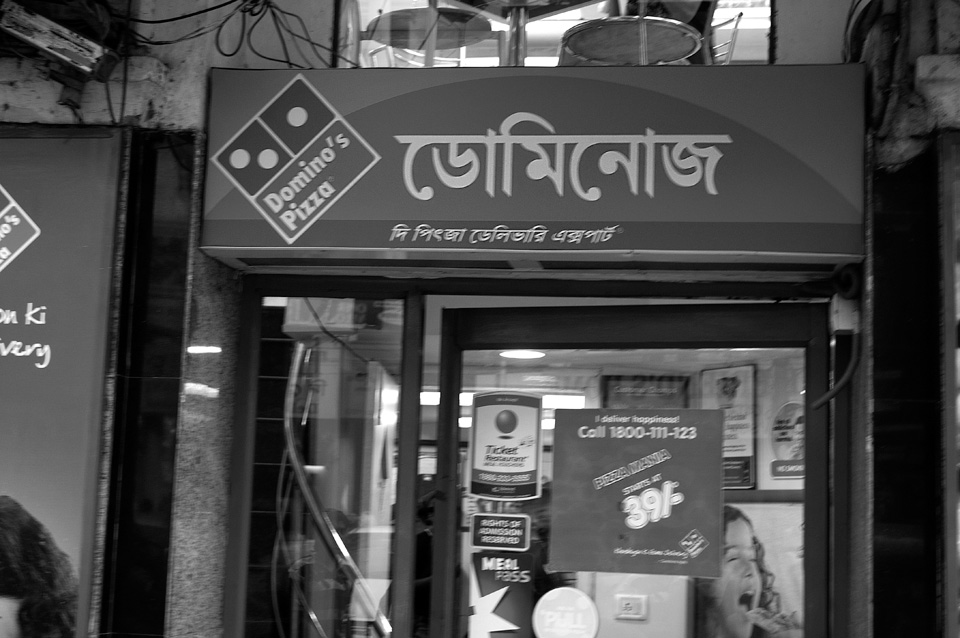
In Calcutta, another poorly executed rip-off of a high-contrast Bengali text face is used. Advanced type nerds may know what I mean when I say that this is a copy of the local equivalant to Times Roman, though, rather than Times New Roman. (Google it, and earn a type-nerd merit badge.)
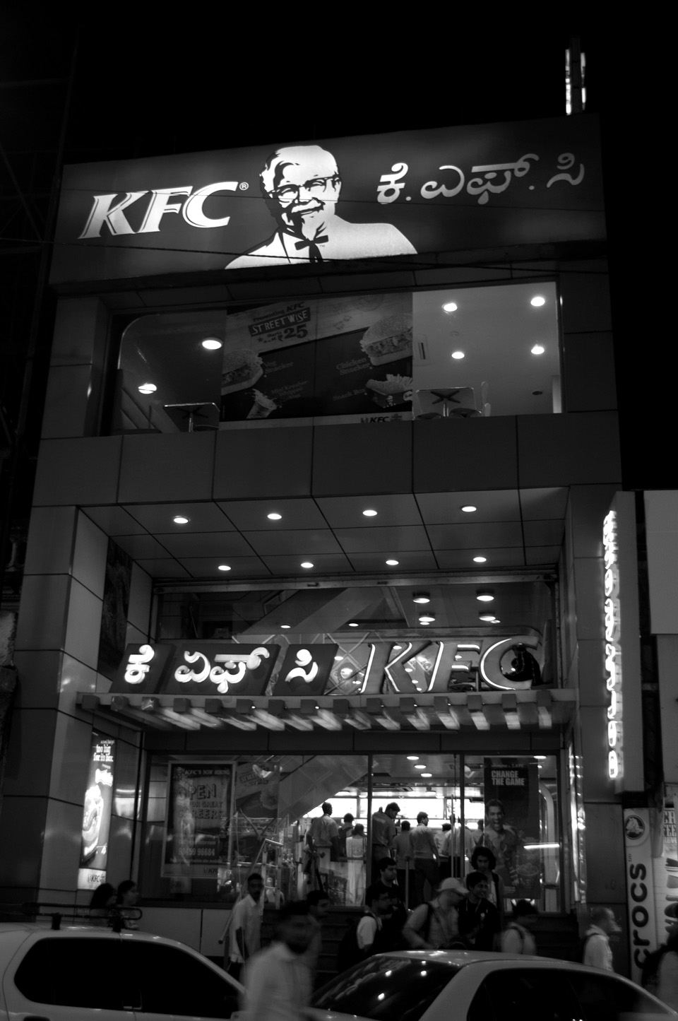
The Colonel disappoints, as well, going so far as to mix two different inappropriate Kannada typefaces in this Bangalore shopfront. Neither one matches the heavy strokes with the gently flared endings of the KFC logotype. Instead we have a gently rounded typeface and a pointy, high-contrast one — crude Kannada equivalents to, perhaps, Arial Rounded and Poster Bodoni.
Daniel Rhatigan is a type designer, graphic designer, and publisher of Pink Mince. Born and raised in New York, he now lives in London, England, where he is working on Indic typefaces that will be much, much better than the ones shown here that made him so cranky.