Century: 100 Years of Type in Design

This little bit of excitement has taken up a lot of my time and concentration for the last few months, and the last few weeks in particular.

[Century: 100 Years of Type in Design from Monotype on Vimeo.]

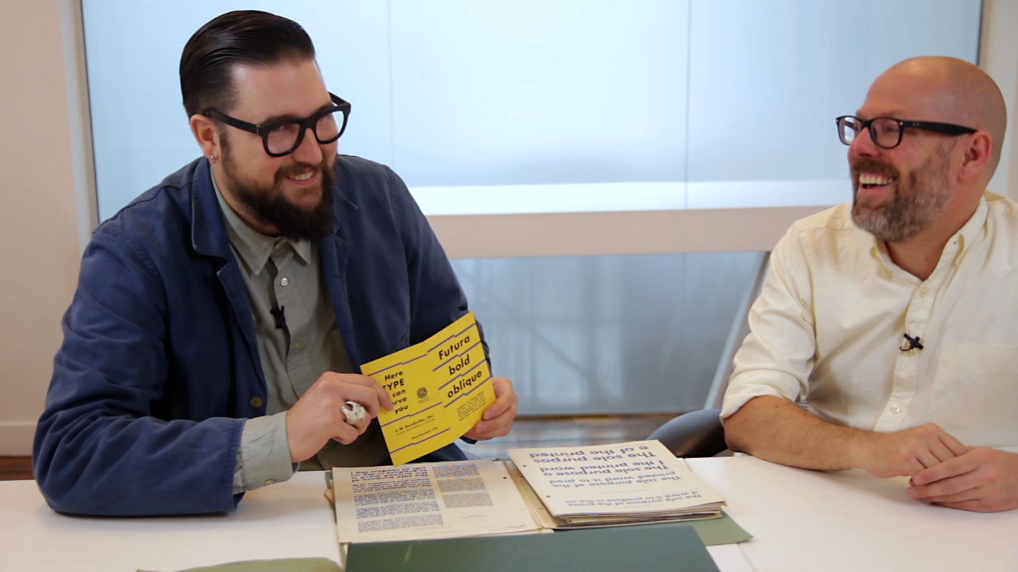
From the AIGA, our hosts: “Gathering rare and unique works from premier archives in the United States and London, “Century” will serve as the hub of a series of presentations, workshops and events held at the AIGA gallery as well as the Type Directors Club and the Herb Lubalin Study Center of Design and Typography at Cooper Union in New York City. The “Century” exhibition features a range of artifacts representing the evolution from typeface conception to fonts in use. Typeface production drawings by the preeminent designers of the last 100 years, proofs, type posters and announcement broadsides are supplemented by publications, advertising, ephemera and packaging.”


And if you’re curious, here is some of the coverage:

[All photos by Bilyana Dimitrova. Video clip by Ben Louis Nicholas. Animations by Pentagram.]

Exploring Gill Sans (and then some)

The latest video that the D&AD has produced down at the Monotype archive in Salfords, featuring a couple of MATD students having a chat with me about typefaces and research.

Exploring Gill Sans from Chris Light on Vimeo.

I Directed, shot and edited this for Monotype on behalf of D&AD. In the third of film in our series, A Living History of Type, Type Director Dan Rhatigan unearths the project files for Gills Sans, one of the most iconic typefaces in the Monotype Archive.

Together with Typeface Design students from the University of Reading, Dan explores how Gills Sans has both evolved and developed over the years, through an array of correspondence, proofs, notes and memos dating back to the phototype era.

Discovering Mercurius

This is a few months old, but it shouldn’t be a surprise that I’ve been delinquent about posting it here for posterity. (Blah blah not paying enough attention to the blog yadda yadda.) Over the last year, we’ve been letting the D&AD come down to Monotype‘s archive in Salfords to film people exploring the material there. The resulting film clips are part of the Inspired by Typography section on their site, part of a growing collection of material to hopefully get people excited about this stuff.

In this clip, I go fishing through a box of original drawings to investigate some things drawn by the mysterious Fritz Steltzer, and then come across some really sublime original drawings by Imre Reiner for his typeface Mercurius Script.

I’d never seen Mercurius before, and when we filmed this I thought it may have been an unreleased design — or at least one never digitized — but it turns out it’s still available. I’m not completely wild about the actual typeface, which somehow lacks the ZING of the original drawings. I think it may be mostly an issue of spacing and fit, so maybe I’ll get an opportunity to tinker it with it someday and see if I can get it right.

I also make a few guest appearances in this earlier video they shot at the office:

Stay gold, Ponyboy

tumblr_m059srwBsb1qzi80d.jpg

I was a little obsessed with this movie and book during my formative years, for reasons I couldn’t — or wouldn’t — quite figure out at the time. I learned about sex by reading some incredibly graphic Outsiders fanfic written by a girl in my class when we were 12, which tells you a lot about how many stories you hear about Catholic school have some basis in fact.

Similarly, I was secretly fixated on this cover for this book, by the same author:

Rumble Fish