Century: 100 Years of Type in Design from Monotype on Vimeo.
This little bit of excitement has taken up a lot of my time and concentration for the last few months, and the last few weeks in particular.
[Century: 100 Years of Type in Design from Monotype on Vimeo.]
From the AIGA, our hosts: “Gathering rare and unique works from premier archives in the United States and London, “Century” will serve as the hub of a series of presentations, workshops and events held at the AIGA gallery as well as the Type Directors Club and the Herb Lubalin Study Center of Design and Typography at Cooper Union in New York City. The “Century” exhibition features a range of artifacts representing the evolution from typeface conception to fonts in use. Typeface production drawings by the preeminent designers of the last 100 years, proofs, type posters and announcement broadsides are supplemented by publications, advertising, ephemera and packaging.”


And if you’re curious, here is some of the coverage:
[All photos by Bilyana Dimitrova. Video clip by Ben Louis Nicholas. Animations by Pentagram.]
Just released: another in the series of short videos produced by D&AD that peer into the wonders of the Monotype archive. In this latest one, I have a chat with James-Lee Duffy of We Are Shadows about a stack of Futura specimens from the Bauer foundry, and how Futura is used today.
[Unfortunately I can’t embed the video, but you can watch it on D&AD’s site.]

Continue reading “Futura: The Typeface of Today and Tomorrow”
For posterity, since I neglected to post it earlier in the year. This super cut of old Monotype and Linotype films still gets me excited.
I’m still getting back into the swing of things after an extraordinary one-week trip to Iceland for this year’s ATypI conference in Reykjavík. Although I’ve attended ATypI before, this was the first year I’ve been a speaker, and one lucky enough to be allowed two presentations. The first of them was a variation on talk I’ve been doing lately about typographic issues that should be considered when working with webfonts. Luckily, one of my colleagues was able to record it:
Given at ATypI in Reykjavík on 15 September 2011.
The slides themselves are here, in case you couldn’t see them clearly in the video:

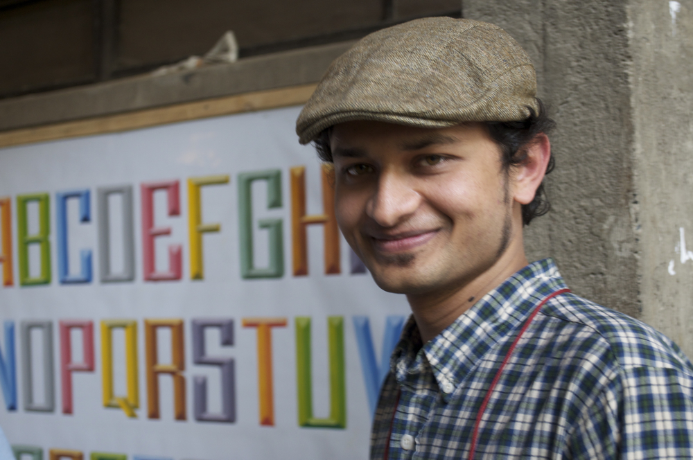
It’s been a treat to see Hanif Kureshi‘s completely awesome HandPaintedType project getting a lot of attention and praise during the last month or so. I met Hanif back in March, at Typography Day in Ahmedabad, and immediately took a shine to the painted lettering he put on display, and it’s no suprise that I was all for the idea of documenting and supporting the efforts of those artists. Hanif showed this short film he made as an introduction to the situation that inspired this project:
Handpainted Type is a project that is dedicated to preserving the typographic practice of street painters around India. These painters, with the advent of local DTP (Desktop Publishers) shops, are rapidly going out of business with many businesses and shops switching to the quicker, cheaper but uglier vinyls. Many painters have given up their practice altogether.
The project involves documenting the typefaces of road side painters across India, digitizing it and archiving it for future generations.
I had a lot of discussions about the sign painters with a lot of designers while I was in India. It’s a difficult bind for the artisans whose livelihood is giving way to the production of cheap digital signage. They can’t match digital sign shops in terms of price or speed, but the work they do is both more charming and more likely to last for a long time. Of course, style and longevity are probably low priorities for customers who are also trying to eke out a living in a difficult economy.
I think the key to survival for the sign-painters may lie in the hand of designers and other tastemakers who not only appreciate the work, but are also more likely to have the market savvy to shift the perception of the lettering trade from being “just” a trade to acknowledging the artistry. A similar thing has been going on in the West with the explosion of interest in crafts and the handmade object, and I think it could certainly happen in India, where everyone seems so quick to see the vibrancy of the handmade letter in comparison to the glut of poor typography. The fonts will improve, though, and what then of the lettering artists (and the art of lettering itself) if they can’t find a place for themselves elsewhere in the culture?
One of the intrepid designers who have purchased a license for Sodachrome (perhaps you recall me mentioning that lovely typeface designed by the talented Ian Moore and me?) is my pal Todd Macfie, a designer in Vancouver who I got to know at Type Camp India last December. After seeing some of the early print samples of Sodachrome when we visited our screenprinter in Chennai, Todd thought it would be a good fit for a project he was developing about self-reflexive literature and hybrid forms of the book. At last, he finally sent me a quick video of his completed prototype book, which features many pages of big, vibrant silkscreens of Sodachrome.
[You know, you can get a license for Sodachrome, too, if you like. Just get in touch.]
One of the points I try and make when I talk about “bad” type (let’s just say it’s of dubious quality, for whatever reason) is that a good designer can do brilliant things with almost any typeface with enough imagination and care and balls. And when I say stuff like that, I envision amazing things like this (warning: may cause seizures, but that’s a small price to pay):
[The opening credits from Gaspar Noé‘s Enter The Void]
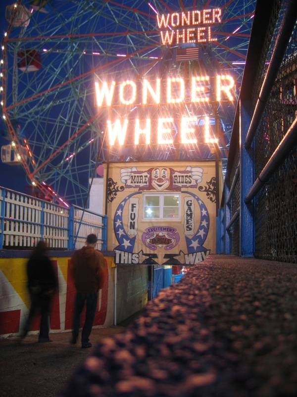
The start of Summer always makes me long for Coney Island, especially now that it’s so far away and I’ll probably never see it again before it finally gives in to all the pressure and becomes something else.

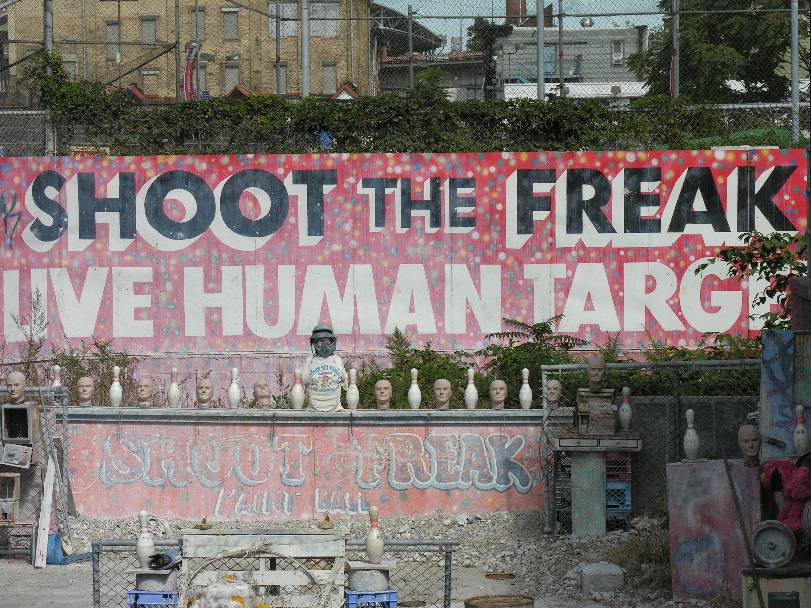
But there’s so much to love. If you haven’t been there it may be hard to see past the decay and appreciate the real charm that comes from the liveliness of the place, and the visible signs of a long, colorful history. I’ve always had trouble putting my finger on my love for the place, although it’s such a goldmine of lettering and kitsch that it’s easy to understand what first sucked me in. But it’s always been more, somehow, too.
Coney Island Dream from Joshua Brown on Vimeo.
[Coney Island Dream from Joshua Brown on Vimeo.]
