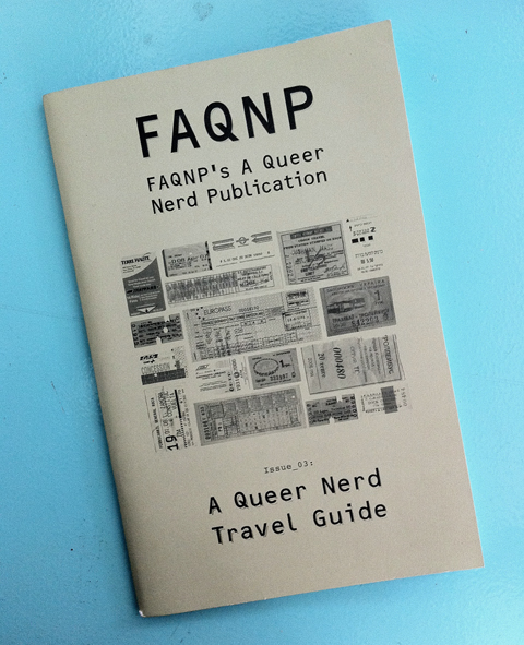
FAQNP #3: A Queer Nerd Travel Guide

FAQNP #3

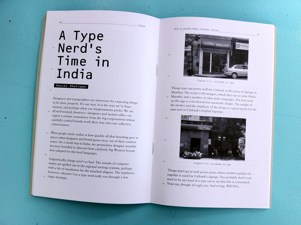
I contributed an article to the zine FAQNP for its third issue, “A Queer Nerd Travel Guide”. My photo feature, “A Type Nerd’s Time in India”, is a look at how well (or for the most part, how badly) a variety of western brands like Citibank and McDonald’s carry through their typographic branding when they use the local scripts in different Indian cities.

Spread from FAQNP #3

Continue reading “FAQNP #3: A Queer Nerd Travel Guide”

Archival material: NYC edition

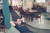
Photo by Rebecca Cooney for New York TodayA decade ago, which is essentially a lifetime ago, the New York Times had a web-only site about living in New York, and featured me in a weekly column about homes/apartments in the city. While I’m impressed that the article and accompanying slideshow are still online, I’m making an effort to gather up things like this and store them here for posterity, just in case.

[To be honest, I’m also just having a bout of nostalgia for the days when I lived alone an had a lot of space to myself for gathering treasure and doing cool stuff.]

So let’s take a little wistful trip down memory lane, past all the awful (and occasionally lovely) things that have happened since then.

Continue reading “Archival material: NYC edition”

The many faces of Sparky

My career seems to be at the point where I rarely need to tailor or tinker with my CV (or résumé in the American parlance), but I need to rewrite short bios over and over again. That’s a good sign, right?

It basically means I don’t have to look for work all that much, since it tends to find me through more casual channels like momentum, word-of-mouth, networking, yadda yadda. (It’s the actual money that’s hard to pin down, tragically. The work keeps piling up.) The trick is that now I only get a couple of sentences to sum up everything as well as highlight the relevant details for the task at hand, rather than letting a amore complete picture come together from the full details.

For instance, here’s one for my current job:

Daniel Rhatigan, a 2006 recipient of a Monotype Imaging Ltd. scholarship, is working at Monotype Imaging Ltd. as part of the UK’s Knowledge Transfer Partnership. KTP is a country-wide program that allows graduate students to partner with industries to help improve business productivity and competitiveness. Rhatigan is working at Monotype Imaging’s Salford’s design office under the direction of senior designer, Robin Nicholas. Rhatigan is chartered with applying his academic experience to a commercial project, while Monotype Imaging intends to benefit through Rhatigan’s development of intellectual property.

But here’’s my bio for the teaching gig in the Netherlands I’ve had for the last couple of years:

Dan Rhatigan is a graphic designer from New York City, now living and working in London. He has worked as a designer and consultant for arts organizations for over 15 years, and has taught and lectured at the City College of New York, Central St Martins, and the University of Reading.

Dan Rhatigan, grafisch ontwerper uit New York City en woont en werkt op dit moment in Londen. Meer dan 15 jaar werkt hij als grafisch ontwerper en adviseur voor organisaties in de kunst- en grafische branche. Verder heeft hij les en lezingen gegeven aan het City College in New York, Central St. Martins en geeft nu regelmatig les aan de Universiteit van Reading in England.

But I do freelance work, too, now and then!:

Daniel Rhatigan worked as a designer and typographer in Boston and New York for 15 years before coming to study typeface design at the University of Reading. He also lectures on typography and branding in the Netherlands and here in the UK. You can look at some of his previous design work at ultrasparky.org.

And then there’s the occasional bit of writing:

Dan Rhatigan is a typeface designer, graphic designer, teacher, and long-time blogger at ultrasparky.org. He received an MA with distinction in Typeface Design from the University of Reading in 2007, and he’s now working with the Typography Department to research and design non-Latin typefaces for Monotype Imaging.

Once in a while, too, the emphasis shifts to my little side project:

Daniel Rhatigan is a typographer and typeface designer, originally from New York City but now based in London. When not teaching or working on a vast family of Indic typefaces, he publishes a zine called Pink Mince — “for the confirmed bachelor of exceptional taste”.
Oh yeah, Pink Mince

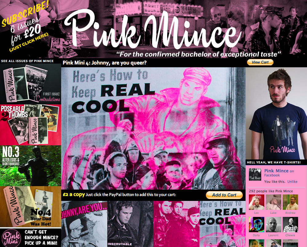
Pink Mince

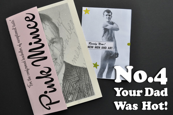
For the past year or so I’ve been working on this little side project that I’ve been meaning to write more about — a zine called Pink Mince. I was waiting to see how it went, and whether or not it would be something that I’d stick with for a while. Now that it’s been a year and I’ve cranked out 4 issues, an offshoot line of 4 mini-zines, and have the next couple of issues well underway it seems safe enough to declare it’ll keep going for a while. Besides, I’ve just invested so much on printing and reprinting that it has to or I’ll be up shit creek.

It’s mostly gay stuff, but it’s also a lot less straightforward than that. The standard tagline is that Pink Mince is “for the confirmed bachelor of exceptional taste”, but I’ve also described it as “a journal of contemporary typeface design illustrated with pictures of dudes”. My pithy mission statement from its Facebook page says: “We aim to delight, titillate, amuse, provoke, and inspire. (That is to say: we feature jokes and blokes, possibly with a point behind it all.)” It’s also about wanting to make something that tactile instead of just another image on a screen. And it’s about getting to feature contributions from a lot of amazingly talented other people. It’s a lot of things, but mostly it’s fun to do.

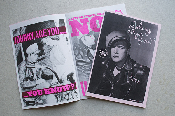
Pink Mince 4Pink Mini 4

But like any print publication, it can be hard to seduce people into taking a gamble and coughing up a bit of coin to check it out. But trust me: there’s something real nice about holding it in your hands and taking it slow. Try it.

So yeah, I actually have a lot more to say about what it’s been like to do all this, but that will take a little more reflection. For now, though, word continues to spread and interest continues to bubble up, so why don’t you check out the awfully kind things that these other gentlemen have had to say so far: Gym Class Magazine, Sturtle, SUNfiltered, We Made This.

Stranger in Stranger

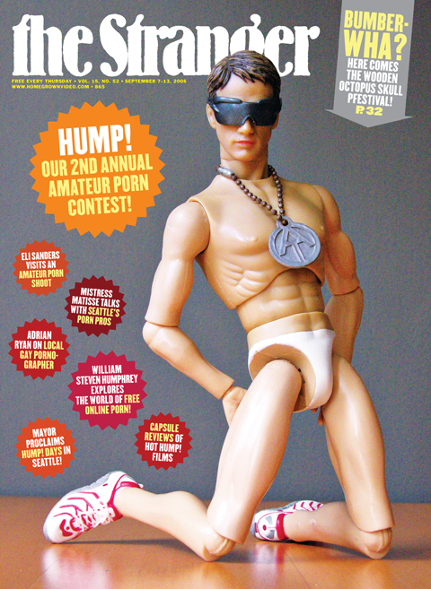
Well, looky-looky at the cover of this week’s issue of The Stranger:

Cover of The Stranger

The photo, taken by a pseudo-pornographer I know, is in honor of Hump! 2, The Stranger‘s 2nd annual amateur porn contest. I’m sure that boy-toy model Jeffy up there would be first in line to submit something to the festival if he could. He’s got that wild exhibitionist streak in him. Can’t you tell?

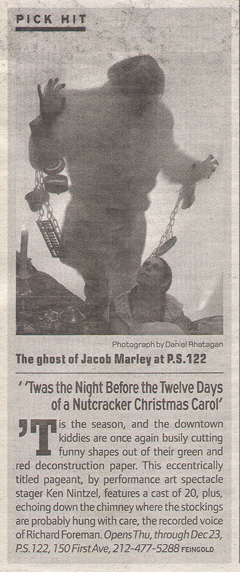
One More Twas Shot

And we have another appearance of the ‘Twas photo with this review from the Voice. Again, there’s a disappointing lack of credit, but I’m more convinced than ever that the photography has really been helping this show get as much mileage in the press as it has. Now, I should also mention that the show was completely delightful, but it definitely helps when you can provide the press with some good visuals to promote your show.