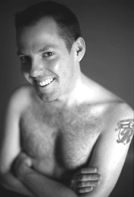
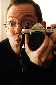
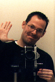
 It’s amazing what a haircut can do to help morale. I think it’s because I cut my own hair (and have ever since I was fifteen — I’m solely responsible for all those asymmetric skater styles I wore in high school and college), and I usually end up doing on the spur of the moment when I feel the need for some kind of change that I can control. Or maybe it’s the feeling of letting go of excess weight. Or just the novelty of looking different after feeling a bit of a rut come on. Any way you look at it, I’m all easy-to-groom again and ready for the wash-and-go pace of my trip abroad.
Oh yeah, someone I chat with a lot pointed out to me that I haven’t even mentioned here that I’m leaving Thursday for a free week-long trip to Sorrento, Italy. [Insert warning of a week without updates here.] I’m helping a friend look after a group of her customers (among many other things, her company sells tour packages) in exchange for a week of free travel, food, and lodging in southern Italy. This is the same way I got to go to China and through the Panama Canal. It’s a sweet deal, and playing shepherd to a busload of tourists is a small price to pay for the change of pace.
But anyway, I shouldn’t suggest that I needed a haircut because I’ve been feeling rotten or anything. stressed yes, with sporadic mopiness, but not rotten. Amidst the frantic crush to get work and errands done before I leave for Italy, I had a fantastic weekend entertaining P.J. and Chris, who stopped by for a quick trip filled with record shopping, eating in bamboo-filled restaurants, and general carousing.

There were some moments of weird social dynamics to the whole situation. I mean, we all got along swimmingly, but P.J. and Chris are old friends who haven’t seen each other in a while, and who came to visit me after they had already spent a couple of days together in Philadelphia.  To some extent, that left me a bit of an outsider to chunks of conversation they were having. Besides, they were in tune to the goings-on in all the record stores we visited in a way that I haven’t been in a few years, since moving from Boston back to New York threw off my connection to any flavor of musical scene. On top of that, I know them independently, through correspondence and phone calls and whatnot, so I also had to adjust to meeting each of them face-to-face for the first time. It’s an adjustment I’ve had to make many times when meeting on-line pals for the first time, but the extra layer of catching up they had to do threw me for a little while. I got over it, they got over it, we got used to knowing each other as meatspace pals instead of flirty online abstractions.
Them boys is fun, though, and we laughed a lot, looked at a lot of cute boys, bought a lot of records (well, all I got were a few zines and a Chicks on Speed EP of B-52’s covers), and goofed around.


 It’s amazing what a haircut can do to help morale. I think it’s because I cut my own hair (and have ever since I was fifteen — I’m solely responsible for all those asymmetric skater styles I wore in high school and college), and I usually end up doing on the spur of the moment when I feel the need for some kind of change that I can control. Or maybe it’s the feeling of letting go of excess weight. Or just the novelty of looking different after feeling a bit of a rut come on. Any way you look at it, I’m all easy-to-groom again and ready for the wash-and-go pace of my trip abroad.
 To some extent, that left me a bit of an outsider to chunks of conversation they were having. Besides, they were in tune to the goings-on in all the record stores we visited in a way that I haven’t been in a few years, since moving from Boston back to New York threw off my connection to any flavor of musical scene. On top of that, I know them independently, through correspondence and phone calls and whatnot, so I also had to adjust to meeting each of them face-to-face for the first time. It’s an adjustment I’ve had to make many times when meeting on-line pals for the first time, but the extra layer of catching up they had to do threw me for a little while. I got over it, they got over it, we got used to knowing each other as meatspace pals instead of flirty online abstractions.
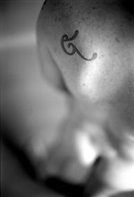
 The new tattoo. Another in my ongoing series of tattoos based on letterforms I think are beautiful. From a visual standpoint, I’ve been wanting something big, black, and smooth-edged that would peek outside of most clothing, but that I could cover up when I wanted to look respectable. As I was walking home from CBGB’s last night (this month’s Homo Corps, where I looked like an ass because I was wearing a suit and carrying a box of Jordan almonds since I’d been at a wedding earlier in the evening), I had this flash of inspiration that a letter with an umlaut on my back would be a nice touch, so that the dots would be visible above the neck of a t-shirt.