
Hallo! It is guaizine from #Vienna, #Austria baby!
with ultrasparky March 2015 #PHOTO by male®
This time, @guaizine and I are meeting up in Berlin next week to run around and take pictures. Holler if you want to hang out!
Ragtag grab-bag

Hallo! It is guaizine from #Vienna, #Austria baby!
with ultrasparky March 2015 #PHOTO by male®
This time, @guaizine and I are meeting up in Berlin next week to run around and take pictures. Holler if you want to hang out!
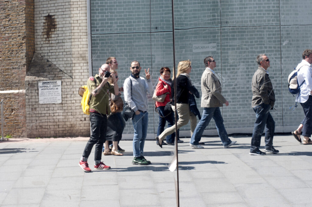
XXXclusive on GUAIzine:
male® & Ultrasparky touring around London
photography by Ultrasparky | May 2013
This time, @guaizine and I are meeting up in Berlin next week to run around and take pictures. Holler if you want to hang out!
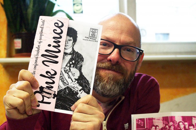
Oh, that‘’’s right! BLN.FM was at Zinefest Berlin and wanted to know all about Pink Mince.
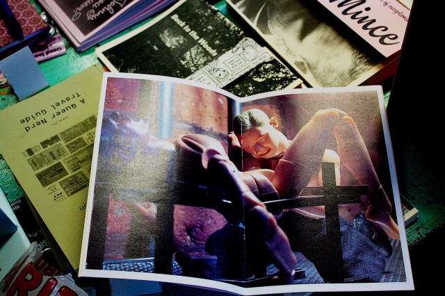
I was specifically asked to show something racy, presumably to spice up the story a bit. It was easy enough to comply.

It pleases me immensely that I was able to keep my Black Hearts t-shirt for the new official work portrait. GO TEAM VENTURE!
[Photo by Matt Carr]
Note: for the sake of posterity, and because I’ve been blogging long enough to know that online stories tend to go missing after a while, I’ve started trying to repost articles in which I’m included. This lovely post by Ellen Shapiro, who came to see us at Pencil to Pixel, originally appeared on Print magazine’s site.
At Monotype’s “Pencil to Pixel” pop-up exhibition in New York City last month, 3,400 students and professions learned about the history of typography. Artifacts demonstrated how metal type was historically designed, made, specified by designers, and set by typesetting companies — and translated into today’s font menus for individual users.
“The lesson from an exhibition like this is that the design of a typeface can outlast the moment that produces it, and that a good design can evolve to meet the needs of technology without losing its essential spirit,” said Dan Rhatigan, Monotype’s UK type director. “Lots of younger designers who came through seemed really eager to see the background of the typefaces they already know, and the exhibit helped them appreciate why we’re still trying to improve the technology behind those designs,” he added.
Here are close-ups of some of the artifacts that were on display as well as some typography history:

1928 — Eric Gill’s pencil and ink drawings for Gill Sans, the fifth best-selling typeface of the twentieth century. Gill (1882-1940), a British sculptor, stonecarver, printmaker and typeface designer, designed Gill Sans in 1926-1928 for Monotype at the request of Stanley Morison, who was interested in a contemporary sans serif face with British character. Classified a “humanist” sans-serif face intended to be legible in both display and text, its proportions were based on Roman letterforms rather than being constructed geometrically. Famed uses of Gill Sans include programs for British Rail, the London Underground, Penguin Books, Saab Automobile, and the BBC. Note the use of white gouache paint to touch up the letterforms.

1937—Copper patterns for Eric Gill’s Joanna. Copper pattern plates were utilized in the manufacturing stage between the drawings and the metal type itself. A transitional serif typeface named for one of Gill’s daughters, Joanna was designed in 1930 and originally intended as a proprietary face for his printing business, Hague and Gill, opened in Buckhamshire, outside London, with son-in-law René Hague. It was adapted by Monotype in 1937 and made publicly available in 1958. Gill set the text of An Essay on Typography, his classic book on letterforms, typesetting and page design, in Joanna. In the book, he demonstrated and championed the first use of “rag right” rather than justified columns to create even letter- and word spacing.
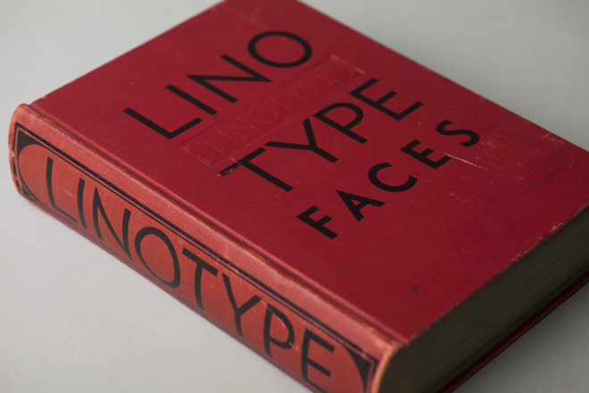

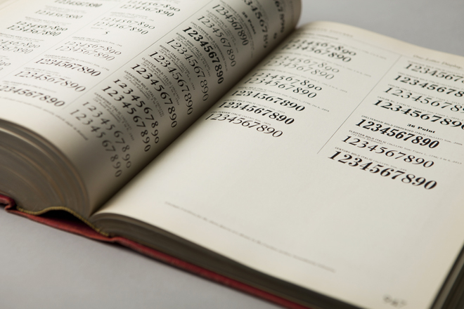
1939—“Big Red,” a comprehensive specimen book of Linotype faces. Published by Mergenthaler Linotype Company, this classic reference tool measures 7.75″ x 10.75″ and contains 1,215 pages of type specimens for hand-set headlines and text set on linotype machines, including model ads and announcements with lavish use of dingbats, ornaments and borders.


1932—Littleworth. These rare, original letter drawings are in the Monotype archive for Littleworth, a hot-metal typeface no longer available,

1971—Classic linotype faces were remastered for photo-typesetting. These brochures announced Monotype newly released versions of Helvetica and Univers for use on the first photo-typesetting machines.
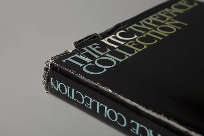

1980—The ITC Typeface Collection, a specimen book of the library of the International Typeface Corporation. This 574-page, 12 x 12” square book is a compendium of the individual “26 Good Reasons to Use” booklets originally designed by Herb Lubalin and released by ITC throughout the 1970s. It was published to interest manufacturers of typographic equipment and materials in licensing the ITC typeface library, which included American Typewriter, Avant Garde Gothic, ITC Benguiat, ITC Bookman, ITC Century, ITC Franklin Gothic, ITC Garamond, Korinna, Lubalin Graph, Serif Gothic, Souvenir, and Zapf Dingbats. In addition to Herb Lubalin, type designers included Ed Benguiat, Tom Carnase, Tony DiSpigna, Aldo Novarese and Herman Zapf.
The book concludes with a copyfitting chart, essential to all designers, part of whose job was to mathematically convert typewritten manuscripts into set type by calculating the size and leading to fit on the page.
In 1980, ITC subscribers included Cello-Tak, Chartpak, Letraset and Zipatone, manufacturers of rub-down lettering, in addition to Alphatype, Berthold, Compugraphic, Monotype, and other purveyors of photo-typesetting equipment. Agfa Monotype acquired ITC in 2000.

2013—the typographic body art of Dan Rhatigan, Monotype’s UK-based type director. This was the “display” in the exhibit I was most curious about (even though he was standing next to a display of covers and spreads of U&lc, a few of which I’d had a hand in).

“My tattoos are always a point of interest with type crowds,” said Rhatigan, who said he got his first tattoo, the swashy ‘R’ of an ersatz family crest he designed, in 1998. “After staring at that ‘R’ for months, I realized that my love of type is timeless. So I started adding shapes I loved from different typefaces, working with different tattoo artists who appreciate the idea enough to carefully reproduce the artwork I supply.”
Rhatigan’s friend Indra Kupferschmid put together a custom MyFonts list of most of the typefaces that are tattooed on him. There are a few others, too, he added (some of which apparently can’t be shown in polite company), including letters from Delittle Wood Type foundry; from H&FJ’s Champion Gothic; and from Sodachrome, designed by Rhatigan and Ian Moore for House Industry’s Photo-Lettering collection.
Me! Just a quick email Q&A for Design Week that I did recently:
Monotype type director Dan Rhatigan on a changing typographic industry, the perils of a second degree and the importance of experimentation.

[Photo by the magnificent GUAzine]
A preview section of the interview I gave to Eye magazine for their Monotype special edition, number 84:
Since I started working full-time at Monotype, and especially since I took over as UK Type Director last Spring, work has consumed a larger and larger part of my life. This would be bad if I didn’t love this job more than any other I’ve ever had, and if I didn’t feel like I was contributing to what happens at Monotype. My attempts to keep up with this site, always a tricky endeavor at the best of times, may have fallen slack, but I’ve hardly been slacking off elsewhere.
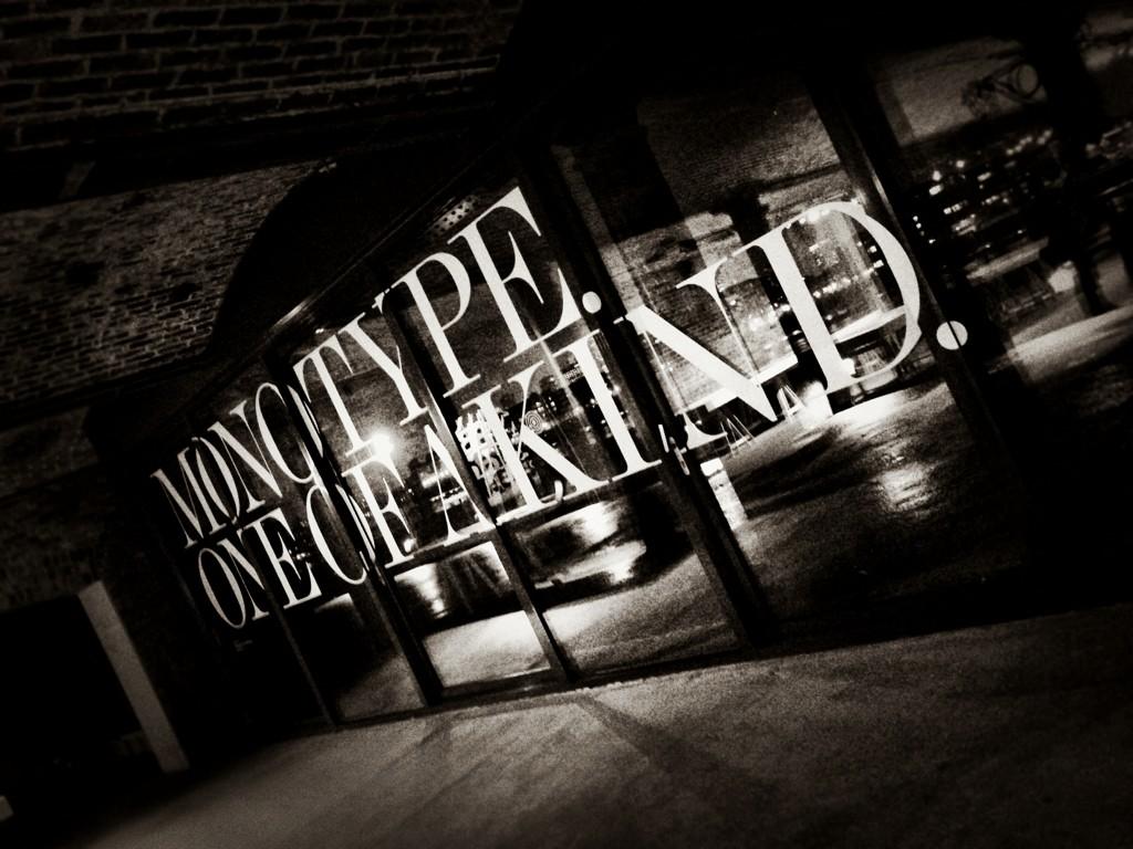
The last two weeks have been the culmination of a frantic couple of months of preparation for a giant exhibition of work from Monotype’s past and its present, and hopefully a look at its future. Pencil to Pixel, masterminded by my extraordinarily talented colleague James Fooks-Bale, designed by SEA, partially curated (and with guided tours) by me, and pulled off thanks to the efforts of many more, was huge success by all measures, and hopefully one of many more endeavors to come.
On the whole, I am not a confident man, especially about my looks or my body. This is slowly getting worse as I get older, and I move further away from an optimum version of my self-image that I never quite achieved, and is now beyond my reach for good. The background of that is typical, tedious, and not worth getting into, but the overall effect is that I generally hate seeing pictures of myself, as they tend to reinforce what I already think. I’m still curious to see them, though, because from time to time they turn out alright, and I get a glimpse of a version of myself that I don’t loathe quite so much. Once in a while, a bit of external perspective makes me think there may be some promise left after all.
Last month, I had a chance to meet up with a photographer/artist/restaurateur named Martin, or Male®, as he goes by on the internet, while he was in London. Martin had contributed some great photos to Pink Mince a while back. We’d never met in person before, and he wanted to photograph my tattoos. We got on well enough, so strolled around a bit one afternoon and caught a show at the Barbican the next day, during which he’d occasionally stop me for a few portraits. (If you know me well enough, you can identify the expression I make when I’m self-conscious but trying to look calm, cool, and collected regardless.)
It’s been startling to see the results as they’ve trickled onto his blog since then. While I still cringe a little at the site of myself, I don’t actually dislike the composite portrait that is built up throughout the set. A little older, scrawnier, greyer than I’d care to see, but there’s character there, and I tend to forget about that. It helps that Martin’s skilled with a camera, and has chosen moments well. But that considered view from someone else who is seeing me with fewer preconceptions is refreshing. Maybe I’m not such a wreck after all?
Ask me again when I’m tired or particularly frustrated and I may change my thoughts altogether, but at the moment I’ll cling to a bit of good vibes. I spend so much time in my own head, where the outlook is often rather bleak, that it’s a pleasant change of pace to look in from the outside. Thanks for the brief taste of self-esteem, Martin!