
It pleases me immensely that I was able to keep my Black Hearts t-shirt for the new official work portrait. GO TEAM VENTURE!
[Photo by Matt Carr]
Ragtag grab-bag

It pleases me immensely that I was able to keep my Black Hearts t-shirt for the new official work portrait. GO TEAM VENTURE!
[Photo by Matt Carr]
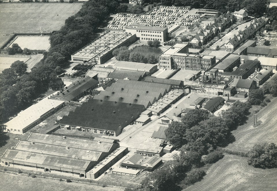
When we show material from Monotype’s archive in the UK, I like to include photos of the Monotype Works, the company’s cluster of factory buildings in Salfords, Surrey. Seeing an aerial view of the Works and a few glimpses inside some of the factory buildings gives a real sense of scale to the operation. It took a lot of people, space, material and equipment to make all those machines and all that type, and it can be tricky for people who’ve only interacted with digital type to really appreciate what went into creating the typefaces that carry over from the days of metal type.

Another point that I like to make is that the Monotype Works in Salfords was just one location out of many that were producing type (and type-making machines). Even if you look at the companies that are part of Monotype today, there were (at one time or another) the Works in Salfords, a plant in Scotland, a plant in Frankfurt, plus Lanston Monotype in Philadelphia, and Linotype’s plants in Brooklyn, England, and Germany. That’s an awful lot of activity and infrastructure. And it’s only one slice of the industry.
Even traditional foundries (as opposed to companies like Linotype and Monotype who made machines that letter people produce their own type) were huge. Have a look the Caslon Letter Foundry in London around 1902, or the Haas Type Foundry in Switzerland in 1950, or even a printing operation that made its own hot-metal type like the US Government Printing Office.
When we talk about the type industry today, we’re talking about software and design companies, from tiny one-person studios to (at Monotype’s end of the scale) a few hundred people. What has disappeared is a proper industry of machines and factories and scores of people. Physical type is a small-scale craft these days, which is pretty great in some ways, but a sad loss in others.
[A short blog post I recently wrote for Design Week…]
The English language (and the Latin alphabet it uses) is well-known for adapting itself with the times and the needs of the many different people who use it. Because the language and the writing system have changed so much already, someone or another regularly comes along with a new pitch for yet another change. But is it a great idea or just a gimmick to propose something new when we’ve already got the building blocks?

Recently Paul Mathis, an Australian restaurateur, has decided to “improve efficiency” by shortening the word “the” to a letter “Ћ”* which is designed to look like a combination of the letters “T” and “h”. Mathis seems baffled that “and” can be abbreviated with an ampersand while being only the 5th most commonly used word in English, while the most commonly used word still requires THREE WHOLE LETTERS! His pitch is that his new character could save valuable strokes of the pen or valuable characters in a tweet. Maybe so, but is his the right solution?
Although he proposes this as a new shape, in fact just writing about it requires an existing solution (and probably not the best): the Cyrillic capital letter “Tshe”, used for Serbian.** If you look at Ћ in just about any typeface, though, you can see that it’s already got better proportions than just a T and an h crammed together. What troubles me the most, though, is that saying Ћ can replace “The” would be awkward for people who already know the Cyrillic alphabet and the sounds its letters can make.
Besides, the Latin alphabet already has a Unicode-ready single character that makes the right sound, and it comes in both upper- and lowercase: the thorn! Used mostly in Icelandic today, Þ and þ are used for the “th” sound of “the”. The eth (Ð and ð) might work a little better linguistically, but thorn also has history on its side. That quaint “Ye Olde” tavern you like? That comes from an older way of writing thorn that looked more like a “y”.
These gimmicks occasionally gain some ground, though. Martin Speckter invented the interrobang — ‽ — in 1962 and it finally made its way into the Unicode standard, although you’d be hard-pressed to find it in general use. You may also have seen talk of the SarcMark – which someone suggested could be used to denote sarcasm to avoid any awkward misinterpretations during text or email conversations – however that idea didn’t really take off either.
The ampersand grew out of writing convention, and eventually took on a slightly subtler meaning than just any instance of “and”. That kind of evolution is how these concepts take root. Mathis’s gimmick is more of a limp stab at a revolution, and probably one we should dismiss. Þ end.
The latest video that the D&AD has produced down at the Monotype archive in Salfords, featuring a couple of MATD students having a chat with me about typefaces and research.
Exploring Gill Sans from Chris Light on Vimeo.
I Directed, shot and edited this for Monotype on behalf of D&AD. In the third of film in our series, A Living History of Type, Type Director Dan Rhatigan unearths the project files for Gills Sans, one of the most iconic typefaces in the Monotype Archive.
Together with Typeface Design students from the University of Reading, Dan explores how Gills Sans has both evolved and developed over the years, through an array of correspondence, proofs, notes and memos dating back to the phototype era.
The sound of a skateboard deck on pavement is one of the most vividly thrilling turn-ons I know
Note: for the sake of posterity, and because I’ve been blogging long enough to know that online stories tend to go missing after a while, I’ve started trying to repost articles in which I’m included. This lovely post by Ellen Shapiro, who came to see us at Pencil to Pixel, originally appeared on Print magazine’s site.
At Monotype’s “Pencil to Pixel” pop-up exhibition in New York City last month, 3,400 students and professions learned about the history of typography. Artifacts demonstrated how metal type was historically designed, made, specified by designers, and set by typesetting companies — and translated into today’s font menus for individual users.
“The lesson from an exhibition like this is that the design of a typeface can outlast the moment that produces it, and that a good design can evolve to meet the needs of technology without losing its essential spirit,” said Dan Rhatigan, Monotype’s UK type director. “Lots of younger designers who came through seemed really eager to see the background of the typefaces they already know, and the exhibit helped them appreciate why we’re still trying to improve the technology behind those designs,” he added.
Here are close-ups of some of the artifacts that were on display as well as some typography history:

1928 — Eric Gill’s pencil and ink drawings for Gill Sans, the fifth best-selling typeface of the twentieth century. Gill (1882-1940), a British sculptor, stonecarver, printmaker and typeface designer, designed Gill Sans in 1926-1928 for Monotype at the request of Stanley Morison, who was interested in a contemporary sans serif face with British character. Classified a “humanist” sans-serif face intended to be legible in both display and text, its proportions were based on Roman letterforms rather than being constructed geometrically. Famed uses of Gill Sans include programs for British Rail, the London Underground, Penguin Books, Saab Automobile, and the BBC. Note the use of white gouache paint to touch up the letterforms.

1937—Copper patterns for Eric Gill’s Joanna. Copper pattern plates were utilized in the manufacturing stage between the drawings and the metal type itself. A transitional serif typeface named for one of Gill’s daughters, Joanna was designed in 1930 and originally intended as a proprietary face for his printing business, Hague and Gill, opened in Buckhamshire, outside London, with son-in-law René Hague. It was adapted by Monotype in 1937 and made publicly available in 1958. Gill set the text of An Essay on Typography, his classic book on letterforms, typesetting and page design, in Joanna. In the book, he demonstrated and championed the first use of “rag right” rather than justified columns to create even letter- and word spacing.
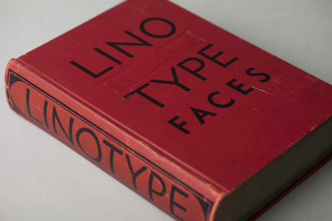

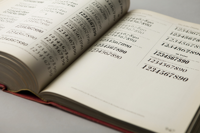
1939—“Big Red,” a comprehensive specimen book of Linotype faces. Published by Mergenthaler Linotype Company, this classic reference tool measures 7.75″ x 10.75″ and contains 1,215 pages of type specimens for hand-set headlines and text set on linotype machines, including model ads and announcements with lavish use of dingbats, ornaments and borders.


1932—Littleworth. These rare, original letter drawings are in the Monotype archive for Littleworth, a hot-metal typeface no longer available,

1971—Classic linotype faces were remastered for photo-typesetting. These brochures announced Monotype newly released versions of Helvetica and Univers for use on the first photo-typesetting machines.
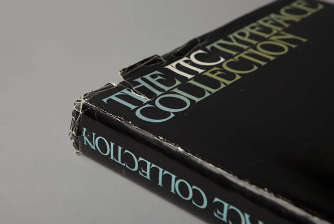

1980—The ITC Typeface Collection, a specimen book of the library of the International Typeface Corporation. This 574-page, 12 x 12” square book is a compendium of the individual “26 Good Reasons to Use” booklets originally designed by Herb Lubalin and released by ITC throughout the 1970s. It was published to interest manufacturers of typographic equipment and materials in licensing the ITC typeface library, which included American Typewriter, Avant Garde Gothic, ITC Benguiat, ITC Bookman, ITC Century, ITC Franklin Gothic, ITC Garamond, Korinna, Lubalin Graph, Serif Gothic, Souvenir, and Zapf Dingbats. In addition to Herb Lubalin, type designers included Ed Benguiat, Tom Carnase, Tony DiSpigna, Aldo Novarese and Herman Zapf.
The book concludes with a copyfitting chart, essential to all designers, part of whose job was to mathematically convert typewritten manuscripts into set type by calculating the size and leading to fit on the page.
In 1980, ITC subscribers included Cello-Tak, Chartpak, Letraset and Zipatone, manufacturers of rub-down lettering, in addition to Alphatype, Berthold, Compugraphic, Monotype, and other purveyors of photo-typesetting equipment. Agfa Monotype acquired ITC in 2000.

2013—the typographic body art of Dan Rhatigan, Monotype’s UK-based type director. This was the “display” in the exhibit I was most curious about (even though he was standing next to a display of covers and spreads of U&lc, a few of which I’d had a hand in).

“My tattoos are always a point of interest with type crowds,” said Rhatigan, who said he got his first tattoo, the swashy ‘R’ of an ersatz family crest he designed, in 1998. “After staring at that ‘R’ for months, I realized that my love of type is timeless. So I started adding shapes I loved from different typefaces, working with different tattoo artists who appreciate the idea enough to carefully reproduce the artwork I supply.”
Rhatigan’s friend Indra Kupferschmid put together a custom MyFonts list of most of the typefaces that are tattooed on him. There are a few others, too, he added (some of which apparently can’t be shown in polite company), including letters from Delittle Wood Type foundry; from H&FJ’s Champion Gothic; and from Sodachrome, designed by Rhatigan and Ian Moore for House Industry’s Photo-Lettering collection.
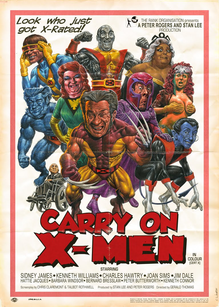
“Despite the bawdy humour, ‘Carry on X-Men’ is in many ways more faithful to the source material than Bryan Singer’s films. Definitely one of the best of the later ‘Carry On’ films.” — Chris Wesson
This is a few months old, but it shouldn’t be a surprise that I’ve been delinquent about posting it here for posterity. (Blah blah not paying enough attention to the blog yadda yadda.) Over the last year, we’ve been letting the D&AD come down to Monotype‘s archive in Salfords to film people exploring the material there. The resulting film clips are part of the Inspired by Typography section on their site, part of a growing collection of material to hopefully get people excited about this stuff.
In this clip, I go fishing through a box of original drawings to investigate some things drawn by the mysterious Fritz Steltzer, and then come across some really sublime original drawings by Imre Reiner for his typeface Mercurius Script.
I’d never seen Mercurius before, and when we filmed this I thought it may have been an unreleased design — or at least one never digitized — but it turns out it’s still available. I’m not completely wild about the actual typeface, which somehow lacks the ZING of the original drawings. I think it may be mostly an issue of spacing and fit, so maybe I’ll get an opportunity to tinker it with it someday and see if I can get it right.
I also make a few guest appearances in this earlier video they shot at the office:
While I’m on the subject of New York, I should also share this look back at the latest Pencil to Pixel that we put on there this past May. This was a huge success, an awful lot of fun (despite the exhausting effort of pulling it off), and the main reason I spent all of the preceding February there.