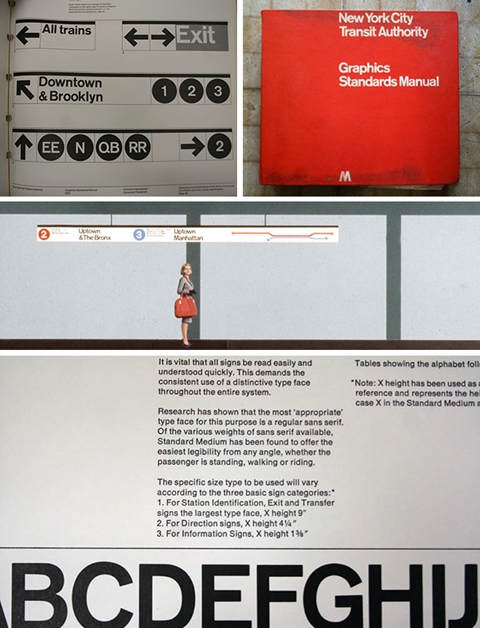
A lot of people who’ve met me — who quickly learn in the course of chit-chat that I’m a type nut and that I’m from New York — will often say something about the use of Helvetica in the New York City subway system, and how much they like it. The thing is, I remember reading years and years ago that Helvetica wasn’t the original spec for the (mostly) Vignelli redesign in the late 60s, but I never got around to digging out any of the details to remind myself what the story was. Thankfully, Paul Shaw has written up a fascinating and thorough article about the history of the subway signage and its evolution over the years, so I can now brush up on the details or refer others to a better source. [Thanks, Norm!]
One thought on “Standard Medium”
Comments are closed.


This looks awesome. Bookmarked for future reading.