Secret World Headquarters

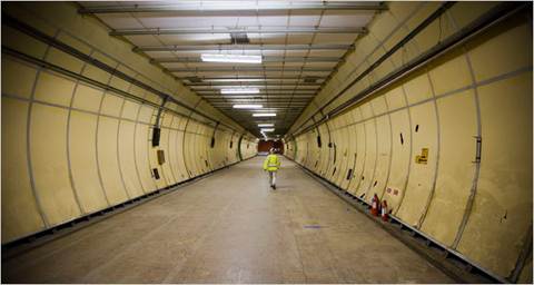
Does anyone have 7 or 8 million bucks they could lend me? I’ve finally found the perfect spot for my secret underground lair: a mile of tunnels deep beneath the heart of London:

tunnels.jpg

That’s room for lots of plans for world domination, guest quarters, and perhaps even a secret submarine dock, or giant burrowing tank of some sort. Actually, if “the air is dry, hot and stale,” it would be perfect for shelves full of comic books and type specimens. Who’s with me?

Standard Medium

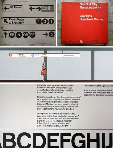
A lot of people who’ve met me — who quickly learn in the course of chit-chat that I’m a type nut and that I’m from New York — will often say something about the use of Helvetica in the New York City subway system, and how much they like it. The thing is, I remember reading years and years ago that Helvetica wasn’t the original spec for the (mostly) Vignelli redesign in the late 60s, but I never got around to digging out any of the details to remind myself what the story was. Thankfully, Paul Shaw has written up a fascinating and thorough article about the history of the subway signage and its evolution over the years, so I can now brush up on the details or refer others to a better source. [Thanks, Norm!]

Not Helvetica, see

Local Colo(u)r

Over the summer I moved from my lovely flat in quiet Reading and moved into a little sliver of a neighborhood at the far end of Tooting in South London. Living in London is decidedly more interesting, but I can’t really afford to live in any of the really interesting bits. My little attic flat has its charms, but you might charitably describe it and the rest of the building as a shithole. The neighborhood — down in the outer rim of Zone 3 — itself is pretty dreary.

But there’s a perk! There’s a small stretch of the road I’m on that has never succumbed to the usual curse of low-income neighborhoods: cheap, bad, plastic or vinyl signage made with badly spaced, boring fonts. Somehow, the shop fronts on this one little block have either hung in there for long enough, or been out of business long enough, that they’ve still got these awesomely charming, quirky, hand-lettered signs.

Not lettering, really, but I love these old signs scattered around:
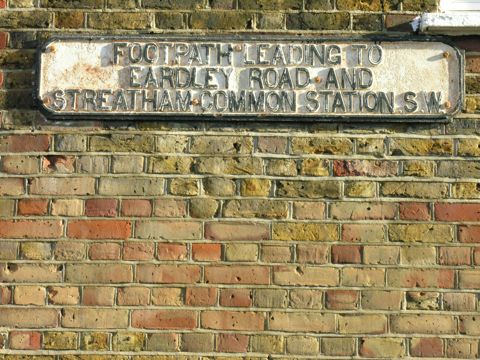
Sign on Mitcham Lane

30 Mitcham Lane has as awful Helvetica-filled sign, but managed to hang onto these groovy numbers on their door:
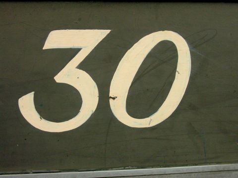
30 Mitcham Lane

I love the spring in these letters at no. 94:
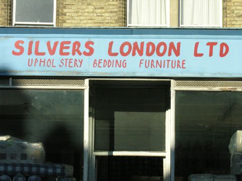
94 Mitcham Lane

They couldn’t quite had the past at no. 95:
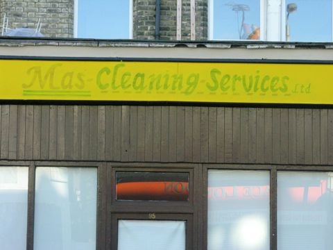
95 Mitcham Lane

My personal fave is this unicase approach at no. 97:
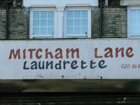
97 Mitcham Lane

I l wish I could see what they covered up at no. 114:
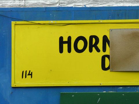
114 Mitcham Lane

This is just an old sign on the corner, but I adore it:
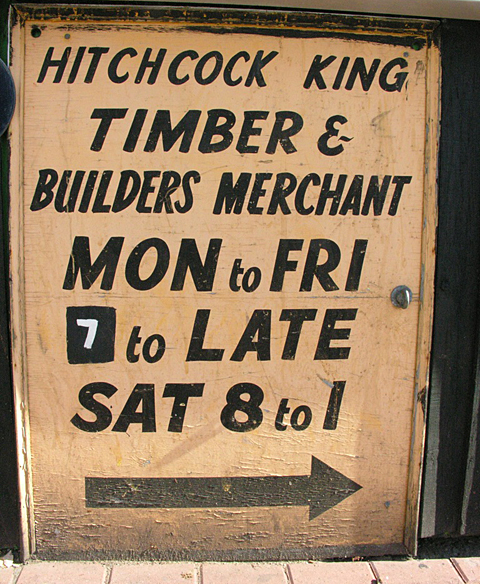
Ad for Hitchcock King