Observed on Design Observer today:
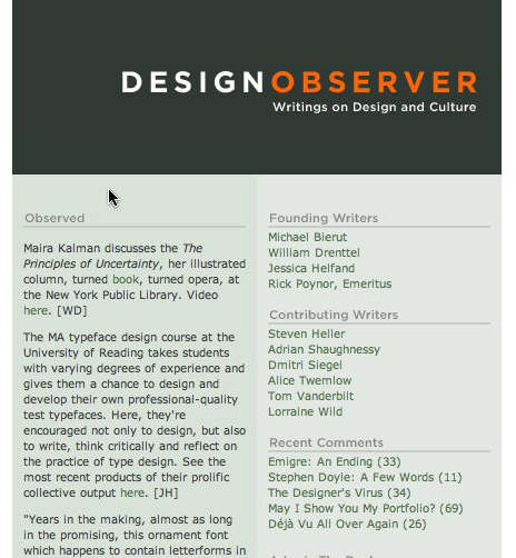
At least we know someone got one of the specimen booklets we sent out. Thanks for the shout-out!
Observed on Design Observer today:

At least we know someone got one of the specimen booklets we sent out. Thanks for the shout-out!
…but enough about me. You should check out what my obscenely talented classmates have been up to this year. 14 dazzling type families that cover scripts like Latin, Greek, Cyrillic, Devanagari, Gujurati, and Tamil — and we’re all just getting started. It’s hard not to bubble over with pride right now.
While griping about the hassles of typesetting math in this Typophile thread, I finally put my finger on what makes so many otherwise good typefaces fall apart in math or technical work: character-level legibility. A good text face works best when its letters work together to make good word shapes, right? When the individual glyphs don’t pull the reader outside of the flow of the text with too many quirks or spacing irregularities. The trouble with setting math or other technical material (chemical equations, charts of ID codes, etc.) is that the context for the individual letters is much less familiar than in typical text. If text is comprehended word by word with less need for the letters themselves to be individually distinguished, then math is read letter by letter in such a way that almost any character could be swapped out for another and change the meaning entirely.
Most of my problems setting math over the years have had to do with letters that just aren’t unique enough when you pull them outside of normal text and start mixing and matching them with Greek and symbols and numbers and lord knows what else. Especially once superiors and inferiors are used, it becomes absolutely critical to know if a glyph is an “l” or an “I” or a “1” or a vertical bar, for instance. (If you’re seeing the right CSS styles for this page, see how nicely Georgia distinguishes those from one another? Check out Arial: l I 1 | )
A good face for this environment needs to strike a balance between the ability of the letters to combine easily for typical reading comprehension, but still hang onto enough unique appearance to hold their own in the free-for-all world of tables and equations.
In Charles T. Jacobi’s Gesta Typographica (London, 1897, although I was only reading passages reprinted in 1964 at the Maidstone College of Art), there’s a mention of a decree made by the Star Chamber on July 11, 1637, that limited the number of master printers in in England to just twenty, and also limited the number of type-founders to just four.
It was a startling tidbit, which made slightly more sense after a little digging. The restriction of legally sanctioned printing to a handful of shops in London was intended as a way to make it as easy as possible for all publications in the kingdom to be monitored and censored by the court of Charles I, whose attempts to consolidate power led to the English Civil War. The 1637 decree was the most extreme of an escalating series of attempts to stifle dissent, often spread by means of pamphlets and books published by independent printers throughout the kingdom. Although small presses continued to produce seditious (in this case meaning anything not sanctioned by the crown) pamphlets and books, many unlicensed founders and printers were raided and arrested, and their equipment destroyed.
In terms of type history, I wonder how many punches, matrices, fonts, and examples were lost in all these purges. The literature I’ve seen so far only discusses the printers themselves, and doesn’t say much about the foundries, or doesn’t make clear if any of the printers had founders working with them under the same roof. It seems possible that entire strands of typographic development may have been snuffed out during this period.
(Note to self: Keep an eye out for other mentions of the censorship by the Star Chamber between 1632 and 1641, thereabouts.)
Although I’m open to serendipity (or pragmatism) when it comes to choosing a thesis topic for next year, I’m leaning very heavily in the direction of working out a type family with closely integrated Greeks and math characters.
It’s a topic that’s been particularly prominent in my thoughts for years, since my job has involved lots (lots!) of work integrating math and other technical notation into text for engineering books. My hands have been largely tied when it comes to making real improvements, since the publisher has been so resistant to substantive changes, but it’s given me lots of time to analyze the problems:
Bad typeface choices, especially considering the poor quality of printing used, the increasing distribution via PDF of the books, and the tendency for pages to get photocopied again and again. I’ve certainly spent a lot of time trying to figure out exactly what design qualities a typeface needs to function under these conditions.
If you’re going to use a typeface for math, you need glyphs that will be completely legible at very small sizes, sometimes below the proportions used for normal superiors and inferiors. This would also apply to the Greeks and symbols.
Greek fonts present all kinds of problems. Even when you get a Greek font that works well enough on its own, the Latinization of the design tends to make it difficult to distinguish some of the individual characters (Α, Β, Κ, et al.) from the normal Latin ones around them. This happens a lot in math, where Greek characters are used in the midst of a dizzying array of other glyphs. The reader is often expected to distinguish Greeks either from their context, the slight design discrepancies between the Greek typeface and the regular text face (since they rarely match), or the use of artificial obliquing applied to the Greek characters. A total disaster.
Math fonts are a total mess. Since they’re always designed separately from text fonts, they don’t integrate in any way when it comes to proportions, stroke widths, overall color, etc. Plus, I have yet to encounter a family of math fonts that supports the full set of Unicode positions for math and technical characters. When they do, they often include a number of poorly documented alternate characters. (I’ve spent a lot of time lately mapping the characters in old PostScript math fonts to their Unicode positions. It’s awful.)
So, there are a few key elements that lend themselves to a meaty solution: a Latin face that’s clear and robust enough to withstand low quality display and reproduction, a really full assortment of glyphs to be used at small sizes, Greeks that are designed to be easily distinguished from the Latins instead of designed to match, and a full set of Unicode-ready math and technical symbols designed to integrate with the basic text.
I know: sounds like a huge undertaking, right? Maybe I can save it for a PhD instead.
The need for someone to do this well is really clear, though, if you look at what’s out there. The available options are an unsatisfying assortment of incomplete character sets and poor design. A consortium of publishers is working on the STIX Project, whose goal is to build a set of fonts that will include the full Unicode character sets for Latin, Greek, math, and symbols, but it doesn’t look like they’re going to release OpenType versions. Also, judging from the existing work from the company designing the fonts, the quality of the type design is still going to be problematic. Although I’m all for the work the STIX Project is doing (“preparation of a comprehensive set of fonts that serve the scientific and engineering community in the process from manuscript creation through final publication”), I cringe at the thought of their low-quality, free fonts being the only option out there (“the STIX fonts will be made available, under royalty-free license, to anyone, including publishers, software developers, scientists, students, and the general public”), since they will really result in even lower standards for technical publishing.
Brace yourselves, gang, I’m about to geek out way beyond any geekery you’ve seen here yet. Today I’m going to meld together comic geekery and typographic geekery, and it’s not going to be pretty.
I’ve been meaning to rant for a while now about the general crappiness of the electronic lettering used in comics nowadays, which not only sucks all the charm out of traditional hand-lettering, but also leaves the lettering prey to all the mistakes of novice desktop publishers. This started when I kept noticing a simple typesetting error showing up over and over again in dialogue balloons: the use of a double hyphen instead of a proper em dash (– instead of —), a typewriter convention that spills over into amateurish handling of type. In digging up old samples to prove my point, however, I discovered that this was going on way before electronic lettering. Here’s a panel from 1966’s Fantastic Four #47:
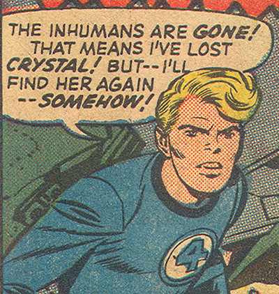
OK, so I guess this particular flub has been going on for a while, probably because traditional letterers were of a similar ilk as their modern peers: neither editors nor real typesetters, either of whom ought to notice things like that. Fine, I’ll let that slide. In the meantime, though, take a gander at the warmth and charm of that lettering. You know why it looks like handwriting? Because each instance of each letter is unique. Simple hand-lettering was cheaper and easier than typesetting, so it made sense, and the crudeness was an appropriate visual match to the artwork and the shortcomings of the reproduction. A perfect unity of tone.
So let’s look at today’s electronic lettering, which is trying to copy the effect of old comics but getting it all wrong. I’ll let this month’s Ultimate Fantastic Four #26 be my scapegoat:
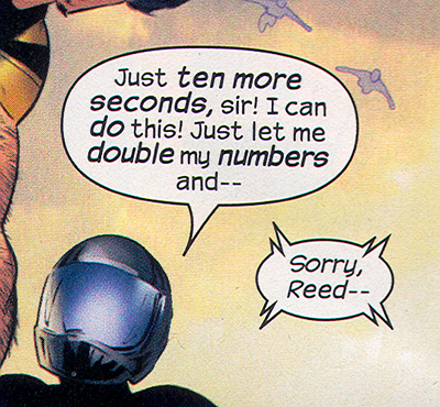
Yeah, that em dash thing. But I said I’d let that slide. Notice how every repeated letter is exactly the same? That, my friends, is why shitty handwriting fonts do not look like handwriting. They look like novelty typefaces. No variation, no warmth, no charm. It’s especially bad form when you get double letters or stacked letters. (Look at “do” and “double” up there.) It’s an affectation, but only taken halfway. Now, I’m not saying modern comics with their detailed art and magnificent reproduction quality should switch to real typefaces. If that happened legions of fanboys, myself included, would probably have massive aneurisms all at once. But since they’re not paying someone to do all that lettering by hand, couldn’t they invest in some better fonts? Some fonts that do a better job of faking the craftsmanship they’re trying to ape? That stuff doesn’t even come with decent letterspacing built in, never mind alternate characters. Gentlemen, we have the technology!
OK, but that’s not even what hurts the worst. Let’s turn our attention back to FF #47, paying a visit to the letter column this time:
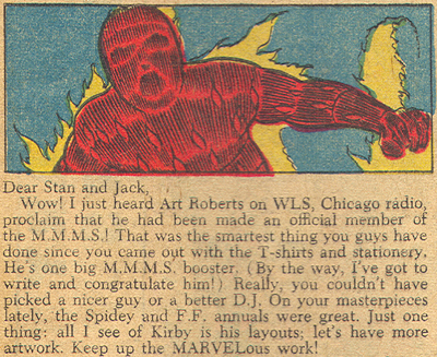
Now, that’s not the best typesetting in the world, but it’s good for what it needs to do. A nice, wide serif typeface that can handle the cruddy printing, and some attention to details like indents, justification, and even ligatures. (Look at the “ffi” in the word “official” — that’s what real typefaces do when they’re used properly, kids.) Since they’re using real type, they’re using good type. Hallelujah!
Ultimate Fantastic Four, however — like most of its contemporaries — makes the Baby Jesus cry:
How to make my eyes bleed, step 1: pick a goofy, “techy” novelty font that ought to be used — and sparingly, one would hope — for titles only, and set paragraphs of text with it. Step 2: set it in white on a black background with no extra letterspacing. Step 3: make sure the line length is super-long and the line spacing is super-tight, so that it’s even harder to read easily. Step 4: center those lines, just to put the rotten cherry on top of the whole thing. Also, those horrible little em dashes that almost look like hyphens, and with no extra room around them! That is not what I want to decipher at the end of a long day.
Now, the thing that pushed me over the edge and made me finally rant like this was actually this image of the Daily Bugle taken from this month’s Daredevil #80 (which otherwise has artwork that’s totally white-hot):
Goddamn, could that look any less like the page of a newspaper? And they pull this crap all the time in Daredevil. (I’m afraid to even look at The Pulse, which probably does a little bit in every issue.) Let me enumerate the sins. Problem 1: there are at least 5 different typefaces in use, and none of them would be really good for newspaper. And they shouldn’t ever get used at the same time (Helvetica and Verdana, I’m looking at you!) Even if they were, there would be 2, maybe 3, altogether. Tops. Problem 2: either the Bugle is a letter-sized pamphlet, or that’s the large-print edition. Three columns, with about 35 characters to a line? I call bullshit. Problem 3: Sometimes the paragraphs are flush left, sometimes they’re justified. Sometimes only half the paragraph is flush left but the rest is justified. (That means that someone used a hard return to make a line break mid-paragraph, which is just bad form.) Problem 4: those paragraph indents are word spaces, not proper em spaces or decent-sized tab stops. that’s why it’s kinda hard to see where each paragraph starts. I spend obscene amounts of money each month for this?
Dear Marvel, please give me a dream job as a typography director so I can make you look better and make the world a more better place. And don’t get cocky, DC: you’re next in my sights.
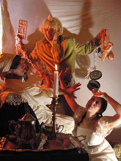
I’ve got one more notch in my belt as of this weekend: my first photo credit in the New York Times. Sadly, the photo didn’t show up in the online version of the article, but you can check it out below:

The photo is from a batch of promo images I shot for ‘Twas the Night Before the Twelve Days of a Nutcracker Christmas Carol, a sort of Christmas story mash-up, done panto-style, which will be running at P.S. 122 this year.
It’s a shame, though, that most of the magic of that image is lost in a small, black-and-white reproduction. Here’s the actual image, in full, glorious color:
Hey, did anyone catch this? The May 27 issue of New York City’s HX magazine featured a write-up about the Poseable Thumbs:
SITE OF THE WEEK
G.I. Joe Type ISO Same
poseablethumbs.comHandcuffed studs, boot-licking slaves, leather-clad muscle queens — sounds like that notorious party at the old Lure, but this web site is different in one critical respect: The men are all six-inch-tall [actually, they’re all twelve inches] action figures. “I’ve heard from a lot of guys who used to have their own G.I. Joes act out their burgeoning sexual fantasies — and a lot of guys who are surprised to find themselves so turned on by the photos I’ve taken,” says Pete Handler, the site’s New York-based photographer and designer. Indeed, the various clever scenes — of fisting, bondage, gangbangs and more — could easily be mistaken for commercial pornography. All the pictures are for sale, along with a book of them, and you can send in your own suggestions of storylines or poses you’d like Handler to shoot, which fits in perfectly with his master plan. “I’m trying to get people’s circuits to cross,” he says, “almost daring them to see how much about what turns them on is in their imagination.” — Jonah Tully