As satisfying as it was to blow off a little steam with my earlier rant about the misinformation surrounding Times New Roman, I knew that there would still be more to say on the matter. The history of this typeface, as I said, is a murky one that is difficult to piece together, and I was happy at the time to leave it alone.
The esteemed James Mosley, however, sent me a quick message about the post that gave me a little more to consider, so let me pull a few more worms out of the can. James pointed out another lazy bit of reporting from that same paragraph in the same article from The Daily:
“Morison wrote a blistering article in 1929 arguing that Times Old Roman, the font of The Times of London, was dated, clunky, badly printed and in need of help — his help”
I should have jumped on that one, too. The thing is, Morison didn’t attack The Times in any article. (If he did, wouldn’t it have been helpful to say where, since it’s unlikely it would have been in The Times itself?) And while Morison had thoughts about the impropriety of the older types in use, “clunky” is probably not the word he’d use. Morison’s thoughts about the use of type in The Times came in a few stages (as detailed from James Moran’s Stanley Morison: His Typographic Achievement):
- In the summer of 1929, Edmund Hopkinson of The Times asked Monotype about taking some ad space in a special supplement. “Morison startled Hopkinson by saying quite bluntly that he would rather pay The Times £1000 to keep their hands of a Monotype advertisement. He continued by giving Hopkinson a lecture on the bad printing and out-of-date typography of his newspaper.”
- Hopkinson passed these comments along to William Lints-Smith, manager of The Times, who met with Morison about these critiques, and offered him a job as a typographic advisor, which Morison eventually accepted.
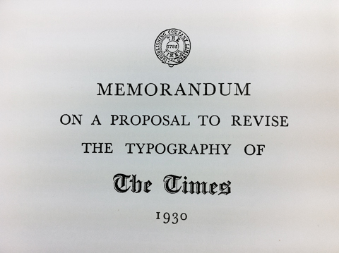
- After proposing at a conference on 24 October 1930 that a completely new typeface would be the best solution to the paper’s typographic troubles, Morison prepared a 34-page memorandum about the typographic issues, used for the benefit of a committee charged with looking into his proposal. 25 copies of this were prepared, and most were destroyed later on.
So his critiques were severe, but hardly public. In fact, his public writings about the paper’s type history, such as in the 1929 printing supplement and the Monotype Recorder later on, are quite neutral in tone.
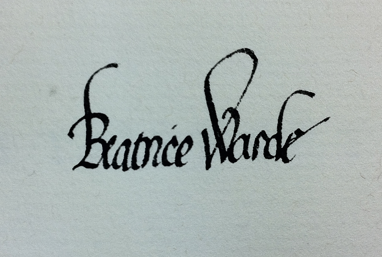
James also wonders if the misleading image from the Recorder that has caused so much confusion about the name of the older type was Beatrice Warde‘s idea. I thought that was likely, too, so I put the question to Dr Shelley Gruendler, the best source of info on Beatrice that I know. In her words:
I have no recollection of EVER knowing specifics about a cover unless she wrote about it to her mother or Gill or someone. However, she loved clever phrases (her type poems & limericks demonstrate this) and since she was the ‘editor’ (and essentially the ONLY writer for it, I’d assume that she had everything to do with it. Of course, she wouldn’t have shot it herself or flipped the neg to print it, nor would she have set it (a lady would never get her fingers inky!), but I’d bet the bank that it was all her and nobody else.
Like a lot of people, James is also skeptical of the official line that Times New Roman is the result of Morison’s vision and Victor Lardent drawing skills. I referred to this as the “more fully documented” story, because it’s the only formal credit given, and records to suggest otherwise are patchy. The thing is, even if William Starling Burgess never had a hand in the genesis of Times New Roman, it’s almost certain that Morison wasn’t the one who made it work as a type design. The real ghost figures in most of the early Monotype faces were Frank Hinman Pierpont, the manager of the Monotype Works in Salfords (the same site where our UK office is today), and especially Fritz Steltzer, the German-born manager of the type drawing office. These guys and the staff they managed would have been the ones who took Morison’s concept, as expressed in Lardent’s drawings, and refined the drawings, worked out the spacing, made the adjustments for different sizes, and so on. Lardent’s drawings for Times New Roman are gone, but I’ve seen reproductions and they show the spirit of the final type, but not the details.
Steltzer, in particular, is an enigma. There’s almost nothing written about him, although people familiar with how the drawing office worked are quick to note the influence and skill he had. From 1899 until he was interned during World War II (he apparently retired once he was freed at the end of the war), Steltzer supervised all the work in the drawing office, and even trained most of the staff himself, many of whom were recruited from the local school in nearby Reigate.
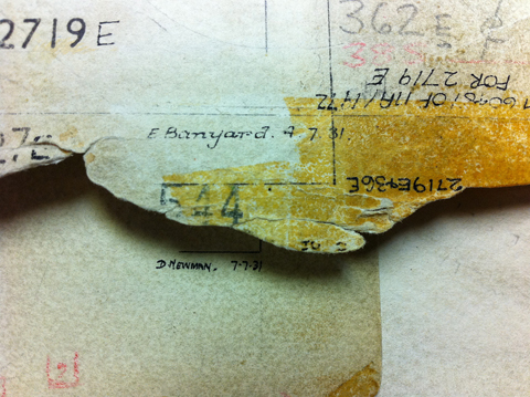
And what about that staff in the drawing office? How much credit should they get? In general, they were the hands that produced the drawings, but not really typographers who had an eye for the overall design. A rarely discussed detail, though, is truly worth mentioning: many hands worked on each typeface, and most of those hands belonged to women. If you look at the master pattern drawings, there’s an initial, a last name, and a date on each one (and often more of the drawings were modified later on). Most of the drawings were executed by E. Banyard, M. O. Donnell, A. Johnstone, D. Laing, M. Morris, D. Newman, W. Pooley, and D. Pritchett. Robin Nicholas, who started out in the drawing office in 1965, clarified some of those as Enid Banyard, Dora Laing, Daisy Newman, Miss Pritchett, and Miss Pooley. (Since they were always referred to as “Miss”, he’s not sure of their first names, even though their time at Monotype briefly overlapped.) Dora Laing was in charge of the drawing activities themselves, while Fritz Steltzer looked after the department as a whole, but I can’t say whether Dora’s role was more one of coordination or quality control of the work itself.
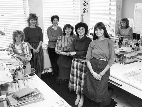
[Sidenote: The role of women in type history has been a big one, even if the debate about inequality in the industry rages on. Note the people working with Fiona Ross in Linotype’s Non-Latin drawing office in Cheltenham back in the day:]
I think that much of the confusion about credit for type designs such as Times New Roman and others produced by companies like Monotype and Linotype in their early decades comes down to a lack of a notion of design authorship. The word “design” was being used more and more often, but in practice the production of type in these environments was still more related to the trade of punch-cutting, just expanded to an industrial scale. It was very much a large team of people who brought type into the world, many of whom had very specific roles in the process, but still crucial to overall quality of the end product. Morison, for instance, may have had the idea and certainly had the publicity, but he didn’t get those letters to work as a typeface. Pierpont, Steltzer, and the staff of the drawing office made a working system out of the ideas, not just for Times but for many other families.