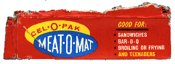
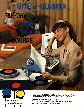
My roommate Mark came home from the weekly visit to the neighborhood thrift store with a set of Milles Bournes cards that Parker Brothers put out some time in the sixties. (Milles Bournes is a card game where you rack up points by metaphorically travelling through the French countryside.) I instantly fell in love with the design of these cards — the style of illustration, the use of type, all of it. It is such an elegant solution — a breezy sense of fun was created without neon, dumb jokes, product placement, or low-brow caricature. Those were the days.
Category: ultratypographic
Broiling or Frying Teenagers?
I found this little gem on the roof of my building one day, apparently a leftover from my landlord’s Memorial Day barbecue. I’m so enamored of this mysterious boxtop that I don’t even really want to know exactly what it is. I’m afraid that the brutal truth would only convince me that Meat-O-Mat really isn’t good for teenagers.