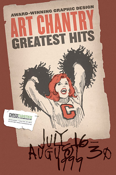
As I mentioned, I got a piece of unsolicited e-mail yesterday from my idol, a Seattle-based designer named Art Chantry. He was doing a Google seach and ran across this old journal entry of mine where I mention that he saved my life. Curious, he dropped me a quick note to ask what in hell I was talking about.
 Well, back when I was a senior studying design in college, I found myself swiftly losing my winsome zeal for my chosen profession. My work was adequate, in that I was doing what was required of me with a certain amount of technical proficiency, but I was disillusioned and my enthusiasm was pretty much gone. I was spending all my time at a computer, pushing stuff around on a tiny black-and-white screen, trying to finish assignments but not having much fun with them. I couldn’t remember what had once seemed so enticing about design, because it just felt like I was at the start of a lifelong career path of churning out monotony. After three-and-a-bit years of art school, for which I’d waited most of my life, I was getting the sinking feeling that I’d made a bit of poor choice in focusing on graphic design.
 I was plucky, though, so I still kept reading about design and keeping myself involved in the field, hoping I was just in a rut. I tried to get the most out of my student membership in the AIGA by going to see a lot of talks by famous-ish designers. One time, I went to go see this guy Art Chantry speak. I hadn’t heard of him, nor had anyone else at school, but we saw a couple of examples of his stuff and it looked fun, so off we went. WOW! His stuff just blew my ass away. And not only was his work good, but I also loved his attitude and his approach to design. He did stuff that was raw, and funny, and sensitive to details, and — this was the kicker — expressive. Yes, he was doing work for clients, but he found ways of putting his own energy into the stuff he produced. He often did a lot of work for chicken scratch, because he believed in what the clients were doing and because they gave him the freedom to take some chances and be playful. (I use the past tense, but I assume this is still the case.) Suddenly, I saw a version of graphic design that wasn’t just slick and clever commercial art. This stuff was everything that I ever loved about comics and punk and zines and B movies that ever made me want to make stuff of my own.
 It wasn’t just the final products that struck a chord, but also the way Art spoke about how he came up with stuff. He hadn’t become enslaved to a Mac, and has never really made use of a computer part of his work at all. He made stuff with his hands, pushed around typeset galleys, and experimented with what could be done on or off press. He played with the materials at hand, and tried some things just to see if it could be done. A cruddy budget could be an opportunity to see how interesting a picture could be made with photocopies and white-out. If a retro-style wood-type poster was needed, why not just have an authentic old poster shop set the type? If a burnt edge was needed for the design, why worry about creating an illusion when it’s simpler to singe the stack of press sheets? This is what real “thinking outside the box” was about before that became such a terrible cliché. And behind all this was a sharp wit, a really solid sense of typographic texture and form, and an understanding of craftsmanship needed by the designer, the printer, the typesetter, and anyone involved. It was so damn refreshing. It was exhilirating to see that there really could be a place in design for all the other things I loved and was learning: drawing, printmaking, photography, painting, whatever. It made me realize that design could be what I made of it. It could be personal and expressive and still work for someone else. It could be tactile and physical and textural, not just a flat abstraction or a printout.
 I raced home that night with my head overflowing with ideas and inspiration. Nothing specific, but just these flashes of other ways to try things I’d been doing all along. I took out a couple of huge pieces of paper and feverishly scrawled all the ways I could think of to make images or to set type or make marks on paper or deal with paper’s third dimension. It sounds corny, yeah, but that single brainstorming session opened the floodgates for me. I wound up redoing all the projects I’d worked on that semester, starting most of them over from scratch and doing about a million times better. I got the same grades I would have otherwise, probably, but that wasn’t the point. I realized how to do work that I was excited about, that I was proud of.
 With a few lapses in conviction over the years, those lessons have stayed with me, really playing a huge part in making me the designer — the artist, if you can generalize like that — that I am today. This is not to say that I do work that looks like Art Chantry’s. Far from it. I’ve worked out a lot of my own visual and conceptual and philosophical ideas over the years, and seem to have arrived at an approach that is certainly my own, little seen as it may be these days. (I might also point out that this is the same approach that led me to give up on working as a designer for the time being, freeing me to think of design as my medium of choice for personal work, not just a job I happen to like.) No, I learned how to incorporate play and handicraft and integrity into my work. I learned that slick or flashy is not always good, and that new solutions can come from old tricks, as long as you maintain a fresh perspective. I know, that’s a lot of ethereal-sounding hoo-hah, but it’s true. Damnit!
Thanks, Art. You rock.


 The new tattoo. Another in my ongoing series of tattoos based on letterforms I think are beautiful. From a visual standpoint, I’ve been wanting something big, black, and smooth-edged that would peek outside of most clothing, but that I could cover up when I wanted to look respectable. As I was walking home from CBGB’s last night (this month’s Homo Corps, where I looked like an ass because I was wearing a suit and carrying a box of Jordan almonds since I’d been at a wedding earlier in the evening), I had this flash of inspiration that a letter with an umlaut on my back would be a nice touch, so that the dots would be visible above the neck of a t-shirt.


