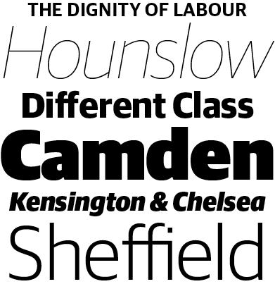
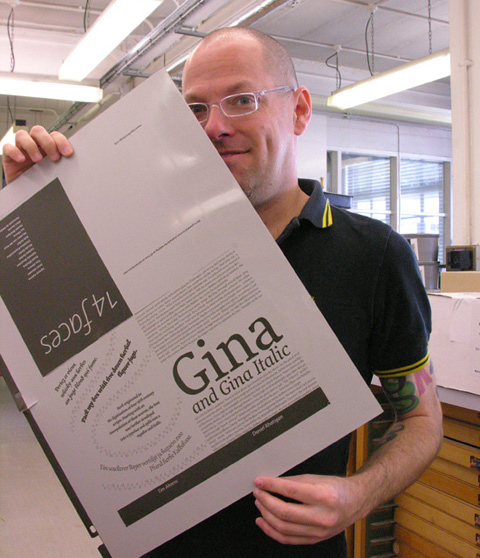
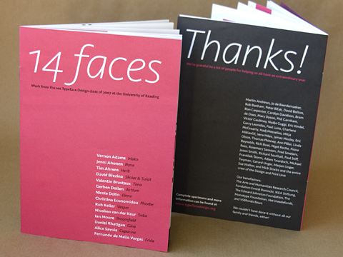
Another deadline finished! We turned in our typeface files last week, and I just turned in the specimen booklet this morning. Next it’s an essay on the development and production of the typefaces, and after that it’s on to my research dissertation. Needless to say, there’s no Summer vacation for me this year.
Even with the other deadlines looming, it’s an incredible feeling to have finally “finished” the typeface. (I use the quotes because there are still problems to address, and I’ll probably spend a lot more time fleshing out a real family of fonts instead of the two I have now.) This was an entirely new undertaking for me, and I wasn’t sure I could pull it off. I look forward to getting better as time goes by, but I’m pretty proud of what I’ve done so far, and pretty grateful to everyone who helped it come together.
Before I spend the next week or so writing about the typefaces themselves, I’d really like to take a moment to say something about their namesake — my old friend/boss/mentor/inspiration Gina Brandt-Fall.
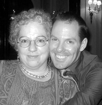 Gina was an extraordinary woman who passed away in April 2001. Although she had been having an ugly, all-out battle with breast cancer for the previous two years, and knew her days were running out, I don’t think she was prepared for the sudden liver failure that claimed her in the end. I know I wasn’t. Gina, who I worked with for years, moved to California a few months prior, planning to start a new life in the wake of the cancer that she fought so aggressively. Her doctors discovered more cancer, though, burrowed further into her chest and lungs where they couldn’t get to it without major surgery that would have left Gina in excruciating pain for her last months. She opted for more chemotherapy instead, so she could have a few good weeks out of each of those last months — time to enjoy the sun, to be with her friends, to be able to pull together the fragments of the wonderful book she had been working on for so long. Even during her illness, Gina was incredibly vibrant, emotionally and intellectually engaged, empathic, thoughtful, insightful. Gone, just like that.
Gina and I took to one another immediately went I first interviewed with her for some freelance typesetting work in about 1996 or so. From the very first day, I was taken by her enthusiasm, humor, and quick mind as our conversation went from typesetting to typography to books to literature to life, and that spark never faded during all the years we worked side-by-side. I learned an incredible amount of new things from her, and I was actively encouraged by her to take those new ideas to new levels, and to always leave myself the energy to do what I love. And I laughed with her. Oh my, how we laughed when we were together! Even when we started out bitching and moaning about the workplace and the larger world, we were able to put things in perspective and mix joy in with the righteous indignation. She was not only a friend and a colleague and a teacher, but also an inspiration. That’s cliché, I know, but true: I aspire to her level of passionate interest in life.
Once I knew I was going to set aside life as I knew it to follow a dream, it seemed like the perfect tribute to Gina to dedicate a part of that dream to her. Not only was she the one who made me learn how to typeset math (or rather, she was the one who made me realize how fascinating it could be, and who encouraged me to keep learning as much as I could), but she was the one who showed me that it’s good to hang onto your dreams and jump at them when you have the chance.