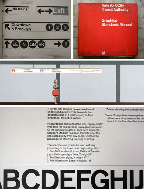
A lot of people who’ve met me — who quickly learn in the course of chit-chat that I’m a type nut and that I’m from New York — will often say something about the use of Helvetica in the New York City subway system, and how much they like it. The thing is, I remember reading years and years ago that Helvetica wasn’t the original spec for the (mostly) Vignelli redesign in the late 60s, but I never got around to digging out any of the details to remind myself what the story was. Thankfully, Paul Shaw has written up a fascinating and thorough article about the history of the subway signage and its evolution over the years, so I can now brush up on the details or refer others to a better source. [Thanks, Norm!]
Category: ultratypographic
Local Colo(u)r
Over the summer I moved from my lovely flat in quiet Reading and moved into a little sliver of a neighborhood at the far end of Tooting in South London. Living in London is decidedly more interesting, but I can’t really afford to live in any of the really interesting bits. My little attic flat has its charms, but you might charitably describe it and the rest of the building as a shithole. The neighborhood — down in the outer rim of Zone 3 — itself is pretty dreary.
But there’s a perk! There’s a small stretch of the road I’m on that has never succumbed to the usual curse of low-income neighborhoods: cheap, bad, plastic or vinyl signage made with badly spaced, boring fonts. Somehow, the shop fronts on this one little block have either hung in there for long enough, or been out of business long enough, that they’ve still got these awesomely charming, quirky, hand-lettered signs.
Not lettering, really, but I love these old signs scattered around:

30 Mitcham Lane has as awful Helvetica-filled sign, but managed to hang onto these groovy numbers on their door:

I love the spring in these letters at no. 94:

They couldn’t quite had the past at no. 95:

My personal fave is this unicase approach at no. 97:

I l wish I could see what they covered up at no. 114:

This is just an old sign on the corner, but I adore it:

House in the house
I’m a big fan of House Industries, not just as designers and fellow pop-culture enthusiasts, but also as a bunch of really good-natured, fun, talented guys. It pains me regularly that they release all these zesty, beautifully crafted typefaces that I rarely get a chance to use. Luckily, they also make the best schwag in the business, effectively building something of a lifestyle brand based around their typefaces. This Fast Company article about them is a nice little profile, in case you don’t know much about who they are. (And shame on you if you don’t.)
A font walks into a bar
Believe it or not, corny jokes about typefaces are the kind of thing that are usually too geeky even for me. Nevertheless, I feel like I ought to just post something about this now before every other person in the universe starts sending me links to it, like they did with the font conference video. (I appreciate the thought, by the way. Don’t get me wrong.) So here you go: Typographunnies. [Thanks, Brad.]
These go to 11
Rejoice! The MA Type Design program at Reading has just unleashed a new batch of gorgeous, freshly minted typefaces! Behold!
I’ve had a real blast getting to know these guys during the past year, but since I wasn’t actually there in the studio with them all year I only had the barest notion of where everyone was going with their designs, and then I had already moved to London by the time everyone began the final frenzy of completing their fonts. It’s so exciting to see what great types they finally produced. Congratulations, gang!
Typography for Lawyers
Once you start thinking about typography, you begin to realize that it affects everyone to some degree or another: it’s not just the preoccupation of the font nerds in your life. (Just ask any of the many people I’ve turned to the Dark Side over the years. Once you start thinking about kerning there’s no return.) Typography is an integral part of communicating, and people often need to communicate. It’s nice, then, when people who get it take the time to explain its relevance in their own field. Case in point: Typography for Lawyers, written by lawyer and former type designer Matthew Butterick.
The few comments on the site so far are hilariously detail-oriented and pedantic, which you might expect from a project aimed at lawyers and typographers.
Badger
If you think you would enjoy an extremely cute but sad tale of a lonely badger living in a flat in South London (and really, how could you not enjoy it?), then you should buy a copy of Howard Hardiman‘s Badger. It’s really charming, I promise.
[Shameless self-promotional alert: I helped Howard put the final product together, since I’m such a fan of the badger. The book also features a little bit of a little typeface I designed.]
And people think I’m fussy?
I giggled at this passage that I just encountered in The Joe Orton Diaries:
Peter Willes rang up. ‘What do you mean by sending me such an atrocious script?’ he said. ‘What?’ I said. ‘All the “O’s” are out of line. I can’t read a script like that. Haven’t you another copy? ‘No,’ I said. “I’ll have to get it retyped,’ he said. ‘I can’t let the actors see a script in that state.’ ‘Did you read the script?’ I said. “A little.’ ‘What did you think of it?’ ‘I thought it rather dated,’ he said, ‘though that may have been the effect of the “O’s”.’
See? Good typography makes a difference.
ΩÖØ
Do you like the idea of using crazy characters in your blog posts or online profile headlines, but just can’t remember all those nutty character entities? Fret no more! This website is a tiny little thing that lets you copy and paste to your heart’s content. Of course, after all the time I’ve spent dealing with Unicode charts, I actually think they could have been a little more ambitious. How useful is it to include the interrobang (‽) but not mu/micro (μ) or the eth (ð)? We love the eth!
Read about Reading
If you can find yourself a copy of the current issue of Baseline (number 55, Summer 2008) you’ll find a nice little profile of the stuff that goes on at the Typography Department at Reading.
[Baseline‘s website doesn’t seem to do permalinks, so here’s the excerpt. Find the article, though: it has more stuff and pretty pictures, too.]
The department has the longest established record of any university devoted to research into typography and information design. The staff summarise their interests as ‘design for reading’. Approximately fifty percent of the department’s activity is devoted to research and post-graduate work, so it is not surprising therefore that it has been awarded the top rating for research quality on two occasions (1992 and 2001) in the British universities’ Research Assessment Exercise.
The range of taught masters courses includes MAs in Book Design (course tutor Paul Luna); Information Design (course tutors Paul Stiff and Rob Waller); and Typeface Design (course tutor Gerry Leonidas); and an MA (Res) in Typography and Graphic Communication (course tutor Mary Dyson).
Reading is unique in having rich collections of historic lettering, printing and design. These include the archive of the Otto and Marie Neurath Isotype Collection; a collection of more than 20,000 items of printed ephemera; and several archives of twentieth century designers.
Research centres
The department also has two research centres. The Centre for Ephemera Studies is based upon the collection of printed ephemera which reflect everyday life in the past. More recently, Rob Waller has joined the department after twenty years in practice, and established the Simplification Centre. The primary aim of this is to conduct research on information design and make this accessible to organisations which communicate with the public on complex matters. One of the department’s impressive range of recent and currently funded research projects are described below (see issue 55 for the full article).


