The Art of Working Together

I wanted to draw special attention to Jonathan Hoefler‘s remarks about collaborative typeface design from this Typophile thread, because they are wise, and they give credit where it’s due, and because they paint such a clear picture of the kinds of things I love so much about getting to team up with smart, creative people on cool projects whenever I can. (Hi, Ian! Hi, Rathna! Hi, Matt!)

Continue reading “The Art of Working Together”

The Land of Oz

I’ve been gathering and sorting images for a talk I’m giving tomorrow at Central St Martins on type design, and how looking at “bad” typefaces and awkward signage and eccentric hand-lettering can teach a type designer a lot. The basic premise is that there are good lessons in there, as long as you can stop fussing about whether it’s good and take the time to time to consider what works, despite other problems with taste or style or function.

As I pull stuff together, I’ve found myself teetering on the edge of just doing an entire piece about Cooper Black and Cooper Black Italic, a pair of my all-time favorite typefaces.

It can be really difficult to appreciate how beautiful Oz Cooper’s original designs are, since these types have been so watered down, abused, and over-used for so long. If you go back to the source, you see that these are rich, warm, lively letters. Maybe not perfect for every occasion, but big and bold and inviting. It should be no surprise that they were widely used and eventually widely licensed or pirated for a variety of situations and fabrication methods.

The trouble seems to come from the quality of reproduction in the may ways of adapting the design for signage, iron-on letters, labeling machines, etc. A lot of the subtlety of the outlines get lost in all this translation, and the spacing usually goes to shit, and then suddenly this friendly letter is just saying “FREE MUSTACHE RIDES” on someone’s shirt or advertising a 99¢ sale and all the charm is lost.

But it’s still there, just waiting to be used well. As much as I hate flying with EasyJet, for instance, I quite love all that orange and Cooper Black they use. And I still totally have a jones for iron-on Copper Black lettering, especially if it’s flocked.

I really should just do an Oz Cooper talk one of these days, I suppose, and just get all this out of my system once and for all.

Credit where it’s due

The Catcher in the Rye

As you may expect, there’s been a lot of press about J. D. Salinger since he passed away last week, but the negligence of some of it has irked me. The covers of Salinger’s books have always been iconic and distinctive, due in no small part to their simplicity and austere type-only designs, as demanded by the man himself.

It’s nice to see that the brief slideshow of the new covers at The Guardian discusses the typography and gives due credit to its designer, but then why does this longer piece about the covers in The Times make a fleeting mention of an unnamed “graphic artist” without clarifying that the type was a custom job made by by the absurdly talented designer, letterer, an all-around nice guy Seb Lester? It’s annoying enough that type designers rarely get proper credit for their contributions, but when the the whole story in about the typography? Tsk, tsk.

But nevertheless, props to Seb on a job well done! (And to The Guardian for giving some credit, at least.)

Commercial Commercial

I was all excited a while back about the impending availability of the Guardian type family, but its creators didn’t seem to do anything public about it for a while. Well, the wait is finally over: Paul Barnes and Christian Schwartz have finally launched a website for Commercial Type, and it’s just lovely. The typefaces themselves are delightful, but I’m particularly charmed by their EULA notes, which are an elegant solution to something that I’ve been thinking about lately.

The booming interest in bad writing

I don’t expect a lot of quality from cheap journalism in low-end newspapers, but when the subject is near and dear to me, it almost causes me physical pain to know that someone got paid to look through Google results for an hour or so and then write up a report that reads like the work of a 14-year-old slacker.

Continue reading “The booming interest in bad writing”

Non-Latin domain names coming soon

Wow, this’ll be a huge change. ICANN is getting ready to allow internationalized domain names — web-site domain names that use non-Latin character encodings instead of the regular western alphabet.

Internationalized Domain Names (IDNs) are domain names represented by local language characters. Such domain names could contain letters or characters from non-ASCII scripts (for example, Arabic or Chinese). Many efforts are ongoing in the Internet community to make domain names available in character sets other than ASCII.

These “internationalized domain name” (IDN) efforts were the subject of a 25 September 2000 resolution by the ICANN Board of Directors, which recognized “that it is important that the Internet evolve to be more accessible to those who do not use the ASCII character set,” and also stressed that “the internationalization of the Internet’s domain name system must be accomplished through standards that are open, non-proprietary, and fully compatible with the Internet’s existing end-to-end model and that preserve globally unique naming in a universally resolvable public name space.”

You can read this BBC story for the more easily digested version:

The internet is on the brink of the “biggest change” to its working “since it was invented 40 years ago”, the net regulator Icann has said.

The body said it that it was finalising plans to introduce web addresses using non-Latin characters.

The proposal — initially approved in 2008 — would allow domain names written in Asian, Arabic or other scripts.

My head is swimming with questions. A lot of them are about the specifics of getting this to work, considering how complex it still is to handle a lot of non-Latin writing systems with current fonts and technologies. There’s still a big divide between encoding the characters and representing them visually with a lot of scripts, and still only limited solutions for handling that. With Indic scripts, to pick an example I’ve been rather deeply immersed in lately, the way the Unicode-based characters are typed in is just the first step: rendering names or words in a way that makes linguistic sense requires a little extra software processing, and some carefully built fonts. So are the address bars in web browsers going to handle OpenType substitutions to make that happen? Or is there going to be a different encoding solution that’s a little more WYSIWYG when it comes to typing in non-Latin addresses? I’m guessing a lot of those issues have come up in the ICAAN proceedings, so I suppose it’s time to wade through them and see what the deal is.

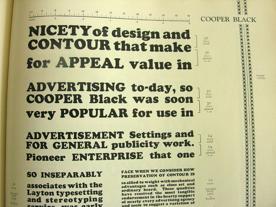
In one sense, of course, this is brilliant. Domain names are part of our online identities and brands these days, and people should be able to use their own languages and writing systems to identify themselves online. It’s only fair, and it shows respect for the huge sectors of the world that don’t use our alphabet everyday. Hopefully this will also encourage more technical support — and type design,if we’re starting to think about web fonts, too — for non-Latin scripts. (Trust me, it’s a typographic desert out there in the non-Latin world.)

But there will also be a certain amount of balkanization that’s likely to come of it, on top of just the language barrier. Linking to non-Latin domain names will require extra know-how about how to key in those names. It will require some understanding of encoding versus representation, writing direction, and even sensitivity to the differences betwen one character and another in an unfamiliar alphabet. Again, these are things that would all be good for people to learn, but we can’t even get people to use nice, clean HTML all the time. It would be a shame if the extra complexity keeps people from bothering to connect to the internationalized portion of the web. I suppose some sort of transliteration layer will spring up, but again…so many questions!

The New Rail Alphabet

Available at last! Margaret Calvert and Henrik Kubel have released the New Rail Alphabet, their gorgeous revival of Calvert’s classic design for British hospitals and transport networks in the 60s. As you can see, it’s like a Helvetica, but with a touch more warmth to it.

There was a feature about the design in the latest issue of Eye magazine, in which the new typeface was called Britanica, but there were some lawyer-y concerns, and they finally decided to go with something a bit closer to the original name.