In 2007, I had just turned in my MA dissertation at Reading, and spent a few weeks volunteering at St. Bride to help them shift books and boxes around the building so they could renovate. One day, James Mosley and his wife dropped by, because the library had asked James to finally clean out a storage closet he had started using when he had been the librarian. Among the impressive collections of Penguin paperbacks and assorted magazines, he had also saved many of his childhood toys and school notebooks. (He was struggling with maths as a youngster!)
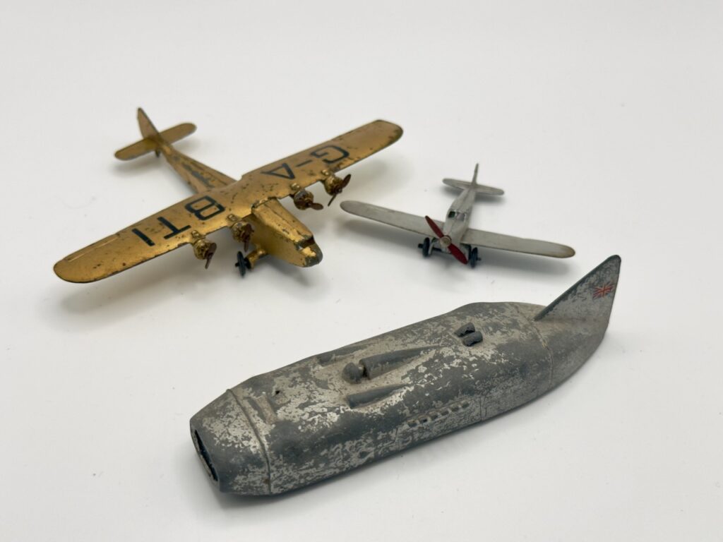
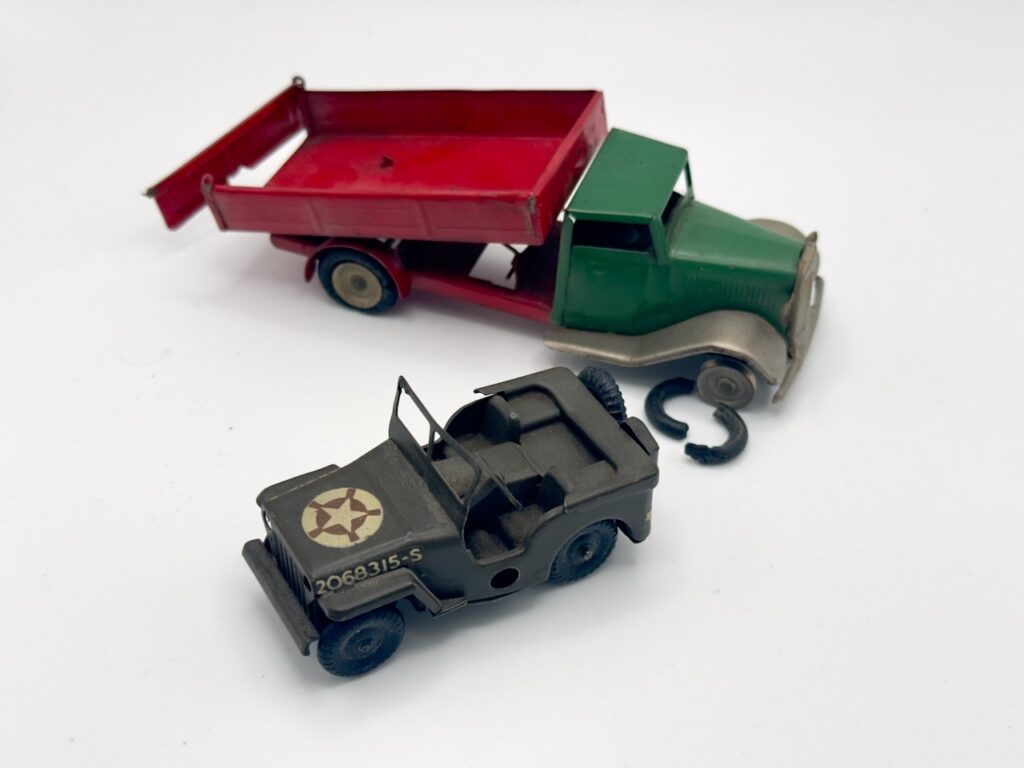
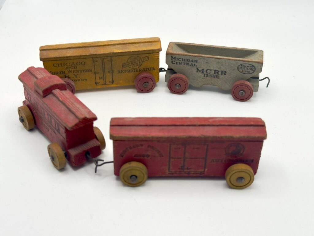
He very kindly let me keep these sweet tin and wood toys of his, which were probably from around 1940. He also gave me a random matrix drawer from the Figgins foundry that had been sitting in a pile of odds and ends, and encouraged me to sit in on his lectures again as long as I was still living in Reading with time on my hands. I have to confess that his rich curriculum of type history was much easier to process the second time around, once I’d already had time to digest what he’d shared with us during the year of MA. James was generous with his knowledge and insights, but it was this small act of generosity with his personal nostalgia that still sits with me all these years later. I thank him for all of it.