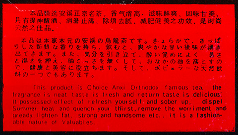
To date, this is still the single worst — and the most delightful — butchered translation I have ever seen. From a package of Jian Fei Cha tea purchased at Shanghai No. 1 Department Store.
Category: ultrascrapbook
Beads and Blankets
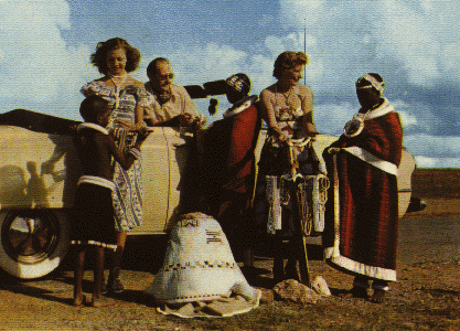
This is one of the few pictures from a South African travel brochure (circa approximately 1960) that actually shows some of the native population. No, this was not an early sign of the fall of apartheid, though. I quote:
Travelling comfortably along the highways and byways you will see these picturesque native people. When passing through the Native Reserves, remember to pause at the local trading store. It is the natural meeting place and you should meet many colourful “types”.
Callico Calliope!
Boston. July 4. Summer of 1990. These flyers were littered all over Boston’s Back Bay neighborhood. Mark, Ed, Joe, and Dave were walking around with me when we discovered this impassioned plea for the return of this lost kitty. Passionate or not, we still generated a full three-hour assortment of jokes trying to figure out exactly what the hell the deal was with the cat and the tubes. “It’s the kitty calliope!” “It’s the cat who can be played like a bagpipe!” “The tubes must be for draining precious brain fluid so that the cat doesn’t take over the house once and for all!” I can barely remember all the material, but the image is so potent, it can still reduce any of us to tears of laughter.
Oooh, Typing – It’s Dreamy!
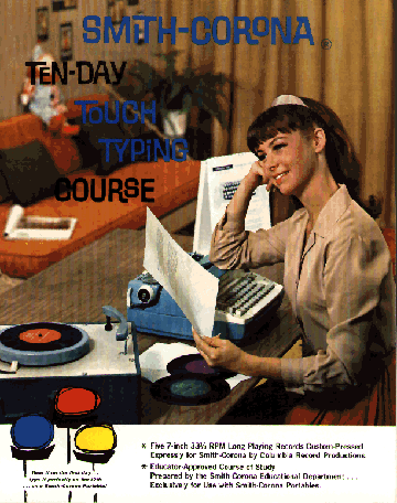
This just turned up during my weekly visit to the local thrift store. Another beautiful example of design from an age of truly wonderful high-spirited typography. The package itself, though, is an anachronistic dream — a touch-typing course on a set of 45s for a Smith-Corona electric typewriter. Perfect shape, too.
Le Car Cards
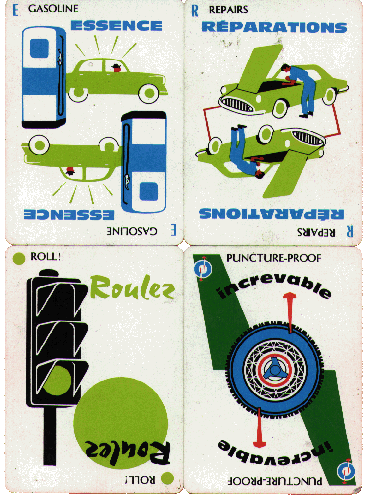
My roommate Mark came home from the weekly visit to the neighborhood thrift store with a set of Milles Bournes cards that Parker Brothers put out some time in the sixties. (Milles Bournes is a card game where you rack up points by metaphorically travelling through the French countryside.) I instantly fell in love with the design of these cards — the style of illustration, the use of type, all of it. It is such an elegant solution — a breezy sense of fun was created without neon, dumb jokes, product placement, or low-brow caricature. Those were the days.
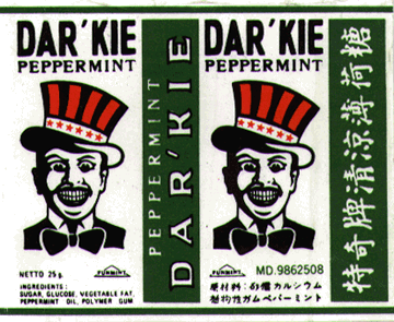
Fresh — Minty Fresh!
I purchased these mints in the Shanghai airport. I went into the lounge to try and get rid of some loose change when my jaw hit the floor upon seeing a box full of these mints. Having grown up in an era (and an area) where all the lawn jockeys were repainted to look like clowns or white people, it was shocking to see that the “minstrel” was still considered a novel advertising gimmick in some part of the world. Despite the addition of the accent to the name (apparently a nod to the civil rights movement), the attempt to cash in on the same image that Al Jolson used for a while seems obvious.
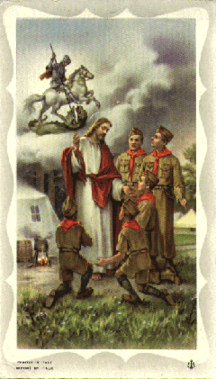
A Boy’s Best Friend
My friend Eileen, known for her eagle eye when it comes to the subtleties of Americana, found this small prayer card for me at a religious statue and souvenir shop in downtown Boston. She instantly knew that I would see the wonderful inherent wackiness of this combination of Jesus, Boy Scouts, and a vision of St. George slaying the dragon. You figure out the semiotics.
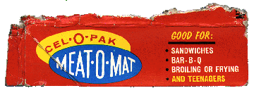
Broiling or Frying Teenagers?
I found this little gem on the roof of my building one day, apparently a leftover from my landlord’s Memorial Day barbecue. I’m so enamored of this mysterious boxtop that I don’t even really want to know exactly what it is. I’m afraid that the brutal truth would only convince me that Meat-O-Mat really isn’t good for teenagers.