
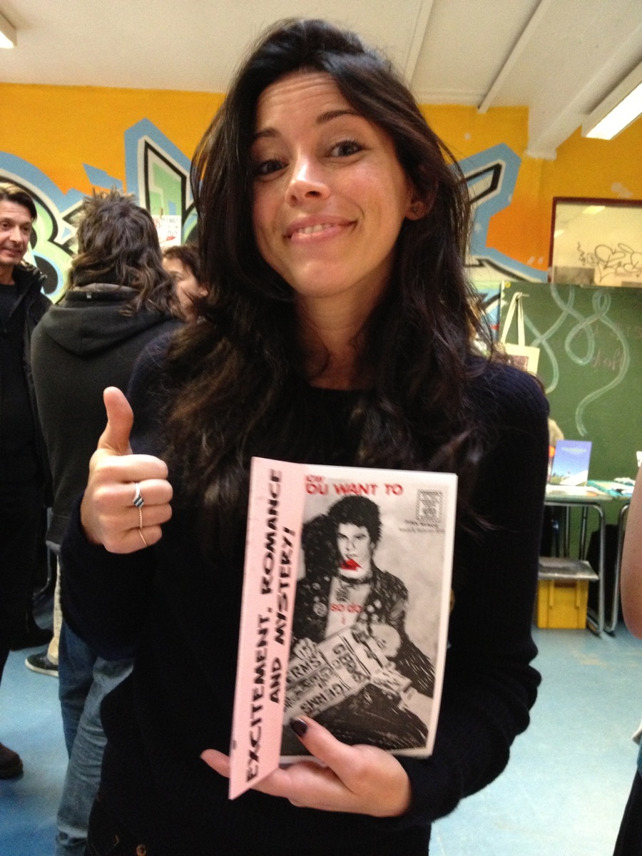
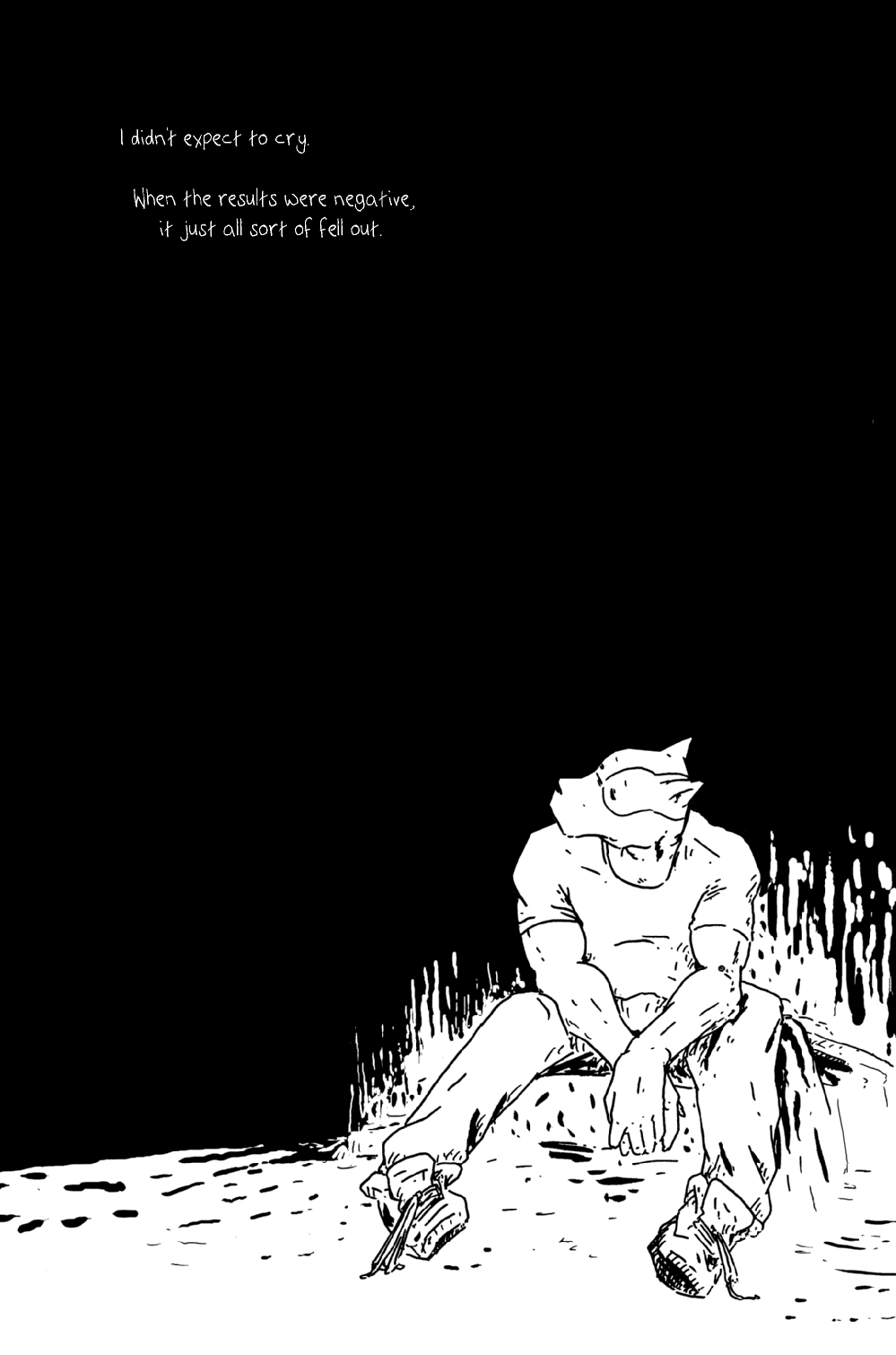
My good friend Sina: this is the photo of him that was made part of the big montage/diary comic of his featured in the new Pink Mini — Clothes Make the ’Mo — available here.

Ragtag grab-bag

My good friend Sina: this is the photo of him that was made part of the big montage/diary comic of his featured in the new Pink Mini — Clothes Make the ’Mo — available here.
Just a quickie: a link to a nice little article about zines written by Kate Nancy, who I met when she stopped by the Pink Mince stall at Zinefest Berlin last November. The article includes a couple of quotes:
“For me, the latest explosion of zines is very much about a return to paper, a reaction to years of content and interaction only happening online,” says Rhatigan, who published a zine called Rumpus Room in the early ‘90s and maintained activity in the zine community for more than a decade. He describes a wave of zine-makers – wearied by the costs of mailing and photocopying – defecting to online publishing en mass. “But a decade later the Internet was clearly figured out by regular media, so it doesn’t surprise me that people react against that once again to find ways of making things they care about tangible and more permanent, more special.”
Why yes, as a matter of fact I will be spending all of February back in New York City, on IMPORTANT WORK BUSINESS. That’s a much better way to return for a spell than than two years ago, when I had to flee England because of my expired work visa. Going back with a purpose and a fancy play to stay for a month will be much more invigorating.
[Image via Cam Chuck]

I forgot to mention this wonderful little review from Howard that really made my bitter little heart melt a little and swell with pride. It’s always nice feel appreciated by people who you think are intimidatingly talented.
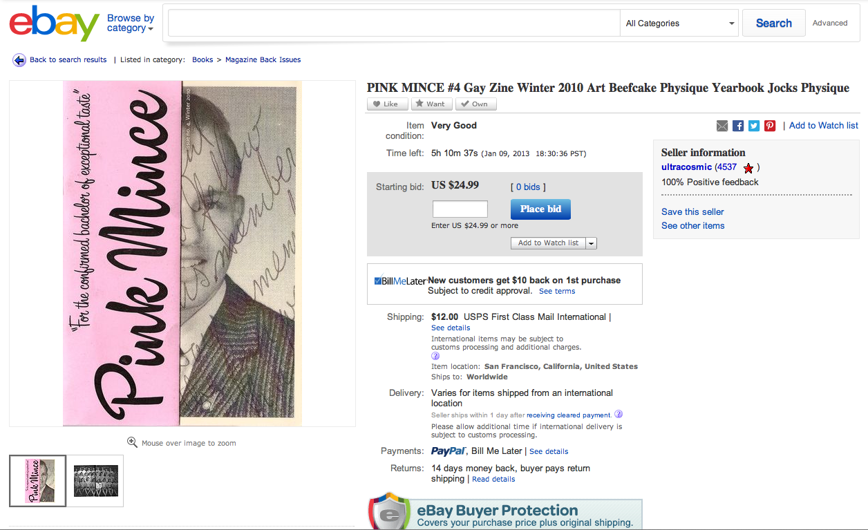
This guy actually sells a lot of amazing zines, old physique mags, and other material of interest, but I’ve always been a little frustrated by his prices. (I have given in and bought stuff from him in the past, and always been a happy customer, mind you.) In this case, though, I feel compelled to point out that Pink Mince #4 is still in print and you can get it right from the source for just a fiver.
Still I love the mini-review embedded in the description:
By using vintage yearbook pictures of guys and athletes mixed with classic physique photography, this issue of Pink Mince creates the homoerotic school you wished you were part of in your horny fantasies.
This is the stuff that will be collectible in the future, limited release, stylish, classy, hot. Limited run.
AMAZING!!
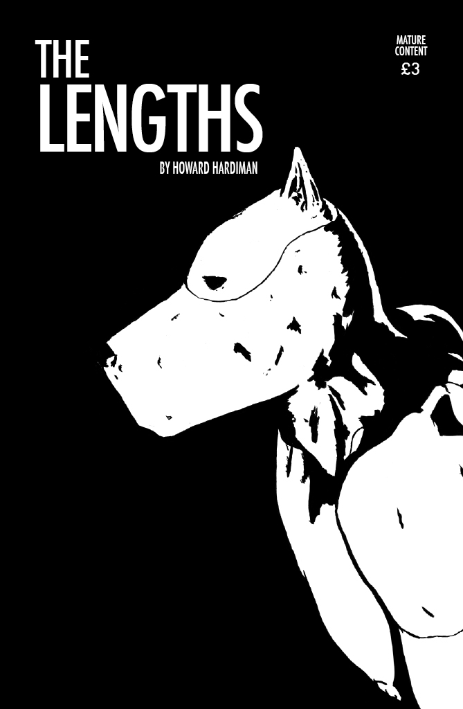
Now that he has completed his ambitious, tricky, and emotional comic series The Lengths, I’m really pleased to see my pal Howard Hardiman get recognition for the achievement. Check out, for instance, this majorly fantastic review from The New Statesman (an excerpt):
The Lengths is an important work. It covers topics largely passed over even in prose literature, let alone the diversity-challenged world of comics. In giving a voice to the voiceless, Hardiman deserves praise — and behind the anthropology, The Lengths is a love story sweetly told.
The best way to check out the series for yourself, of course, is to support the artist and buy it here.
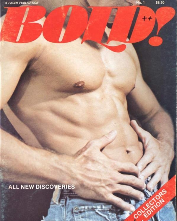
Ever since I first found this cover to a gentleman’s magazine on Tumblr, I’ve been perplexed. First, let me say that I think that is a brilliant piece of graphic design, regardless of what you may think about the subject matter. The composition is superb, there is a spare use of only the most essential elements, and the typography is exquisite.
It’s the type that has been a captivating mystery. Obviously, that title is set with Stilla, François Boltana’s sublime titling face from 1973. But I had never seen that swash L in any version of the font before. Letter-by-letter, Stilla is gorgeous. However, all those exuberant shapes often fit together very awkwardly, so it’s a difficult face to use, especially in all caps. An L that drops below the baseline like that is just what would be needed to pull off a word like BOLD (as well as some very careful letter spacing). I wondered if that version of the L had been drawn separately and pasted in alongside the type, but that really seemed like overkill for a stroke mag.
I should have guessed that my trusty 1989 Letraset catalogue would hold the answer:
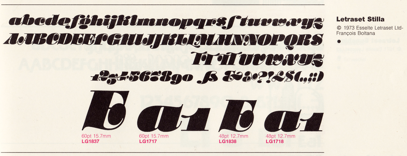
There it is. The very swash L I’d been wondering about, as well as a couple of TT ligatures to help out that tricky combination. I found a sheet of Letraset Stilla recently, but it was only the lowercase letters. It wasn’t until I was checking a detail of that sheet in the catalogue that I noticed the solution to the puzzle.
Things like this are all too common, unfortunately. It was perfectly feasible — and often invaluable — to have alternate characters with Letraset, a product that required letters to be chosen and applied one at a time, with care. Those extra touches are the sort of thing were rarely carried into the early days of PostScript fonts, with their meagre limit of 256 characters (many of which were reserved by generic symbols). Unless fonts proved to have enduring popularity, those lost elements tend to be forgotten. Maybe, if I have a few spare hours at hand, I can sneak the extra characters back into Stilla. Hmmmm, maybe that’s exactly what I ought to do…
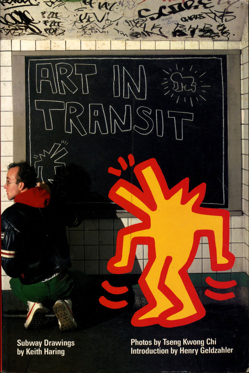
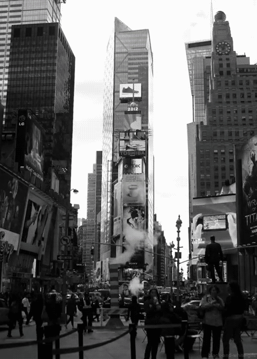
I remember stumbling across this book in the New Dorp branch of the library on Staten Island when I was young. Looking at the publication date now — August 1984 — I realize I must have seen it just when it came out, right before I started my freshman year of high school. It had to be at least that early, because I distinctly remember being on the lookout for Keith Haring‘s subway drawings all through high school, when I commuted to the Upper East Side every day. Sure enough, I saw them show up a few times at East 86th Street a couple of times, and occasionally in other stations. I had no clue that Haring was already a name in the art world, so these always felt like secret treasures to me, connecting them only to this little book I found in a local library when I was looking for stuff about drawing cartoons.
This little book — and Haring himself — made an impression for all kinds of reasons, not all of which I could really pinpoint when I was just turning fourteen. It was the first time I thought to think of street art as real art, or vice versa. It was art that was fun, an idea I was starting to wake up to. I loved the drawings shown — so much! — and I also loved that they were quick, forbidden, and took advantage of really specific opportunities:
The advertisements that fill every subway platform are changed periodically. When there aren’t enough new ads, a black paper panel is substituted. I remember noticing a panel in the Times Square station and immediately going aboveground and buying chalk. After the first drawing, things just fell into place.
That seemed so cool to me when I was just a kid who drew comic books but was getting ready to jump into the wider world around me. Also, Keith Haring was cute — so cute! — in a goofy, nerdy way that was great; not like a model or a TV star but a real way. Although I couldn’t make any sense of that reaction at the time it certainly fit a pattern that would eventually be clear.

A preview section of the interview I gave to Eye magazine for their Monotype special edition, number 84:
Since I started working full-time at Monotype, and especially since I took over as UK Type Director last Spring, work has consumed a larger and larger part of my life. This would be bad if I didn’t love this job more than any other I’ve ever had, and if I didn’t feel like I was contributing to what happens at Monotype. My attempts to keep up with this site, always a tricky endeavor at the best of times, may have fallen slack, but I’ve hardly been slacking off elsewhere.
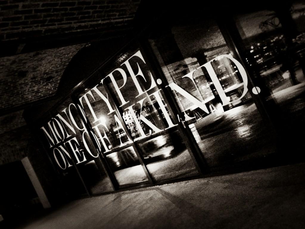
The last two weeks have been the culmination of a frantic couple of months of preparation for a giant exhibition of work from Monotype’s past and its present, and hopefully a look at its future. Pencil to Pixel, masterminded by my extraordinarily talented colleague James Fooks-Bale, designed by SEA, partially curated (and with guided tours) by me, and pulled off thanks to the efforts of many more, was huge success by all measures, and hopefully one of many more endeavors to come.