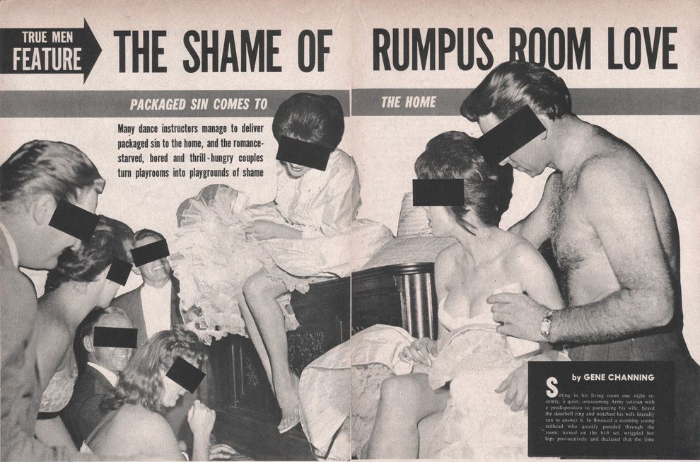
Shame? Shame! There is no shame to be had for loving in the rumpus room. Or for loving Rumpus Room, really. (Rumpus Room was the name of my zine from the early ’90s, as well as the name of my first web domain, so this amuses me a whole lot.)
Ragtag grab-bag

Shame? Shame! There is no shame to be had for loving in the rumpus room. Or for loving Rumpus Room, really. (Rumpus Room was the name of my zine from the early ’90s, as well as the name of my first web domain, so this amuses me a whole lot.)

In this flyer I made for my friend Lynn’s 16th birthday party, we can see that I was playing aorund with this punky, pre-digital, cut-n-paste aesthetic ages ago. This was 1988 when I was 17, just about to head off to college. Lynn and I both straddled the edge of Staten Island’s suburban-y punk scene, so this wasn’t entirely us being poseurs. You can definitely see the early seeds of the Punk Mince art direction.
Media: felt tip pen, Letraset, Letratone, Apple IIe printouts, cut-n-pasted catalogue photos, and the Xerox machine at my part-time receptionist job at a Catholic retreat house
Me! Just a quick email Q&A for Design Week that I did recently:
Monotype type director Dan Rhatigan on a changing typographic industry, the perils of a second degree and the importance of experimentation.

[Photo by the magnificent GUAzine]
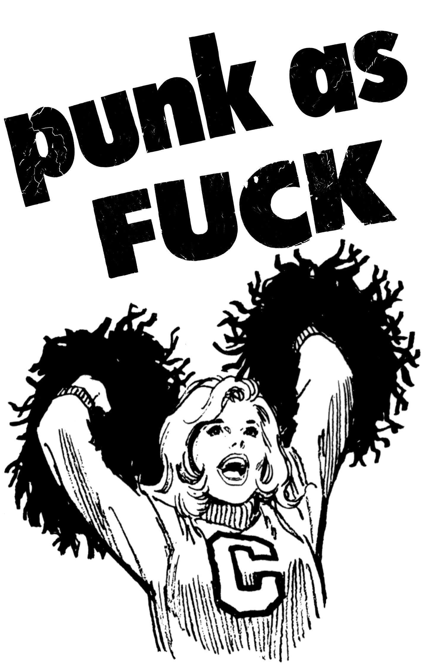
An unused graphic from Pink Mince #9 — Punk Mince. The cheerleader is shamelessly recycled from artwork I first prepared for a class project when I was in grad school: a poster for an imaginary lecture by Art Chantry. The original image was from some clip-art I salvaged when I was designing my college yearbook in in 1991.

I generally don’t talk about Pink Mince when I’m doing things related to my day job, but I threw in a handful of visual references to accompany an interview in the latest issue of 8 Faces magazine. (If you like or love typography, then you really should check out 8 Faces.)
You can order 8 Faces here. And, of course, you can order Pink Mince here. You can also buy that t-shirt (and others) at the Pink Mince Zazzle shop.


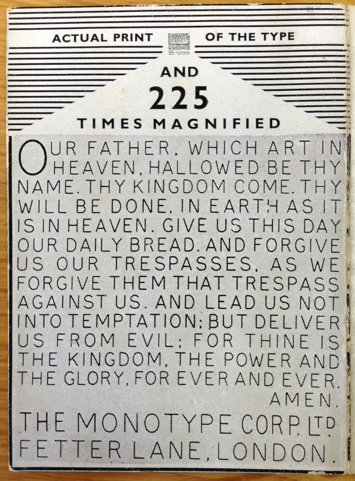
An old foundry trick for showing off the precision of punch-cutting and typecasting abilities is to make something at a breathtakingly small size. This Typophile discussion about Roger Excoffon’s beautiful, bonkers typeface Calypso reminded me to dig out Monotype’s own example of punch-cutting prowess: the Lord’s Prayer on a 12-point square piece of type:
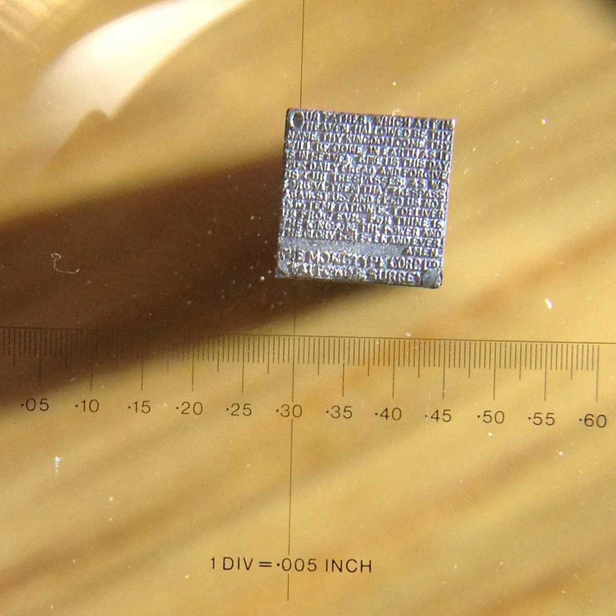
According tot he accompanying leaflet, each letter measures .008 inch from top to bottom. Monotype’s manufacturing methods were famously precise, holding tolerances down to .0001 inch. Those tolerances at every stage are part of the showmanship here. Producing a piece of type with such fine detail is the last stage of a process that starts with a 10-inch drawing that is reduced to a 4-inch copper pattern that is reduced to a full-size steel punch that is struck into a brass matrix that is used to cast the lead type. And that’s just the bare-bones explanation of what’s involved.
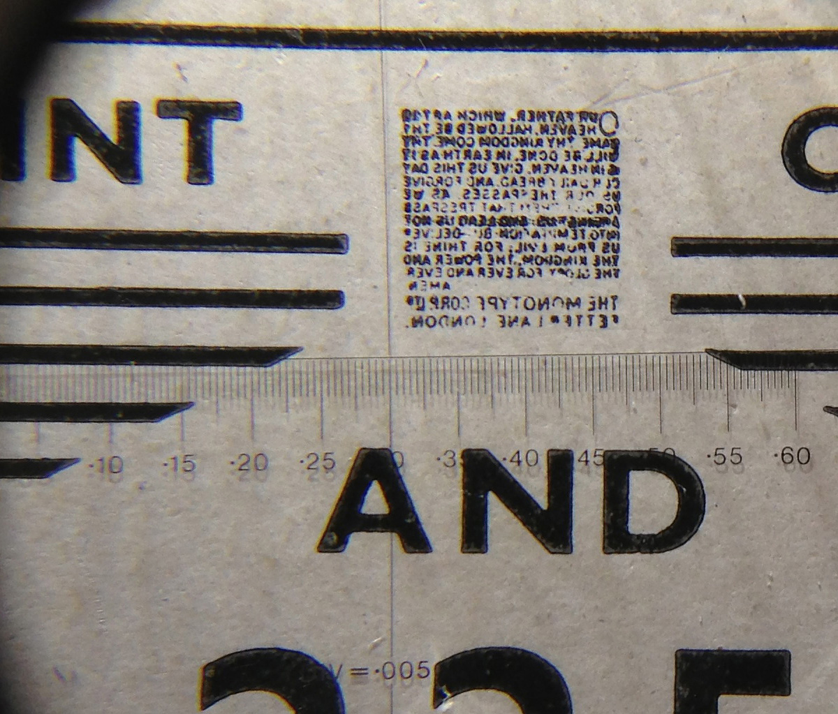
A sharp eye will notice that the text on the face of the piece of type is right-reading, while a typical piece of type will be in reverse so that it prints properly. This small piece of lead was meant to be seen through a magnifying glass, a bit of showing off — not for printing. If you look at a printed sample through the same magnifier, you can see that printing the type was much a much sloppier affair than cutting or casting it:


Catching up on Pink Mince orders and back issue production today. Is your collection complete yet?
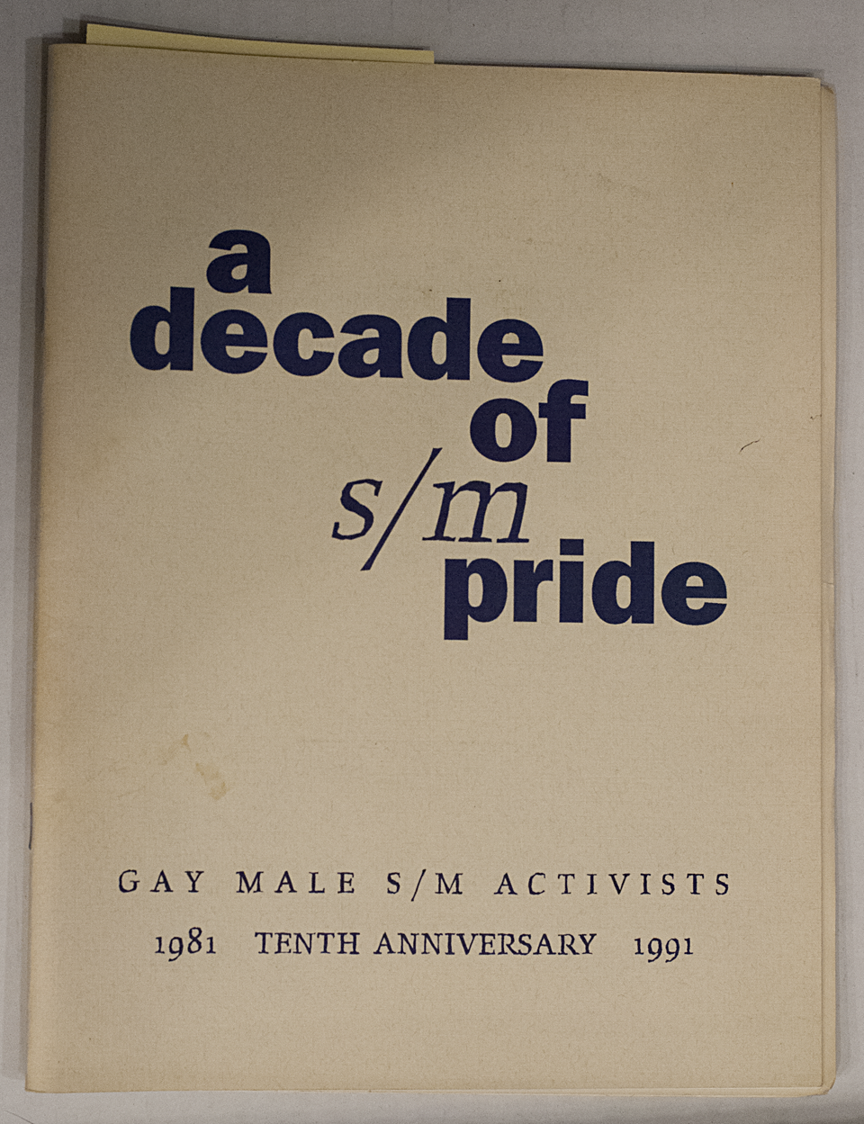
There I was, happily doing some research at the Center here in New York, digging through the Donald Mashburn collection, when I had a nerdgasm. I was looking through an archive of flyers for gay nightclubs and sex clubs, with a fair amount of porn catalogues in the mix, but it’s safe to say that I’m pretty jaded about adult material at this point. I was trying to pick out things from the ’70s or ’80s that had a certain graphic sensibility about them, with a vague sense of collecting material for a future issue of Pink Mince.
But then I saw it.
I wrote a short little thing for Wired UK about the history of the Johnston Underground typeface. I was worried that I could only barely scratch the surface in 500 or so words, but people seem to enjoy it anyway:
Last week we celebrated 150 years of the London Underground, but 2013 also marks the centennial of its iconic typeface, first commissioned in 1913. Edward Johnston, a British calligrapher and lettering artist, was asked to create a typeface with “bold simplicity” that was truly modern yet rooted in tradition. Johnston’s design, completed in 1916, combined classical Roman proportions with humanist warmth. This mix of qualities, driven by Johnston’s approach to the written letterform, also influenced his student Eric Gill, who assisted with the design of the Underground typeface and developed some of its ideas in his own Gill Sans in the following decade.
“Underground” — later known as “Johnston” — was circulated as a lettering guide for sign-painters and also made into wood and metal type for posters, signs, and other publicity materials used throughout London’s transport network.
Johnston himself only drew one weight of the typeface. He based its weight and proportions on seven diamond-shaped strokes of a pen stacked in a row. This gesture even shows up in the typeface itself, with the characteristic diamond used as the tittle of the “i” and “j”. He felt so strongly about the weight of the design that when another student of his agreed to create an accompanying set of bold capitals, Johnston wouldn’t speak to him for decades afterward.
Johnston’s type became a distinctive feature of the Underground brand over the years, but by the late ’70s it was less practical to use the old wood and metal fonts. Inevitably, the brand was getting watered down as other typefaces were chosen for different uses around the system. In 1979, London Transport asked design agency Banks & Miles to modernise “Johnston” and prepare it for the typesetting systems of the day, such as the Linotron 202.
Eiichi Kono, a new designer at the agency, was asked to revise and revive the family. Not only did he redraw the proportions for better display and even out some of the inconsistent details of the original, but he also took on the challenge of adding two new weights and accompanying italics for the full set, giving the family much greater versatility. Some years later, this design was further refined and expanded by Monotype, with even greater support for different languages. Known now as “New Johnston”, the fonts are used exclusively by Transport for London today as its brand typeface.
Other versions are commercially available to the rest of us, each taking a different approach to adapting Johnston’s design.
P22 Type Foundry released its faithful, officially licensed version of Johnston’s original in 1997, also offering a number of lively graphic
elements such as ornaments and borders that draw on TfL’s rich visual history. P22 London Underground was later updated as P22 Underground Pro with many more weights and typographic features.
While P22 revived “Johnston” as a display typeface, designer Dave Farey was interested in refining the concept to work better for text in his 1999 design of “ITC Johnston”. His first iteration included three Roman weights that were redrawn and respaced with a freer hand, using the original as a starting point and a model. When adding italics
later, Farey looked back to Edward Johnston’s legacy as an influential teacher of calligraphy and writing, and he devised a more cursive set of forms that drew on a very English tradition of lettering.
So happy birthday to the Underground and its namesake typeface, in all its flavours.