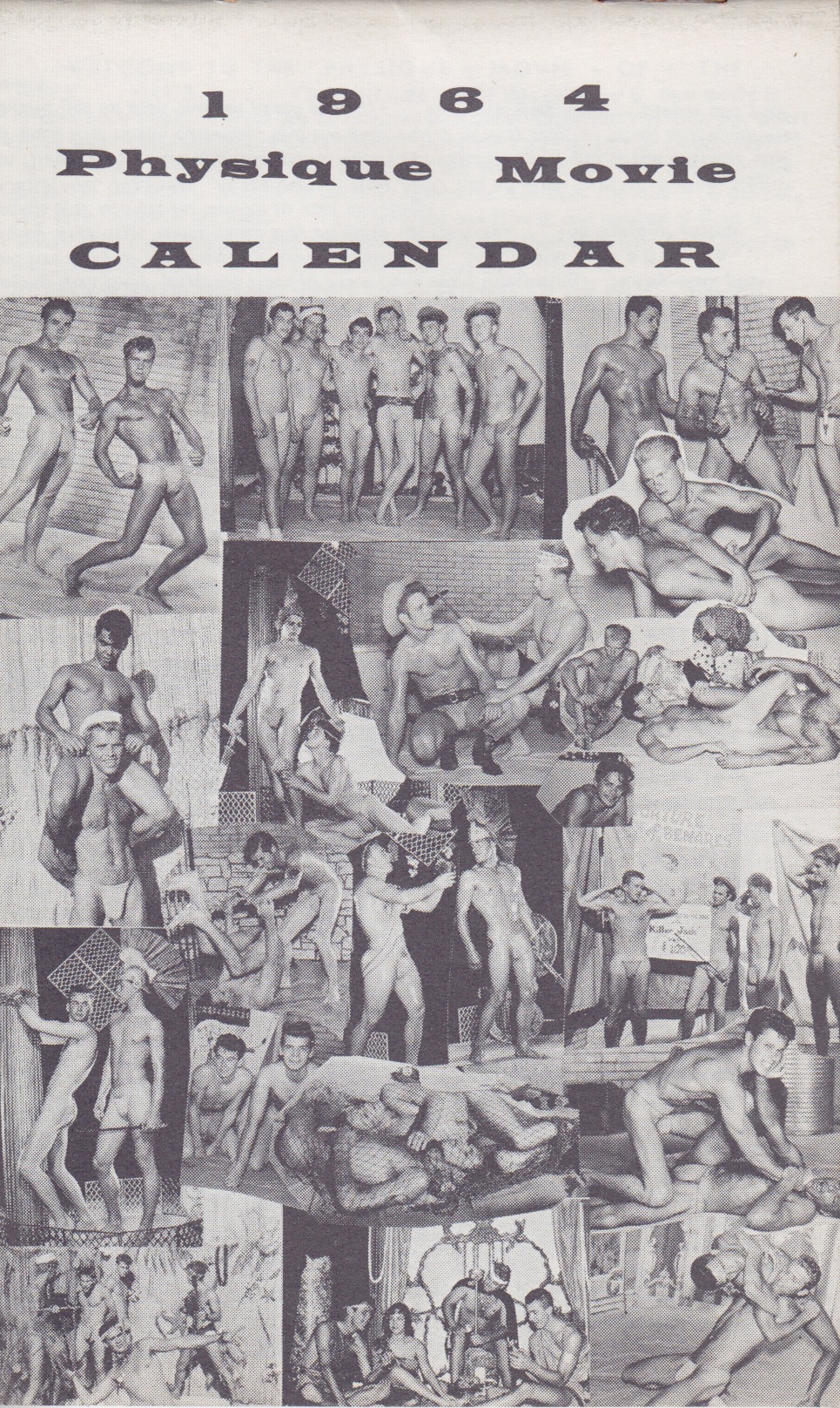
OMG AMG! I just noticed that the days of the week in 2014 are going to line up with those in my 1964 Athletic Model Guild calendar. I’m already a big fan of Bob Mizer‘s work, so expect to see more of this this throughout the year!
Ragtag grab-bag

OMG AMG! I just noticed that the days of the week in 2014 are going to line up with those in my 1964 Athletic Model Guild calendar. I’m already a big fan of Bob Mizer‘s work, so expect to see more of this this throughout the year!
It’s pretty common to hear people shake an angry fist at the close of a year, and I’ve certainly done the same. All in all, though, this past year was pretty spectacular for me. Lots of opportunities came my way, I was generally able to make the most of those, I got to do a lot of cool things, and I had fun a lot, regardless of a fair amount of stress. (This was probably the year I became a workaholic once and for all.)
I did a lot of cool things and met some intimidatingly talented people through work, and seized some great chances to do things like come back to New York and look after things going on here. I saw a couple of my old favorite bands — The Specials and Chucklehead — play some fantastic reunion shows. I made new friends, and got back in touch with some old ones. I travelled a lot! (So, so much travel.) It was often exhausting, but also fun to see Manchester, Ditchling, Boston, Portland, Chicago, Atlanta, Savannah, Stockholm, Guwahati, New Delhi, Bologna, Rome, Florence, Venice, Milan, Berlin, Paris, and probably some others I can’t remember. I had many feelings, some simple and some more complicated. I stayed healthy, and thought a lot about how I spent a long time assuming that would never be the case by now.
So in all honestly, I just hope 2014 doesn’t suffer too much by comparison. I hope I avoid a few obstacles looming on the horizon. I hope all goes well with a few big projects. I hope I get more time with my folks. I hope new exciting things come my way, too.

For posterity, since I neglected to post it earlier in the year. This super cut of old Monotype and Linotype films still gets me excited.
I’ve been having a serious dilemma with this entire web site for the last few years. Ultrasparky.org doesn’t really serve much purpose any more, and it hasn’t for some time. At the same time, I don’t want to retire the site itself because it’s been my primary online home for longer than most people have been using the internet. The blog itself — the core around which the site is built — is not a blog anymore. It’s not a log of anything on the web anymore. At best, it’s a place where I dump press clippings for posterity, or write the occasional bit of fluff that runs longer than a tweet.
The things that this blog once gave this blog a purpose — a forum for personal writing, a way of connecting to other people doing the same — are long since dead, killed by the growth of the medium itself. Too may people came to see the personal stuff, but without the context of all the stuff that came before it. The idea of keeping a blog as a mental mood board of things that you like was killed by platforms that made that mode of writing commercially viable and too tightly focused for me to bother with it. The social aspect was the first part to die, really, and the part that can never be resuscitated now that online interaction has moved from blogrolls and trackbacks and comment threads to juggernauts that make it too seductively easy to keep up with people in a constellation of commercial platforms rather than my own little homestead.
I certainly don’t mean to critique social media for this. I am far too avid a user of Twitter, Facebook, Instagram, Tumblr, et al. to think they are awful, or even a problem. They make it so easy to do many things, but it does pain me a bit that they all do what they do better than I could ever do here, and they separate a big, messy experience that I once enjoyed into so many splinters of activity.
The means of publishing and sharing ideas, recommendations, activities, or other things on the web have become too mature in their own ways to even make it simple to fold them back into this format, as I used to do with all my side projects that had run their course, like Rumpus Room, the Poseable Thumbs, the Trusty Sidekicks, the WYSIWYG Talent Show, and others. I don’t have the technical chops to fold in activity from my Facebook feed, multiple Twitter accounts, my many Tumblr blogs, and other online presences, nor do I think it would even make sense for that material to sit here without the hooks to other people that make them all work so well in their own spaces.
There is, of course, the divide between the personal and the professional — the private and the public — which is nothing new to lie or too the web, but becomes much more of a hassle with maturity. I think the diplomatic issues about an online presence has dampened the spark of far more of the blogs I once followed than defection to other platforms. I certainly have grappled with it over and over again over the years, and this was never even the place for all my stories even at its most candid.
Still, I can’t bring myself to shut the doors and turn out the lights. I’ve lived here far longer than anyplace I’ve lived physically, and I don’t want to erase or simply archive over 17 years of online output and declare, “That’s that!”. Lasting this long his has been, in many ways, the greatest thing I have ever done, even if the blog and I are only limping along at this point. What should I bother to do here, if no else is paying attention anymore?
I’m certainly not alone in this dilemma. Jason Kottke has been thinking about the death of the blog. Frank Chimero has been thinking about how to defrag one’s online activity and gather it together in one spot again. I would love to see some tools for bringing the richness of my overall online experience back into my own home, but it’s hard to imagine what that would be like, and how it would connect to the older material on this site. But who knows? Perhaps this is the year I can find a way to breathe some life into this old idea.
Here’s a short but wonderful blog post about the Satyrs Motorcycle Club, featuring some terrific photos of the members relaxing at the beach — a far cry from the image of a gay leather gang. Check out the rest of the site, too, to find out more about the club and its history.
Also, check out this short video on the Satyrs

Drummer, vol. 1, no. 6, 1976. Mine at last! I have been trying to get my hands on a copy of this for years, ever since that cover first caught my eye. So graphic, so totally unlike any other magazines of its ilk. Honestly, seeing a small image of this planted a seed that would eventually led to Pink Mince.
For a fetish magazine, Drummer was so playful in its early days, but that eventually gave way to a more typical vibe.
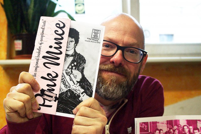
Oh, that‘’’s right! BLN.FM was at Zinefest Berlin and wanted to know all about Pink Mince.
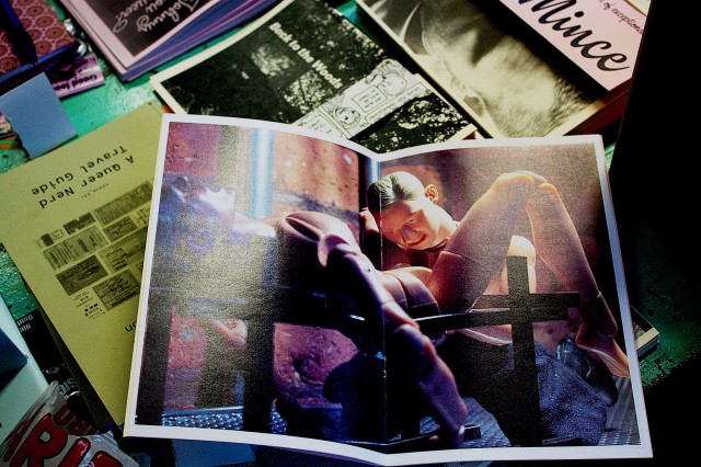
I was specifically asked to show something racy, presumably to spice up the story a bit. It was easy enough to comply.
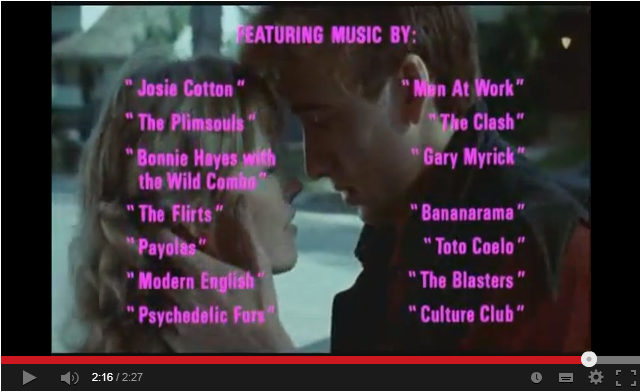
I have always considered Valley Girl the most self-aware, perfectly crafted 80s movie of them all. The soundtrack is sublime, and was painfully hard to find before the era of digital music. I carefully looked after my copy of a popular bootleg cassette that had this soundtrack on one side, and the (also seminal) soundtrack to Beyond the Valley of the Dolls on the other.
Fantastically charming illustrated summary of a talk I gave at Cooper Union last night, drawn by the magnificent Eva-Lotta Lamm.
One of the things that’s always made me a little uneasy about designing things for the web is the likelihood of the stuff you make being wiped away for good once a site is updated. I tried to break myself of the habit of building comps in Photoshop relatively early (although I’d build some “furniture” there to place in and around my blog templates), so I’ve never had very good records of what early versions of this site used to look like. Since I’ve been posting material in some manner of another since 1996, that’s a lot of evolution wiped away.
That’s why The Wayback Machine is so wonderful. Thanks to its digital archive (and my tendency to post static rather than dynamic pages out of my blog databases), I can get a glimpse of how much I’ve tinkered with the site over the years: