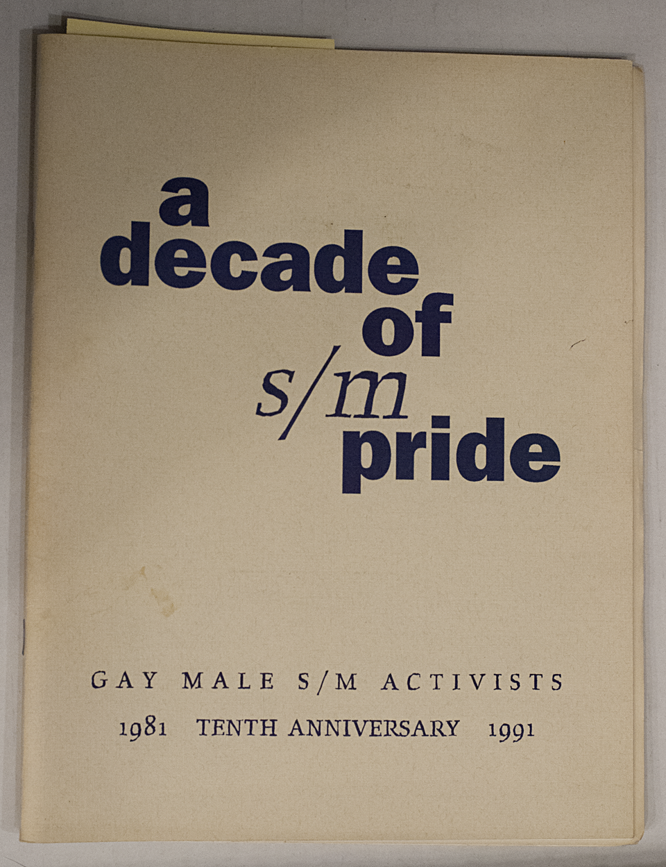
There I was, happily doing some research at the Center here in New York, digging through the Donald Mashburn collection, when I had a nerdgasm. I was looking through an archive of flyers for gay nightclubs and sex clubs, with a fair amount of porn catalogues in the mix, but it’s safe to say that I’m pretty jaded about adult material at this point. I was trying to pick out things from the ’70s or ’80s that had a certain graphic sensibility about them, with a vague sense of collecting material for a future issue of Pink Mince.
But then I saw it.

No, it wasn’t the GMSMA stuff that caught my attention. Rather — and this was the nerdy part that I then had to explain to everyone in the room after I squealed a bit — it was the unexpected use of Erik van Blokland and Just van Rossum‘s ground-breaking Beowolf.

Beowolf, in its original format, was a masterful, inspired exploration of what could be done with the now-deprecated PostScript Type 3 font format, which allowed for extra programming instructions in a font. Basically, every letter shape changed ever so slightly each time it was printed, so that it never, ever looked the same. It was so, so cool. Slow, and apparently tricky to output, but cool.
I’ve only ever seen it use a few times, and those were usually specimens. (There’s an OpenType version available now that randomises a fixed number of alternate shapes for each character, but that’s less fun.) Finding samples of it in a souvenir program for an S&M organisation? Priceless.
Update: I added this example of Beowolf to Fonts in Use.
