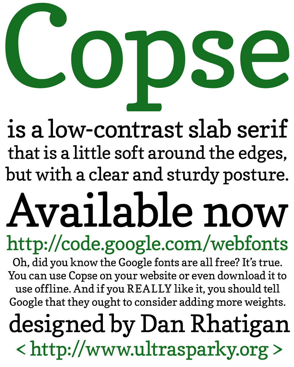
I performed a little experiment during the the first two weeks of this month, and designed a typeface called Copse. The design is not very experimental, but the process was. When I realized I would need some freelance projects to tide me over until I secured a new work visa and began a new full-time job in the Spring, I was approached by Google and asked to submit some proposals for their library of web fonts. Since they were hoping for something ready before the end of the year, we thought I should try some display fonts with a focused concept that could be produced rapidly, and expanded later on if they proved to be popular. (That means the more you use it, the more likely you’ll get more weights and styles to use at some point.)
Copse is a hybrid of a text face and a typewriter face, meant to hold up well if used at small sizes online, but produce a soft but clear effect at larger sizes. It has low contrast and soft edges, with some kicky ball terminals to provide a splash of color.
You can get it here — right now, for free.
Update: To answer a few questions that have been trickling in, which reminded me that I forgot to mention half the things about this that I intended:
- “Has it derived from Gina?” Yes. Working from the outlines of a reliable design was part of the original experiment in producing this quickly. Although some glyphs have been completely altered, it’s basically Gina’s skeleton wearing different flesh — lower contrast, simplified connections, flatter serifs and terminals, slightly taller caps, different spacing. Basically, I filed down all the delicate parts and rebuilt the details.
- “Also on XP, without Cleartype, it looks flaky… but you probably know this” Ugh. Tell me about it. Now I understand quite vividly why everyone who deals with webfonts is so eager for DirectWrite to become the new standard. Hinting for Windows is really tricky, and it’s the main reason I can’t muster much enthusiasm for working with (or on) webfonts that much yet.
- “Is it using any Truetype hints or is it just all auto stemmed?” It’s using TrueType hinting, but that was generated automatically. I always design with Type 1 autohinting in mind, since I know how to prepare that pretty well. Mostly, it requires consistency and keeping track of stem weights and alignments. All those values are then fed into the set-up for TrueType hinting, but I don’t yet know how to tweak the TrueType hints manually after that.
- What’s nice about webfonts is that they make it easy to push out updates and fixes. I hope I can improve some things like hinting and certain outline details eventually.
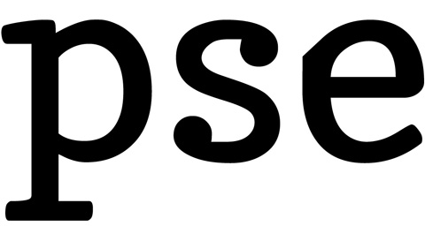
Also, In the version Google posted the other day, I noticed a glitch that I’ve corrected and should be available for re-download in a day or two. Basically, if you use the downloaded font in any Adobe software and set it larger than 100 points or so, the lowercase “e” or its related accents looks like this:

[Beware — technical font nerdery happening NOW.] I drew the original glyphs as Type 1 outlines in Fontlab, and then converted these to TrueType outlines at the end. Then I opened the file in FontForge to do the TrueType autohinting, and to run a few automated tasks to reduce the number of nodes and optimize the results. The weird spur on the “e” comes from an off-curve point getting numbered as the first in the outline. Easily fixed, but it looks like Adobe’s rendering engine misinterprets that after a certain size threshold.

Hello,
Recently we have had a request from a client to use Copse in their website instead of an unavailable-for-web slab serif. I checked out google’s font preview, but I couldn’t figure out how to download it for mocking up the pages in photoshop. Do you have any suggestions or perhaps a way to use it offline? Any advise would be appreciated.
Conrad
It would be AWESOME if we had a Bold and italic version of Copse. 🙂