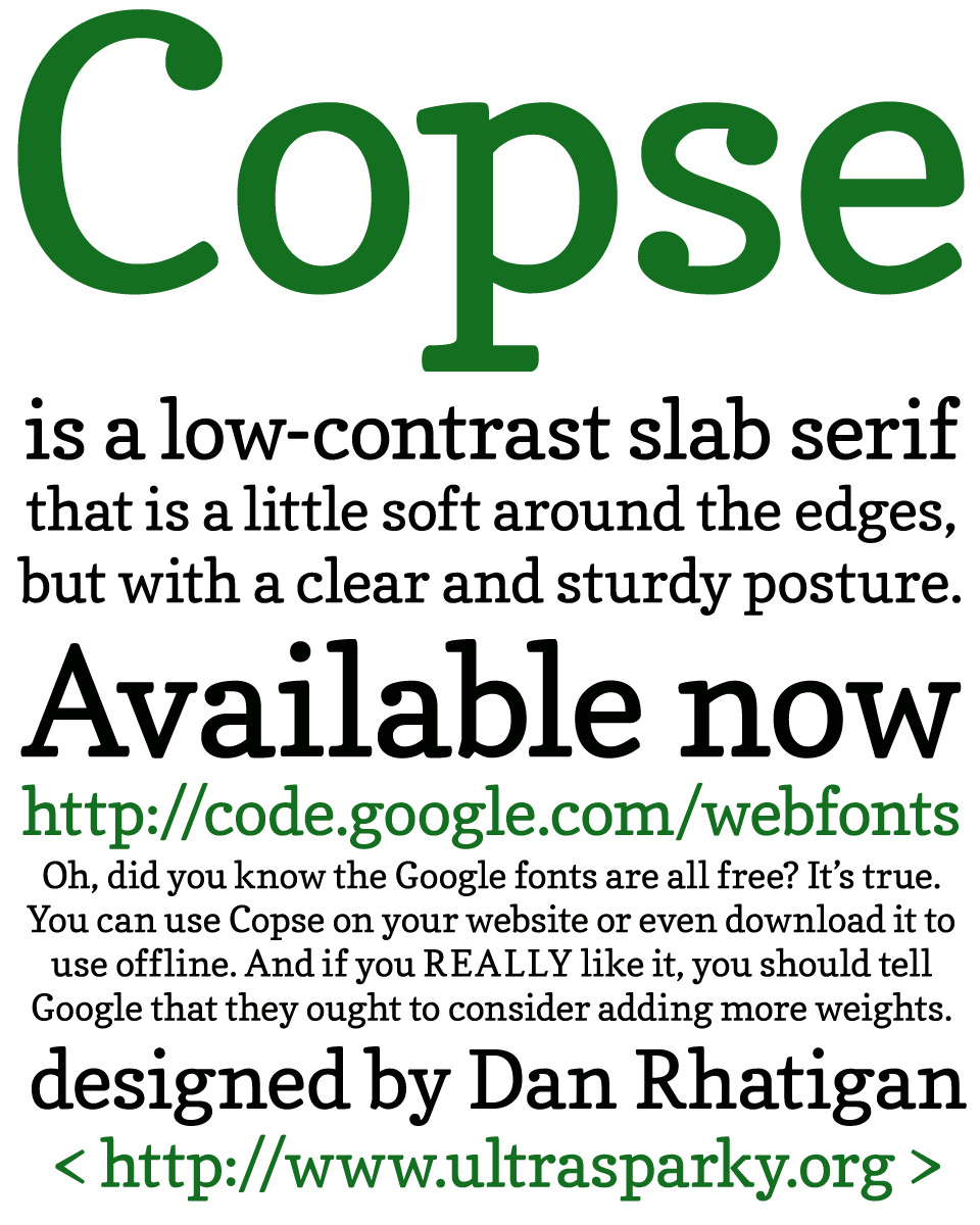
I performed a little experiment during the the first two weeks of this month, and designed a typeface called Copse. The design is not very experimental, but the process was. When I realized I would need some freelance projects to tide me over until I secured a new work visa and began a new full-time job in the Spring, I was approached by Google and asked to submit some proposals for their library of web fonts. Since they were hoping for something ready before the end of the year, we thought I should try some display fonts with a focused concept that could be produced rapidly, and expanded later on if they proved to be popular. (That means the more you use it, the more likely you’ll get more weights and styles to use at some point.)
Copse is a hybrid of a text face and a typewriter face, meant to hold up well if used at small sizes online, but produce a soft but clear effect at larger sizes. It has low contrast and soft edges, with some kicky ball terminals to provide a splash of color.
You can get it here — right now, for free.
Update: To answer a few questions that have been trickling in, which reminded me that I forgot to mention half the things about this that I intended:

