
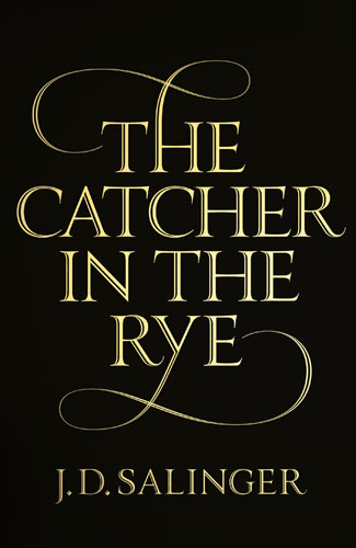
As you may expect, there’s been a lot of press about J. D. Salinger since he passed away last week, but the negligence of some of it has irked me. The covers of Salinger’s books have always been iconic and distinctive, due in no small part to their simplicity and austere type-only designs, as demanded by the man himself.
It’s nice to see that the brief slideshow of the new covers at The Guardian discusses the typography and gives due credit to its designer, but then why does this longer piece about the covers in The Times make a fleeting mention of an unnamed “graphic artist” without clarifying that the type was a custom job made by by the absurdly talented designer, letterer, an all-around nice guy Seb Lester? It’s annoying enough that type designers rarely get proper credit for their contributions, but when the the whole story in about the typography? Tsk, tsk.
But nevertheless, props to Seb on a job well done! (And to The Guardian for giving some credit, at least.)