I was all excited a while back about the impending availability of the Guardian type family, but its creators didn’t seem to do anything public about it for a while. Well, the wait is finally over: Paul Barnes and Christian Schwartz have finally launched a website for Commercial Type, and it’s just lovely. The typefaces themselves are delightful, but I’m particularly charmed by their EULA notes, which are an elegant solution to something that I’ve been thinking about lately.
Day: January 5, 2010
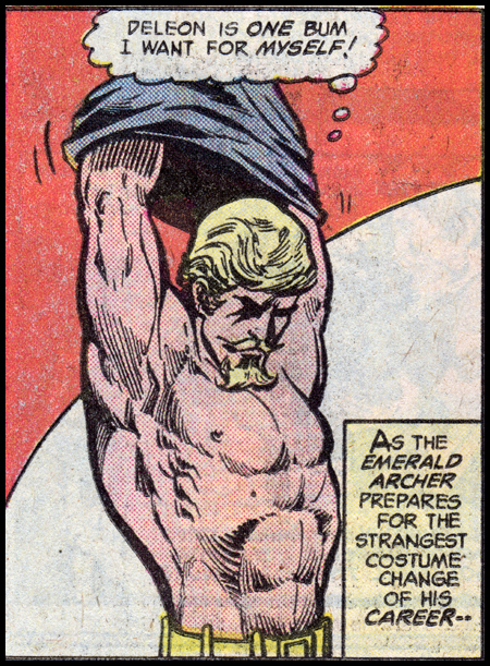
Shoot that poison arrow
Oh, Olly! I should have guessed. [Via Postmodern Barney.]
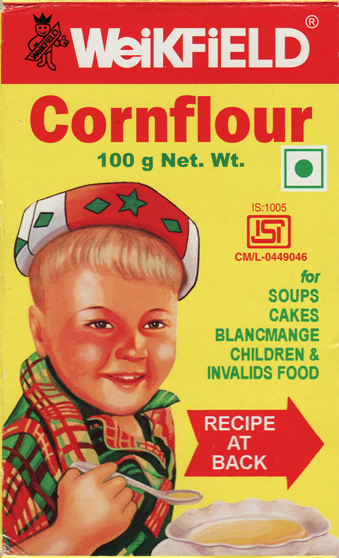
Children & Invalids Food
I found this gem of a package in a supermarket in Chennai (India) when I was there for Type Camp a few weeks ago. Our main mission was to find products that felt characteristically Indian, but to no one’s surprise I was drawn to this bit of ephemera that looks like an old bit of British illustration that was awkwardly reworked to give it some “ethnic” details, such as that hat that looks like it was added in a hurry by some intern in the art department at some point. And check out that hand holding the spoon! But don’t look to closely for too long. The eyes will haunt you.