Month: January 2010
Credit where it’s due
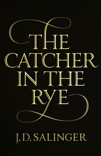
As you may expect, there’s been a lot of press about J. D. Salinger since he passed away last week, but the negligence of some of it has irked me. The covers of Salinger’s books have always been iconic and distinctive, due in no small part to their simplicity and austere type-only designs, as demanded by the man himself.
It’s nice to see that the brief slideshow of the new covers at The Guardian discusses the typography and gives due credit to its designer, but then why does this longer piece about the covers in The Times make a fleeting mention of an unnamed “graphic artist” without clarifying that the type was a custom job made by by the absurdly talented designer, letterer, an all-around nice guy Seb Lester? It’s annoying enough that type designers rarely get proper credit for their contributions, but when the the whole story in about the typography? Tsk, tsk.
But nevertheless, props to Seb on a job well done! (And to The Guardian for giving some credit, at least.)
10 Commandments
 I quite like, but I do not necessarily love, the work of Gilbert & George. It’s cheeky, it often looks great, it’s interesting, and all, but it can get a little heavy-handed now and again, and I really think they went off the rails visially once they got their hands on a copy of Photoshop. But whatever: these things happen. There are very few artists of any kind who manage to produce work that feels just as fresh and resonant all the way through their careers.
I do appreciate a number of the themes that run through what they do, however, many of which are summed up nicely in this manifesto-slash-list of commandments-slash-performance piece:
-
Thou shalt fight conformism
-
Thou shalt be the messenger of freedoms
-
Thou shalt make use of sex
-
Thou shalt reinvent life
-
Thou shalt create artificial art
-
Thou shalt have a sense of purpose
-
Thou shalt not know exactly what thou dost, but thou shalt do it
-
Thou shalt give thy love
-
Thou shalt grab the soul
-
Thou shalt give something back
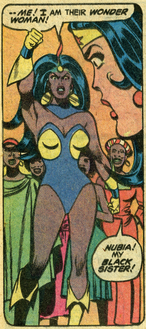
My Black Sister

[Thanks, Sina!]
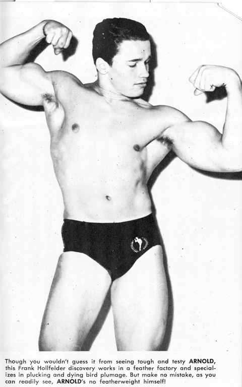
Humble Beginnings
As things get underway with the Perry vs. Schwarzenegger case about the fate of gay marriage in Califronia (and perhaps, by setting some precedent, elsewhere in the States), let us take a moment to glance though the pages of MANual magazine’s March 1966 issue, shall we?

The little things
Extrapolating from current data, it looks like 2010 be the year I sell off all my worldly goods in a vain attempt to pay bills, but still manage to starve myself. Alone.
Still, there are a handful of things that buoy my spirits in these trying times (or at least this week): reading Jane Austen, the reappearance of Cadbury Mini Eggs, the impending climax of Dollhouse, the Stern family’s annual newsletter, grapes, and slow but steady progress on my Tamil typeface.
To the aerojets!
I usually like steampunk better in theory than in execution. I mean, it works well on paper: I love the mashup of historical and futuristic ideas and technology, and I’m certainly a ardent supporter or artisanal crafts and gadgetry. (Not to mention a man in goggles.) It’s a groovy idea, but as a subculture it generates so much kitsch. And not the good kind. It’s so often too earnest for its own good, with just a touch too little awareness of the inherent fantasy, despite the fun of it all. But when it’s good — when it’s really original and when it works on more than one level — it’s so unbelievably cool, like the work of this guy:


[Above: “Raptor” Fighter Pilot Mask by Bob Basset]
We Americans Abroad
I’ve had this TImes article sitting in a tab in my browser for the last day because it rang true in so many ways and I wanted to write about that, but frankly I don’t have the time or the energy (which is another lengthy post in itself, really). In short, though: I prefer living over here and a lot of Americans get on my nerves when I stumble across them, but until I read this I was having trouble articulating what I actually liked on the whole about Americans, and what Europeans always try but fail to explain about what they like about Americans. So good work, Mr Dyer.
My American Friends, by Geoff Dyer
Commercial Commercial

I was all excited a while back about the impending availability of the Guardian type family, but its creators didn’t seem to do anything public about it for a while. Well, the wait is finally over: Paul Barnes and Christian Schwartz have finally launched a website for Commercial Type, and it’s just lovely. The typefaces themselves are delightful, but I’m particularly charmed by their EULA notes, which are an elegant solution to something that I’ve been thinking about lately.
Shoot that poison arrow

Oh, Olly! I should have guessed. [Via Postmodern Barney.]

