Note: This is really a response to a question posed in this Typophile thread, but I’m also jotting down some info here so I can find it more easily some day.
In September 1935 Gill drew for Monotype a stressed sans-serif type with many prophetic qualities: it looked forward to Hermann Zapf’s ‘serifless roman’ Optima of nearly a quarter of a century later. Although it was given a series number (430), and a few trial sorts were cut, it was never issued to the trade.
— Sebastian Carter, Twentieth Century Type Designers
I dug around a little bit in the archives at Monotype and was finally able to track down a few traces of the Eric Gill‘s unreleased Series 430, a slightly flared sans serif in the Optima/Albertus mode, made at 30 point.
First of all, here’s a scan of a photocopy of the trial print, a test setting a few characters cut to show the basic relationships of caps to lowercase, round shapes to vertical strokes, and the cap and x-heights to the ascenders to descenders. I wasn’t able to track down the original print made from the sorts themselves, but this still shows where the design was headed:
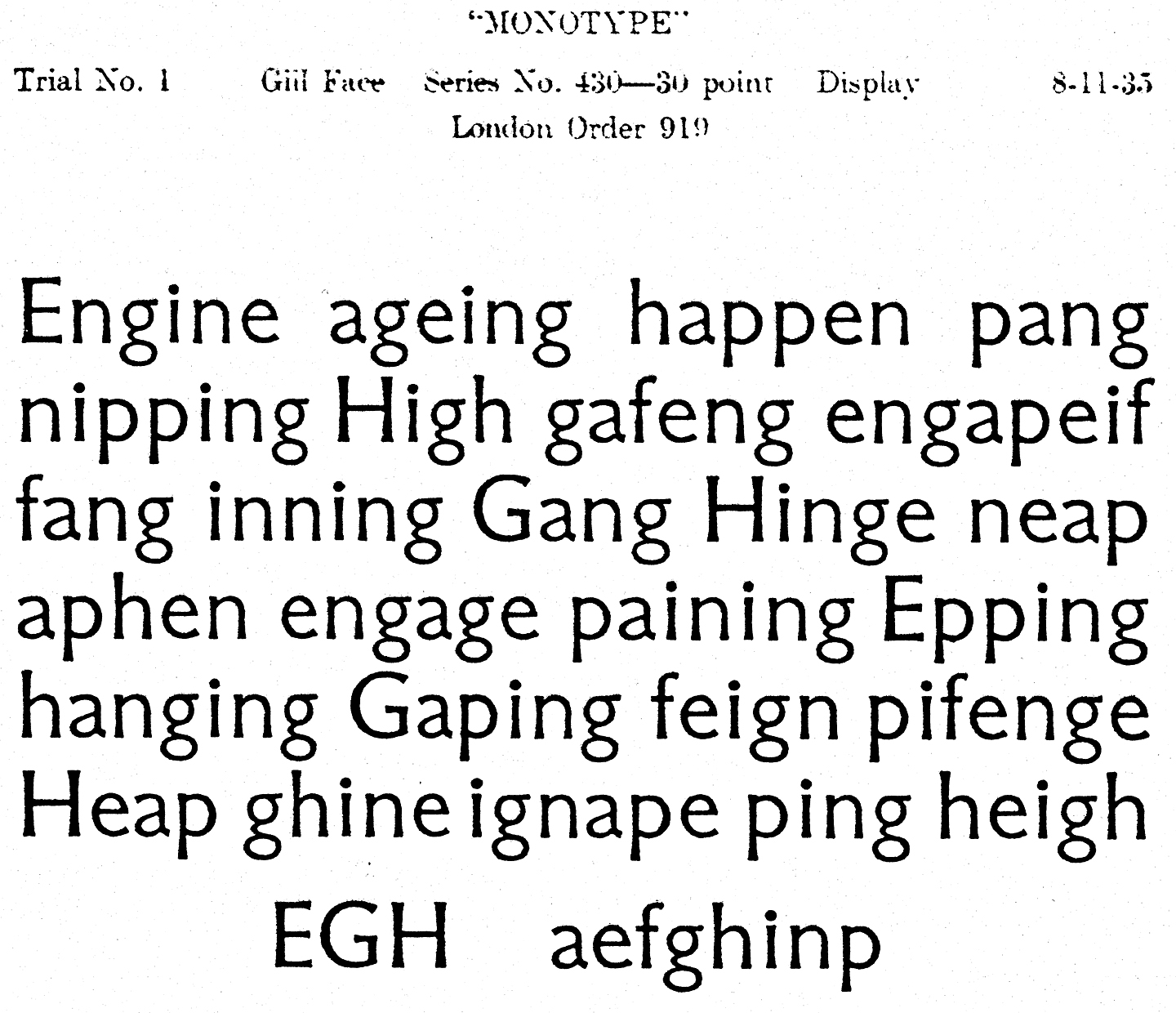
The caps look pretty heavy compared to the lowercase letters, at least for my taste, and I can’t say I love the overall feeling. It certainly does feel like Eric Gill’s work, though. Maybe that’s part of the trouble: it reminds me too much of others typefaces of his, without having quite enough character of its own. Some of the other glyphs are more distinctive, but since not all were cut for the trial it’s difficult to say if they would have helped the overall feel.
There are engineering drawings for the basic capital and lowercase letters, numbers, and a couple of punctuation marks, but they were clearly not all cleaned up for final production. Although the drawings for the few characters that were cut (those that were used in the trial print) have been refined, the rest of them are still just rough outlines, presumably made from enlarged projections of the originals. These unfinished drawings are sketched out in pale, wobbly lines, but they still show what Gill was proposing in terms of style and proportions. (The original drawings don’t seem to be around here anywhere, so I assume these went back to Gill at some point.)
You can see in the (quickly taken and crudely touched up) photos below some of the characters that were never cut, as well as a finished drawing that was used to make some of the trial sorts (just to give you an idea of how much additional work went into the final outlines):
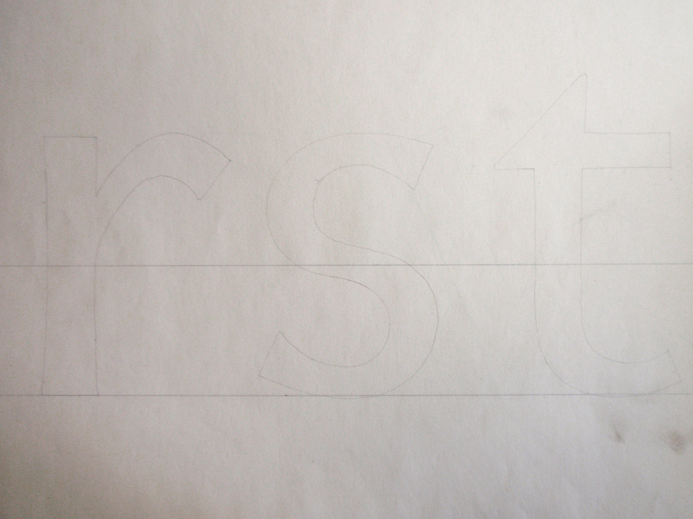
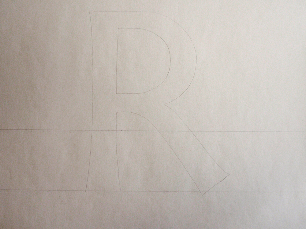
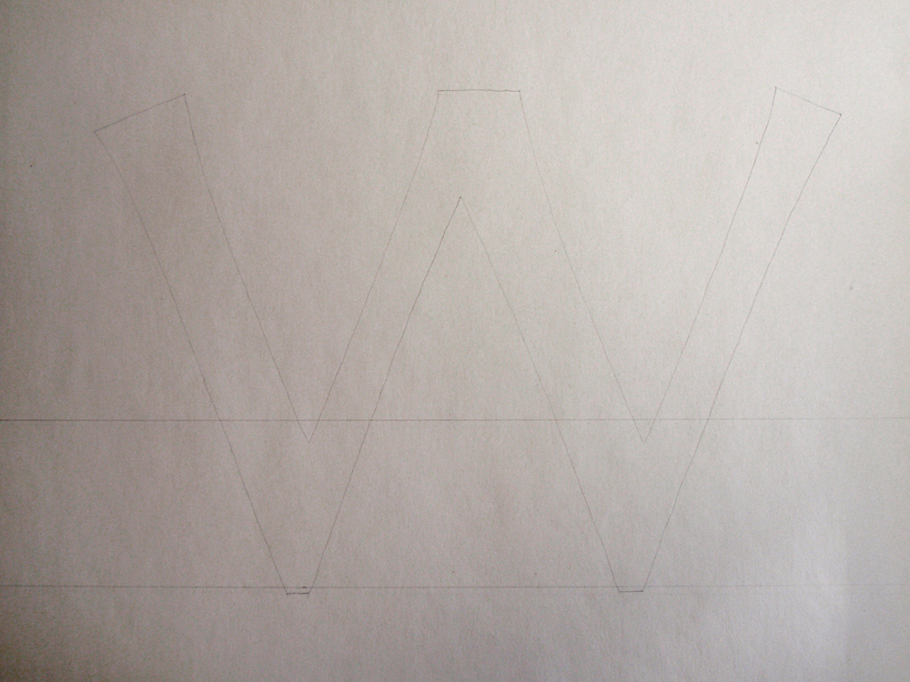
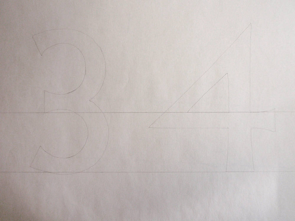
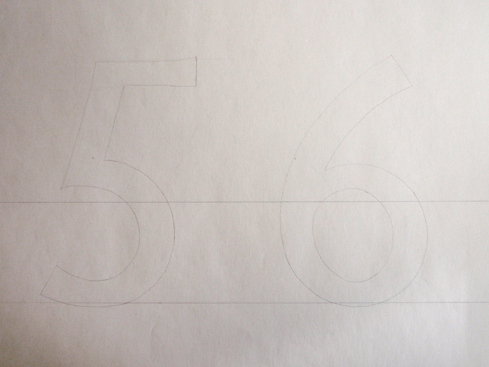
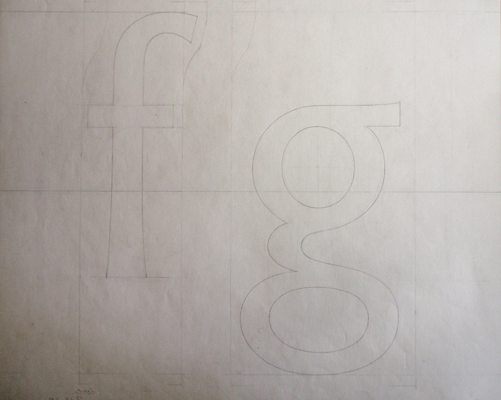
[I’ve reversed the images so you can see the characters as they would have printed. The engineering drawings show reflected versions of the characters, as you can see by the way the notes on the drawings are shown in reverse in these images.]
I haven’t been able to find the correspondence that would shed some light on why this typeface never progressed much further than this, but the basic details available in the production log confirm that it was abandoned relatively quickly &emdash; begun in 1935, set aside in 1936, and officially cancelled in 1944:


It is amazingly cool that your new job allows you to research stuff like that.
Interesting, before I couldn’t imagine an opportunity to overshoot something that wasn’t a single point nor a curve. The baseline of the W makes proves it.