Teaching new dogs old tricks

My associate Mr. Moore — a popular but occasionally controversial contributor to Design Assembly — has written another great piece. This time around he’s kicking off what will hopefully be a series of “old book reviews” by considering the pearls of wisdom contained in Carl Dair’s 1952 book Design with Type.

And if your curiosity is piqued after reading Ian’s review, you can also find the whole thing preserved at Google Book Search.

Magical mystery tub

I’m reading my way through a stack of old issues of Metropolis (my sister recently handed me all the back issues from my subscription that she received after I left the country in September ’06), and this Susan Szenasy editorial from March 2007 really resonated with me.

I love having a good soak in a a good tub, a pleasure that’s become an acute craving now that I can’t even guarantee a quick shower with hot water in the shithole where I currently live. Oaklands had a pretty spectacular tub, but even that was easily surpassed by the at my friend’s flat where I house-sit from time to time. That one is pure heaven.

I agree with Szenasy’s basic requirements for a good tub: deep, made of metal rather than plastic, with a good angle for reclining. I’d add one more feature that can make or break a good bath for me: natural light. There’s something about a generous flood of natural light — even weak, midwinter British light — that completes the experience for me.

Sometimes a nice, hot bath can be so perfectly relaxing that I struggle with it. I’m so used to being tense and stressed out that I can feel my whole body rebel against the relaxing effects of a long, hot soak. In a twisted way, I have to concentrate on letting myself unwind. Sad, but true.

The Internet says I know something

It gives me a mild flash of nerdy glee to know that I am now cited as a source for information in not one but two articles on Wikipedia. If you ever have any need or desire to read about Microsoft’s Cambria typeface or the ubiquitous Times Roman, you will find sections of those articles that draw directly from my MA dissertation on typefaces for mathematics.

It’s flattering, of course, but it’s also the kind of thing that reminds me that while Wikipedia is exceptionally useful, articles you find there are not actually great citations in themselves. Information on Wikipedia is supposed to be verifiable. That is, it should ideally point to another source to back up what it says there. In the case of my two citations, Wikipedia points to my dissertation (kindly hosted at Mark Jamra’s fantastic Type Culture site). Even that, though, is not a primary source, since everything I wrote is the result of research looking back to the actual primary sources. So the articles on Wikipedia are — in this case, and in many others — references to references to sources, not reliable information in and of themselves. They’re useful, sure, but just starting points if you’re really trying to get to the bottom of something.

Unreleased, untitled Gill typeface

Note: This is really a response to a question posed in this Typophile thread, but I’m also jotting down some info here so I can find it more easily some day.

In September 1935 Gill drew for Monotype a stressed sans-serif type with many prophetic qualities: it looked forward to Hermann Zapf’s ‘serifless roman’ Optima of nearly a quarter of a century later. Although it was given a series number (430), and a few trial sorts were cut, it was never issued to the trade.

— Sebastian Carter, Twentieth Century Type Designers

I dug around a little bit in the archives at Monotype and was finally able to track down a few traces of the Eric Gill‘s unreleased Series 430, a slightly flared sans serif in the Optima/Albertus mode, made at 30 point.

First of all, here’s a scan of a photocopy of the trial print, a test setting a few characters cut to show the basic relationships of caps to lowercase, round shapes to vertical strokes, and the cap and x-heights to the ascenders to descenders. I wasn’t able to track down the original print made from the sorts themselves, but this still shows where the design was headed:
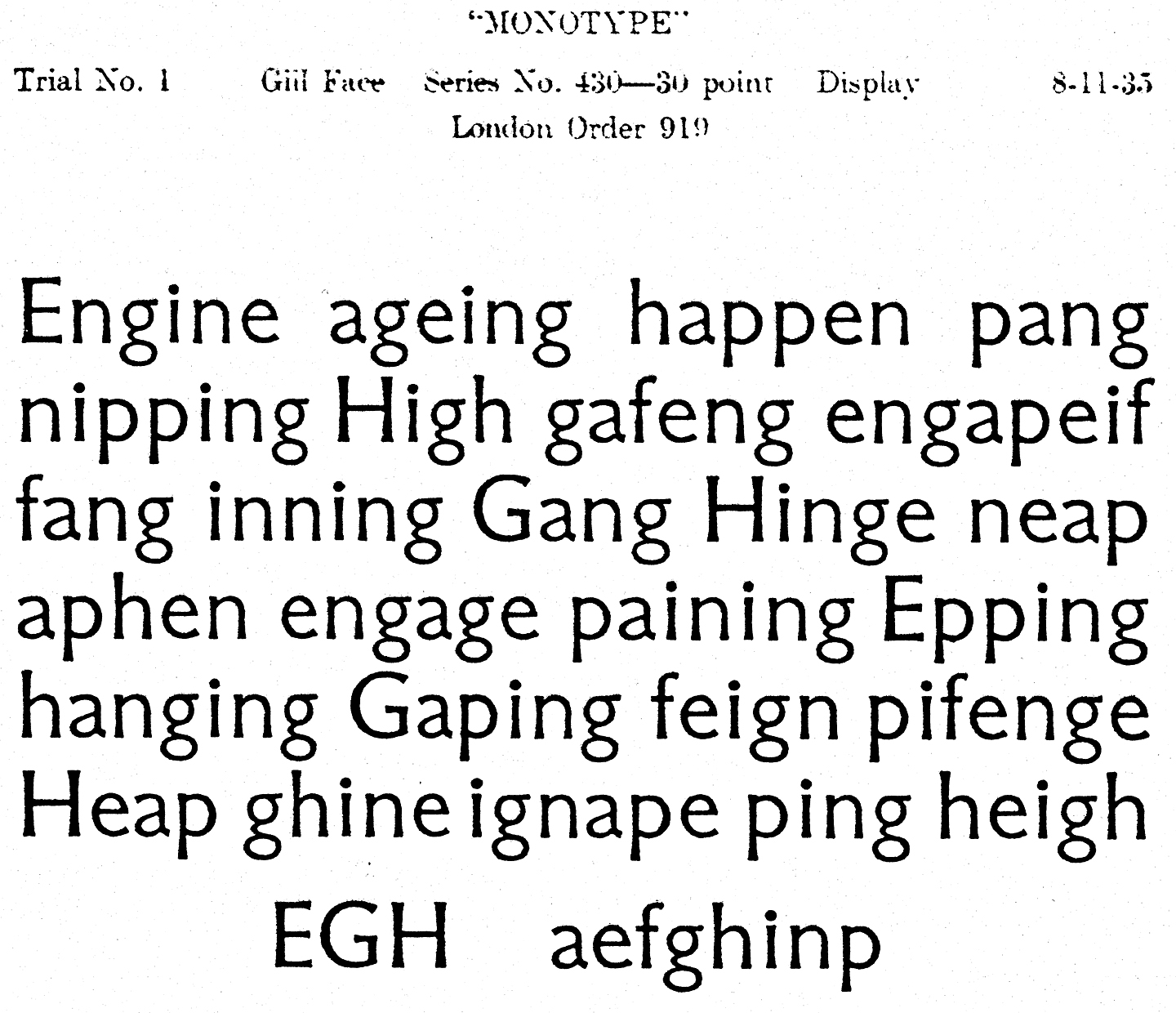
Trial setting of Eric Gill's Series 430

The caps look pretty heavy compared to the lowercase letters, at least for my taste, and I can’t say I love the overall feeling. It certainly does feel like Eric Gill’s work, though. Maybe that’s part of the trouble: it reminds me too much of others typefaces of his, without having quite enough character of its own. Some of the other glyphs are more distinctive, but since not all were cut for the trial it’s difficult to say if they would have helped the overall feel.

Continue reading “Unreleased, untitled Gill typeface”