It wasn’t just my imagination — I really did feel the rumblings of an earthquake last night. I felt my laptop vibrating at first, but I quickly realized it wasn’t just be the hard drive spinning when my entire bed and then the entire building shook for a few seconds. We were too far away to have any damage, but it was freaky all the same.
Month: February 2008
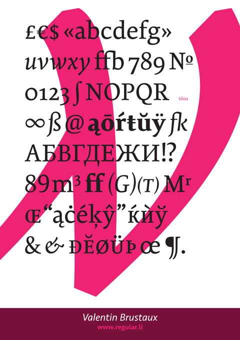
The New Swiss Typography
A ton of congratulaions to my Reading classmate Valentin Brustaux, whose gorgeous typeface Tiina won a prize for text/type family in this year’s Type Director’s Club competition.
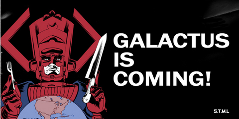
Two Great Tastes…
…that taste great together — Jack Kirby and Jack Chick:
Read the rest of this little gem over at Your Mom’s Basement.
Speaking of Galactus, I’m glad that his “blog” that I once mentioned is still online.
Into the Woods
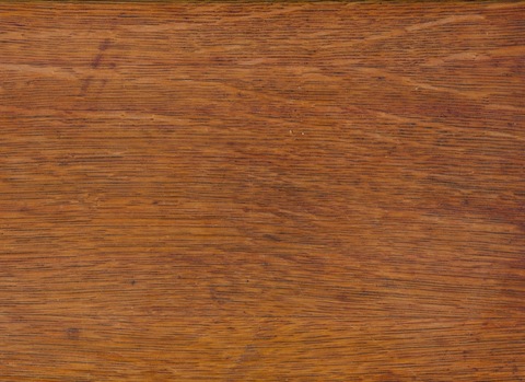
In general, I’m partial to wood. I prefer real wood for floors and furniture, and I’m particularly fond of slightly weathered old wood that looks like it’s lived a little. That being said, I have a real thing for totally fake wood-grain patterns — not fake woods or veneers — but stuff that is so fake it’s kitschy. Hey, I never said I was high-brow.
Much to my delight (and further proving my theory that there’s a blogger out there to cover any special interest one could imagine), I just stumbled across It’s (K)not Wood, a blog devoted to all kinds of fake wood things. It’s startlingly comprehensive!
I don’t go for all the stuff that’s made of other things but molded to look like branches and twigs and such, but I’m giddy to find so many faux bois (as they say) delights, such as this way-fun furniture I’ve been coveting for a while now.
Golden Lights
I adore the Midas Project, a not-quite-graffiti project in Barcelona where mundane objects around town are spray-painted gold. It looks amazing! It reminds me of Commutable, a great project from 1996 where the decrepit steps on the Manhattan side of the pre-renovation Williamsburg Bridge were covered in gold leaf. It looked strange and lovely, and was also a good visual cue to slow down on your bike before you went shooting over the end of your bike path to your doom.
(Thanks, FormFiftyFive!)
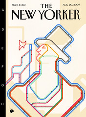
Eustace Tilley Subway
When I was glancing through all the submissions for the New Yorker‘s Eustace Tilley contest, I somehow neglected to realize that one of my favorite submissions — a brilliant riff on the classic Vignelli map of the NYC subway system — was done by one Alberto Forero, a fellow Regis alum (and fellow ephemera fanatic) who took over my old post as the school newspaper’s graphics editor back in the day. I also love that the print article about the contest winners shows Alberto’s illustration along with my other two favorites.
I never knew him that well, but like many of the remarkable, talented, trail-blazing guys I know from my Regis years, Alberto is — at the very least — a triple threat: he’s a designer, illustrator, and musician. Go check him out, and maybe send some work his way.
(Speaking of the school newspaper, someday I need to write about how it was working on the school newspaper that turned me from a compulsive doodler into a future typographer, due in large part to my fascination with using a VariTyper machine to set headlines using all the cool Avant Garde alternate glyphs.)
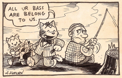
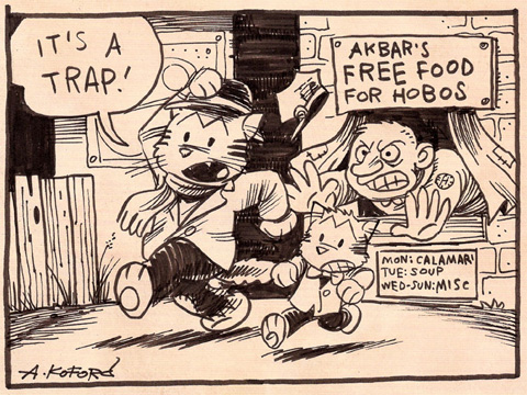
Royal Occidental Tuna Fisheries, Ltd.
The basic gimmick as described at the Flickr archive is:
“From 1912-1913 he [grandfather Aloysius “Gorilla” Koford] produced a comic strip which was featured in 17 newspapers, including the Philadephia Star-Democrat, the Tampa Telegraph, and the Santa Fe Good-Newser. The strip was entitled “the Laugh-Out-Loud Cats” and featured the exploits of one Meowlin Q. Kitteh (a sort of cat hobo-raconteur) and his young hapless kitten friend, Pip.”
Roar!
Just got back from a late showing of Cloverfield, which was lots of smash-em-up fun, if perhaps a little vivid for anyone who’s actually experienced a New York crisis or two. It’ll be interesting to see what tonight’s Sustiva dreams bring on.

