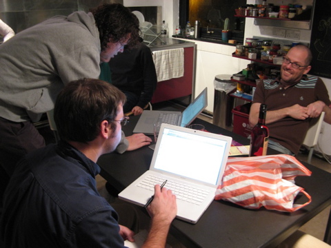
I was awakened this morning by a completely insane hailstorm that had me worrying about the large windows with the non-safety glass in our flat. It was good to wake up, though, since I had to get into London to do some research. In London this morning, a freaking tornado demolished a bunch of buildings. An unexpected river of blood also ran out of my nose when I was in the restroom at the library. I fully expect a rainstorm of frogs or a tsunami or something to strike before tomorrow.
If It’s Kiki It Must Be Christmas

Now that I’ve been lucky enough to catch Kiki & Herb, it finally feels like Christmas. It was a fantastic show, naturally, but it was interesting to see how the crowd reacted to it. In some ways, it felt like the run they had in the West Village a few years, where a lot of the crowd didn’t quite understand what they were getting themselves into. Like then, there were people in the audience this past Friday that seemed to think this would be just another campy drag show for the gays. As I’ve said many times, calling Kiki and Herb a drag act misses the point entirely: they are a dark, cathartic emotional roller-coaster ride. I’m not sure exactly when the first people walked out of the show on Friday night, but it may have been during the big cancer medley (but definitely before the eco-disaster/suicide medley). Obviously, the theater’s favorite aging, monstrous, heartbreaking showgirl is still doing something right if she’s making people that uncomfortable.
Much to my delight, London felt like a small town this weekend, in a way that New York often did at the times I loved it the most. At Friday night’s show and then walking around on Saturday, I saw a bunch of familiar faces (and considering why they looked familiar, it just goes to show that I look for portraits instead of cock shots on the internet) here and there in the crowds. I saw Herb/Kenny Mellman himself strolling at one point, although I didn’t get a chance to compliment him on the previous night’s success. At the Design Museum on Sunday I ran into my pal Dan from Germany, who I’d also seen earlier int he week when he was in Reading to check out the MATD program for next year. As I learn my way around town, it’s very comforting to feel myself becoming a thread in its fabric a bit.
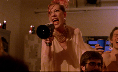
I also finally got to see Shortbus, and was again surprised to see people walk out in the middle. So are people in London just more squeamish than in New York, or are they just less likely to read about what they’re about to see? Seriously. This is supposed to be a challenging movie, but I guess some folks were just there for the sex but not the emotional one-two punch.
Shortbus was fantastic, and reminded me an awful lot of the small-town vibe I often felt in New York, not in the least because it was littered with people I’d met, performers I’d seen, and streets I’d walked along over the years. It was a fantasy version of the Bohemian life in New York, granted, but still one I’d tasted from time to time over the years. The last few years in New York were often frustrating because so much more of my energy had to go toward surviving in New York rather than living in it, so it made me a little sad think about how much community and fun had come to feel like a fantasy for me there, instead of the reality it had once been. But there I was, sitting with old friends in a new place, working on another stage of my eclectic, adventurous life once again. So who knows?
Holiday Festivities
Fear not, true believers, I’m still here and still kicking. We’ve spent the last couple of weeks at school doing workshops in greek and Indic scripts, which involved an awful lot of work with a few impromptu social events throw in for mental health.
At the last minute, the American posse here decided we didn’t want to let Thanksgiving go uncelebrated, so my flatmates and I donated our generously proportioned lounge so we could invite our classmates over for a some Indian take-out. (Because Thanksgiving is all about Americans and Indians coming together, right?) Even though it’s the one holiday I get really sentimental about, I’d mostly forgotten about Thanksgiving, and in the end I was glad we were able to celebrate it properly. By properly, of course, I mean that it wasn’t about the food so much as about family, and this year my family is effectively the ragtag group foreigners I spend every day with now.
I was beginning to note that Advent seems to be a much bigger feature of the Christmas season here in the U.K., and then it suddenly dawned on me that they need Advent more than we do in the States since they don’t have the day after Thanksgiving to open up the season for them.
I’m also thankful for the generosity of an old pal, who’s taking me out this Friday to kick off the Christmas season in the best way possible. (Here’s a hint!)
I won’t be going home for Christmas this year. Or rather, I won’t be heading back to visit on relatives or friends, since I technically have no home of my own to which I can return. We’re expected to keep working through most of the month-long Christmas break, so I decided that it would be too stressful and exhausting to fly to the States for a few days of madness and sentiment, only to race back and hit the books. I’m sure I’ll have a lovely Generic Midwinter Holiday with the other expats, and best of all I’ll have a few days to just sleep and slack off.
Wrap Me, Read Me
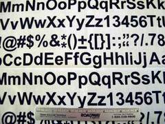
I know that Dave from Helveti.ca is finishing up his first book design project over here, so I am shamelessly scooping, and shamelessly stealing these pictures of awesome typofabrics from India, Ink.
 |
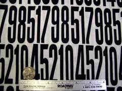 |
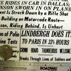
Even though I can barely sew on a button I’ve been fantasizing what I could do if I bought up every stitch of it that this eBay seller could get her hands on, especially once I discovered that she has other kinds as well:
 |
|
Friends, students, admirers, and mockers already know of my vast collection of type-themed t-shirts, but now I’m imagining myself wearing a full suit made out of type cloth. Perhaps all Helvetica, with a nice shirt made out of the serify stuff, and a tie and pocket square made from the numbers? Or at least some sheets and pillowcases. What with the tattoos, the t-shirts, and flights of fancy like this, I realize that I’m on the verge of becoming a Batman villain, albeit one with much more style than this loser. Still, if anyone can make this happen I will be your slave for life.
Of course, I’d much rather have a Cooper Black leather jacket. (Thank you folks, I’ll be here all week.)
You Can Judge a Book by Its Counters
Now that we’ve started drawing and sketching for our practical work, I’ve been spending more and more time thinking about the kinds of forms that might work well for the problems I’ve been talking about so far. In many ways, it’s a very open-ended question: it’s not a unique problem to want clarity and legibility in type for dense text situations that may not be produced well. For the kind of technical publications I’m targeting, a certain kind of “classical” or “traditional” feeling would probably be received well, but I’m determined to sneak in as many technical adaptations (addressing issues of reproduction quality, optical sizes ranging from titles down to elaborate superiors and inferiors, legibility of individual letters as well as words) as I can.
Continue reading “You Can Judge a Book by Its Counters”Word Shapes
In Counterpunch, Fred Smeijers talks about the importance of word shapes in how we read:
At the root of configuration or overall visual arrangement is the design of the word. . . . Though it might seem that the type designer’s aim is to make new characters, the real goal is to create a new word-image. [ch. 4, p. 29]
Good type leads to good word shapes which leads to good comprehension. Makes sense, right? It’s a concept I’ve read about elsewhere, but as I try to develop a brief for this whole math type issue, it leads to some additional questions. Namely, how do we read word shapes in math? As I’ve mentioned before, equations don’t really work as words quite the same way, and comprehension is a little harder since you can’t easily rely on context to clarify individual characters. Equations have basic rules for structure and notation, though, so there are conventions that aid comprehension in that context. So what kinds of patterns emerge form those rules? What are the functional “word shapes” that make math notation comprehensible? And — most importantly — how can type be optimized to make those mathematical word shapes easy to read?
Spacing in math is, in general, much looser than in text since it’s often a collection of symbols and operators. In a way, each symbol is a noun and each operator is a verb. Rows of symbols are usually shorthand for values multiplied by one another, and looser spacing helps clarify their separation from one another. You may find actual words like “sin” (sine) or “cos” (cosine) scattered within, set in roman rather than italic. These words ought to be spaced normally. You also have changes in vertical positioning all the time — superiors, inferiors, division, limits, matrices, etc. Readability, then, has to factor in the different meanings of space, different meanings of style, and different reading directions. This is pretty different from anticipating word shapes that move in one direction along one line.
Smeijers, Fred, Counterpunch: making type in the sixteenth century; designing typefaces now. London, Hyphen Press, 1996
Notes for Practical Stuff
And a few other ideas to file away for the practical work:
-
- The STIX folks have been keeping up with developments to Unicode, and are maintaining tables of recommended Type 1 character names. Look into that.
- Structured documents can have a tough time dealing with the level of granularity that might be required for complex font changes, unlike TeX documents that seem to thrive on it. What can be done to anticipate fitting and usage problems in when it’s not easy to change back and forth between fonts? For instance, can OpenType contextual alternates be used to insert terms like “sine” and “cosine” that wouldn’t be set italic like other characters in math?
In addition to standard text and numerical glyphs, a good family for dealing with math would need a pretty robust set of agate glyphs for superiors, inferiors, dense tables, etc.
- Also, spacing would have to be very different for characters that get used for equations, so a different font that spaces the glyphs differently may be needed: probably not monospaced, but certainly set wider, and with no italics that kern or overset their bounding boxes.
- Should the type be optimized for screen display, publication, or some happy medium?
- Italics should be fairly upright, but definitely italic in style rather than staying too close in form to the roman. They will need to be very distinct from one another.
- Not too much contrast, or any details that are too delicate. However, not too blocky and informal, either.
- The equation might may also benefit from having short ascenders and descenders to minimize trouble with spacing of overbars, stacked combining symbols, and divisions.
Mitja’s “Reflection on Practice” essay talks about some good qualities that would be relevant to what I’d like to do, especially the notion of case-sensitive punctuation and operators.
Euler Thoughts
An article by Donald Knuth and Hermann Zapf about the development of their Euler fonts for typesetting math gives me a lot to chew on. More than I can lucidly process right now, so instead let me jot down a few notes to file away for further thought or inquiry:
- Knuth mentions a lot of qualities that mathematicians expect to see that are based on blackboard-writing conventions. Are those still relevant at this point, or is more teaching and research with math being done with electronic tools. If so, how do those tools present the math?
- Optimization for screen display could be a big factor with the practical work.
- Track down the digital Euler fonts themselves. The AMS only offers a few of the fonts as part of their TeX resources, and Linotype seems to have the full set, but only as part of a fairly pricey collection of Zapf’s work on CD.
- What other math development projects have there been? Something must be happening with the STIX fonts, right? What kind of research went into Microsoft’s Cambria Math? What about Lucida Pro’s math? What other major efforts were there before the Euler project?
- Maybe a general idea for the dissertation could be an investigation of the various efforts that have been made to address the type-for-math problem. Every time I read about one, it seems to have been formed out of nothingness, without much inquiry into what’s come before. that’s probably not the case, but it could help to dig up antecedents and follow them through to more contemporary efforts.
- Knuth and Zapf talk a lot about the scripts and frakturs and such, not just the romans, italic, and Greek. Look for more examples of all of those.
Knuth, Donald E., and Zapf, Hermann, “AMS Euler — A New Typeface for Mathematics” Scholarly Publishing, April 1989, pp 131–157
Future Tendencies of the Past
It’s interesting to read “Future Tendencies in Type Design” in 2006, 20 years after Hermann Zapf first wrote this article about whether or not there is any point in updating classic typefaces for yet another new type technology. (Short version: He says “no.”)
I tend to agree with him, for many of the reasons he cites. Typefaces are very much products of their own era and its technologies, and attempts to carry them over into other contexts lose a fair amount of the spirit inherent in the source. At the same time, it’s not as if the basic designs of type should be laid to rest just because new technologies call for adaptation. Instead, it would be wiser to openly acknowledge the source and inspiration, but solve the problems of the new context from scratch without holding too slavishly to the model.
Of course, any revival of an old typeface is forced to do this to some degree or another. The problem, though — one which Zapf (and plenty of other people I’ve heard/read) feels has mostly been handled badly — is one of typefaces getting badly updated without enough regard to the past to accurately match them, or enough thought about the future to adequately evolve them in to something else.
It strikes me as a very Modernist stance to take: form follows function, so if the function (or manufacture or reproduction methods) changes, then the forms should adapt accordingly in order to give the best result. Zapf has seen his own work designed for metal go through some poor adaptions from film to digital, and wishes that market forces would have made it easier to create new versions altogether rather than corrupt the original ideas and slap the same names onto them.
The interesting questions come from the time this article was written, when digitization of type was really in its infancy. From the vantage point of a couple of decades later when we have more sophisticated type technology and more processing power and storage capacity for handling digital type, we’re probably in much better shape to produce more faithful historical revivals. However, whether or not to do so is a big decision. Some foundries, thankfully, are coming out with newer, more sophisticated versions of their initial adapations of older fonts (Adobe Garamond Premier Pro, Linotype Sabon Next, Monotype Bembo Book), but they still involve compromise. At the same time, there seem to be more and more families like Hoefler & Frere-Jones’ Mercury, which may start from some historical models but really blossom once they are adapted for contemporary usage problems and take full advantage of contemporary production technology.
Zapf’s essay is followed in the same volume of Visible Language by an essay from Matthew Carter, in which he describes his historical references and the extent to which he followed or departed form them in his design for ITC Galliard. Carter based Galliard very directly on the work of Robert Granjon in the 16th Century, but describes in some depth how his own design for a contemporary typeface required many adjustments for technical reasons, market demands, and & perhaps most importantly & to preserve the actual spirit of the source material. To get something to work in film and eventually digital setting, a slavish recreation was less useful than an informed, sensitive tribute.
Zapf, Hermann, “Future tendencies in type design: the scientific approach to letterforms.” Visible Language, vol XIX, no 1, 1985, pp 23–33
Carter, Matthew, “Galliard: a modern revival of the types of Robert Granjon.” Visible Language, vol XIX, no 1, 1985, pp 77–97
Here, There, Everywhere
I’ve been on the move, obviously. I doubt I’ll ever get the chance to say much about the last few days at home, but they were hectic, sad, and sweet to varying degrees. The big moving sale/party turned out to be a god way to generate money, get rid of crap, and see friends while there was still time. It even turned out to be a way to repair a few fractured friendships, which was especially good for my morale. My final (maybe? maybe not?) WYSIWYG was fun, but since I had no time to prepare anything I improvised and can’t relay my story. People laughed, though, so I guess it went well. The frantic pace and my overwhelming preoccupation made it difficult to really appreciate my last few days in New York, and my last few days with Special Agent Josh, but now that I’ve had a chance to catch my breath I can feel the saudades creeping up on me, filling in the free bits.
I had only a few days to get settled in Reading, and they were a blur of errands, biking around town, and getting to know the outgoing class of MA students, all of whom confirmed that I will barely be eating, sleeping, or having a life for the next 12 months. As much as I’ve become a hermit-like workoholic this last year, I think I’ll have to brace myself for much more of the same during the next.
And now, with barely a chance to think about it before arriving, I’m in Lisbon, having my last hurrah before the work gets underway. I’m here for an another big type-geek conference, though, so it’s still a way of easing myself into my new life. (N.B.: Everyone in Lisbon is sexy, especially the kid at the art school hosting the conference. It’s just lovely, really. Also the city is absurdly beautiful.) I have a few more days of all this before I head back to Reading for school and student poverty and my daily bike rides, so I’m basking in the Portuguese vibe while I can.
So, for those of you who aren’t reading this just to see if I’m alive, have I completely bored the shit out of you yet? I hope I’ll have time to be interesting one of these days.

