Edwardian masher

While I’m on this Joe Orton kick, here’s another great bit from the diaries:

Saturday 15 April

Watched Doctor Who on television. Rubbish, but there’s a young boy in it who’s worth looking at; like an Edwardian masher at a Gaiety show, I mentally undress him. I’m sure the BBC would horrified if they realised that even a science fiction series can be used erotically.

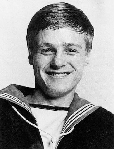
Judging from the date, I’m assuming that the episode in question was part of “The Faceless Ones“, and that the alluring lad in question was probably young sailor Ben Jackson, played by Michael Craze.

Ben Jackson

“Edwardian masher at a Gaiety show” is my new favorite phrase, by the way. And though Orton is a good enough writer for that quip to feel very off the cuff, it’s actually the one instance in his diaries where I spotted him re-using an earlier joke. On the 24th of January, 1967, Orton paid a visit to meet Paul McCartney and Brian Epstein to talk about writing a script for the next Beatles movie. During the course of the evening, a pop group called the Easybeats drop by, about whom he says:

…about five very young and pretty boys trooped in. I rather hoped this was the evening’s entertainments. It wasn’t, though. …After a while we went downstairs. The Easybeats still there. The girl went away. I talked to the leading Easybeat. Feeling slightly like an Edwardian masher with a Gaiety Girl.

The Easybeats

Singin’ for your supper

Bette Davis pulled a neat trick when she took on the title role of Whatever Happened to Baby Jane?, managing to revive (and in some sense, reinvent) her career at an age when most leading ladies were left with no place in Hollywood. I knew that she worked hard to get the role, and worked hard to get it right (that kind of scenery-chewing doesn’t come easy), but I had no idea she went to such great lengths to promote the movie:

Poor dear. The spectacle of her performance in the movie was intentional, and quite briliant. This just makes me wince. You can almost see her gritting her teeth and thinking, “focus on the paycheck, focus on the paycheck”.

[Thanks to Café Muscato for digging up this gem.]

Badger

Badger by Howard

If you think you would enjoy an extremely cute but sad tale of a lonely badger living in a flat in South London (and really, how could you not enjoy it?), then you should buy a copy of Howard Hardiman‘s Badger. It’s really charming, I promise.

[Shameless self-promotional alert: I helped Howard put the final product together, since I’m such a fan of the badger. The book also features a little bit of a little typeface I designed.]

And people think I’m fussy?

I giggled at this passage that I just encountered in The Joe Orton Diaries:

Peter Willes rang up. ‘What do you mean by sending me such an atrocious script?’ he said. ‘What?’ I said. ‘All the “O’s” are out of line. I can’t read a script like that. Haven’t you another copy? ‘No,’ I said. “I’ll have to get it retyped,’ he said. ‘I can’t let the actors see a script in that state.’ ‘Did you read the script?’ I said. “A little.’ ‘What did you think of it?’ ‘I thought it rather dated,’ he said, ‘though that may have been the effect of the “O’s”.’

See? Good typography makes a difference.

ΩÖØ

Do you like the idea of using crazy characters in your blog posts or online profile headlines, but just can’t remember all those nutty character entities? Fret no more! This website is a tiny little thing that lets you copy and paste to your heart’s content. Of course, after all the time I’ve spent dealing with Unicode charts, I actually think they could have been a little more ambitious. How useful is it to include the interrobang (‽) but not mu/micro (μ) or the eth (ð)? We love the eth!

One more thing about Orton

You know, there are lots of other things that have been happening that might be better to write about (Travel and work abroad! Fetishwear spending sprees! The waxing and waning of various flirtations!) but all that stuff always takes so much time and effort that I ought to be devoting to things that actually help pay my bills. But since I’ve just started reading The Orton Diaries on today’s bus/tube/plane/train trip, I’m thinking again about a certain ex and all the similarities between him and Orton’s carefully constructed public persona that just seem too perfect to be a coincidence. And the intro of the book also reminded me that Orton’s diaries and letters are held at my old university, in the library where a certain someone also used to work.

Also, Orton is still really sexy and smart and funny. But kind of a jerk, just like a certain someone always was.

My Aim Is True

schiphol_urinal.jpg

So it wasn’t my imagination. When I was stopping to take a quick leak on my way through Schiphol Airport yesterday morning, I spotted this little thing that looked like a fly in the urinal, except it clearly wasn’t a fly. It sort of seemed like something stuck to the bowl, so I found myself trying to wash it away. I fell right into their nefarious social-engineering trap! What a chump.

Stop men from peeing on the floor. Authorities at Schiphol Airport in Amsterdam have etched the image of a black housefly into each urinal. It seems that men usually do not pay much attention to where they aim, which can create a bit of a mess. But if you give them a target, they can’t help but try to hit it. Similar designs have been implemented in urinals around the world, including mini soccer goals, bulls-eyes, and urine video games (seriously). Do they work? Since the bugs were etched into the airport urinals, spillage has decreased by 80 percent.

[From Good, via BoingBoing.]

Actually, it’s a pretty brilliant idea, and really not sinister at all. I have to admit that when I first realized it wasn’t a fly or a speck of dirt in the bowl, my immediate instinct was that it was some kind of viral ad campaign, since I’ve been getting more and more pissed off [heh.] about how hard it is to escape ads in public spaces. I’m really pleased this was an intentional attempt to get dudes to do the right thing. (Note to other airports/places with public restrooms: Please don’t try to do this with ads. The urinal cakes with ads in them are horrifying enough. Thanks.)

Prick up your what now?

Joe Orton

I’ve just finished the original book, and am now finally watching the filmed version of Prick Up Your Ears, the biography of playwright Joe Orton. I had a nagging sensation while reading the book that there was a lot about Orton that reminded me of an ex of mine with whom I had one of my more melodramatic relationships. Twice.

Gary Oldman as Joe Orton

Watching the film now, I’m convinced that Orton — and particularly Gary Oldman’s performance as Orton — fed into this guy’s personal mythology, and certainly his kit bag of posturing and affectations. He was, like Orton, a guy from a fucked-up working class background who picked himself up by his bootstraps using a fistful of natural intelligence and talent. Like Orton, he was also sexy as fuck and kind of a smug, self-satisfied cock. I don’t recall him ever mentioning Orton — I guess by the time we’d met he’d moved on to other literary obsessions. Actually, it would be more in character if he’d decided that Orton wasn’t much to think about from a literary standpoint, no matter how much he played up the same kind of romantic rebel schtick.

Read about Reading

Baseline #55If you can find yourself a copy of the current issue of Baseline (number 55, Summer 2008) you’ll find a nice little profile of the stuff that goes on at the Typography Department at Reading.

[Baseline‘s website doesn’t seem to do permalinks, so here’s the excerpt. Find the article, though: it has more stuff and pretty pictures, too.]

The department has the longest established record of any university devoted to research into typography and information design. The staff summarise their interests as ‘design for reading’. Approximately fifty percent of the department’s activity is devoted to research and post-graduate work, so it is not surprising therefore that it has been awarded the top rating for research quality on two occasions (1992 and 2001) in the British universities’ Research Assessment Exercise.

The range of taught masters courses includes MAs in Book Design (course tutor Paul Luna); Information Design (course tutors Paul Stiff and Rob Waller); and Typeface Design (course tutor Gerry Leonidas); and an MA (Res) in Typography and Graphic Communication (course tutor Mary Dyson).

Reading is unique in having rich collections of historic lettering, printing and design. These include the archive of the Otto and Marie Neurath Isotype Collection; a collection of more than 20,000 items of printed ephemera; and several archives of twentieth century designers.

Research centres

The department also has two research centres. The Centre for Ephemera Studies is based upon the collection of printed ephemera which reflect everyday life in the past. More recently, Rob Waller has joined the department after twenty years in practice, and established the Simplification Centre. The primary aim of this is to conduct research on information design and make this accessible to organisations which communicate with the public on complex matters. One of the department’s impressive range of recent and currently funded research projects are described below (see issue 55 for the full article).