Pink Minx

Gay Shame 1

Having grown up with a life-long concern about being perceived as a sissy, largely due to a long childhood being called a called a sissy or being told not to be one, I opted to participate in Gay Shame (this year’s theme: A Festival of Femininity) by confronting my neurotic aversion of wearing pink for fear of looking too girly, and by trying to look like quite a big sissy. I succeeded, and had tremendous fun.

Gay Shame 2

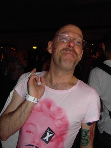
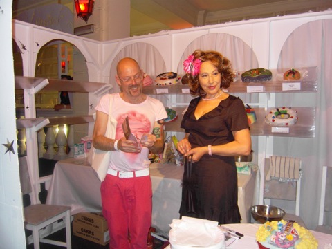
[Incriminating photos from the lovely Mr Green, who wore white, not pink.]

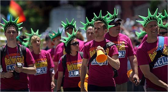
The ladies and gentlemen of the ACLU LGBT Project also wore pink at last week’s Pride festivities, or at least bright fuschia t-shirts I designed for them. According to the San Francisco Chronicle:

On the other hand, it was down with drab for do-gooders. The ACLU’s fuchsia T-shirts with green Statue of Liberty crowns: simple yet sublimely multicolored.

ACLU Pride

I still hate wearing pink, but I am quite proud — no, I am quite pleased — to be a big ol’ nancy homo fairy who likes to kiss and hold hands and stuff with other dudes.

And in case you didn’t get it, this post’s title is a shameless reference to Pink Mince, a little zine thing I’ve started publishing. Why haven’t you ordered a copy yet?

Subway Stories

It only dawned on me yesterday that the videos from the WYSIWYG Talent Show were still languishing on our old web server, which is rather a terrible waste considering how much more easily you can handle video on the internet now thanks to YouTube. So without further ado, here’s a clip of me from March 2005, reading my bit at “The City That Never Shuts Up: New York Stories”.

Related:

Table for one, please

I am a pretty intensely introverted person, which can be a challenging thing now and again. As long as I get a little time to myself to regroup and unwind, I’m perfectly comfortable being sociable or doing far more extroverted things like teaching or going out, but situations where I am around other people for long stretches of time really wear me out. No matter how much I treasure good company and enjoy being around interesting people, dealing with more than a few people at a time — or any number of people for a long stretch of time — usually requires a conscious effort, a way of slipping into a different, more outgoing mode for a little while, and then getting some serious rest afterwards. (This, as family members may be suspecting at this moment, is why I always retreat to the solitude of long naps in the middle of holiday get-togethers.)

Continue reading “Table for one, please”

Photos officially OK in NYC

Finally, common sense prevails over security theatre and knee-jerk paranoia:

Faced with complaints from photographers and tourists alike, the NYPD has issued a department order reminding cops that the right to take pictures in the Big Apple is as American as apple pie.

“Photography and the videotaping of public places, buildings and structures are common activities within New York City . . . and is rarely unlawful,” the NYPD operations order begins. [From the New York Post]

[Click the image above to enlarge and print for yourself to carry around, if you’re so inclined.]

Let’s hope they finally drop the anti-photography here in the UK one of these days.

Brief Message from the Management

Fucking Spam

I throw up my hands in defeat. I’ve finally had to shut down the comments on this entry about Sodachrome. Although some very lovely and flattering authentic comments were made (for which Ian and I are deeply grateful), I have been drowning in an onslaught of spam ever since someone thought it would be nice to add that page to StumbleUpon. Note: It was not nice. It led to a fucking awful, endless torrent of spam that has overwhelmed my ability to check for any real comments amidst the spam.

Crap Rotation

I’ve had analog stuff on the brain lately. I may be someone who’s been online for a long time, and who stays tethered to the internet throughout the average day in one way or another, but I’ve always been a little ambivalent about the medium. And I don’t just mean how much I hate building web sites, despite running one (or a few, usually) for such a long time. I guess my ambivalence is more about the culture of the medium, more than the platforms themselves. I’m always fascinated by how the online world changes and surprises me, but I’ve been at it long enough to miss some things that have gotten further than what I liked about them. It was a lot more fun to participate when online life was an immature mess that was in the middle of sprawling outward.

I used to make stuff — actual, physical stuff, like zines and mixtapes and paper and postcards — a lot, and the tactile aspect of that was a huge part of wht I liked. I don’t make so much stuff anymore, and I miss the way I enjoyed the making and the sharing of it. I stumbled into the web because I was curious about this new thing that was emerging, and it was easy enough to tinker with it and feel it out. Throwing up a web page built with Mosaic was also a cheap alternative to putting out the slightly ambitious zine I had been making, so the first pages I made were supposed to be a staging ground for what I’d publish the next time I had a little extra scratch lying around. Then they became a repository for stuff I was posting on discussion groups, and then a repository for what I’d published in my zine, and then Blogger happened and then GreyMatter and then Movable Type and then Flickr and then Twitter and other stuff and it became more and more and now here we are. Now, I find myself constantly expanding and contracting in the online world — testing new things, leaving them when they don’t give me something I like. I don’t really like the endless networks that can spin out in all directions. I like a smaller net with edges that are just blurry enough to leave room for serendipity. I like a bit more community and a bit less…well, a bit less onslaught of everything, I guess.

Continue reading “Crap Rotation”

The New Rail Alphabet

Available at last! Margaret Calvert and Henrik Kubel have released the New Rail Alphabet, their gorgeous revival of Calvert’s classic design for British hospitals and transport networks in the 60s. As you can see, it’s like a Helvetica, but with a touch more warmth to it.

There was a feature about the design in the latest issue of Eye magazine, in which the new typeface was called Britanica, but there were some lawyer-y concerns, and they finally decided to go with something a bit closer to the original name.