Superheroes without Borders

Every single one of these covers from old Arabic editions of Superman comics is exquisite, somewhat surreal, and perhaps a nice reminder that Superman only started fighting for the American way in the 50s during the thick of the Cold War. Up until then, a couple of Jewish teenagers just wanted him to fight for truth and justice. Frankly, I think we could all use a little of that, not just the US. Recontextualization FTW!

Wise words on webfonts

My brain shuts down over webfonts. I can’t muster the will to care. Partially it’s because I really hate designing and building websites and I just don’t want to know more because then it will be easier to avoid it altogether. Partially it’s because I’m waiting to see how much hideousness will result from this incredible race to make a gajillion fonts available for the web, when the browsers, the users, and the fonts themselves just don’t seem to be up to the task yet. Oh sure, there’s potential, but it all seems so familiar. Or, as summarized very neatly by John Hudson in this Typophile thread:

To me, the rush to the web fonts market looks pretty much identical to the rush to the desktop publishing market, so I’m expecting a lot of bad typography and difficult to read text, and the better part of twenty years to clean up the mess. It isn’t good enough to say that ‘if somebody chooses a font that … stinks, that’s their choice’, because typography serves first reader, then the text, and only then the author/publisher.

May Day!

Oh, nothing to fuss about. that’s not “May day!” as in, “Help!”; it’s “May Day!” as in, “It’s the first of May and after a solid four months of working almost every waking hour, money has last started to flow back into my coffers, allowing me to rejoice, pay many bills, and indulge in some long-overdue infrastructural upgrades.” So you can understand the need for the exclamation point, clearly.

So that picture can be considered a bit of a status update. I just took it with a new camera that is making me squealingly happy, now that I can at last retire my trusty but aging point-and-shoot and switch at last to an SLR. In that photo I’m wearing new glasses (well, some 10-year-old frames, but with a new prescription) that allow me to see clearly again for the first time since I smashed my old ones three months ago. And I’m not scowling, despite the absurb workload of the last few weeks, which means I must be in a good mood overall, probably due to the onset of longer days and the seasonal readjustment of my energy levels.

So yeah, it’s Saturday and I’m working, but I think I may be out of the woods soon, and I’m practically starting to function like a regular person again.

Hi-class operations in the ’hood

While enjoying this teeny article about the cost structure behind designer clothes that sell for seemingly unreasonable prices, a little bell went off in the back of my brain as the writer mentioned the Martin Greenfield factory, where they were making manufacturing some designer khakis that eventually sell at Bergdorf Goodman for $550. A quick search confirmed my suspicion: that’s the place across the street from my old loft in East Williamsburg, where I lived for two-and-a-half years. I knew it was one of the few buildings in the area that was still a working factory rather than a dumpy building full of artists in search of cheap space, but had no idea they were doing the high-end stuff.

Sadly, I assume that Tenochtitlan 2000, the tortilla factory around the corner, was not operating with the same profit margins.

[And wow, it’s been a long time since I looked at the online slideshow that I linked to in that old post about my place. Damn, I miss that place, even though the loft — and my life — really went to shit eventually.]

Enter the Void

One of the points I try and make when I talk about “bad” type (let’s just say it’s of dubious quality, for whatever reason) is that a good designer can do brilliant things with almost any typeface with enough imagination and care and balls. And when I say stuff like that, I envision amazing things like this (warning: may cause seizures, but that’s a small price to pay):

[The opening credits from Gaspar Noé‘s Enter The Void]

Oh Coney, My Coney

The start of Summer always makes me long for Coney Island, especially now that it’s so far away and I’ll probably never see it again before it finally gives in to all the pressure and becomes something else.

Wonder Wheel

But there’s so much to love. If you haven’t been there it may be hard to see past the decay and appreciate the real charm that comes from the liveliness of the place, and the visible signs of a long, colorful history. I’ve always had trouble putting my finger on my love for the place, although it’s such a goldmine of lettering and kitsch that it’s easy to understand what first sucked me in. But it’s always been more, somehow, too.

Coney Island Dream from Joshua Brown on Vimeo.

[Coney Island Dream from Joshua Brown on Vimeo.]

Shoot the Freak

Let me pass

passport photos

New passport photos, at last all sorted. Hilariously, there’s a place down the street form the studio that does them. Well, it wouldn’t have helped to get them last week since I’m still waiting for a paycheck deposit so I can end in the fees for the new passport anyway. And then I just start hoping this all gets fixed before I have to fly to the Netherlands to teach at the end of May.

Oh, and don’t get even GET ME STARTED on the headaches that are going to be involved with securing a visa renewal by December. I’m going to be nagging a lot of people all summer long if that shit’s going to happen.

Don’t be a snob

I’ve been really focused on getting things ready for a talk I gave to the design students at Central St Martins last night, because it was a whole new presentation that required me to really digest and process a lot of ideas that have been simmering on the backburner for a while. The basic point of the talk, which will surely be revised and expanded and edited and given a few more times, is that when you do research about type design — particularly design for unfamiliar writing systems — you need to be incredibly objective and open to all possibilities and examples and things you can learn from them. Maybe you don’t have enough understanding to know whether or not your sources and examples are reliable, or maybe you’re letting your personal taste be your guide — either way, you probably need to stop and step back and ask yourself if what you’re doing is relevant, appropriate, or effective. There can actually be a lot of useful lessons in things that you might easily dismiss (for plenty of good reasons) as being “bad’.

After the talk, there was a great Q&A session with the audience, and then drinks at a pub, and then dinner. It was nice, and a welcome relief from my frenzied pace of late, and very creatively stimulating on the whole to get all all those ideas out of my head and then have clever people respond to them.

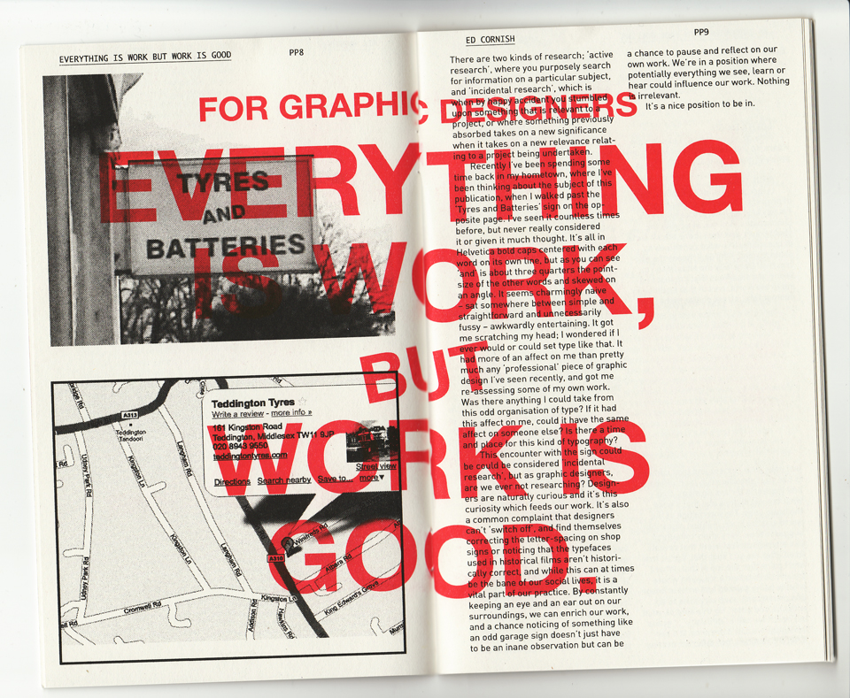
Another nice treat was this little booklet that Rathna gave, published by the CSM students she advises on a little side project called Print Matters. The booklet — printed by Hato Press on a Risograph machine, which I now desperately want — was a bunch of short reflections on practice. I was tickled to read that one of them, written by one Ed Cornish, was about stumbling across the same ideas about research in another way.

Print Matters

Continue reading “Don’t be a snob”