I totally want these. No lie. Especially the jacket.
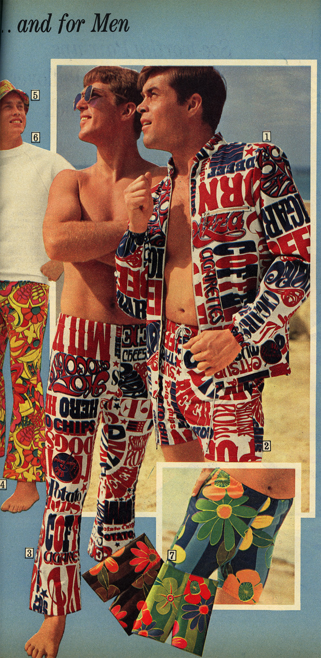
Scanned from a Summer 1969 Sears catalog. Usually I hold back on the judgment and editorializing about things I post on Public Collectors but these patriotic shopping list ensembles just can’t possibly be real. No one bought those right? I refuse to believe that men were walking around on the beach looking like fucking idiots wearing red, white and blue get ups blaring such catchy slogans of the 1960s as: “MILK”, “POTATO CHIPS”, “SHRIMP”, “PIZZA” and “CHEESE.” No way. This shit did not exist. Not a single purchase was made.