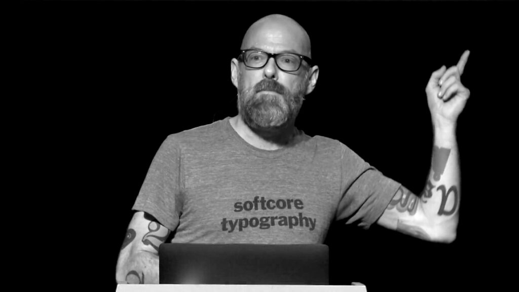
My old pals at the TDC were kind enough to invite me to represent Adobe Fonts on a panel about the state of the type industry at their Type Drives Culture event this past March. I got to say a bit about why we make fonts available the way we do. Watching the video above, I’m also rethinking this past winter’s whole experiment with wearing turtlenecks.
I recently gave in and started watching Star Trek: Discovery, after two seasons of waiting in vain for it to show up somewhere other than the CBS subscription service. I’ve been following along and reading caps, though, and my curiosity finally got the better of me. And I really like it so far!
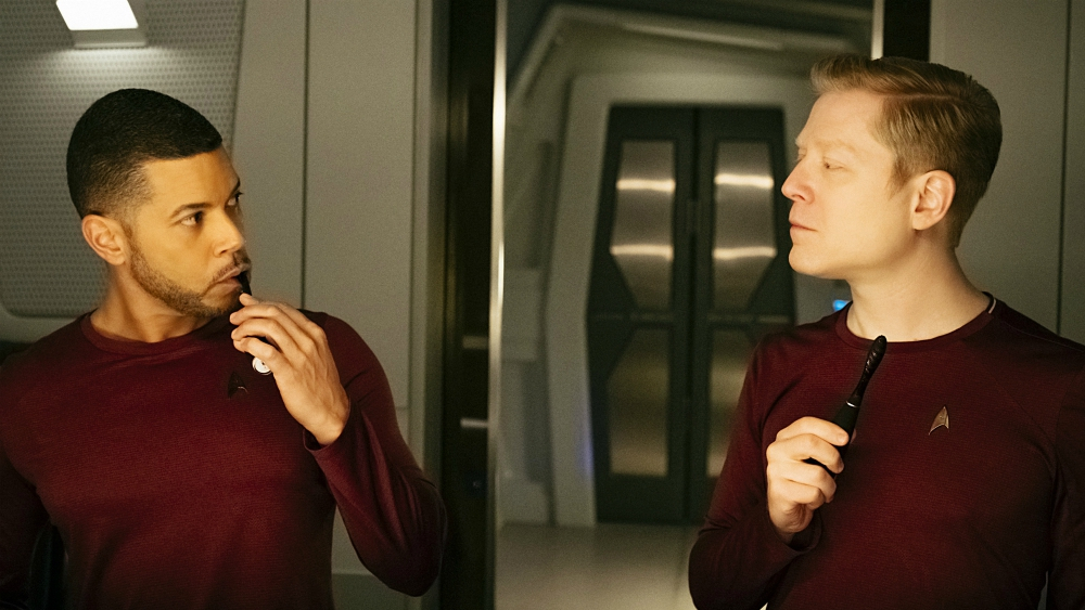
Even though I’ve already read spoilers and know who the characters are in general terms, I was deeply moved this morning as I watched the end of “Choose Your Pain”, one of the earlier episodes. Even though I already knew that the show is the first in the Trek franchise to include a gay couple, they way it presented Culber and Stamets in their quarters at night touched me so deeply. It was just so…normal.
They were just talking about the day’s big events while brushing their teeth. There was no melodramatic declaration of identity. No romantic grandstanding. Not even a clear mention that they were a couple, or married. Looking back on the episode, it seems clear that others understood their relationship, and thought little of it.
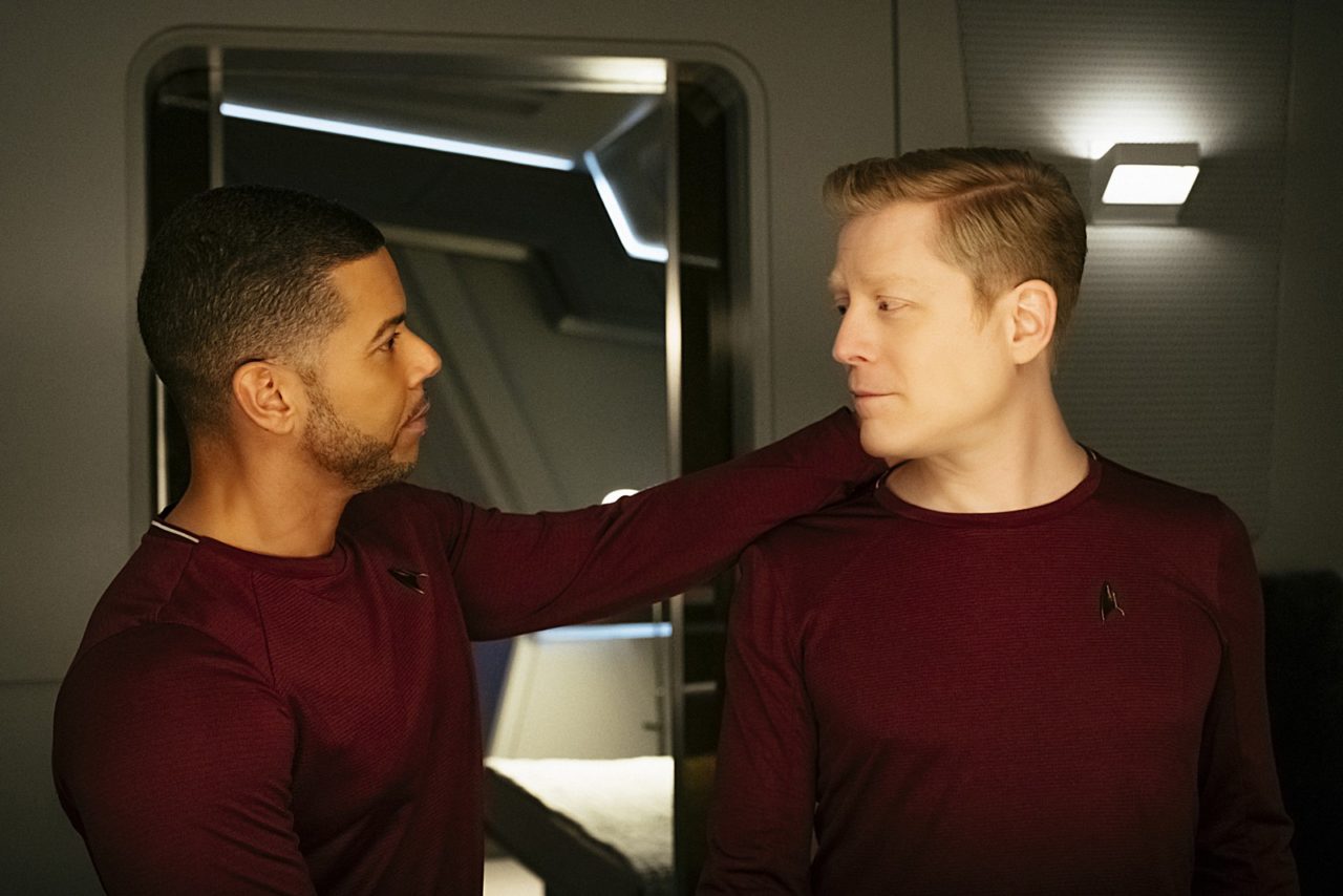
The couple didn’t even kiss in this scene. But yet it was so intimate! A familiar and moving interaction between two people who shared a life. I was floored. It turns out this was the representation of gays I’ve been waiting for all these years, especially in something that I love the way I love Star Trek. The gayness was incidental, yet unmistakeable. Inherent to the characters and their interaction, but not a plot point in itself. It just felt like it was part of their lives — clearly important, but one element of many. I hadn’t realized how badly I’d want to see it this way. Where no one has gone before, indeed.
During the second half of the twentieth century, the United States moved toward greater social acceptance of LGBT people, due to the cumulative efforts of numerous groups engaged in social and political activism. One of the many challenges facing any attempt to bring together a community of gay people was the difficulty of producing and distributing any books or periodicals with overtly gay content, which was under threat of various methods of censorship. However, even as legal hurdles fell away, social censure remained an ongoing challenge to gay communities and the publications targeted to them.
During that same period, the graphic arts industry experienced its own rapid evolution, as the development of ever faster and cheaper means of typesetting and printing made a greater variety of typographic choices available with fewer barriers to their use and reproduction. Typewriters, phototypesetting systems, rub-down type, and eventually desktop publishing software provided an increasing number of ways to easily prepare text for layout and reproduction, with less and less formal training required to do so.
I just realized that “Three typefaces for mathematics”, my MA dissertation from the Typography department at Reading is one of a handful of examples posted at typefacedesign.net (and includes a link to the full document hosted on Issu). For future reference, that may be a more reliable place to find it than on this site, although for now it’s still available here. I lost all the source files (InDesign doc, illustrations, scans) in the Great Hard Drive Crash of Twenty-Twelve, so I’m glad that there are still copies of the PDF in circulation.
As I’ve often told people over the years about my experience on the Typeface Design MA, one of the most valuable things I learned there was how to properly research and write about a subject. There is some irony to my saying “valuable” here, in that I have a very good career in typeface design, but I actually think that what I learned about critical thinking, looking for and using primary source material, and shaping and defending an idea have proven to be fundamental to much of the work I’ve done as a designer, curator, and (begrudging) writer over the years since I finished my degree.
I’ve always been flattered that my dissertation has been used in class as an example of solid academic writing, considering what a slow and painful process it was to write it. I’m not a great writer, nor very disciplined at being productive when I need to write, but I discovered that working on something like that is an excellent way to clarify my thinking about something, by forcing me to consider every day. It exposes the gaps in my thinking in a way I can skim over in a talk, a tweet, or conversation.
It’s good to remind myself of the usefulness of the writing process as I consider whether I’m ready to buckle down and return to Reading (the university, not the town) to work (remotely, and part-time) on a PhD. It’s one thing to be interested enough in a subject to go deep, but another to get proper guidance and to be challenged on my assumptions. I often joke that I did a PhD’s worth of work on Monotype history when I worked there, but without ever getting any credentials. The reality is, though, that I did all that work without getting credentials OR doing the research work with any real rigor. Time to get serious, at last.
I was in Hamburg last month at the kind invitation of the Peter Schmidt Group, who asked me to speak at their Beyond Type event. Despite the jet lag, I managed to speak in full sentences about the future of typography as I see it.
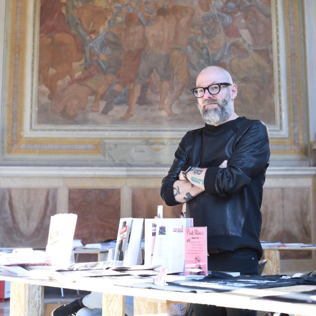
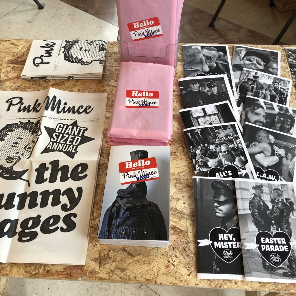
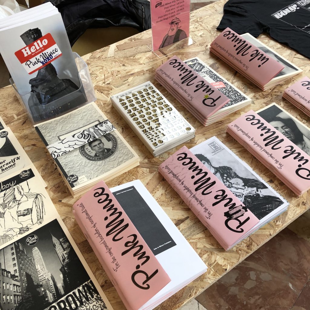
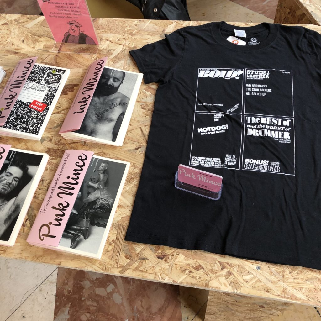
I used to run a Tumblr “mood board” for my zine that had a little over 8 years of content, much of it dancing around the line between obscenity and legitimate expression of sexual identity. When Tumblr was sold recently, I didn’t expect the new Tumblr censorbots to do a good job of making the distinction, and I’m fucking angry that I need to worry about it. With Tumblr’s new policy of crawling through and removing adult content, I have a weary fear that queer content is going to suffer.
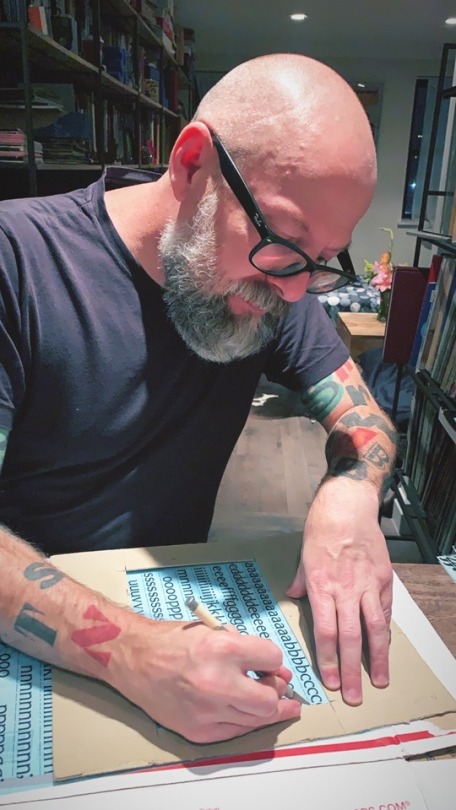
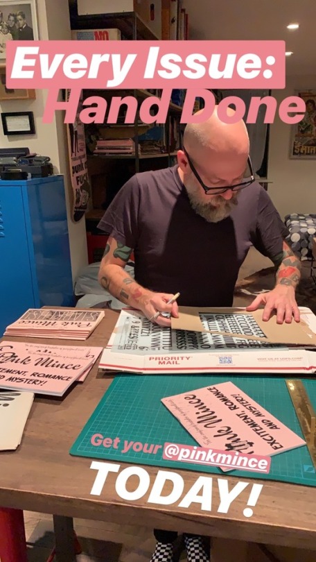
So once my backups are done and filed away for my future reference, I’m folding my Tumblr blogs and deleting my account. I’ll still be around on Instagram at @pinkmince, and as always I’d like to encourage everyone to stop by pinkmince.com to check out the zine that gave birth to this project, and expresses the end result of all of this gathering and inspiration and thinking.

 I just realized that “