Kerning 2017, June 9 — Dan Rhatigan – Marginalized Typography from GrUSP on Vimeo.
Category: ultratypographic
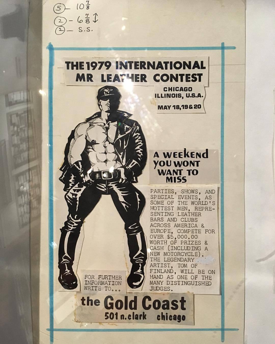
IML 1979 at the Gold Coast
Paste-up of an ad for IML 1979 at the Gold Coast (at Leather Archives & Museum)
TYPO Labs: Variable Fonts Progress Report
Fastest upload ever! I just gave this talk earlier today at TYPO Labs in Berlin. I’ve barely slept for the last two days, so I’m surprised that I sound so lucid.
Since last September’s announcement of the new OpenType 1.8 spec, variable fonts have been moving from concepts and demos into practical solutions. This overview will summarize the progress made so far on new fonts, the environments that can support them, and what some designers have already learned to do with them.
Update: And here’s a nice montage of scenes and impressions from the event:
Source Han Serif: An open source Pan-CJK typeface
When I started at Adobe last September, the Adobe Type team had been hard at work for quite some time on a major project: Source Han Serif, a serif-style family supporting pan-CJK languages. This is a follow-up to Source Han Serif, but pushes the scope a little further than that project, particularly in that it turns out to have been the original story for Frank Grießhammer’s wonderful Source Serif, as well.
I didn’t do much for the project itself other than keep an eye on its progress while my better-qualified colleagues finished what they’d started, but thy were kind enough to let me talk about the work and how it fits in with Adobe Type’s overall mission, which IS my job to worry about.
Variable Fonts in Print
Just a quick interview feature in Print about some upcoming things in the type world:
Variable Fonts with Dan Rhatigan
By: Callie Budrick | April 1, 2017
If you’re working in the typography world, you may have heard the whisperings of collaboration between some of the biggest names in technology. Adobe, Apple, Google and Microsoft have been working together (with the help of independent type foundries and designers) to create something that’s going to change the way we see type — literally. They’re called variable fonts, and Dan Rhatigan took the time to tell us everything we needed to know about them.
“Variable fonts are a way of taking many, many, many styles within a typeface family — from very lightweight to very bold weight, from wide to skinny — and packaging them all up into one small file,” he explains. You’re not just saving space, you’re also getting access to all of the possible weights and sizes on the spectrum of a font. That includes more than the names you would choose from a font menu like bold or light. But how does it work?
Basically, “it’s a more complicated and sophisticated version of a font file. But it’s still just a font file and will behave on any operating system that can support it,” says Rhatigan. Variable fonts are based in formulas like any other font file. “In terms of how it knows what it can do, that’s where the applications will come in and be able to register, ‘oh, these are all possibilities within one file,’ rather than having to specify a different file to get a different style.”
Example of how Variable Fonts, a developing font technology, can work. Source: Erik van Blokland
He explained it to me like this: the same mechanism that allows a webpage to read flow when you zoom in and out in a browser window can manipulate a font’s style when it gets built into the CSS. So if you take a phone or tablet, and you turn it from vertical to horizontal, “the same device detection that allows it to register that the device orientation is changing could allow the font file to switch to, say, a more condensed style for the vertical orientation, or a more expanded style for the horizontal.”
Variable fonts are still in the early days of conception, but that isn’t stopping people from experimenting and pushing the boundaries here and now. David Jonathan Ross from DJR Foundry and the Dutch type foundry Underware have both been testing experiments. The Big Four have also been getting input on the technical side from designers and typographers around the world. Erik van Blokland from LettError has contributed a lot of the math that has made dynamic fonts more flexible. Friends from Monotype who helped develop TrueType GX in the 90s and Dalton Maag from Typekit have also been have helping make variable fonts the best they can be. “It’s encouraging to me that people aren’t holding their cards close to themselves, and that they’re trying to engage in a dialog as we all come to understand what will be possible and what we can make possible for people who use these fonts.”

The header of LettError’s website, demonstrating dynamic fonts.
A few days before chatting with Dan Rhatigan, I had a conversation with Paula Scher. She made the comment about how she prefers when design leads the software, rather than the software leading the design. Is it possible that variable fonts could be a shortcoming by giving designers too many options to work with? “Variable fonts will be a very flexible tool. My hope is that…it will encourage designers to think very deeply about what they can do with that. I would hate to see people saying things like, ‘Oh, I can have any weight,’ and then begin using weights that don’t make sense just because [they’re available],” he says.
As for other possible drawbacks, “[it’s] an added responsibility for type designers,” says Rhatigan. Variable fonts will require type designers to be more methodical, since every possible weight will be available to developers. “You can’t make a weight and then clean it up.”
“Variable fonts are not the solution for all kinds of fonts. Not everyone will have to make [or use them]. They’re a good solution for packaging up large font families that would otherwise come with a lot of different styles within them.”
SVA Type Lab
For the last few Summers I have been one of the instructors for the SVA Type Lab, a 4-week course in typeface design here in New York. This year, we’ve been trying to promote the course with some cute short videos:
The Blank-ish Page
This talk took place on Saturday, June 18, 2016 in The Great Hall at The Cooper Union as part of Typographics.
Typographics 2016: The Blank-ish Page from Type@Cooper.
My summary from the program:
It can be difficult to explore possibilities of typography when designers—and especially clients—assume certain things are given, when these variables are not hard limits, just conventions. I want to look at the background of certain defaults of our software, to get people to consider them in some context and think about them more critically.
Tailored Typography
“Tailored Typography”, a talk I gave at the San Francisco Public Library on March 29, 2016, as part of Type@Cooper West’s lecture series
I’ve delivered some variations of this talk in the past. In fact, I believe the first iteration for it was for Type@Cooper in New York. My ideas about the material presented continue to evolve as I learn more doing various bits of research, but this time I was able to be a little more direct in my discussion of some details now that I no longer directly represent Monotype. (There had always been some legal hindrance in my ability to speak as an employee about the manufacturing activities of the Linotype and Monotype corporations in their original incarnations, neither of which are actually the same entity that operates today as Monotype Imaging, Inc. Don’t even get me started on that.)
The basic premise of this talk, though — the relationship of type production to type design — is a big fascination of mine that keeps going deeper all time time, so I imagine someday there will be other versions of this that evolve even further.
Learning from Letraset
“Learning from Letraset”, a talk I gave at Cooper Union on February 22, 2016, as part of Type@Cooper’s Herb Lublin Lecture Series
Letraset and other brands of rub-down type literally put typography in the hands of the people. Rub-down type made it possible for students, professionals, and everyone else to design with real typefaces, without needing professional typesetting services. A cheap and easy way to experiment with typography and other graphic elements, Letraset put a lot of care into making type easy to use well, but it also resulted in a lot of ways to use type badly, but with interesting results. With some care and attention, however, it was a great way to develop an eye for typography.
This talk was a look at Letraset’s type and other graphic supplies, showing how they put the tools of professional design into everyday hands. It also looked at how people had to improvise with Letraset, and made the most of the materials at hand.
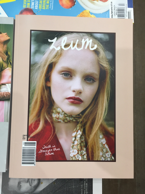
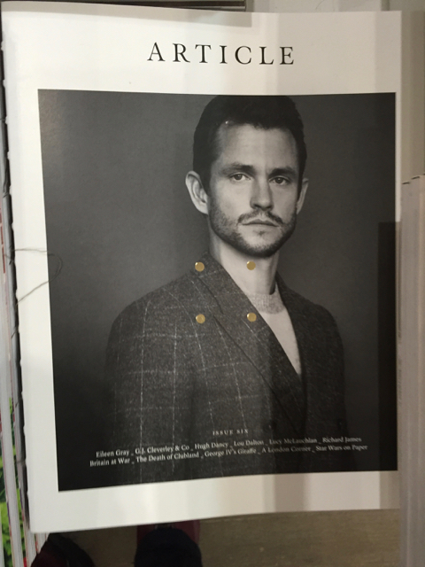
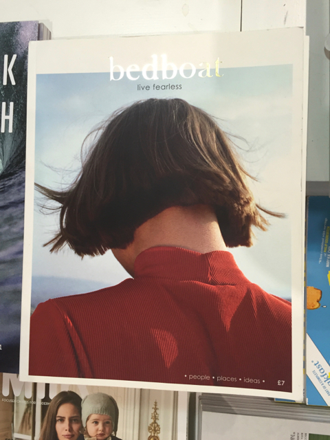
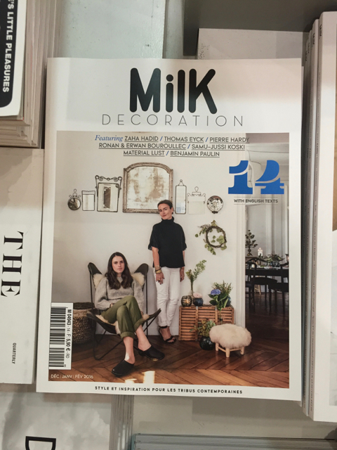
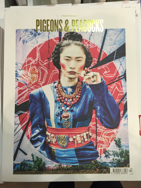
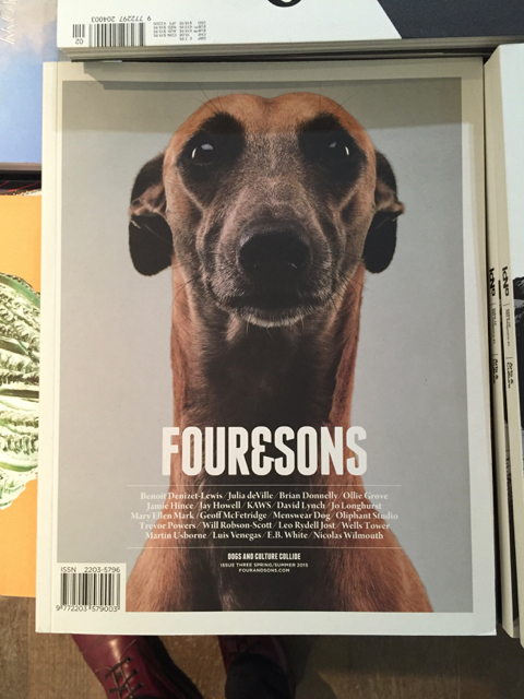
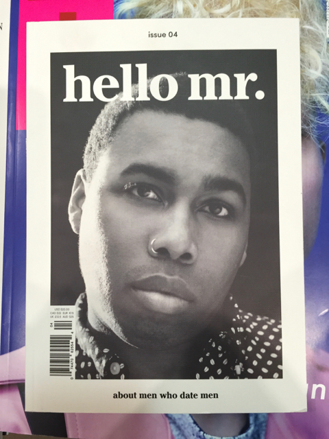
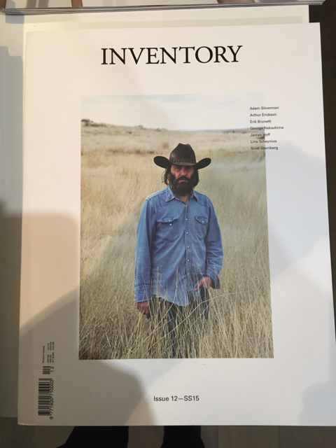
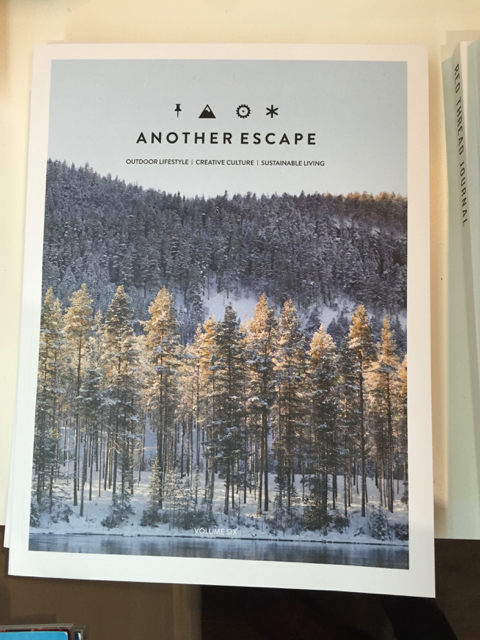
The Indy Style Mag Style
A couple of years ago I wrote about a trend in magazine cover design that felt like was becoming a real cliché — centered title, single image with a border, maybe a bit of non-hierarchical list about what’s inside. After a recent visit to the newer, larger Magma shop in Covent Garden, I can see that this very homogeneous style for independent mags is still deeply entrenched, and spreading.