Dan Rhatigan describes himself as a middle-aged nerd who really likes type; so much so, that he’s used his arms as a canvas to showcase the more than 30 letterforms that mean something to him. If you happen to see him wearing short sleeves, you’ll react in one of two ways. One, you’ll immediately try to figure out what message the letters and numbers convey, then become confused because there appears to be no rhyme or reason to the tattoos. On the other hand, if you’re into typography, you’ll immediately get it and want to start a conversation.
Professionally, Dan brings to the table over 25 years of extensive experience in various industries as a typesetter, graphic designer, and typeface designer. He has spent time curating exhibits, speaking internationally, and teaching graphic design, typography, typeface design, and branding at Pratt Institute, The City College of New York, University of Reading, and ArtEZ Institute of the Arts. He holds a BFA in graphic design from Boston University, and an MA in typeface design from the University of Reading in the UK.
While studying in the UK, Dan got involved in a joint project between Monotype and the University of Reading, researching and designing non-Latin typefaces. This project facilitated his entrance to the type-design world on a full-time basis; and later Dan worked at Monotype as their Type Director, with responsibility for their New York and London offices. Today, Dan lives in New York where he works with Adobe Typekit as the Senior Manager of Adobe Type, and serves on the board of the Society of Publication Designers, and is the Director-At-Large on the Board of Directors of The Type Directors Club.
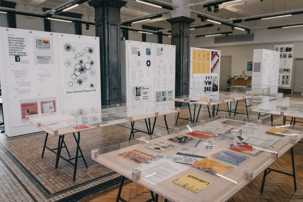
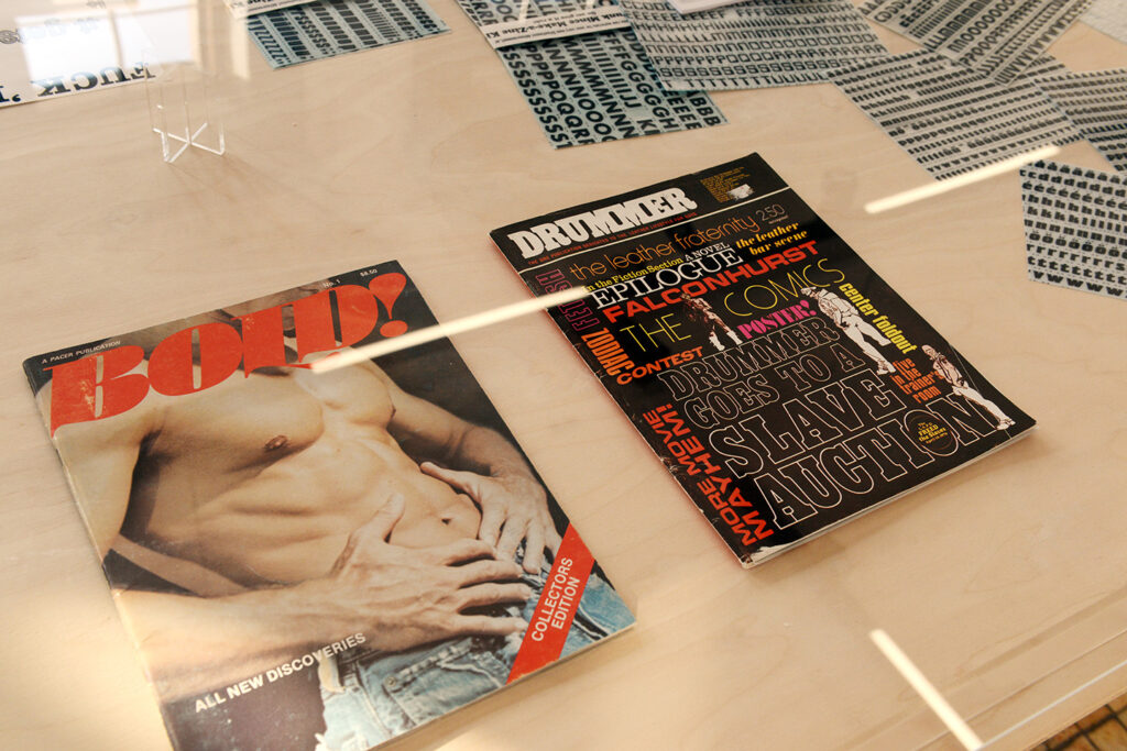
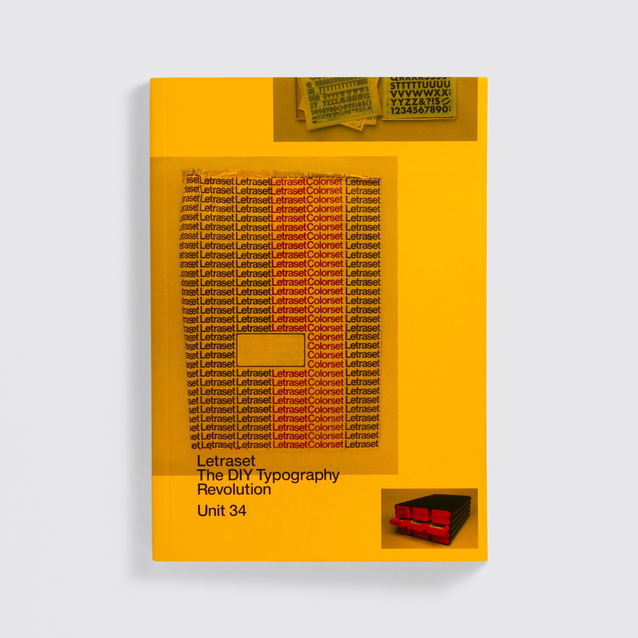
As a child, Dan dreamed of drawing comic books, and kept busy drawing the covers with big splashy logos. In elementary school, Dan together with a friend drew comic books and sold them at their lemonade stand. But, it was in his teen years while working with Letraset and a headline-setting machine for his high school newspaper that Dan realized he could manipulate the personality of the story he was headlining by changing the style of letters. This was when he first grasped that he could have a profession in type.
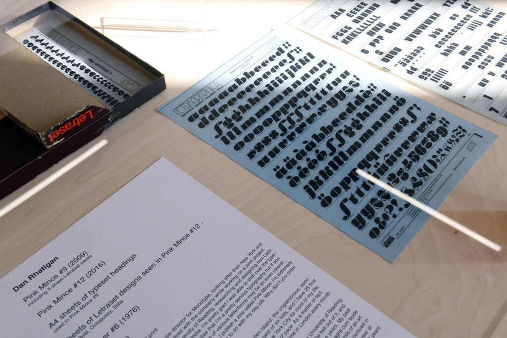
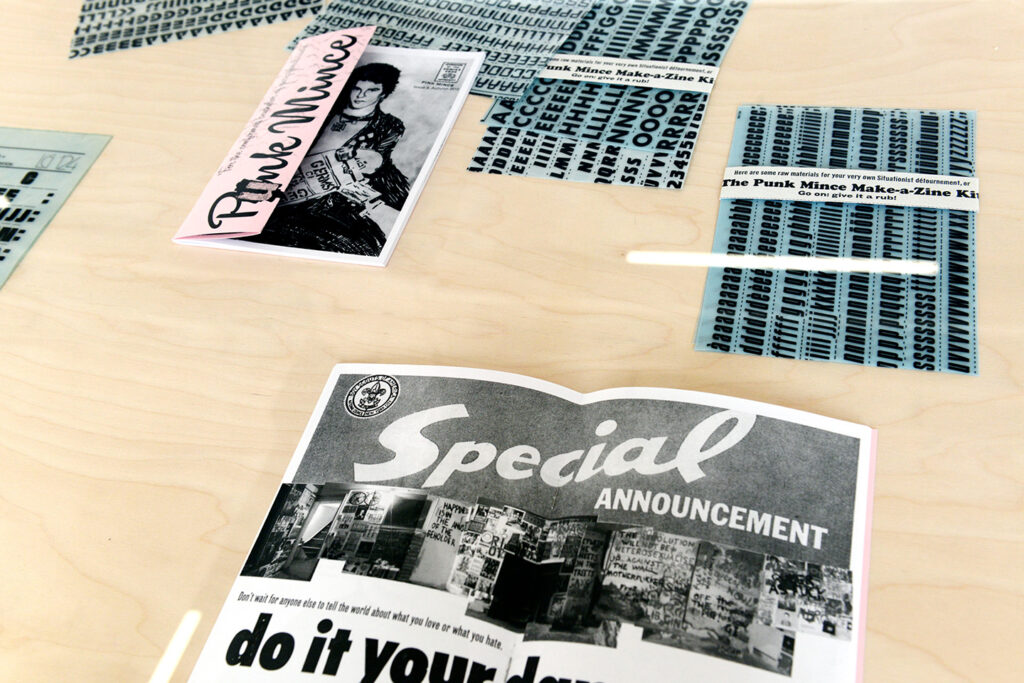
Dan began self-publishing Pink Mince (a queer British zine) in 2006. This began as a side project to help him acclimatize to living in England, and relieve day-to-day stress. Although published sporadically, Dan is really proud of the zine’s thirteen issues; the Minis and the related Tumblr moodboard. Today, Pink Mince has become a labor of love, and a ‘catch all bucket’ for the creative things Dan would like to do. In fact, if money were no issue, he would parlay Pink Mince into a full magazine, because ‘it isn’t just a gay zine, it is a showcase for contemporary typeface design and vintage lettering that features pictures of dudes.’
Dan is the youngest of six children born to an Irish Catholic family in Staten Island, New York. He admits to being bookish and introverted (read awkward and shy), which seems contradictory to the nickname he picked up in his youth – Sparky, that has become an extension of who he is – Ultrasparky. When he’s not working or spending quality time with his partner, Dan enjoys hanging out with friends; indulges an indiscriminate sweet tooth; listens to an eclectic mix of music, and is an accomplished photographer.
In the final analysis, Dan Rhatigan has a healthy respect for the history of typography, is knowledgeable, articulate and displays immense curiosity in his craft. Although he has collaborated on, and has his name attached to various innovative font families, it remains his dream to conceive, nurture and present to the world a typeface family all his own. … Stay tuned!
By Claudia L. Phillips