Marked for Life

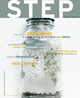
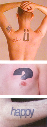
Step Inside DesignIf you check out the January/February issue of (the not great but not completely terrible) Step Inside Design magazine, you’ll find a short article about typographic tattoos featuring such luminaries as me (with the most ink, in journalism terms) and Dan’l (who inspired the author when she spotted his “happy” tattoo on the bus one day). It’s a nice little article, but now I find myself reflexively cringing at the thought of being part of a burgeoning trend.

I wish there more photos included with the article, because some of the other tattoos described sound truly exquisite. The last time I talked to the writer she was contemplating a book on the subject, so maybe I’ll get to see some of them eventually. If that happens, though, I’m going to have to make damn sure that I can offer something better than a low-res JPG for them to use. Not only does my picture in the article show all the signs of being blown up from a smaller version, but it still manages to show all the freckles and acne scars on my back. I’d hang my head in shame, but that would only draw attention to my back.

Me, some stranger, and Dan'lHere’s a brief excerpt:

“What’s new here is the graphic sophistication and awareness of tattoo design: Both the tattooed and those tattooing them are responding to trends in a visually driven culture. Patrons of tattoo parlors, especially in urban areas, often come in with predesigned messages, printed out from the fonts on their computers. And the younger, hipper tattoo artists are often design school grads, with a broad knowledge of typographic choices.”

I’ve been getting the itch to add another tattooed letter to my set, too. Although I have a loose waiting list of candidates, I keep waiting for serendipity to drop something truly outstanding in my lap. So here’s what I’m thinking: why don’t some of you send in suggestions? Maybe a little collaboration is order this time around/

Send me a picture of a letter you like. Here are some guidelines to keep in mind:

  • Single letters only no words
  • Don’t think about the whole typeface. Take a look at individual letterforms and consider them as images all by themselves.
  • I’ve been conservative about color so far, but I’m open to suggestion.
  • 3-D designs would be fun, as would interesting handwritten forms. The sky’s the limit, though: surprise me.

Soliciting Feedback

Working draft #2:

I have always done my best work when I have been able to understand a problem or a task by engaging myself with the ideas underlying it, tinkering and exploring possibilities. The scope of a issue, the plastic qualities of a particular material, the aesthetic sensibilities of a client or an audience, intriguing subject matter investigation of any or all of things is crucial to my ability to enjoy and succeed at what I do. This principle that has guided me through my career so far, informing my decisions to accept or discard various challenges on the basis of their ability to nurture my desire to learn as I work.

As an art student at Boston University, I learned not to produce artwork, but to think of its practice as a way to explore anatomy, history, perception, composition, and the pleasures of various media. Eventually, the study of graphic design led me to typographic expression and a practice of problem-solving that left room to draw upon the full range of talents at my disposal. Studying design in the early 90s also exposed me to digital technology at a time when I would be able to explore it as my profession was fundamentally altered by it.

Shortly after graduation, I took a job as a typesetter with the university, viewing it as an apprentice-ship in the finer points of typography and printing. (Fortunately, it also gave me a way to take more classes without the burden of tuition.) The digital aspects of that job also began my career in publishing technology, which has competed with graphic design as my primary focus ever since. When working as a designer neglected to feed my curiosity and desire to learn continuously, then working in technology gave me opportunities to explore other ideas altogether.

To me, the connections between the two fields were obvious: both addressed the need for clarity, communication, and ways to address current goals while planning for those that may develop in the future. Craftsmanship, investigation, and originality are intrinsic to both. Inventive solutions to many design problems often depend on the use of technology, and vice versa. In the workplace, though, organizations are often structured in ways that encourage discrete rather than cross-disciplinary activity, despite the limitations of doing so.

Tired of ricocheting between disciplines to feed my expansive curiosity, I began working toward a master’s degree in communication design at Pratt Institute. Before my first year in the program was complete, I realized that the experiment was a dismal failure. Rather than a source of guidance and criticism an environment that would allow me to develop the connections I saw between graphic design and the systems that support it, and how each could enhance the other the program proved to be more appropriate for students looking to perfect particular professional skills. Facing conflicting demands of work and school, I chose to abandon basic courses that repeated the lessons of my undergraduate studies in favor of the few classes that let me grapple with complex design problems. When I withdrew from the program, those incomplete courses became failures that contrasted my success in the upper-level courses. I returned to full-time work and the ongoing conflict between its opportunities and its restrictions.

As a designer, I have been able to indulge my interests in typography, tactility, and sequences of reading. As a technologist, I have been able to indulge my interests in logic, workflow, and systems that can accommodate new developments. Personal work has let me indulge my interests in art, writing, history, and politics. Usually, what I lack is the luxury of exploring how all these fit together: How do you shape the experience of a reader or user? How do different media enhance or distort the information they convey? How can the richness of information in structural markup be expressed in print? How much of an author can a knowledgeable designer prove to be?

I have come to think of design as a means of conceiving and building the vocabulary, syntax, and cadence of unique dialects needed to express complex ideas in comprehensible ways. Doing those things well relies on the ability to grasp those complex ideas in the first place. Given the opportunity to study in the [name removed to increase the suspense] program, with its emphasis on process, investigation, conceptual development, and learning that goes beyond design itself, I hope to develop a methodology for achieving and encouraging real understanding as a fundamental aspect of practice not a luxury to enjoy when time, money, or business objectives permit, but an inherent strength.

Type Freaks

Yes! Someone finally gets it! Someone understands. This is the best essay I have ever encountered about the peculiarities of the typesetting world, which doesn’t quite exist anymore the way it used to. It’s a strange world of marginalized freaks and perfectionists who always seem to have gravitated toward the profession and gotten stuck there for one reason or another, learning to take great pride and joy in making all those letters look nice.

Continue reading “Type Freaks”

Art Chantry Saved My Life

As I mentioned, I got a piece of unsolicited e-mail yesterday from my idol, a Seattle-based designer named Art Chantry. He was doing a Google seach and ran across this old journal entry of mine where I mention that he saved my life. Curious, he dropped me a quick note to ask what in hell I was talking about.

Well, back when I was a senior studying design in college, I found myself swiftly losing my winsome zeal for my chosen profession. My work was adequate, in that I was doing what was required of me with a certain amount of technical proficiency, but I was disillusioned and my enthusiasm was pretty much gone. I was spending all my time at a computer, pushing stuff around on a tiny black-and-white screen, trying to finish assignments but not having much fun with them. I couldn’t remember what had once seemed so enticing about design, because it just felt like I was at the start of a lifelong career path of churning out monotony. After three-and-a-bit years of art school, for which I’d waited most of my life, I was getting the sinking feeling that I’d made a bit of poor choice in focusing on graphic design.

I was plucky, though, so I still kept reading about design and keeping myself involved in the field, hoping I was just in a rut. I tried to get the most out of my student membership in the AIGA by going to see a lot of talks by famous-ish designers. One time, I went to go see this guy Art Chantry speak. I hadn’t heard of him, nor had anyone else at school, but we saw a couple of examples of his stuff and it looked fun, so off we went. WOW! His stuff just blew my ass away. And not only was his work good, but I also loved his attitude and his approach to design. He did stuff that was raw, and funny, and sensitive to details, and — this was the kicker — expressive. Yes, he was doing work for clients, but he found ways of putting his own energy into the stuff he produced. He often did a lot of work for chicken scratch, because he believed in what the clients were doing and because they gave him the freedom to take some chances and be playful. (I use the past tense, but I assume this is still the case.) Suddenly, I saw a version of graphic design that wasn’t just slick and clever commercial art. This stuff was everything that I ever loved about comics and punk and zines and B movies that ever made me want to make stuff of my own.

It wasn’t just the final products that struck a chord, but also the way Art spoke about how he came up with stuff. He hadn’t become enslaved to a Mac, and has never really made use of a computer part of his work at all. He made stuff with his hands, pushed around typeset galleys, and experimented with what could be done on or off press. He played with the materials at hand, and tried some things just to see if it could be done. A cruddy budget could be an opportunity to see how interesting a picture could be made with photocopies and white-out. If a retro-style wood-type poster was needed, why not just have an authentic old poster shop set the type? If a burnt edge was needed for the design, why worry about creating an illusion when it’s simpler to singe the stack of press sheets? This is what real “thinking outside the box” was about before that became such a terrible cliché. And behind all this was a sharp wit, a really solid sense of typographic texture and form, and an understanding of craftsmanship needed by the designer, the printer, the typesetter, and anyone involved. It was so damn refreshing. It was exhilirating to see that there really could be a place in design for all the other things I loved and was learning: drawing, printmaking, photography, painting, whatever. It made me realize that design could be what I made of it. It could be personal and expressive and still work for someone else. It could be tactile and physical and textural, not just a flat abstraction or a printout.

I raced home that night with my head overflowing with ideas and inspiration. Nothing specific, but just these flashes of other ways to try things I’d been doing all along. I took out a couple of huge pieces of paper and feverishly scrawled all the ways I could think of to make images or to set type or make marks on paper or deal with paper’s third dimension. It sounds corny, yeah, but that single brainstorming session opened the floodgates for me. I wound up redoing all the projects I’d worked on that semester, starting most of them over from scratch and doing about a million times better. I got the same grades I would have otherwise, probably, but that wasn’t the point. I realized how to do work that I was excited about, that I was proud of.

With a few lapses in conviction over the years, those lessons have stayed with me, really playing a huge part in making me the designer — the artist, if you can generalize like that — that I am today. This is not to say that I do work that looks like Art Chantry’s. Far from it. I’ve worked out a lot of my own visual and conceptual and philosophical ideas over the years, and seem to have arrived at an approach that is certainly my own, little seen as it may be these days. (I might also point out that this is the same approach that led me to give up on working as a designer for the time being, freeing me to think of design as my medium of choice for personal work, not just a job I happen to like.) No, I learned how to incorporate play and handicraft and integrity into my work. I learned that slick or flashy is not always good, and that new solutions can come from old tricks, as long as you maintain a fresh perspective. I know, that’s a lot of ethereal-sounding hoo-hah, but it’s true. Damnit!

Thanks, Art. You rock.

A Plea to the Nerds

Do you have a math or science background? If so, maybe you can give your old pal Sparky a hand. I’ll gladly barter trinkets or prominently featured links to your web site You see, in a little while I’m going to be a doing a week-long consulting gig for Princeton University Press, configuring certain features of their typesetting system and showing them how to set equations, formulas, and other kinds of mathematical notation. I’m trying to collect examples of as many kinds of mathematical typesetting as I can find to use as examples and reference materials for them, but most of what I’m familiar with is specific to the needs of mechanical engineers. Do you have any textbooks or academic publications you could browse through for me? Any photocopies or scans would be totally fantastic. I’d really appreciate it. Also, any pointers toward a chart on the Web listing the names of various math characters would be cool.

On a less geeky topic, I’m trying to track down this incredible punk cover I once heard of the song “Find It,” sung by the Carrie Nations in Beyond the Valley of the Dolls. Does ay one know who did the cover? Know where to find it? Lemme know!

Tattoo U

The new tattoo. Another in my ongoing series of tattoos based on letterforms I think are beautiful. From a visual standpoint, I’ve been wanting something big, black, and smooth-edged that would peek outside of most clothing, but that I could cover up when I wanted to look respectable. As I was walking home from CBGB’s last night (this month’s Homo Corps, where I looked like an ass because I was wearing a suit and carrying a box of Jordan almonds since I’d been at a wedding earlier in the evening), I had this flash of inspiration that a letter with an umlaut on my back would be a nice touch, so that the dots would be visible above the neck of a t-shirt.

So I started looking at old-style serif typefaces, thinking that an “o”, with its off-axis center, would be very lovely. Just for kicks I started looking at some bolder sans serifs and other letters, and the Meta Bold “u” really looked outstanding. I decided to move the dots of the umlaut out to the sides a bit more than where they would sit if the letter were used in text, since it looks better that way on its own. Once I did, I noticed this lovely effect where the letter began to look like two simplified figures standing side-by-side, one reaching out to the other. A little precious perhaps, but that little bit of added conceptual value was the clincher. (see how a nerd like me can turn an otherwise kick-ass tattoo into a tedious exercise of over-analysis?)

This one hurt like a motherfucker. It was so much bigger and darker than either of my last two, and went right over the bony parts of my spine. The sensation of the needle in the soft parts of my neck was also extremely unsettling. It was so uncomfortable that this time I give myself at least two or three days before I start thinking about another.

Old School

I don’t mind being 29. In fact, I was speaking with Gina today about how I think I may have been born in time to enter the design field at just the right moment. My education and experience as a designer started the old-fashioned way: I drew type by hand as a regular homework exercise, I used gouache and Letraset and colored paper to make comps, and my first job involved specifying type for professionally set galleys that I pasted down by hand for a 180-page book which I planned out on a Mac. And when I started working as a typesetter for B.U., I learned how to use a serious, complex typesetting system on which no assumptions could be made. Every decision about typography and page layout had to be considered, so I learned discipline and craftsmanship which served me through the dark times of the desktop publishing revolution. But at the same time, I was right there working with Macs and the Web as they exploded, and I was in a great position to learn as they developed.

So I am old enough to have learned the craft that preceded me, and young enough to be open to — and a part of — the possibilities that are swirling around us now. And lucky enough to have been able to learn how to use the best elements of both approaches. I love me!

Another Call to Arms, of a Sort

Subject: Neither Quark nor PageMaker is the answer
Date: Wed, 20 May 1998 23:39:42 -0400
From: Daniel Rhatigan <Sparky@inch.com>
Newsgroups: alt.zines

Frequently, discussions in this group turn toward the practical discussions of zine-making: printing, computer programs, layout problems, etc. Everybody’s always got a lot of good ideas about how to fix technical problems, but how about some of the design problems that a lot of the questions bring up? Pagemaker or Quark won’t give you a good-looking zine, only good choices will. I’m still a fan of people doing it the old-school way with typewriters or even decent handwriting, but for everyone who’s moved onto writing and publishing in the digital age along with me, let me rant a little of my design philosophy.

At work, in my zines, in everyday life, I’m always grappling with the relationship between typography and technology. As the fields grow more interrelated each day, each demands a greater understanding of its influence on the other, and those of us who dabble in one cannot help but learn more of both. Consideration of the two can allow us to profit from their relationship rather than be thwarted by it.

I have a true love and respect for type, and I know I’m a geek about it. I think the abstract beauty of a single letterform can be breathtaking on its own, but more importantly I think typography is our means of conveying language, integral to how we read and how we communicate. If typography suffers then communication suffers with it, robbed of its full potential. I value the role that typography plays in language, and I feel a responsibility to allow it to play its role as perfectly as possible. Type should help us understand words, and its complexity should never be underestimated.

Perhaps the easiest way to ignore the complexity of typography is to become distracted by the complexity of the technology we use to set type. Though we are now expected to develop expertise with computers, we are not freed from our responsibility to think critically about typography. Computers are powerful tools that have offered us many new opportunities, but they do not offer us solutions to the problems of working with type.

It is easier now than ever before for anyone to put type on a page and have it look pretty clean, but it is also too easy for the finer elements of effective typography to be ignored. This can be the result of too little technical proficiency, too little visual sophistication, or even too little patience to make the adjustments needed to perfect computer-generated type. All designers now working as typesetters also have the responsibility to master the technology that creates their type. Just as we should not allow ourselves to forget the many responsibilities involved in designing with type, we should also not underestimate the complexity of our common tool — the computer.

Computer operating systems and software packages are complex tools that allow us to achieve far more than we may have once thought possible. Conversely, their complexity may limit our abilities if we are not able to work within the parameters of their logic. As with any tool or any printing process, we must be sensitive to the way computers work so that we can make the greatest possible use of them. Once we understand the working of these systems, then we often find that we were limited not by the tool, but by our ability to use it.

My years in school and my subsequent years working for myself and for other people have taught me the importance of design and typography. I have come to believe that they present us not only with opportunities, but with problems that we must solve to aid communication and also to improve our visual culture. I say we should seek the best solutions to these problems, while trying to be clear, inventive, expressive, and efficient. This requires sensitivity to subject, concept, medium, and tool alike.

Don’t fall into the trap and just play dress-up with visual style. If you’re doing your zine out of love, show it all the love you can. Make it as effective and as right-on-the-money as possible. Don’t cheapen your writing or the writing of your contributors by making things look “cool” with funky fonts and clip art that aren’t really supporting the writing or the tone of the zine. Don’t make it too busy just because you can. Don’t think that because your program will let you do something that means it’s a good thing to do. Make good choices, pay attention how truly readable and how true to itself your zine is. I don’t even mean making your zine look slick — if your zine is raw, then use your tools to make it raw. If it’s thoughtful, use your tools to show that.

And keep on keeping on.

Is That Really Natural Gas?

Odor-ama numbers
Odor-ama art

Oh, the sad and sorry life of Francine Fishpaw! But the pungently sweet glories of having my very own Odorama card! Carefully preserved since a 1988 showing of “Polyester” at Cinema Village in New York, I only take this out once every couple of years or so in order to let someone or another have their very own sniff of this holy relic.

This card became even more important to me during college, when I went to a double bill of Hairspray and Polyester at the Somerville Theater, hoping to get my hands on another card or two. I was anxious because the show was billed as having the last load of Odorama cards in existence, and sure enough, I arrived five minutes after the last ones had been dispersed.

I’ve heard that New Line Cinema manufactured more cards to be packaged with the laserdisc of the movie, but apparently they were not able to perfectly duplicate all the original smells.