A week later, and I’ve finally had a chance to unpack from my trip to Θεσσαλονίκη. (I’m procrastinating on the typeface, naturally.) I brought back some lovely souvenirs to remind me of my Greek adventure:
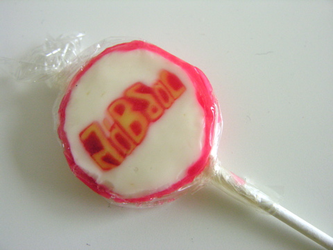
Candy is essential for keeping drowsiness at bay during a long conference. These weren’t the tastiest, but they have embedded Greek letters, and that’s cool.
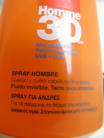
A pasty Irishmen like me would burst into flames if I tried to face a Mediterranean heat wave without protection. When I went to the pharmacy to grab some sunscreen, I had to wade through labels in Greek, French, and Spanish but not English. I selected a nice, strong cream, but the lady at the counter was very adamant that I buy men’s sunscreen. I tried to explain that it wasn’t a big deal, but she finally convinced me that the men’s version was better for the top of the head. (To her credit, there were no signs of pink on my bald pate after a week in the sun.) Mostly,she just seemed a little embarrassed that I might get something packaged for women.
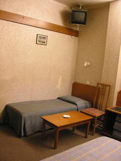
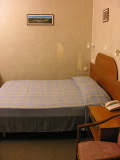
A certain culture of assumed machismo was all over the place in Greece. I was sharing a hotel room with my flatmate Rob, like I usually do, but this is the first time I’ve ever checked into a hotel room and had the clerk automatically assume that sharing a room with another guy was proof enough that we absolutely need a room with two beds. It was the truth in this case, but it caught me off guard that it seemed so urgent to him that no female roommate meant no double bed. Luckily, we got a roomy triple all to ourselves, even if it wasn’t especially chic:
There are newsstands all over the city, and while making one of my many stops for bottled water I picked up some comic books published for the Greek market:
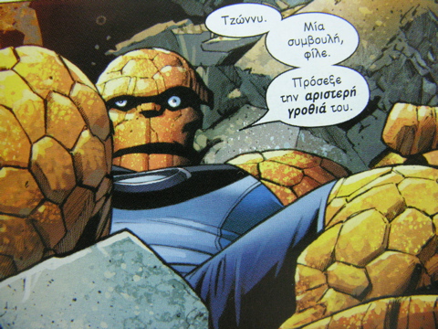
I had to come all the way to Greece to finally find a book that dared to use upper- and lowercase lettering. See how nicely that works? I wish they’d try it in English one of these days.
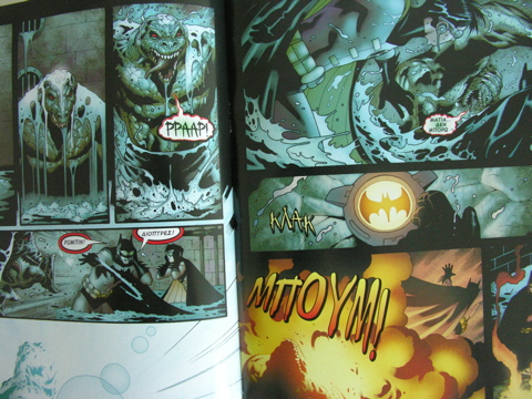
I especially love that even sound effects were translated into Greek. I would have assumed translations were only done using the layer with the black inks, but obviously they reprint the whole thing with the translations. That would have been a lot more expensive before the days of digital prepress.