More on Sodachrome

A few people have been asking about how Sodachrome actually works, and how a user would assemble the pieces to work properly. It’s actually a lot simpler than it might seem: no crazy OpenType features, no complex setting. It’s just two simple fonts that can be set independently, or — ideally — set on top of one another, either by overprinting separate color plates, or by using transparency modes to blend the layers if you’re going all-digital.

First, let’s have a quick peek at the first font — Sodachrome Left:

Sodachrome Left

And now, Sodachrome Right:

Sodachrome Right

Continue reading “More on Sodachrome”

The Colour Grey, revealed

I may have hinted at this before, but for a chunk of the last year, I have been collaborating with my good friend and fellow MATD alumnus Ian Moore on some type and graphic design projects. Need some bespoke type solutions for identities or publications, or help developing some lettering into a full typeface? Perhaps you could use the help of The Colour Grey.

Last Spring we were talking about what kind of work we’d like to do if we partnered up, and fantasized about landing a project that would let us experiment with unusual type solutions that could push the boundaries of how the type could be used, and even go beyond two dimensions in some way. In an almost alarming coincidence, the next day my friend Rathna asked if I’d liked to develop an typographic identity for an online shop selling products that celebrated the quirks and imperfections that are part of hand-crafted production. She wanted a typeface that would benefit from these surprises, especially with the inprecise nature of screenprinting. Bingo! Before we even had a name for ourselves, we had a great project. Months later, the shop is almost ready to go, and we are please to tease you with a peek at Sodachrome:

Sodachrome

Continue reading “The Colour Grey, revealed”

Genuine Imitations

If you’re a type nut who will be in the London area on Thursday, 28 May, Matthew Carter is going to be giving a free lecture, “Genuine imitations: a type designer’s view of revivals“, at the St Bride Library.

Big Figgins

It may be free, but you still have to book a ticket in advance, so act now — the St Bride events have been selling out quite a lot lately. (Great for the library, a little frustrating for interested people who don’t plan ahead.)

“A number of Matthew Carter’s designs have been based on historical types: ITC Galliard, Big Caslon, Big Figgins, Miller and Vincent among them. Others, like Snell Roundhand and Mantinia, were derived from non-typographic sources from the past. In this lecture he explains his debt to the historical legacy — especially to the resources of St Bride’s. His type revivals have varied in faithfulness to their models, which raises questions about the responsibilities of the continuator of traditional forms, about degrees of interpretation, adaptation to current technology, ancestor worship and travesty.”

Update: All sold out now. Hopefully you acted fast and I’ll see you there. Meanwhile, here’s a nice article about Carter from the Washington Post (nothing new if you already know who he is, but it’s nice), since it looks like he’s doing a talk in DC next week (also sold out).

Teaching new dogs old tricks

My associate Mr. Moore — a popular but occasionally controversial contributor to Design Assembly — has written another great piece. This time around he’s kicking off what will hopefully be a series of “old book reviews” by considering the pearls of wisdom contained in Carl Dair’s 1952 book Design with Type.

And if your curiosity is piqued after reading Ian’s review, you can also find the whole thing preserved at Google Book Search.

The Internet says I know something

It gives me a mild flash of nerdy glee to know that I am now cited as a source for information in not one but two articles on Wikipedia. If you ever have any need or desire to read about Microsoft’s Cambria typeface or the ubiquitous Times Roman, you will find sections of those articles that draw directly from my MA dissertation on typefaces for mathematics.

It’s flattering, of course, but it’s also the kind of thing that reminds me that while Wikipedia is exceptionally useful, articles you find there are not actually great citations in themselves. Information on Wikipedia is supposed to be verifiable. That is, it should ideally point to another source to back up what it says there. In the case of my two citations, Wikipedia points to my dissertation (kindly hosted at Mark Jamra’s fantastic Type Culture site). Even that, though, is not a primary source, since everything I wrote is the result of research looking back to the actual primary sources. So the articles on Wikipedia are — in this case, and in many others — references to references to sources, not reliable information in and of themselves. They’re useful, sure, but just starting points if you’re really trying to get to the bottom of something.

Unreleased, untitled Gill typeface

Note: This is really a response to a question posed in this Typophile thread, but I’m also jotting down some info here so I can find it more easily some day.

In September 1935 Gill drew for Monotype a stressed sans-serif type with many prophetic qualities: it looked forward to Hermann Zapf’s ‘serifless roman’ Optima of nearly a quarter of a century later. Although it was given a series number (430), and a few trial sorts were cut, it was never issued to the trade.

— Sebastian Carter, Twentieth Century Type Designers

I dug around a little bit in the archives at Monotype and was finally able to track down a few traces of the Eric Gill‘s unreleased Series 430, a slightly flared sans serif in the Optima/Albertus mode, made at 30 point.

First of all, here’s a scan of a photocopy of the trial print, a test setting a few characters cut to show the basic relationships of caps to lowercase, round shapes to vertical strokes, and the cap and x-heights to the ascenders to descenders. I wasn’t able to track down the original print made from the sorts themselves, but this still shows where the design was headed:

Trial setting of Eric Gill's Series 430

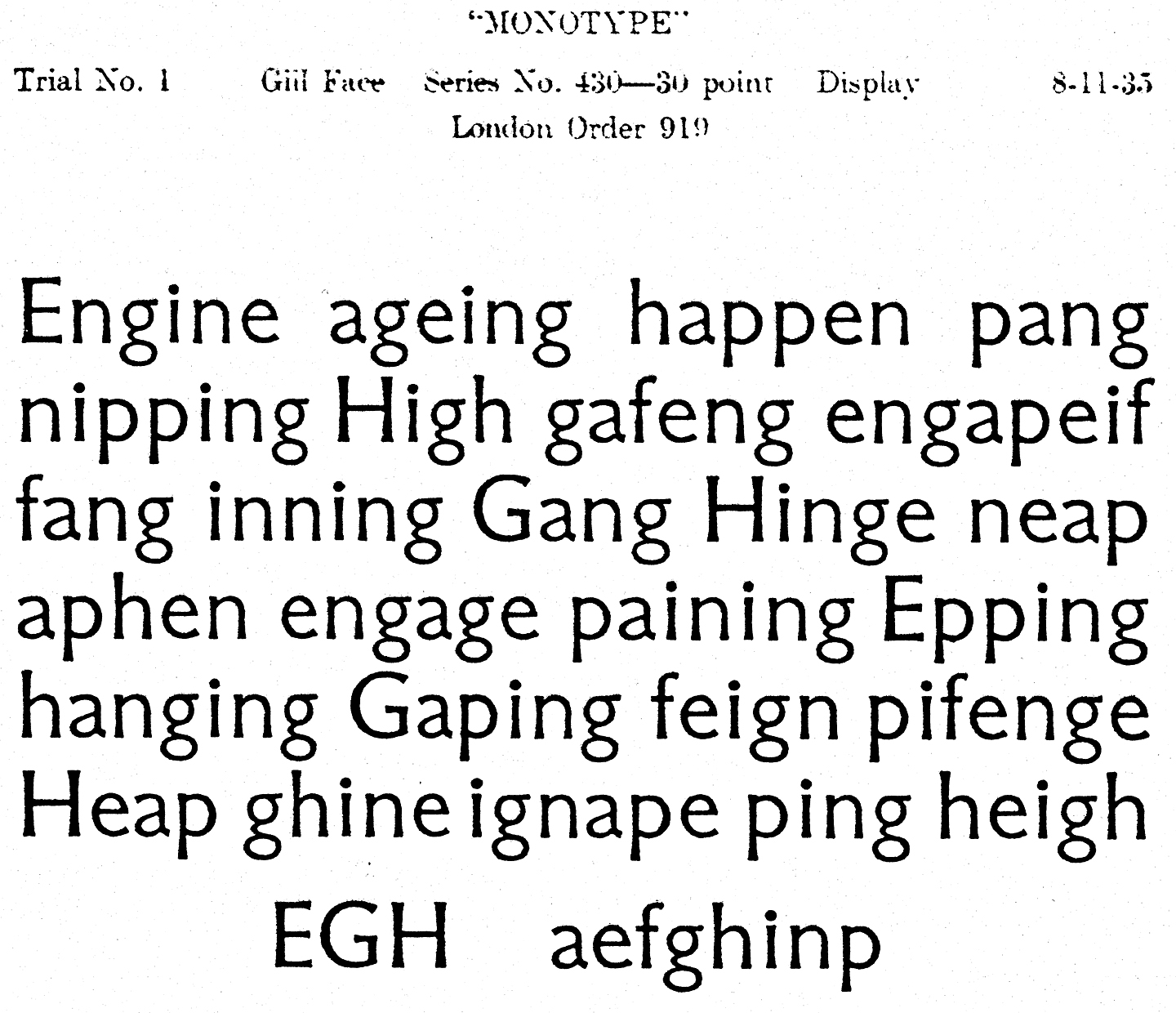
The caps look pretty heavy compared to the lowercase letters, at least for my taste, and I can’t say I love the overall feeling. It certainly does feel like Eric Gill’s work, though. Maybe that’s part of the trouble: it reminds me too much of others typefaces of his, without having quite enough character of its own. Some of the other glyphs are more distinctive, but since not all were cut for the trial it’s difficult to say if they would have helped the overall feel.

Continue reading “Unreleased, untitled Gill typeface”

Processional

One more shout-out: dig this profile of my pal Eric Olson in the November installment of Creative Characters at MyFonts:

Eric Olson of Process Type Foundry

Eric’s awesome wife Nicole Dotin (the other half of the Process Type Foundry) was a classmate of mine at Reading, and Eric and their dog Charlie were sort of honorary members of our class. I already knew Eric was a type designer when I first met him, but it took a while for me to realize that his beautifully crafted typefaces are everywhere, and rightly so.

Standard Medium

A lot of people who’ve met me — who quickly learn in the course of chit-chat that I’m a type nut and that I’m from New York — will often say something about the use of Helvetica in the New York City subway system, and how much they like it. The thing is, I remember reading years and years ago that Helvetica wasn’t the original spec for the (mostly) Vignelli redesign in the late 60s, but I never got around to digging out any of the details to remind myself what the story was. Thankfully, Paul Shaw has written up a fascinating and thorough article about the history of the subway signage and its evolution over the years, so I can now brush up on the details or refer others to a better source. [Thanks, Norm!]

Not Helvetica, see

Local Colo(u)r

Over the summer I moved from my lovely flat in quiet Reading and moved into a little sliver of a neighborhood at the far end of Tooting in South London. Living in London is decidedly more interesting, but I can’t really afford to live in any of the really interesting bits. My little attic flat has its charms, but you might charitably describe it and the rest of the building as a shithole. The neighborhood — down in the outer rim of Zone 3 — itself is pretty dreary.

But there’s a perk! There’s a small stretch of the road I’m on that has never succumbed to the usual curse of low-income neighborhoods: cheap, bad, plastic or vinyl signage made with badly spaced, boring fonts. Somehow, the shop fronts on this one little block have either hung in there for long enough, or been out of business long enough, that they’ve still got these awesomely charming, quirky, hand-lettered signs.

Not lettering, really, but I love these old signs scattered around:

Sign on Mitcham Lane

30 Mitcham Lane has as awful Helvetica-filled sign, but managed to hang onto these groovy numbers on their door:

30 Mitcham Lane

I love the spring in these letters at no. 94:

94 Mitcham Lane

They couldn’t quite had the past at no. 95:

95 Mitcham Lane

My personal fave is this unicase approach at no. 97:

97 Mitcham Lane

I l wish I could see what they covered up at no. 114:

114 Mitcham Lane

This is just an old sign on the corner, but I adore it:

Ad for Hitchcock King