Glyphs on film

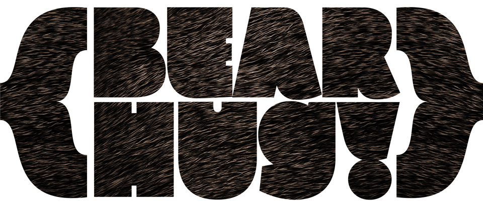
One of the intrepid designers who have purchased a license for Sodachrome (perhaps you recall me mentioning that lovely typeface designed by the talented Ian Moore and me?) is my pal Todd Macfie, a designer in Vancouver who I got to know at Type Camp India last December. After seeing some of the early print samples of Sodachrome when we visited our screenprinter in Chennai, Todd thought it would be a good fit for a project he was developing about self-reflexive literature and hybrid forms of the book. At last, he finally sent me a quick video of his completed prototype book, which features many pages of big, vibrant silkscreens of Sodachrome.

[You know, you can get a license for Sodachrome, too, if you like. Just get in touch.]

Superheroes without Borders

Every single one of these covers from old Arabic editions of Superman comics is exquisite, somewhat surreal, and perhaps a nice reminder that Superman only started fighting for the American way in the 50s during the thick of the Cold War. Up until then, a couple of Jewish teenagers just wanted him to fight for truth and justice. Frankly, I think we could all use a little of that, not just the US. Recontextualization FTW!

Wise words on webfonts

My brain shuts down over webfonts. I can’t muster the will to care. Partially it’s because I really hate designing and building websites and I just don’t want to know more because then it will be easier to avoid it altogether. Partially it’s because I’m waiting to see how much hideousness will result from this incredible race to make a gajillion fonts available for the web, when the browsers, the users, and the fonts themselves just don’t seem to be up to the task yet. Oh sure, there’s potential, but it all seems so familiar. Or, as summarized very neatly by John Hudson in this Typophile thread:

To me, the rush to the web fonts market looks pretty much identical to the rush to the desktop publishing market, so I’m expecting a lot of bad typography and difficult to read text, and the better part of twenty years to clean up the mess. It isn’t good enough to say that ‘if somebody chooses a font that … stinks, that’s their choice’, because typography serves first reader, then the text, and only then the author/publisher.

Enter the Void

One of the points I try and make when I talk about “bad” type (let’s just say it’s of dubious quality, for whatever reason) is that a good designer can do brilliant things with almost any typeface with enough imagination and care and balls. And when I say stuff like that, I envision amazing things like this (warning: may cause seizures, but that’s a small price to pay):

[The opening credits from Gaspar Noé‘s Enter The Void]

Oh Coney, My Coney

The start of Summer always makes me long for Coney Island, especially now that it’s so far away and I’ll probably never see it again before it finally gives in to all the pressure and becomes something else.

Wonder Wheel

But there’s so much to love. If you haven’t been there it may be hard to see past the decay and appreciate the real charm that comes from the liveliness of the place, and the visible signs of a long, colorful history. I’ve always had trouble putting my finger on my love for the place, although it’s such a goldmine of lettering and kitsch that it’s easy to understand what first sucked me in. But it’s always been more, somehow, too.

Coney Island Dream from Joshua Brown on Vimeo.

[Coney Island Dream from Joshua Brown on Vimeo.]

Shoot the Freak