I am back in Brazil for the first time in 25 years or so, and it is still a delight. São Paulo is a very different vibe from Rio de Janeiro — it’s the NYC/LA conflict of South America — but it’s all still warmth and magic to me, with a dash of economic disparity and culture shock.
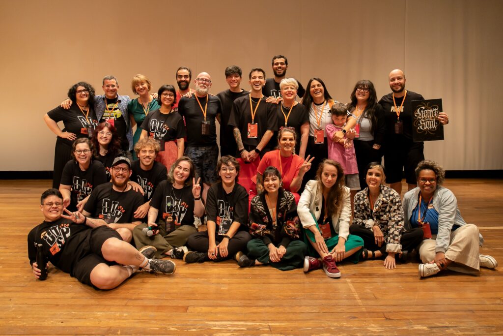
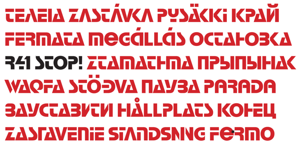
My last trip was an extended holiday vacation, while this was a week of work-related type nerdery surrounding the DiaTipo conference. I led a workshop on marketing type foundries and fonts, and gave the final keynote. (Hopefully there will be a recording to share eventually.)

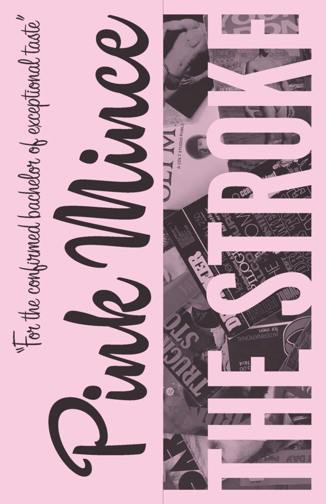
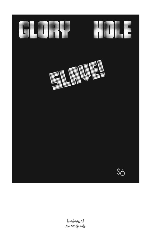
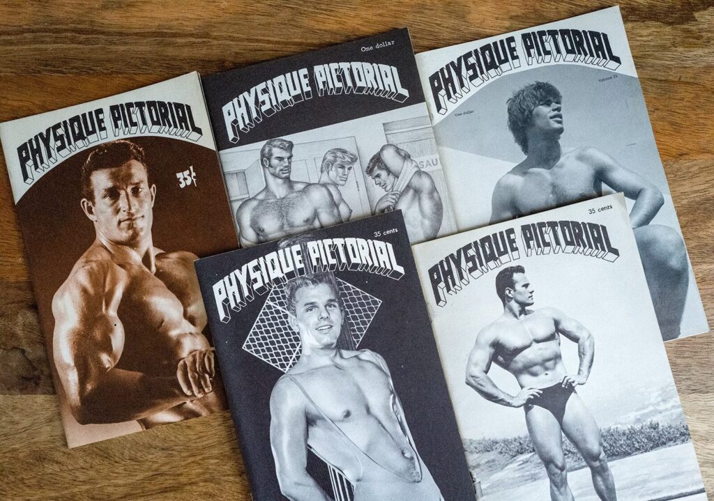
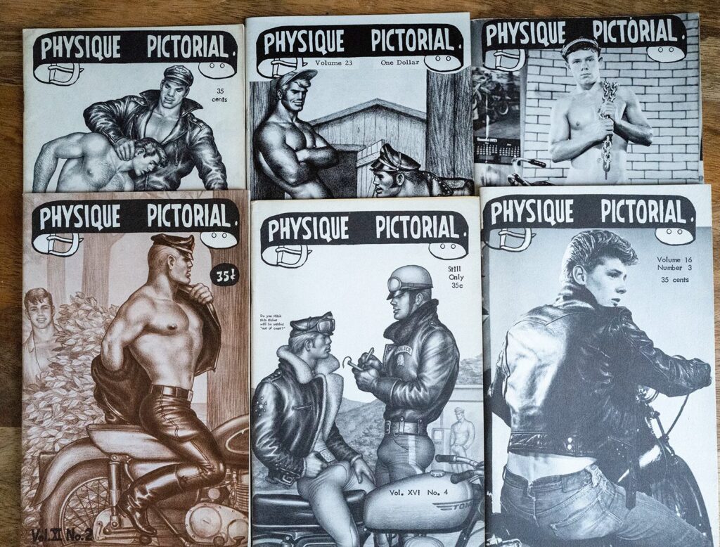
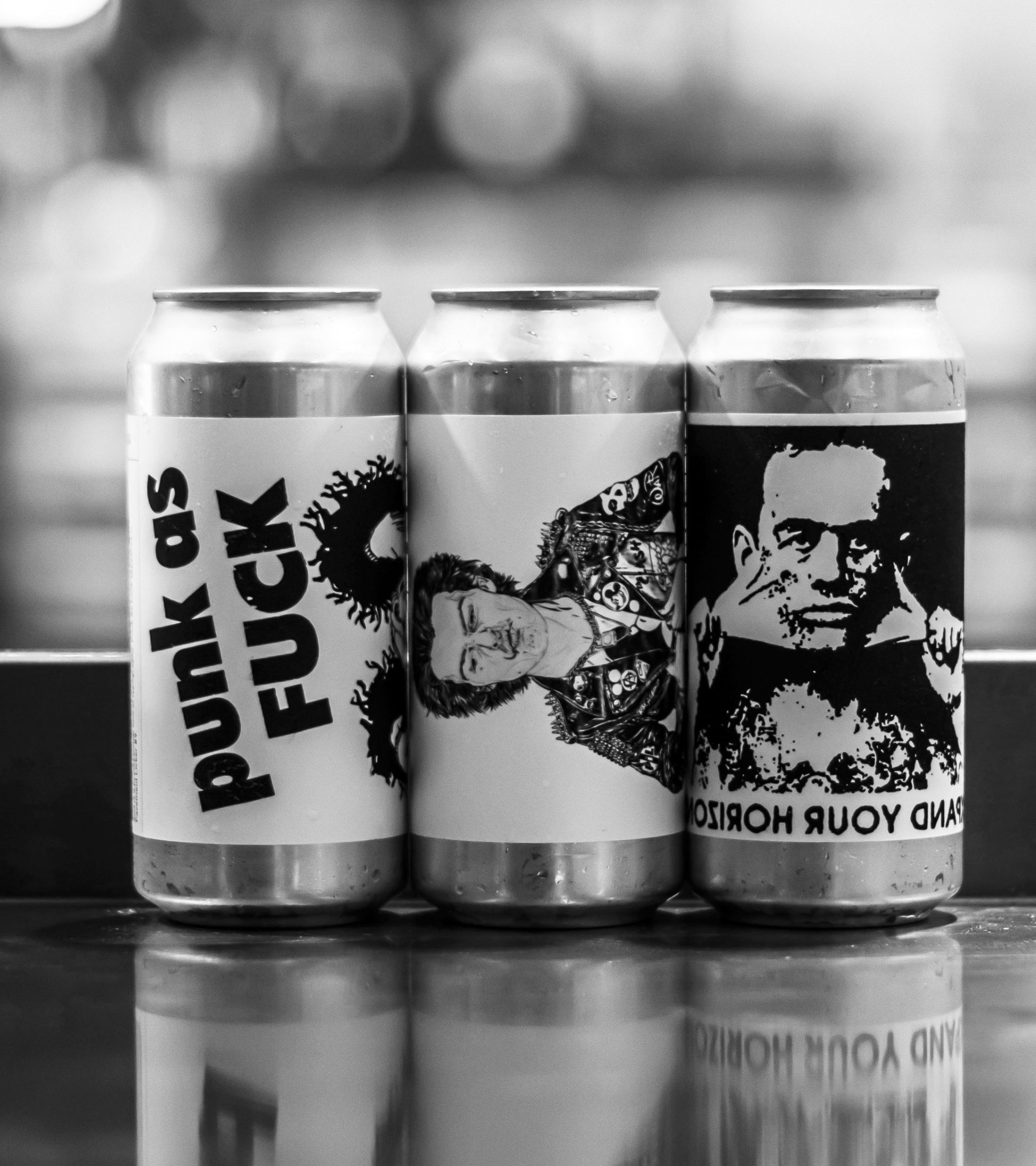
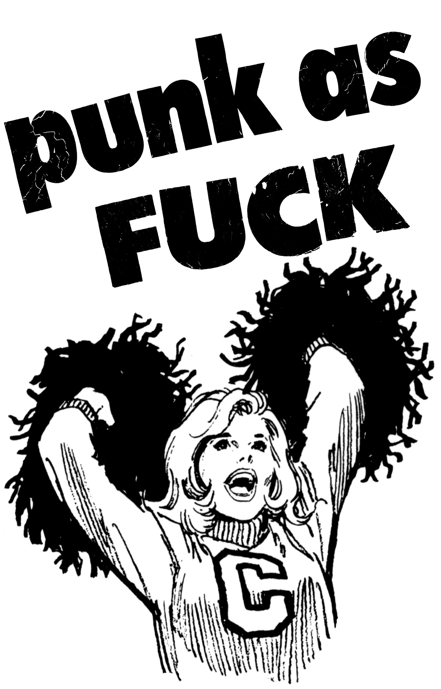
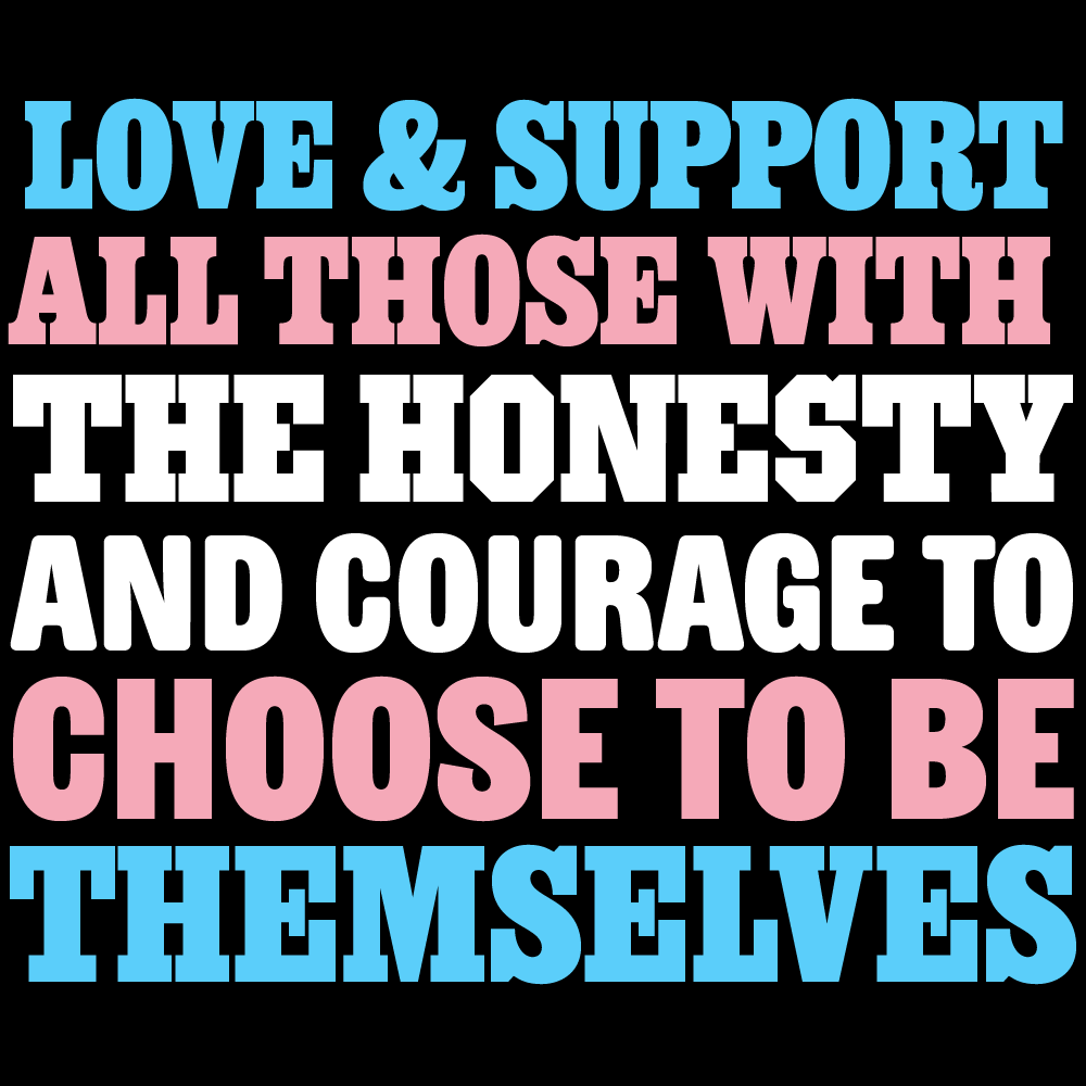
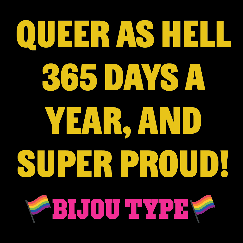
One teeeeeeny little bit of tension about the event is that is held at a Presbyterian university — in a country that continues to struggle with religious conservatism — and the truly terrific team organizing the conference are mostly very queer. They have unfortunately had to struggle a bit with their host, and I think that my proposed talk may have ruffled a few feathers. (Maybe it was the slides showing just the titles of gay magazines, maybe it was general openness about the queerness of my life and my work.) I’m lucky that I am at a place in my life and career that I can get away with openness like that, but I hope the organizers’ desire to include me didn’t cause more stress for them.

So, as a show of appreciation for this wonderful, energetic team of young people who stood by me, I just want to say that I am impressed with them, and I deeply grateful for their hospitality, and I just hope my example offers a little bit of courage to keep on keepin’ on.
Just look at all those beautiful, enthusiastic faces! We were all really lucky to work with such a magnificent crew.