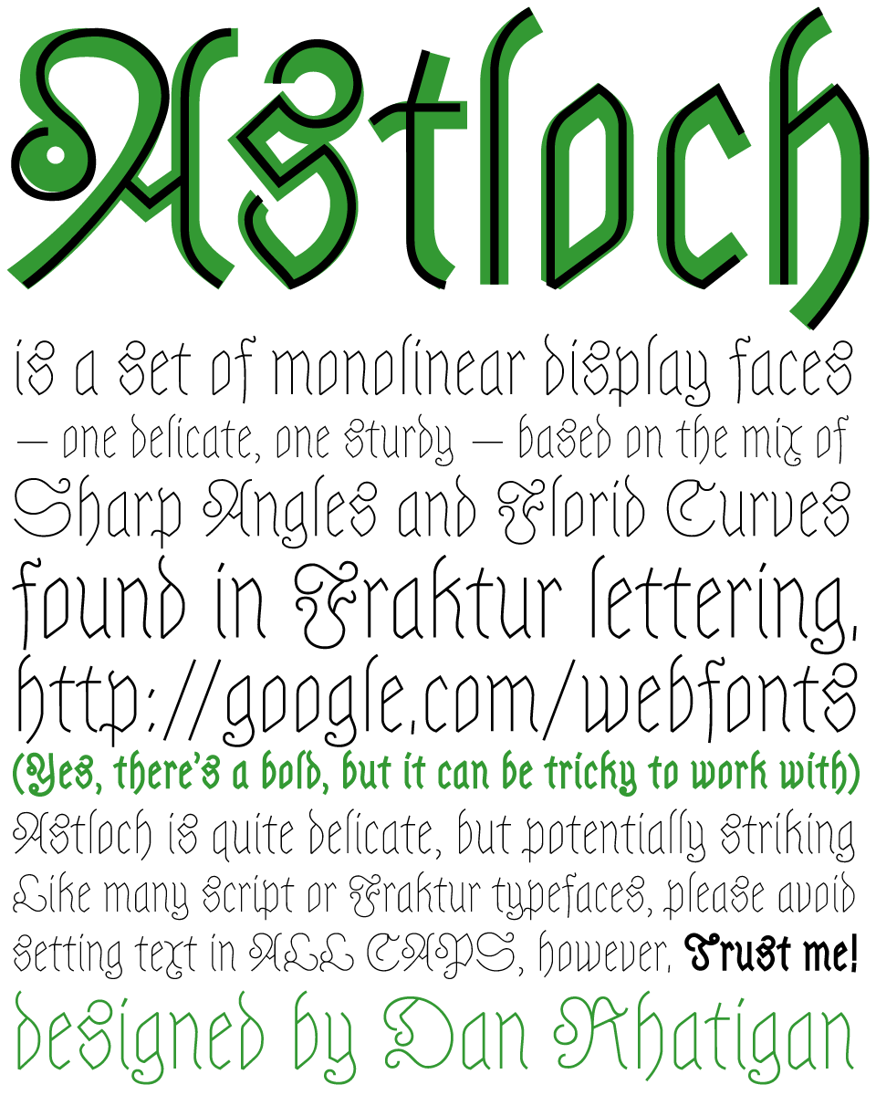
This is my second experiment for the Google webfonts project, somewhat hot on the heels of Copse. Astloch is a pair of fonts based on the interplay of sharp angles and large, loopy curves found in Fraktur lettering. (Astloch is the German word for a knot in a tree or a piece of wood, so it’s staying within the woodland theme with a nod to its German influence.)
Again, I used the Google commission to challenge myself to come up with a focused concept for a display face. Certainly this one is suitable only for display settings. You might be able to make out the text at small sizes, but this is really about looking at big, playful shapes. The original idea was to take the shapes of a typical Fraktur design and eliminate the contrast altogether. What was immediately obvious was that some liberties had to be taken to connect the strokes and establish alignments. The next challenge was the basic legibility of a lot of the letters. Many traditional Fraktur letterforms barely resemble their Roman versions, so I had to invent new shapes that felt Germanic but had recognizable structures, especially with the caps. I can already see some things that will change in later iterations of the design, but for now I hope people see some potential use for this pair of fonts.
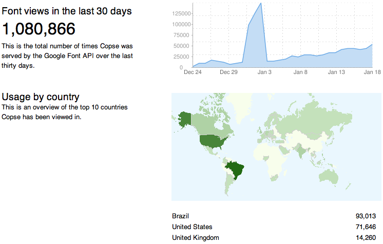
Although Google shows statistics on how many times these fonts have been viewed, downloaded, or used at webfotns (although it doesn’t distinguish which), I have no way of knowing who actually has been using these. If you have, please let me know! I would love to see either Copse or Astloch in action.